• Members 787 posts
    June 13, 2024, 5:47 p.m.

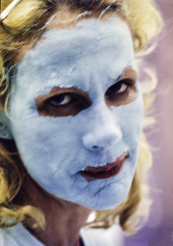
    I TOTALLY love this to bits.

    In 20 years you (both) will look back and recognize this as a highlight of your relationship.
    I have a few images of my wife that are similar (not with a mud mask but the same kind of candid connection). They are my favorite images of her.

  • Members 711 posts
    June 13, 2024, 7:35 p.m.

    Thanks Roel!

    Actually, this image is approaching 30 years old! So, yes, it's something my wife and I look back on.

    😉

    Rich

  • Members 533 posts
    June 13, 2024, 8:26 p.m.

    Unparalleled

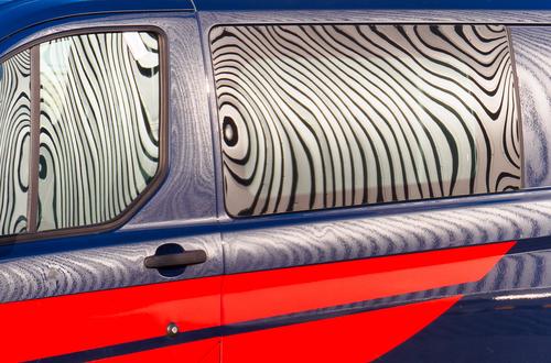
    This vehicle was parked on an industrial estate in front of a warehouse, whose facade was faced with vertical grey metal strips, and their reflection in the paintwork and glass transformed the parallel lines into these patterns. No tricky PP was involved, I just had to mess about trying to get the angle right from the wrong side of a boundary fence.

    Pete

    EA271125.jpg

    EA271125.jpg

    JPG, 806.4 KB, uploaded by PeteS on June 13, 2024.

  • Members 787 posts
    June 13, 2024, 8:58 p.m.

    I have all the time in the world.
    But thanks anyway, even if you don't elaborate.

  • Members 533 posts
    June 13, 2024, 8:59 p.m.

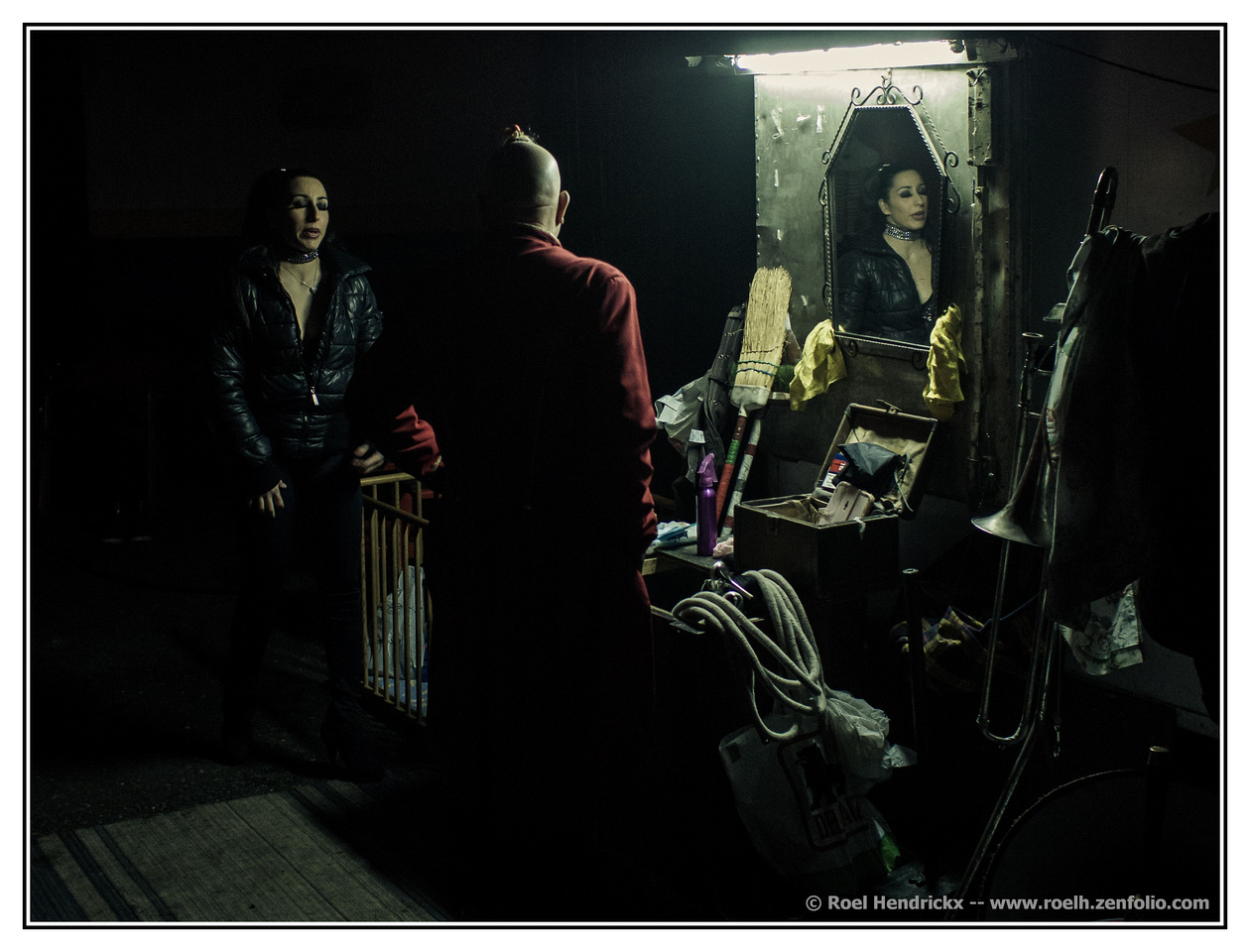
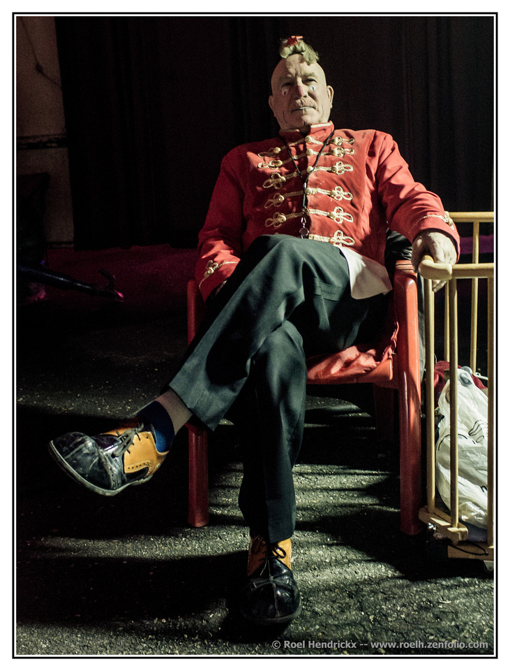
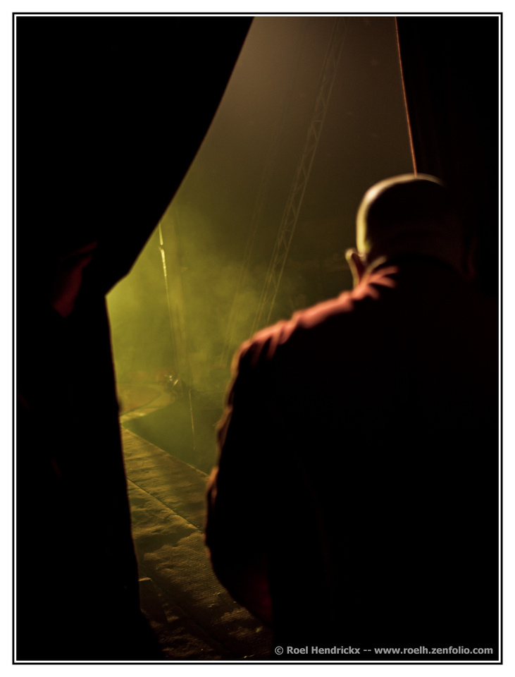
    I love the atmosphere these photos exude, with shallow depth of field and the low key, sparse or even rim lighting and the greeny, film-like tone, giving it a vintage look.
    In no.1 the clown is nicely surrounded by interesting requisites and framed by the woman and her reflection, which is cool. It could have been even better if the laws of physics were defied, or the mirror had been at a different angle, and the reflection was of his face, and thus adding information we didn't already have.
    No. 2 is a great portrait of a proud and confident man, who happens to be a clown. (But what on earth has he got on his head!)
    No. 3 I like a lot. Those clouds of dust or vapour are perfect, and the feeling of heading into the spotlight is captured well. As it is, the area in the spotlight is very sharp and, of course, bright, so our eyes focus on this area and it becomes the main subject. The man is dark and slightly out of focus, and has thus become secondary. So the photo is about the spotlight and a man heading into it and the tension that involves. Had the man been in sharp focus and the rest blurred, it would just be the portrait of the back of a man with interesting light behind him.

    Pete

  • Members 533 posts
    June 13, 2024, 9:08 p.m.

    I like this too, and Rich, Mike and Roel have already explained why. This is yet further proof that extreme sharpness not is necessary to make a wonderful photo. It is simply one of the many ingredients that can be used to make one, but was unnecessary here. In fact the lack of sharpness is an advantage, since it forces the viewer to concentrate on the expression and the situation, which is the essence of this image.

    Pete

  • Members 533 posts
    June 13, 2024, 9:25 p.m.

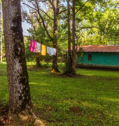
    I agree. This is such a mundane subject, but so effective.
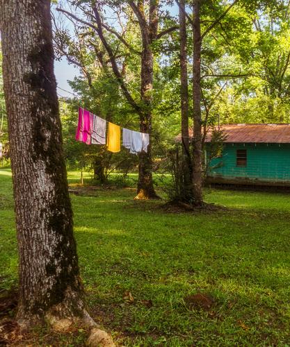
    Actually I have a suggestion for a slight crop. The bright tree or pole on the left edge is distracting and, I find, the green boarded wall of the building is a little too long, so I have cropped accordingly.

    Pete

    Minnie 5280264-edit.jpg

    Minnie 5280264-edit.jpg

    JPG, 16.7 MB, uploaded by PeteS on June 13, 2024.

  • Members 533 posts
    June 13, 2024, 9:33 p.m.

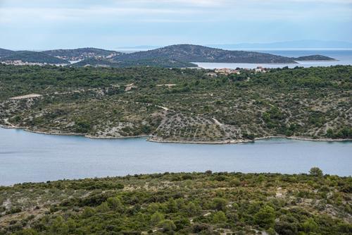
    That is the sort of landscape I would love to be in right now! It is more immersive and looks much better in the full-size version. the layers are good, although the water is almost a visual barrier when looking into the scene.

    Pete

  • Members 533 posts
    June 13, 2024, 9:44 p.m.

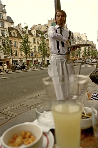
    It's interesting that you say that, Mike, as initially I too was a little disturbed by the vertical line from the glass to the pole, and was all for removing the pole, but as I looked at it more I saw it all as a rather amusing feature, accentuated by that pole. The waiter seems to appear like a genie out of the glass of Ricard, granting the wish of another one the same please - an alcoholics dream! And you are right, it does underline his rather stiff demeanour.
    The jumble on the table and the row of Parisian buildings give it a typical setting.
    Especially having just been to Paris, this image speaks to me!

    If you give the removal tool a go to get rid of the handbag, you could get rid of that little sliver of something just above.

    Pete

  • Members 533 posts
    June 13, 2024, 9:48 p.m.

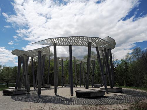
    Well, it is certainly an interesting structure with all those lines and I love the shadows.
    I think the sky is about right, but maybe the rest could be brightened slightly?

    Pete

  • Members 1578 posts
    June 14, 2024, 1:16 a.m.

    And exceptional set, one of your best. Magazine worthy, enigmatic, rich in detail and story, artful. The muted color treatment is wonderfully decadent, and the lighting is masterfully utilized. Each can stand alone but they also work well as a collection. Just grand.

  • Members 3952 posts
    June 14, 2024, 1:21 a.m.

    This is the view from Huggins Lookout overlooking the very popular township of Bright located at the foot of the Victorian Highlands, Australia.

    The panorama was stitched using Photoshop Elements.


    dprevived.com/media/attachments/fc/a9/Pvofu1t74IkqMptSWKtxrcSlum5wVLnPPBFStsQKV7wVSa4rF1cddCfnYawst6rH/hugginslookout-p.jpg

    hugginsLookout_panorama.jpg

    JPG, 77.4 KB, uploaded by DanHasLeftForum on June 14, 2024.

  • Members 1578 posts
    June 14, 2024, 1:21 a.m.

    He seems to be serving you with grand French flair. The posture suggests purposeful and exaggerated movement is upcoming. We all learned about the decisive moment from Cartier-Bresson, but this is the moment before that one. Well caught and presented with a pleasing lemony color palette. I do think I would removed the intrusion on the right border. Should be easy to do with our excellent modern tools.

  • Members 1578 posts
    June 14, 2024, 1:24 a.m.

    Interesting structure. The round shape suggests the occupants might form a circle to share within, kind of like the old talking circle outside the corn mill when I was a kid. I like the way you've angled it against the unusual cloud formation so that the cloud looks like a smoke signal rising from the top of the structure.

  • Members 3952 posts
    June 14, 2024, 1:46 a.m.

    Potentially a very powerful subject but I agree with the others in that generally the scene is too "busy" and the glass in the foreground is a very distracting eye-magnet taking away the potential impact of the waiter.

    I know this was a spontaneous shot but I would have hoped there would have been other opportunities during your visit to the cafe to capture more compelling photos of the waiter at work.

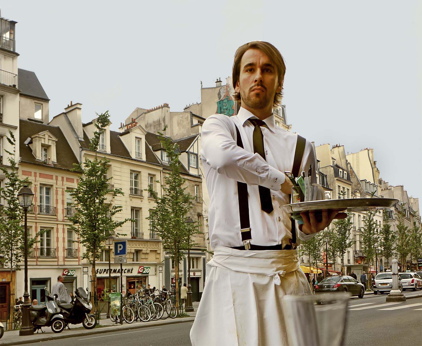
    But given this photo, for me something along these lines would be a much more compelling photo highlighting the waiter.

    Just my $0.02 worth and some food for thought 😊


    dprevived.com/media/attachments/57/1f/hO4bKHYa2ysag05Aa7ixjwbBiFMJ105poYl6l0bNujpFt7cW7GsIURSI1UQjCNMN/waiter-edited-2.jpg

    waiter_edited_2.jpg

    JPG, 226.8 KB, uploaded by DanHasLeftForum on June 16, 2024.

  • Members 1578 posts
    June 14, 2024, 2:10 a.m.

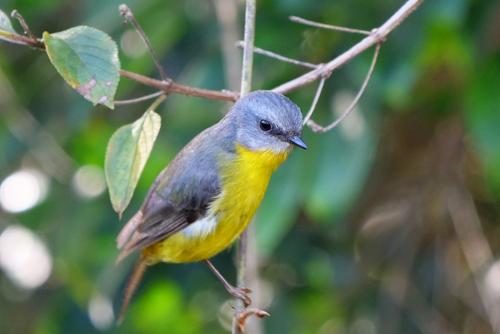
    Truly a beautiful bird that we don't have so a delight to see. His head is wonderfully sharp with a neat little catchlight in his eye. I am a bit bothered by the way his back end falls out of focus, and I'm puzzled by the unattached foot in the foreground - another bird? Then I notice only one of the beautiful bird's feet is showing and I start wondering more about the stray foot. It is a lovely photo but with some questions.

  • Members 1578 posts
    June 14, 2024, 2:12 a.m.

    A lovely broad land and waterscape with mountains, rivers, possibly the sea or a large lake, and tiny dots and clusters of human structures to show us scale. The day is a bit hazy which may have robbed you of a dramatic sky but it mitigated the dark contrasts that sometimes spoil the distant details in such photos. Pleasing scene.

  • Members 1578 posts
    June 14, 2024, 2:14 a.m.

    It's a bit blurred but it adds to the vintage feel of the image. The expression is priceless. No wonder it won!