Sorry that I couldn’t find time to take part earlier and only have a few minutes now, so I will uncharacteristically start with my own photo then try and find a few others where I feel I can add something.
Many of you have made suggestions for different crops, and Dan with different brightness levels. They are all interesting and I would normally have had a play, but that will have to be in the future. So I actually agree with Mike, that it is a photo, which can be chopped and changed in different ways, and each would draw attention to different parts and maybe tell different stories.
-
-
@MikeFewster has written:@Fireplace33 has written:@MikeFewster has written:@Fireplace33 has written:
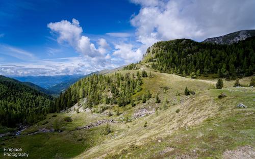
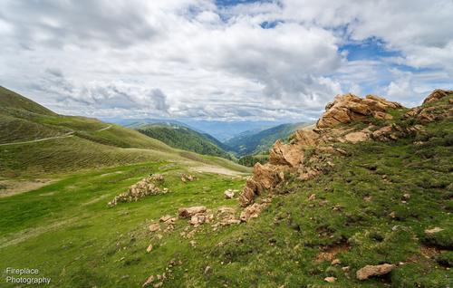
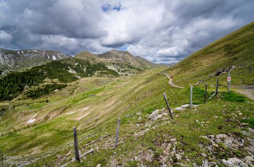
Some wide angle views of the Nockberge in Carinthia
Spent a week hiking with my wife in the Nockberge in Kärnten, Austria. Pretty good hiking conditions; not too hot and not too cold :-)It was good opportunity to try out a new lens I just bought for my Z7
The Viltrox Z mount 16mm F1.8 has had some pretty good reviews so far and I bought it to try some Astrophotography, haven't had that possibilty yet, but here are some first shots in the meantime of the Nockberg mountains
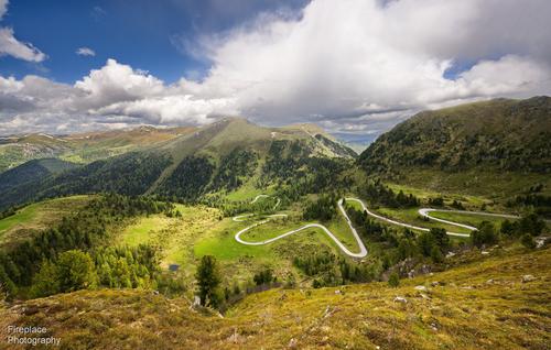
It’s a beautiful area with natural parks and fairly gentle, often grass covered, round shaped mountains, more like hills than the more rocky Alps....and here's one more taken a few days later with the Z14-30 F4
It's the Nockalmstrasse road, and I also posted this last week in the another weekly thread.
It's a 34km long curvy road, that’s loved by motorcycles and sport cars, and snakes it’s way through the area up to a height of 2042m. I searched the map for a good place to get a photo. Then we hiked to that spot, it’s off the beaten track but we found it !You have my total attention. That's a lens high on my "to be considered" list in the Sony mount. To begin with. I'm talking about the lens. What F stops were you using? For a 16mm FF 1.8 lens, the IQ is outstanding. Even more so when the price of the lens is considered. When you get to try it for astro shots, please show them here.
Back to the images. IMNHO, this is excellent use of a wa lens with landscape. Too often a wa is used simply to cram lots into the picture. You are using it to create lines from the foreground into the distant background and the viewer moves through the landscape. The place looks magnificent and I'd like to go there. Put that down to the photos.Thanks Mike. Glad you liked the images :-)
I finally got a chance to respond to this week's thread.
The F stops I used for the first 3 shots with the viltrox lens are shown below the images in my original post, it was F7.1 for two of them and F8 for the other. I'll have to get used to opening it up more. It is a very wide angle lens so, of course, even with the lens wide open the DOF is already large and it is quite sharp. As you mentioned, often in such images I want foreground objects to be in focus too, but even so, I should venture toward a bit wider aperture with this lens :-) By theway, it is well built and resonably compact.Inspired by your shots I did some follow up on the lens. Reviewers are impressed with the corners, even wide open or with just a little stopping down so you are probably right in thinking this lens can be opened up more. When you get around to it (now there's an excuse for another trip) I'll be most interested in the results.
This is a nice set, but I particularly like the first and third for the way composition leads through the photo, like a hiker through the landscape.
In the first, the bright slope attracts the eye and leads over the brow of the hill to the light on the next hill, then through the gap in the trees to those great clouds.
In the third, the fence, supported by the bright slope, to the path and the pointy hill and on to more great clouds. -
@Fireplace33 has written:@Bryan has written:
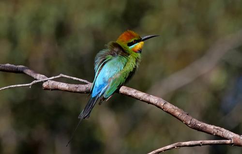
Rainbow Bee-eater
very pretty and colourful bird, well captured
A few weeks ago we went to the south-western corner of Germany, and I was also confronted with these marvellously colourful birds. They are probably a different species, but similar nonetheless. Unfortunately I was not able to get anything like such a good shot, so I really appreciate this one. I think the ruffled feathers give the bird and photo a bit of character, and set it apart from others. It is not a competent but run of the mill photo from a bird-spotter‘s manual, but a nicely observed moment in nature.
-
@DanHasLeftForum has written:@RoelHendrickx has written:@DanHasLeftForum has written:
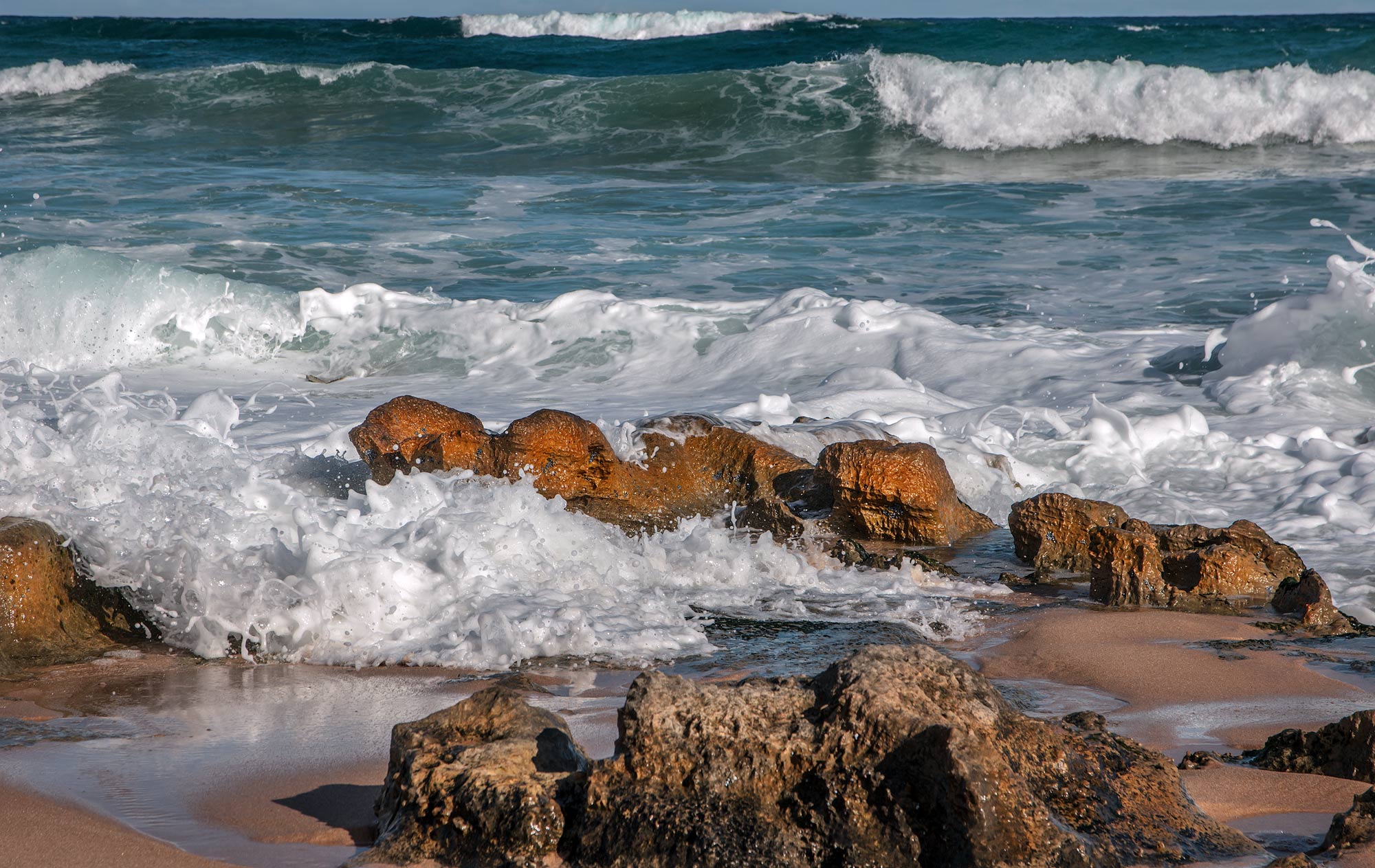
Surf Rolling In
The very late (or very early) light on the rocks creates a deeply saturated colour palette that is always effective: blues and oranges go together as cookies and cream. I like how you placed the horizon ultra high in the frame. It is still there (as opposed to an image that would show ONLY sea and rock), and thus creates a sense of being anchored, but it does not intrude.
Thank you Roel. I'm glad you like it 😊
I posted elsewhere that my normal workflow is to first create a documentary version and where something really grabs my interest I experiment with creating an "artistic" version, as I have done here. I posted earlier in this thread in reply to someone else's comment that I was going for a sort of golden hour look for the foreground to help separate it more clearly from the background.
The documentary version below doesn't allow the water flowing between the rocks in the foreground to stand out enough for me.
Fwiw, this is the documentary version.
Seeing your processed photo alongside the original is particularly interesting. I think the processing really draws attention to those rocks, which for me are the best part of the photo. Yes, the water is good, but the rocks look like waves themselves, and really participate in the surf scene, giving it that extra kick. I assume you were going for an artistic flair, with a broad brush application of warm light to the lower central patch of the photo, which is fine, but if you were trying for a natural look, then I think it falls short, as the white foam to the left and right of the patch is a giveaway. Maybe use a graduated linear mask to add the warm light, if you are after the natural look.
I agree with others that the thin strip of sky at the top looks pinched and needs a bit of room, however, you are right that the horizon, and particularly that distant breaking wave, add depth, so I would try to extend the sky in PP. If you have access to the current version of Photoshop, it is quite easy to extend the canvas upwards slightly and use generative fill to increase that strip of sky - not by much, but just so it is not pinched, which is not a very exact explanation, but I guess you know what I mean. -
@ChrisOly has written:
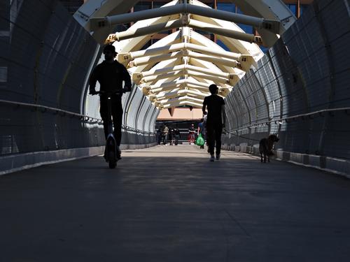
Not too busy.
Pedestrian walkway in downtown Toronto
Sorry Chris. I was preoccupied and meant to come back to your photo before close of business for this week.
It's interesting to see how time changes our responses. Twenty years ago the shot would have puzzled. We'd have wondered why the figure on the left was jackhammering into the floor.
You have caught the "tubular" nature of the walkway and the experience of moving through a tube. At first I wanted to make the crop of the lower day section but I've changed my mind. The handrail and path/wall edges are lit. The eye is led into the darkness where the pedestrians are headed. It's a considerable area. Suspense and drama are created.There is a slight tilting of the image as well that adds a little to the drama. Hitchcock would have approved.
Then there are the repeating and diminishing roof structure forms. They accentuate the length of the tube as does the dark area in the foreground. You ain't getting out of this tunnel quickly. -
@PeteS has written:@DanHasLeftForum has written:@RoelHendrickx has written:@DanHasLeftForum has written:
Surf Rolling In
The very late (or very early) light on the rocks creates a deeply saturated colour palette that is always effective: blues and oranges go together as cookies and cream. I like how you placed the horizon ultra high in the frame. It is still there (as opposed to an image that would show ONLY sea and rock), and thus creates a sense of being anchored, but it does not intrude.
Thank you Roel. I'm glad you like it 😊
I posted elsewhere that my normal workflow is to first create a documentary version and where something really grabs my interest I experiment with creating an "artistic" version, as I have done here. I posted earlier in this thread in reply to someone else's comment that I was going for a sort of golden hour look for the foreground to help separate it more clearly from the background.
The documentary version below doesn't allow the water flowing between the rocks in the foreground to stand out enough for me.
Fwiw, this is the documentary version.
Seeing your processed photo alongside the original is particularly interesting. I think the processing really draws attention to those rocks, which for me are the best part of the photo. Yes, the water is good, but the rocks look like waves themselves, and really participate in the surf scene, giving it that extra kick. I assume you were going for an artistic flair, with a broad brush application of warm light to the lower central patch of the photo, which is fine, but if you were trying for a natural look, then I think it falls short, as the white foam to the left and right of the patch is a giveaway. Maybe use a graduated linear mask to add the warm light, if you are after the natural look.
I agree with others that the thin strip of sky at the top looks pinched and needs a bit of room, however, you are right that the horizon, and particularly that distant breaking wave, add depth, so I would try to extend the sky in PP. If you have access to the current version of Photoshop, it is quite easy to extend the canvas upwards slightly and use generative fill to increase that strip of sky - not by much, but just so it is not pinched, which is not a very exact explanation, but I guess you know what I mean.Thank you Pete 😊
Yes, as I mentioned earlier I was aiming for an artistic effect to separate and highlight the foreground from the background more.
Regarding the pinched sky, some like it and some don't. I explained earlier why I have chosen to leave it as is.
Thank you for your feedback.
-
@minniev has written:@Bryan has written:
Rainbow Bee-eater
You have outdone yourself with this exotic little fellow. He is so unusual and so colorful he could almost be one of those AI birds that float through social media these days. But it's pretty clear he is a real live bird, brilliantly colored, tack sharp with a tiny little catchlight in his beady eye. His peevish expression only adds to the pleasure. The background is nicely blurred. The blurred background branch on the right might be something I'd try to get rid of simply because the rest of the image is so very perfect, but if it didn't work, it really isn't that much of an aggravation.
Thank you minnie. I did indeed feel fortunate that those birds were around and that I got close enough after a few days.You are right that the blurred branch could be removed - just not sure whether my skills would leave something obvious in it's place...
@ChrisOly has written:It may be small, but certainly makes the impression. Colours galore.
@Fireplace33 has written:very pretty and colourful bird, well captured
Yes Rainbow is the right name for these birds. I did see one feeding with other birds in the Dragonfly dam back in Autumn and got a blurry pic with enough to identify it. Very happy that some came again.
@MikeFewster has written:Wonderful birds. For those not familiar with them and their nesting nad social behaviour, google. They are tiny but migrate over long distances.
Bryan's shot brings out the dazzling plumage. The spikey beak and tail play with the photo's twig perch.
I've often tried to photograph these and never got such a good shot.Thank you Mike. After a few days they let me get close enough. That small flock seem to have moved on but today I noticed another pair that were very cautious.
@PeteS has written:A few weeks ago we went to the south-western corner of Germany, and I was also confronted with these marvellously colourful birds. They are probably a different species, but similar nonetheless. Unfortunately I was not able to get anything like such a good shot, so I really appreciate this one. I think the ruffled feathers give the bird and photo a bit of character, and set it apart from others. It is not a competent but run of the mill photo from a bird-spotter‘s manual, but a nicely observed moment in nature.
I recently saw a photo of a Motmot from Central America with very similar markings, just different colours. In a brief discussion we discovered they are from the same Order although that is perhaps a bit far up the tree to suggest much. I also saw a post of another colourful bee-eater that was eye-catching. I never worked out why his feathers were ruffled like that. It was the only time I saw it and they gradually went back to normal over an hour or so.
