Just watched the trailer to that film. Looks interesting, thanks !
You've posted a fun shot here. With the lady placed in the center she's thankfully not distorted while the rest of the building is. I've never used a fish eye and usually try and avoid distortions ;-) I guess the trick is to embrace the effect and use it to the full for fun shots.
-
-
He certainly has an impressive stare! I wouldn't want to annoy him. Nice shot
-
Interesting to watch them grow, but a relief when the building work finally stops. Good opportunity for some shots.
-
It's a magnificent shot. The sky is amazing those clouds seem to eminate from the snow covered mountain peaks. Lots of wide open space here.
The lakes with the reflections of that young forest add in the midground details and they are all lit with some nice warm light.
For more depth that bright grass in the foreground work very well. And you even have a "Bob Ross style" tree trunk that he always used to add in when the painting was almost finished :-) -
Very detailed shot. Nicely processed to show all the craters and the old lava fields in the darker areas. It must have been a very clear night when you took this.
-
-
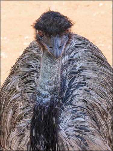
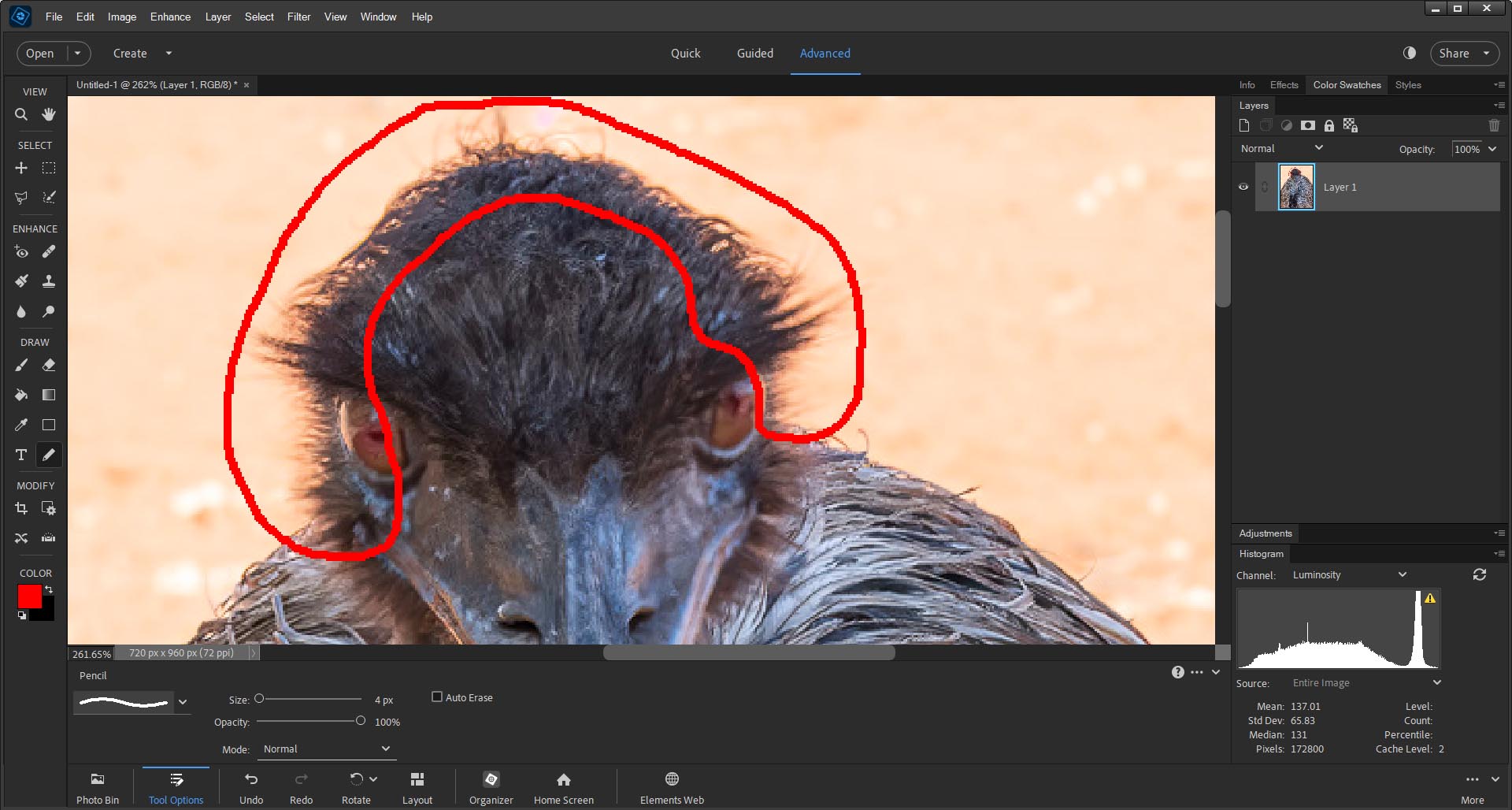
I think Dan is correct and he spotted it well. It's a longish story. I have tried for a front on shot of an emu like this for some years. You don't get too many opportunities. I caught this last year with my previous camera that doesn't have the eye focus AF capability of my new Sony. The bird was interested in me and tending to look at me but was all over the place in movement, especially the head on the long and wobbling neck. What I caught has the focus mainly on the body. The head was slightly blurred both from movement and being a little out of focus. So close to the shot I wanted but not quite. Damn. A chance I might never get again so I turned to Topaz. Sometimes Topaz can perform minor miracles with AI in correcting both motion an lens blur. Topaz also has the capacity to identify faces and apply its magic selectively to different parts of the image. That is what has happened here with the fine feathers of the head perimeter as the program worked overtime to change almost complete blur to something approaching individual strands. If we look carefully at the feather perimeter below the area Dan has selected, it's happening there too but this time Topaz has colours closer to the feather background to work with so it isn't as apparent.
I'd like to show y'all the original so you can see what Topaz has done but I can't. The originals weren't worth keeping and I was so pleased to have got a shot something like I've wanted for a long time that I scrapped the original files.
In a couple of weeks I'll be back in central Australia. This time with my fast eye af camera and if an emu cooperates, I'll try again. I'm happy with this shot but you never stop trying. -
@DanHasLeftForum has written:@MikeFewster has written:
EMU. Central Australia.
The "orange fringe" around the head really stands out on my screen even at default viewing size.
Can you elaborate on what it might be for us?
Is it a masking artefact for some editing that might have been done on the background?
Thanks for sharing 😊
Well spotted. Ref my lengthy explanation following Roel's post.
-
@MikeFewster has written:
Well spotted. Ref my lengthy explanation following Roel's post.
No problem. Your explanation makes sense.
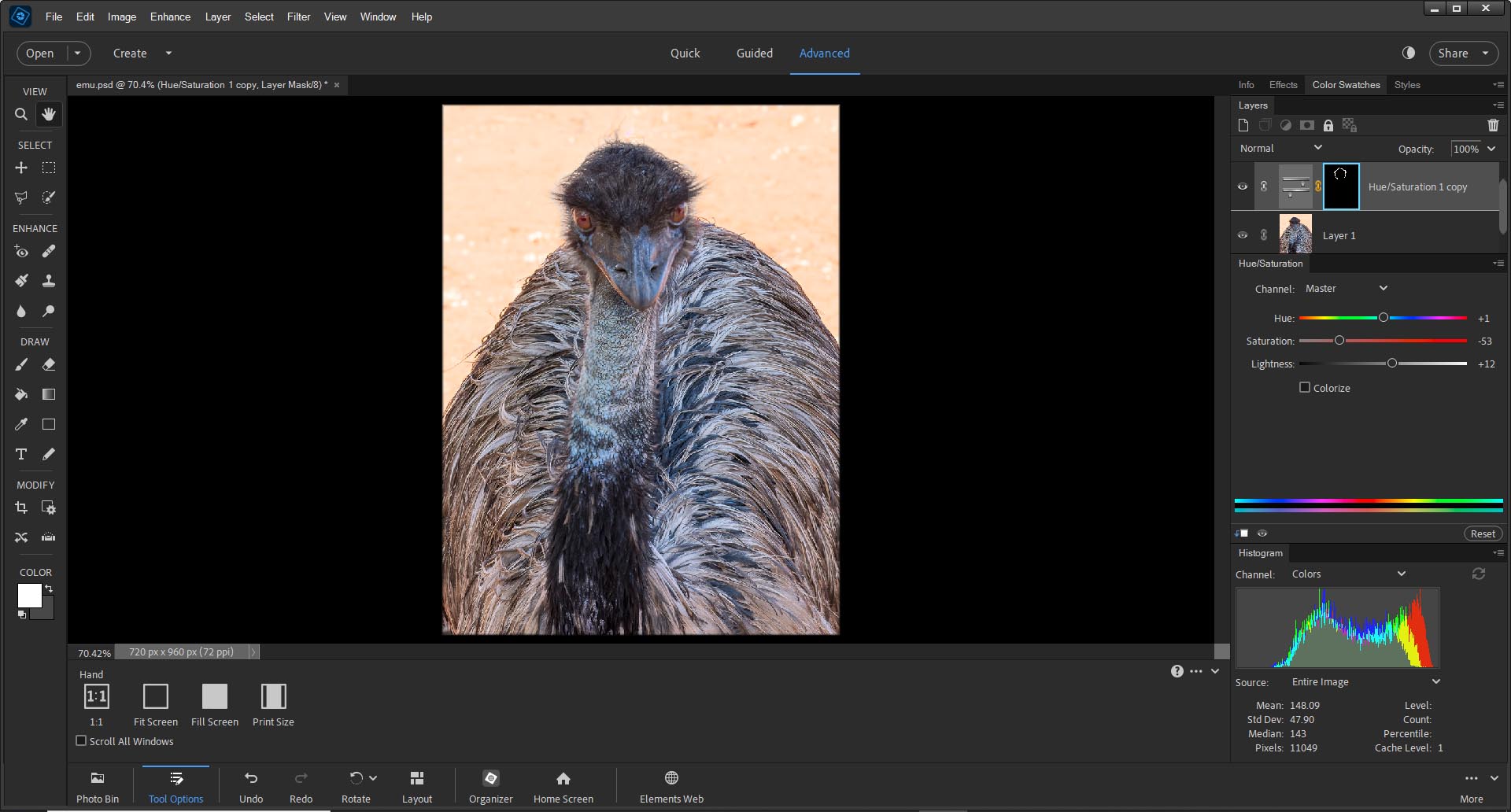
The good news is that if the fringe is undesirable you can remove pretty much most of it, if not all of it.
Fwiw this is a quick and basic hue/saturation adjustment that cleans up most of it but it still needs some tidying up. But it already looks much better on my screen.
-
@DanHasLeftForum has written:
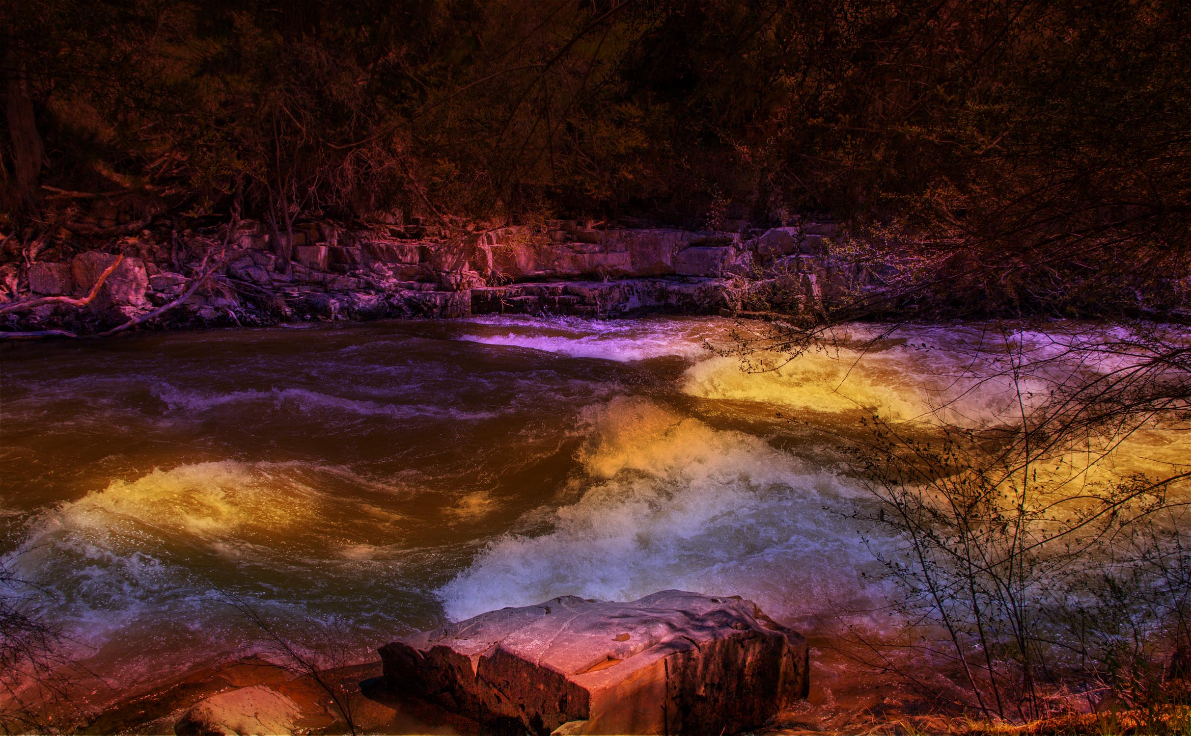
WATER COLORS
Ovens River running through Bright, North East Victoria, Australia.
C&C is not always a string of admiration about postings.
This one is just not my idea of good photography or creative effort. It’s forced, garish and ill-conceived.
I’ve seen such scenes actually lit by lighting like this. At best it’s cartoonish in a bad way.
I don’t have any suggestions about improving this other than not to do it.
Rich
-
@ChrisOly has written:@DanHasLeftForum has written:
WATER COLORS
Ovens River running through Bright, North East Victoria, Australia.
I have to hand it to you, it's a fab image and almost painting like. It seems this rapid river is bathed in wonderful beams of sun. I like the raw nature of the terrain, the shore and very fast moving water. I could sit on the embankment for hours and watch the river flow. Excellent.
Thank you Chris. I'm glad you like it.
But I am fascinated by your interpretation of the image - "It seems this rapid river is bathed in wonderful beams of sun". Your interpretation is the first of that type that I have seen so far. I assume you are referring to the yellowish white caps.
Hopefully it is obvious to most people that this is an "artistic" impression of the scene and not a documentary version but it doesn't really matter if it isn't. The camera settings used is normally a good clue that the image is not a documentary image.
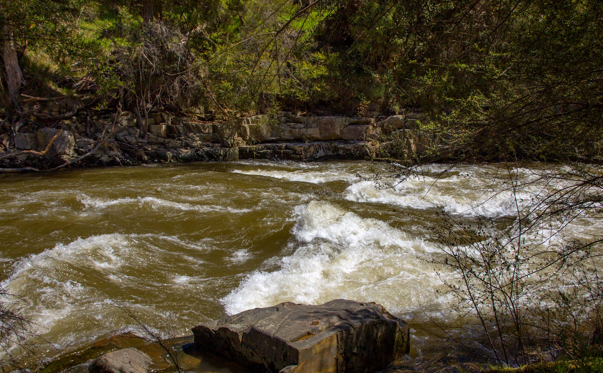
I took the original photo in broad daylight. Yes, watching the rapid was interesting but only for a few minutes before I continued along the river. As I mentioned a few times now, my normal workflow is to create a documentary version of the scene and where something piques my interest I experiment with different ideas to create an "artistic" version. The original documentary image didn't really do much for me and hence the "artistic" version. I aimed to create a sort of night scene lit by colored spotlights.
Fwiw, below is the documentary version.
-
@Rich42 has written:
C&C is not always a string of admiration about postings.
This one is just not my idea of good photography or creative effort. It’s forced, garish and ill-conceived.
I’ve seen such scenes actually lit by lighting like this. At best it’s cartoonish in a bad way.
I don’t have any suggestions about improving this other than not to do it.
Rich
Thank you for your thoughts Rich 😊
This type of image is not everyone's cup of tea. Some will like it and some will not but it gets people talking about my images, as you have done here, so "Mission accomplished!!".
I consider feedback from all sources where my images are viewable and I am happy with the overall feedback so I will continue to create these types of images when I feel it is appropriate.
-
@DanHasLeftForum has written:@Rich42 has written:
C&C is not always a string of admiration about postings.
This one is just not my idea of good photography or creative effort. It’s forced, garish and ill-conceived.
I’ve seen such scenes actually lit by lighting like this. At best it’s cartoonish in a bad way.
I don’t have any suggestions about improving this other than not to do it.
Rich
Thank you for your thoughts Rich 😊
This type of image is not everyone's cup of tea. Some will like it and some will not but it gets people talking about my images, as you have done here, so "Mission accomplished!!".
Yes, I like comments on my images, positive or negative - doesn’t matter.
I consider feedback from all sources where my images are viewable and I am happy with the overall feedback so I will continue to create these types of images when I feel it is appropriate.
But sometimes it does help to actually take heed of the feedback.
-
@Rich42 has written:@DanHasLeftForum has written:@Rich42 has written:
C&C is not always a string of admiration about postings.
This one is just not my idea of good photography or creative effort. It’s forced, garish and ill-conceived.
I’ve seen such scenes actually lit by lighting like this. At best it’s cartoonish in a bad way.
I don’t have any suggestions about improving this other than not to do it.
Rich
Thank you for your thoughts Rich 😊
This type of image is not everyone's cup of tea. Some will like it and some will not but it gets people talking about my images, as you have done here, so "Mission accomplished!!".
@Rich42 has written:Yes, I like comments on my images, positive or negative - doesn’t matter.
@DanHasLeftForum has written:I consider feedback from all sources where my images are viewable and I am happy with the overall feedback so I will continue to create these types of images when I feel it is appropriate.
@Rich42 has written:But sometimes it does help to actually take heed of the feedback.
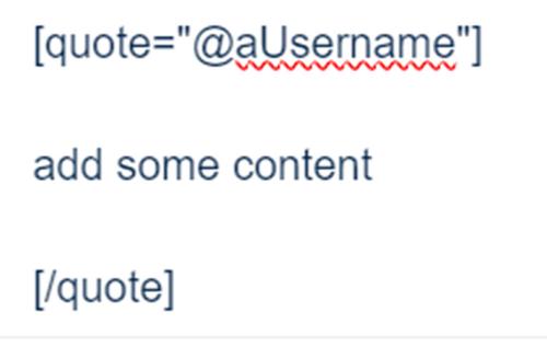
I have now given you the benefit of the doubt, after my previous edits of this post, and assume the above is what you meant to post. Next time make sure you get your quote tags right. It's not hard.
All you need is an opening and closing tag for each quote in the post's conversation.
Stuffing them up once can be an honest mistake. Doing it again will be considered deliberate.
In any case, regarding your second comment I do take heed of the overall feedback from all sources and contributors, as I said, and hence "artistic" versions of my images 😊
-
@Sagittarius has written:
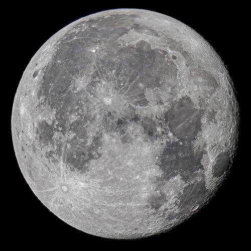
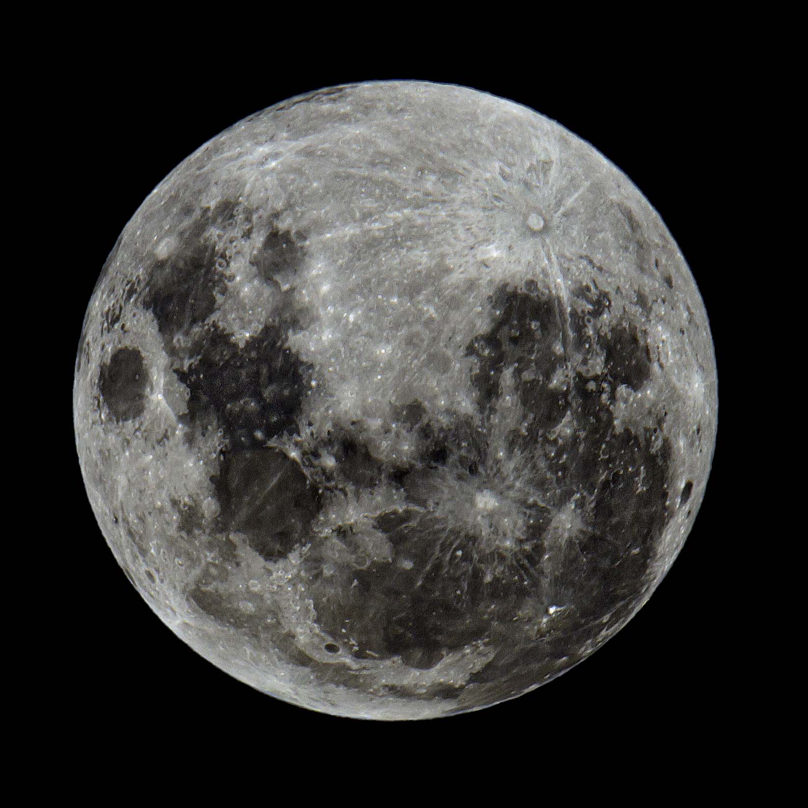
Our closest neighbor in Space.
Wow!!!!!! That's an amazing and fantastic photo given the difficulty in outputting a sharp image of a full moon because of the harsh and flat light striking it from the sun.
It's way better than the best I have been able to come up with since getting my 150 - 600mm lens. The only suggestion I would make, and I am knit-picking because of personal preferences, is to maybe add a little more contrast and see how it looks if you haven't already done so.
Anyway, fwiw below is amongst the best full moon shots I can get but it's not as good as yours.
Well done and thank you for sharing 😊
-
@ChrisOly has written:
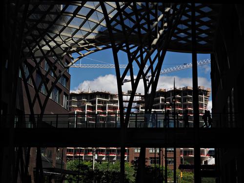
High density
Massive residential development is happening in downtown Toronto recently.
I like the variety of lines throughout the scene which help to move my eyes throughout it.
But I am a little confused. Is the structure in the foreground part of the new development or is the subject of the photo the construction in the background?
If the development is in the background here, hopefully it might be possible to move to the other side of the foreground structure and experiment with the lines and rectangular shapes of the construction to come up with interesting compositions playing with those lines and shapes.
Anyway, just some food for thought.
-
@minniev has written:
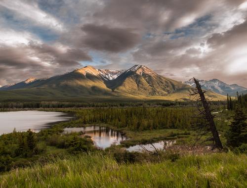
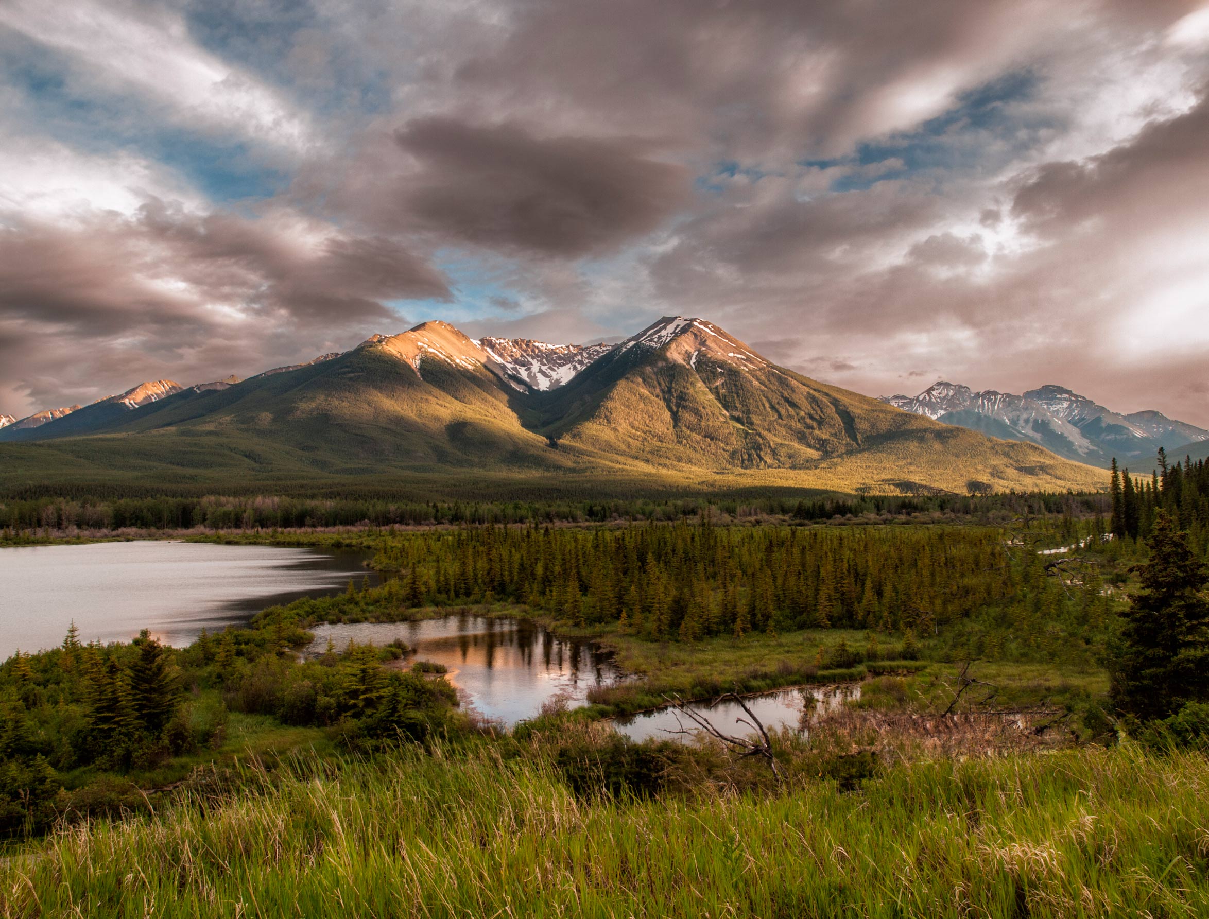
Icefields Highway (wish I was there now instead of here in 110 degree heat). One from the archives, so old it was taken with the venerable E30. I never did anything with the picture because there was a worrisome distraction I could not get rid of without making major alterations in the scene, but the sky and light were so dramatic I couldn't delete it. So yesterday I decided to see whether the new lightroom tools would salvage it, and this is the result. Still a few nits but I'm better satisfied with it.
That's an amazing landscape 😊 I like the sky, colours and lighting very much.
The only thing I would change is remove the annoying eye-magnet of a stump, at least to me it is, which doesn't really add to but only hinders the scene.
Just some food for thought and thank you for sharing 😊
Fwiw, I removed the stump using content-aware fill and some cloning. It would probably need a bit of tidying up but this looks better to me.
-
@Fireplace33 has written:
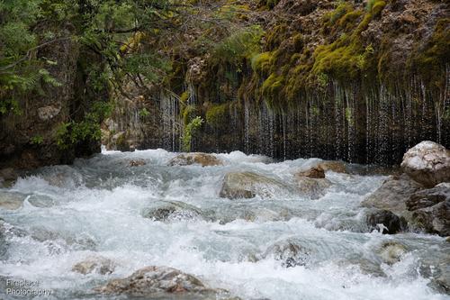
The Triefen
My nephew came to visit us this week. We had planned a walk higher up in the mountains but had to change those plans when a big bank of low hanging cloud decided to sit half way up the mountain all day.
So instead we took him to one of our old favorite walks lower down. This was a path along a wild river to a waterfall called the Triefen at Hinterthal .
As the name in German sort of suggests it’s like a long curtain of water falling like rain drops out of the riverbank wall. It'a formed by the ground water seeping down untill it meets a horizonal impervious layer where it pours out into the river, It’s only about 2-3 m high but more than 70m long!It's a beautiful place and a bit different everytime we visit, This time the river was very full.
Here’s some shots:A slightly more detailed shot showing all the splashes and drops
Very nice series. I like this one the most. For me, the silky look doesn't quite suit the scene, but that's just my 2c worth.
Thank you for sharing.
