• Members 789 posts
    June 27, 2024, 7:02 a.m.

    The movie is definitely worth two hours of your life.

    About fisheye and distortion : there are actually two options. (Maybe more but I'll talk about two)

    1) The first is to indeed fully embrace the effect and put it to good use.
    If you have a subject with curves, the fisheye will exagerrate them and that can be stunning.
    And if you have a subject with symmetric straight lines, curving those might result in something unique.

    2) Or you can try to hide the distortion. There are some tricks for that.
    (And I am NOT talking about using the anti-distortion tools of you PP software.
    I sometimes use those too to mitigate or enhance distortion if I think it looks better, but seldom to totally cancel all distortion.
    Because you need so much correction for that, that you lose 50% of your image and everything in very large corners.
    So why bother using a fisheye then??)

    The tricks I mean are IN-camera, on the shooting location tricks.
    Those tricks are actually obvious if you think about it, but still many people seem to believe fisheye shots are ALWAYS awfully distorted.
    That is wrong.
    The distortion is non-existing in the center of your frame and it gets gradually worse (or better if you aim for it) towards the edges.
    So if there is something that you would like to keep non-distorted, but that something in or near the center of your frame (like I did with my wife: placing her near the edge would have been horrible).
    And if there is an important straight horizontal or straight vertical: keep that too at or near the center of your frame.
    (The late Bill Bootstrap Turner (RIP) that we know from DPR was a master of this trick : he used fisheye for landscapes and seascapes, and you could hardly tell, because he always kept the horizon of his seascapes level and smack in the center.)
    This does NOT mean that your final composition has to become boring or centered...
    You can always keep the straight line (eg horizon) right in the center at the time of shooting, and then crop the image.
    This will allow you to move that straight horizon (or other straight line) higher or lower in the final photograph...
    Or it will allow you to move that straight vertical (like a tower or flagpole) also towards the left of right.
    There, that's it.
    And immediately you also know why many of my fisheye images end up in a ratio of 1:1 square.
    I have used the cropping recomposition trick.
  • Members 789 posts
    June 27, 2024, 7:04 a.m.

    I appreciate this discussion.
    We do not always have to agree to get along.
    This C&C thread is about HONEST and constructive feedback.
    So yes, negative C&C is allowed absolutely, as long as it is polite and constructive (and hopefully motivated).
    Not everything can be to everybody's taste (thank god, or the whole world would be vanilla).
    And that is OK.

  • Members 789 posts
    June 27, 2024, 7:05 a.m.

    Interesting look into the artistic "kitchen".
    Thanks.

  • Members 3998 posts
    June 27, 2024, 7:29 a.m.

    There is a huge range of ingredients and utensils in the PS/PSE kitchen 🙂

  • Members 3998 posts
    June 27, 2024, 7:56 a.m.

    Yes totally agree but one should not put their stupidity on display when providing negative feedback.

    For example, comments like this -

    are imo foolish because it leaves the author wide open to that suggestion being justifiably thrown back at them by anyone who doesn't like something in an image the author posts in the future.

  • June 27, 2024, 8:10 a.m.

    I think I'd just observe that as Joel said, C&C is about constructive feedback. Saying 'not to do it' is not constructive. The choice of 'realistic' or 'artistic' presentation is one of taste, and suggesting that others should adhere to one's own taste is not very reasonable. But also, if people would resist the urge to throw things back at people it would create a bit more peace.

  • Members 3998 posts
    June 27, 2024, 8:55 a.m.

    I see you edited your post with incorrect quote tags and you still haven't got it right 😎 You've fixed only one of your 2 comments. Your first comment, which I have struck out again because it is what you said not me, is still within a quote of my post.

    Look closer at my post where I corrected your tags and note how I did it.

    dprevived.com/t/wednesday-cc-no-theme-thread-845-revived-065-on-2024-06-26/5991/post/80098/

    This isn't rocket science 😊

  • Members 789 posts
    June 27, 2024, 8:58 a.m.

    I agree with all Bob said… except for calling me Joel… (haha)

    It’s Roel (an “exotic name” for English speakers).
    Actually it’s a Frisian name although I am Flemish myself - you can blame my parents…
    And it is pronounced “rule” (as in “rule of law” - haha again)

  • Members 789 posts
    June 27, 2024, 9:59 a.m.

    Expanding on Bob's remarks :

    1) It is generally just wise to avoid words like "stupidity" or "foolish" etc
    (regardless of who one is speaking to or about - calling yourself stupid or foolish is often actually an "insult by proxy/reflection"...)
    Harsh and unkind words are unnecessary and often lead to misunderstanding or escalation.

    2) Also trying to give someone the impression that they are incompetent or stupid is undesirable.
    That's just gaslighting.

    He/she who fits this shoe will know what I mean.
    An intelligent person (as we obviously all are here) can express him/herself without giving offence.

  • Members 1099 posts
    June 27, 2024, 10:50 a.m.

    I appreciate your info on using fisheyes.
    I did a search for the building to get a comparison. Seeing an original helps put the effects at play here in perspective. Amazingly many of the search results exhibited varying levels of keystoning! - They would do well to read your tips above.

  • Members 689 posts
    June 27, 2024, 10:51 a.m.

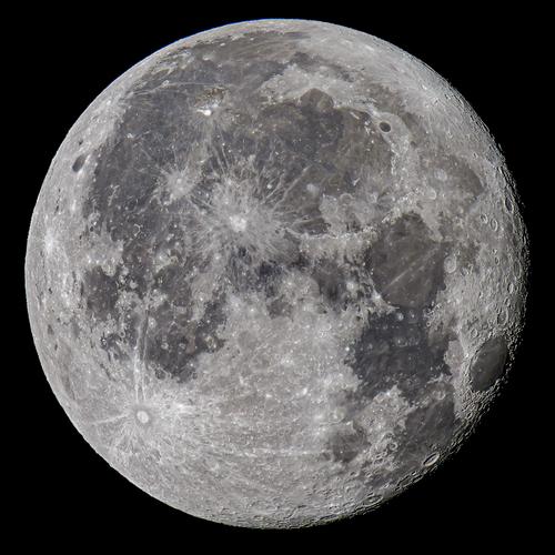
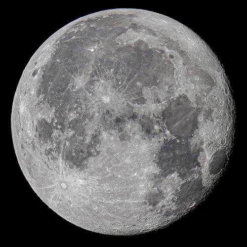
    Thank you all for looking and commenting. I am glad you like it. Following Dan's suggestion I added not a contrast but dehaze.

    Moon 240623 - 2.jpg

    Moon 240623 - 2.jpg

    JPG, 1.9 MB, uploaded by Sagittarius on June 27, 2024.

  • Members 3998 posts
    June 27, 2024, 11:11 a.m.

    It's had the effect of adding contrast. It looks better on my screen and so I like this version more 😊

  • Members 689 posts
    June 27, 2024, 11:22 a.m.

    Dan,
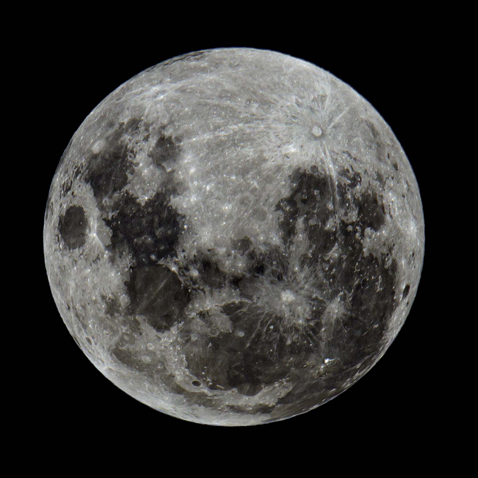
    Your image has too much contrast. I would reduce highlights, brighten shadows, and run it through Topaz Sharpen. I can try if you do not mind. Having original file, not a small JPEG, would help.

  • Members 1099 posts
    June 27, 2024, 11:29 a.m.

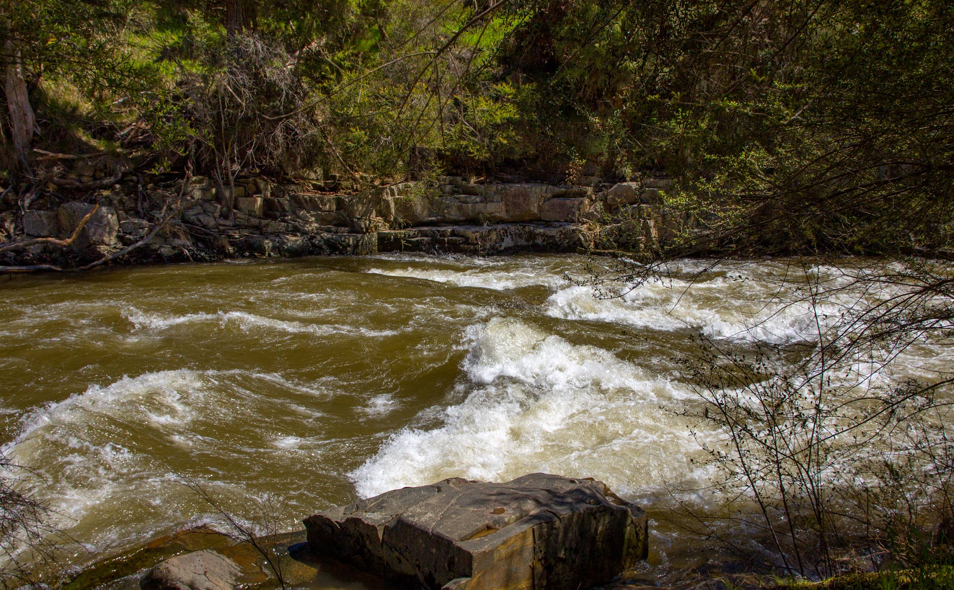
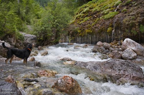
    The inclusion of the dog adds a lot to the scene. A healthy looking specimen, his attention is frozen in time and he appears to be wondering what is going on across the river - which draws our eyes to the main subject. I was puzzled by what looks like a lot of little droplets above the grassy patches on the bank - uh, uh - small flowers!
    I like the silky effect of slower ss on flowing water. Some seem to like a lot. My taste is just enough to not be overly creamy. Your last shot drifts there but that's just me.

  • Members 1589 posts
    June 27, 2024, 3:57 p.m.

    Skillful use of the ultra wide angle to present a beautiful historic structure in a novel way, distorting the structure just enough, and the human subject not at all. The tutorial about how you did it was useful. I love the colors in this one, the golden light emanating from the structure matching parts of Els' clothing, and the structure matching the rest of it, all set off by the nice range of blue hues. I think Danno's brightening made the photo more impactful by clarifying those colors.

  • Members 1589 posts
    June 27, 2024, 4:03 p.m.

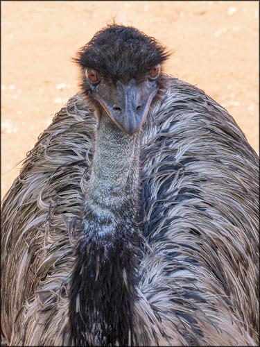
    This emu looks as potentially ferocious as some I've seen and kept distance from. His stare is challenging, and I'm not sure I'd have stayed in proximity long enough to get a shot this good. The angle is great. A direct staredown from a slight over-the-shoulder posture that suggests he is folding his cloak to one side daring you to advance on him. The slight halo in the feathers of his head didn't bother me till Danno brought it up but once I saw it I couldn't unsee it so I'm glad he demonstrated a quick and easy resolution for it, one that would work for human hair as well. I would not have guessed it was a Topaz AI artifact but I should have, as I've run across some far more unsightly that this one.

    At any rate, a fine animal portrait that exudes personality. Well done.

  • Members 1589 posts
    June 27, 2024, 4:14 p.m.

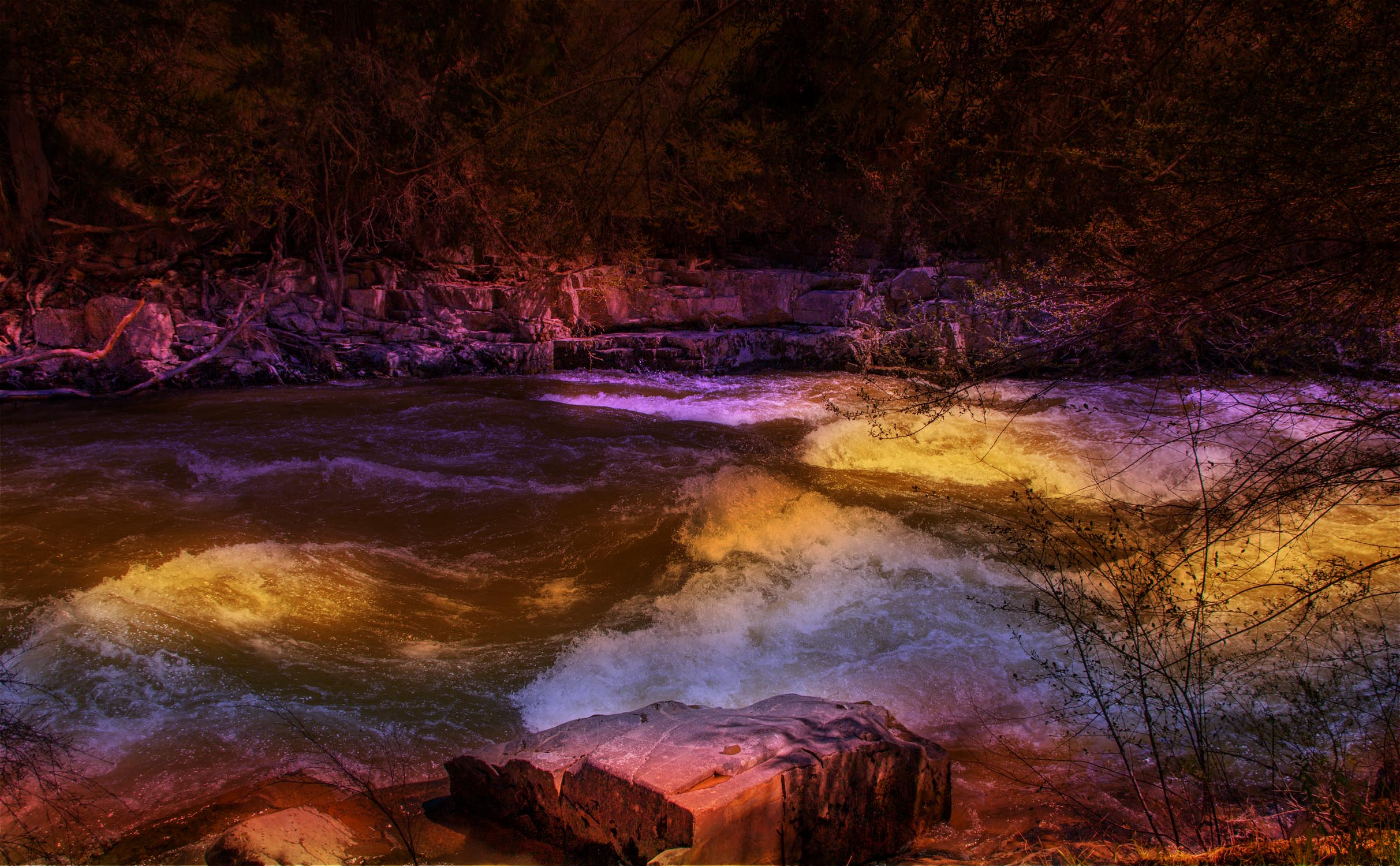
    I do a lot of artistic edits and defend forever anyone's right to do whatever they please with their own photos. Personally, I find this artistically interpreted image unappealing, even though I like the original shot you shared later in the thread and think it has potential. In my opinion, the colors, which resemble the artificial lights used in outdoor decorations or concerts, don't enhance the natural scene but distract from it, creating visual dissonance. Of course, it isn't my photo but yours, so you should pursue whatever you find appealing.

  • Members 1589 posts
    June 27, 2024, 4:17 p.m.

    There's an interesting interplay of shapes and forms and lines throughout this image. Though it is a bit busy and chaotic in design, it seems that the busy and chaotic may be the subject here. I tried raising the shadows just a bit to reduce the impact of the blocked up blacks, and it had the added benefit of making the humans in passage across the walkway more visible and more a part of the composition. To my eye, this was an improvement.