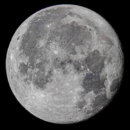
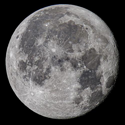
I'm responding to this version because I like it best of the various versions posted. It's quite a fine moon image, with more (fascinating) detail than I usually see in those images and certainly more than I can get with my limited abilities and my humble m43 kit. Mad respect for the photographer and his equipment, which he clearly knows how to use to best advantage.
-
-
Another pretty shot of a bird I shall never meet, with a rainbow of natural coloring that boggles the mind. I do like the unusual effect of the shadow of his beak and the quizzical posture. I think some brightening would help combat the effects of the contrasty lighting, add some facial detail and clarify the wonderful colors - maybe raising shadows and overall brightness or maybe even some selective brightening around his mask too. You are becoming a bird whisperer!
-
A pleasing set that conveys the sense of place. I like them all but the one with the dog stands out - well, because of the dog! The dog helps make the place real for me. I appreciate that you made thoughtful choices about shutter speed to preserve the sense of wildness in the water even when you slowed things down some. The raging nature of this river is a significant part of the personality of this place, and even though a very slow shutter (and ND filter) could have smoothed it all into a fairyland scene that might have been pleasing in its own way, it would not have conveyed the power of that water. Lovely place, lovely photos.
-
You've caught an oddity there, and illustrated it by how you framed the image with that concrete barrier (support post?) separating the sides of the garage or station that are lit differently. That they are both seemingly abandoned gives a sort of post apocalyptic feel to the image. It is hard to look at this without feeling alone. Interesting capture.
-
Very good idea, thank you.
(I am really not good at selective PP.
I suppose you turned my wife into a layer
or you lassoed her (it's been a while since I last did that)
or you masked everything but her
or something else like that..
I should remember to use that kind of tricks more.) -
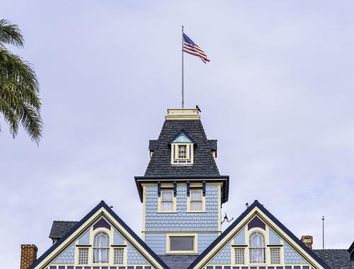
A commercial building at the main intersection in Carlsbad, CA. It houses, what else?, a surf shop.
Not a lot of artistic work for the photographer. Present it honestly. Line it up straight. Correct some perspective distortion.
And include the palm tree to give some SoCal location flavor, as well as the crow saluting Old Glory. Don't get no better'n that.
Rich
-
@minniev has written:@DanHasLeftForum has written:
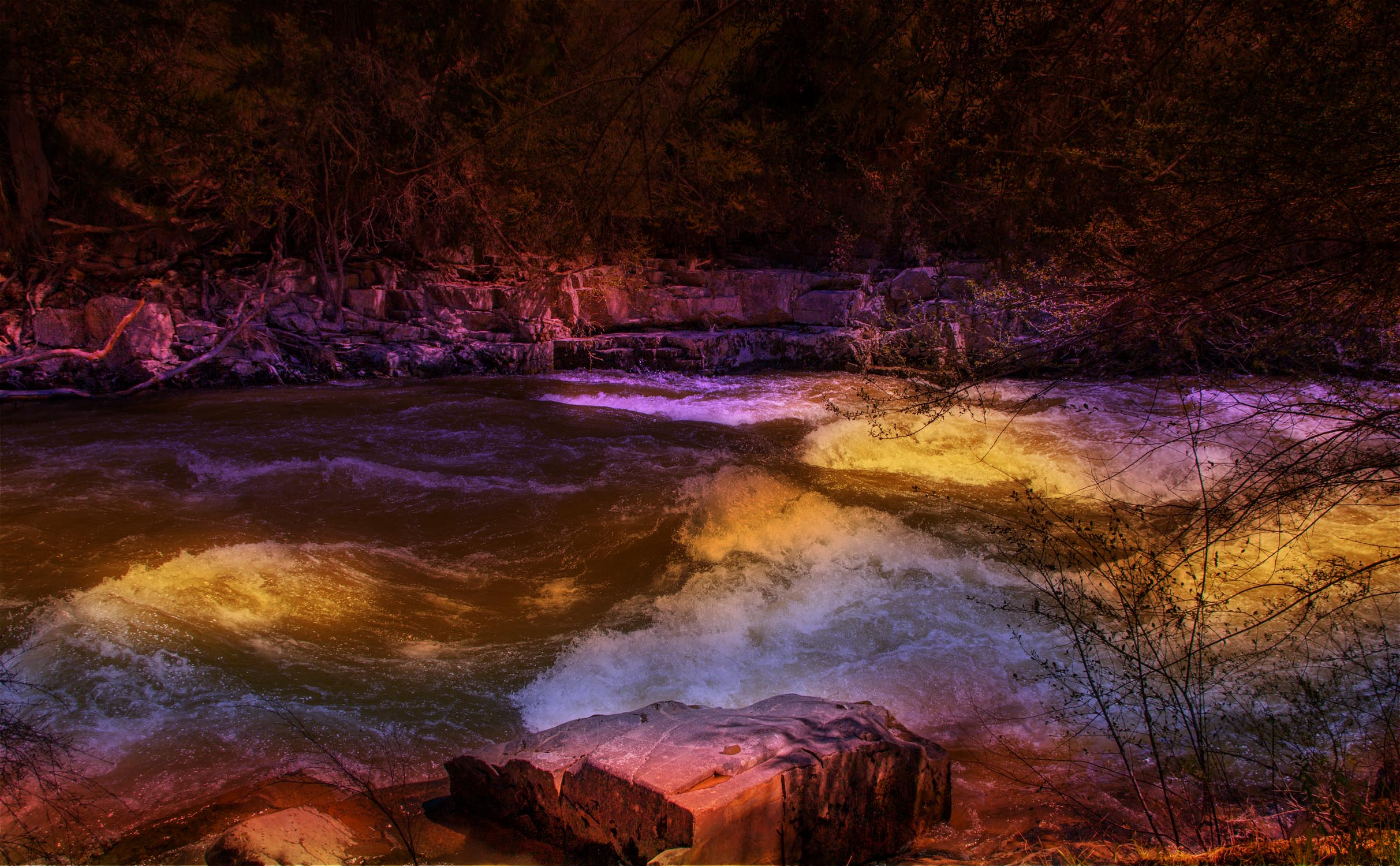
WATER COLORS
Ovens River running through Bright, North East Victoria, Australia.
I do a lot of artistic edits and defend forever anyone's right to do whatever they please with their own photos. Personally, I find this artistically interpreted image unappealing, even though I like the original shot you shared later in the thread and think it has potential. In my opinion, the colors, which resemble the artificial lights used in outdoor decorations or concerts, don't enhance the natural scene but distract from it, creating visual dissonance. Of course, it isn't my photo but yours, so you should pursue whatever you find appealing.
Thank you for your comments minniev 🙂
I posted earlier that this type of image is not everyone's cup of tea and I have no issue with that because it gets people talking about my images.
There are some who like it very much and some who don't like it at all.
I obviously like it as is and it looks good on my screen so making adjustments to suit some who don't like something about it is most likely going to lead some who currently like it as is to find something they now dislike.
-
@Sagittarius has written:@DanHasLeftForum has written:@Sagittarius has written:
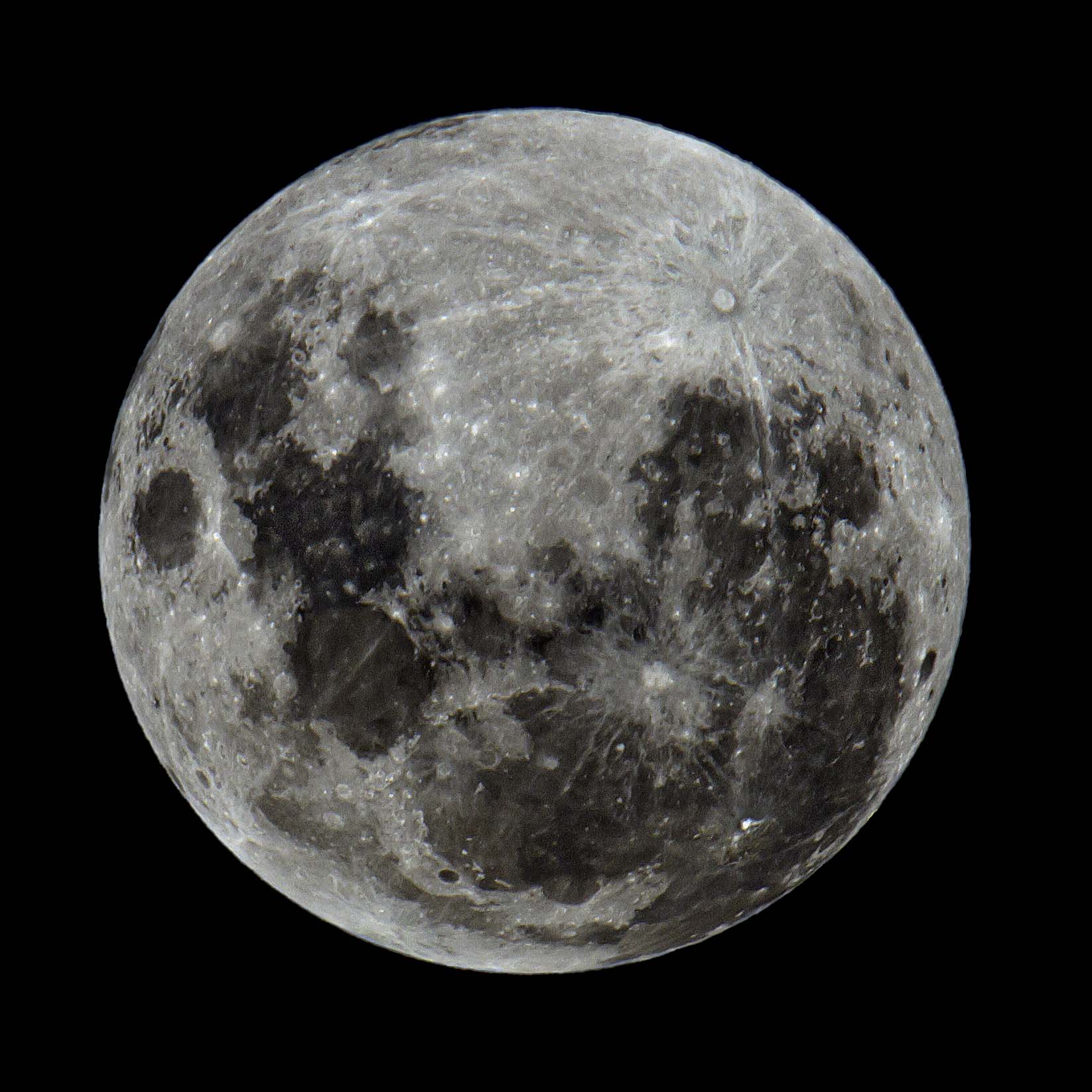
Our closest neighbor in Space.
Wow!!!!!! That's an amazing and fantastic photo given the difficulty in outputting a sharp image of a full moon because of the harsh and flat light striking it from the sun.
It's way better than the best I have been able to come up with since getting my 150 - 600mm lens. The only suggestion I would make, and I am knit-picking because of personal preferences, is to maybe add a little more contrast and see how it looks if you haven't already done so.
Anyway, fwiw below is amongst the best full moon shots I can get but it's not as good as yours.
Well done and thank you for sharing 😊
Dan,
Your image has too much contrast. I would reduce highlights, brighten shadows, and run it through Topaz Sharpen. I can try if you do not mind. Having original file, not a small JPEG, would help.Feel free to edit my version and post it Sagittarius 🙂
I like high contrast b&w or close to b&w images so I settled for that version.
The final look of these types of images is very subjective.
-
@RoelHendrickx has written:@DanHasLeftForum has written:@RoelHendrickx has written:
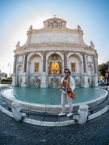
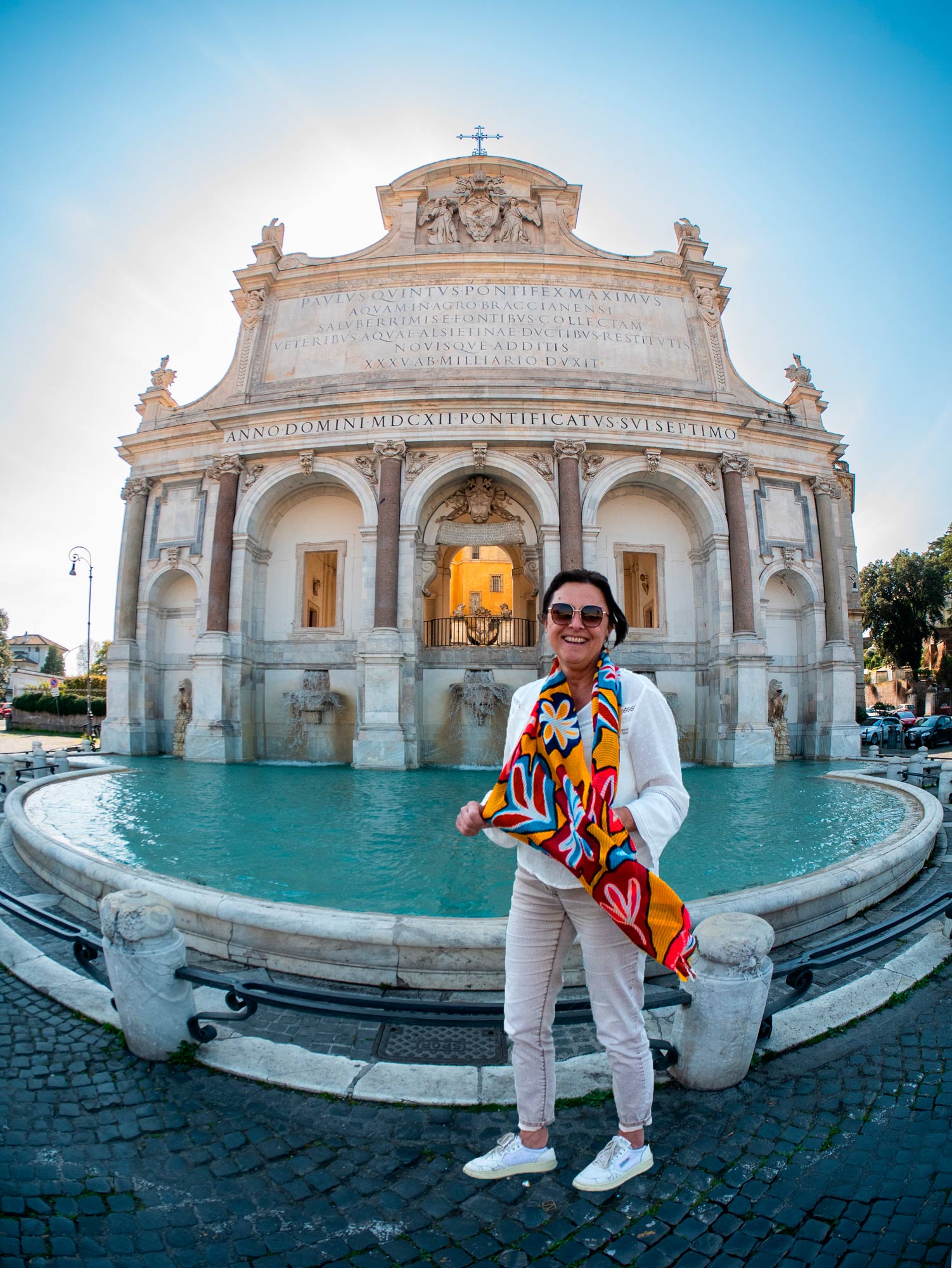
I'm not into ultra wide angle or fisheye shots generally but this one seems to work for me because of its composition and/or cropping. I like the glow from the backlight surrounding the building. It helps take me through the scene from foreground to background.
Just some food for thought. Maybe highlight your wife a bit more to help her standout in the scene?
Thank you for sharing 😊
Very good idea, thank you.
(I am really not good at selective PP.
I suppose you turned my wife into a layer
or you lassoed her (it's been a while since I last did that)
or you masked everything but her
or something else like that..
I should remember to use that kind of tricks more.)You're welcome 🙂
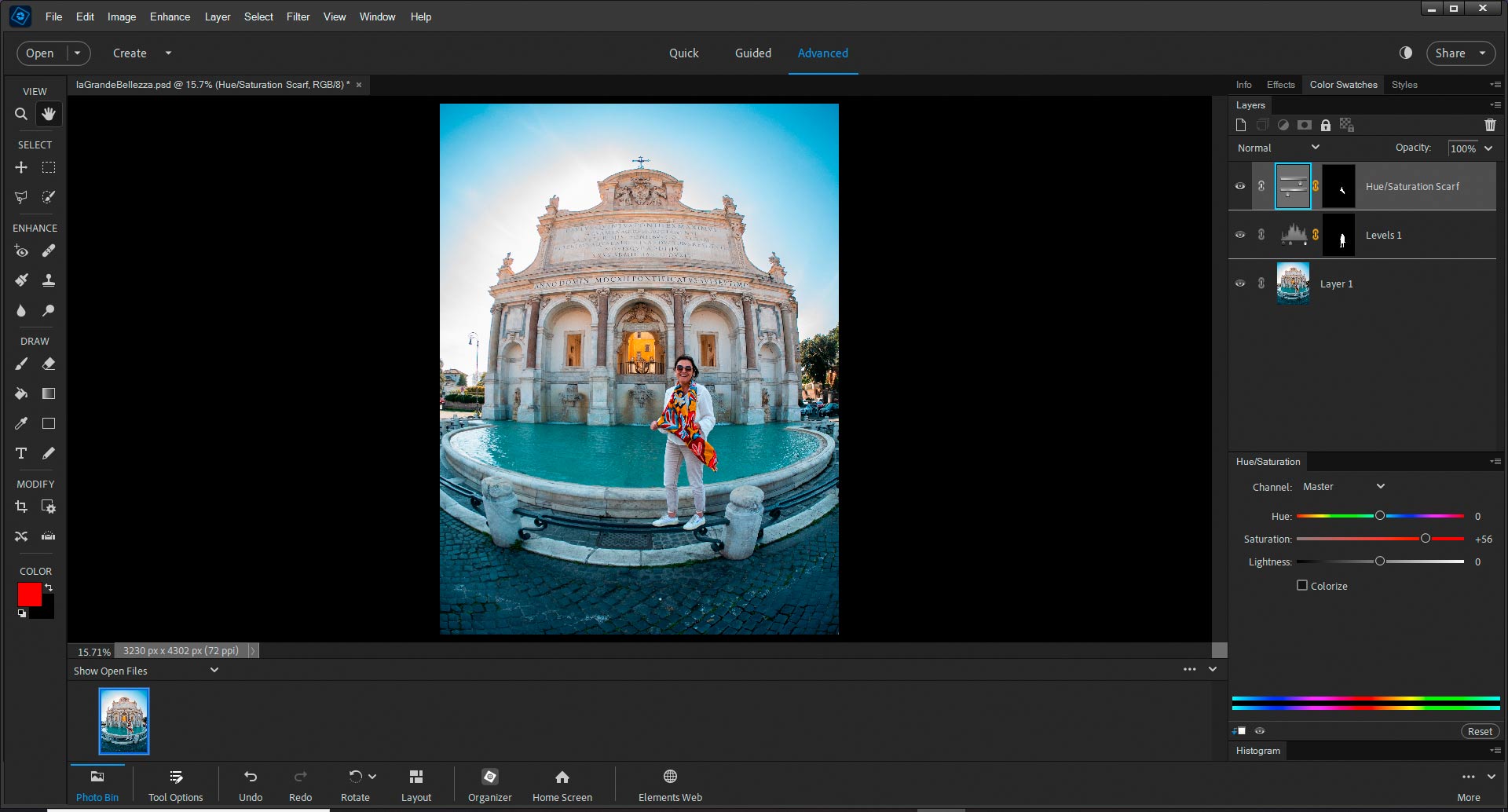
I used 2 layers.
I first selected your wife and used the selection to create a layer mask on a Levels Adjustment Layer to brighten her a bit.
The scarf still looked a bit dull so I selected just the scarf and used the selection to create a layer mask on a Hue/Saturation Adjustment Layer. I bumped up the saturation to help the scarf pop a bit.
-
@DanHasLeftForum has written:@Sagittarius has written:@DanHasLeftForum has written:@Sagittarius has written:
Our closest neighbor in Space.
Wow!!!!!! That's an amazing and fantastic photo given the difficulty in outputting a sharp image of a full moon because of the harsh and flat light striking it from the sun.
It's way better than the best I have been able to come up with since getting my 150 - 600mm lens. The only suggestion I would make, and I am knit-picking because of personal preferences, is to maybe add a little more contrast and see how it looks if you haven't already done so.
Anyway, fwiw below is amongst the best full moon shots I can get but it's not as good as yours.
Well done and thank you for sharing 😊
Dan,
Your image has too much contrast. I would reduce highlights, brighten shadows, and run it through Topaz Sharpen. I can try if you do not mind. Having original file, not a small JPEG, would help.Feel free to edit my version and post it Sagittarius 🙂
I like high contrast b&w or close to b&w images so I settled for that version.
The final look of these types of images is very subjective.
-
@Sagittarius has written:@DanHasLeftForum has written:@Sagittarius has written:@DanHasLeftForum has written:@Sagittarius has written:
Our closest neighbor in Space.
Wow!!!!!! That's an amazing and fantastic photo given the difficulty in outputting a sharp image of a full moon because of the harsh and flat light striking it from the sun.
It's way better than the best I have been able to come up with since getting my 150 - 600mm lens. The only suggestion I would make, and I am knit-picking because of personal preferences, is to maybe add a little more contrast and see how it looks if you haven't already done so.
Anyway, fwiw below is amongst the best full moon shots I can get but it's not as good as yours.
Well done and thank you for sharing 😊
Dan,
Your image has too much contrast. I would reduce highlights, brighten shadows, and run it through Topaz Sharpen. I can try if you do not mind. Having original file, not a small JPEG, would help.Feel free to edit my version and post it Sagittarius 🙂
I like high contrast b&w or close to b&w images so I settled for that version.
The final look of these types of images is very subjective.
Thank you Sagittarius. I don't normally keep raw files after I have finished converting and editing them.
I experimented with various looks and feels when I first processed the original raw file and finally settled on the version I posted. With full moon photos there is a lot of flexibility for adjusting shades and tones and they can all look nice to different people. It's a matter for the creator to finally settle on a version they are happiest with.
-
@minniev has written:@Sagittarius has written:
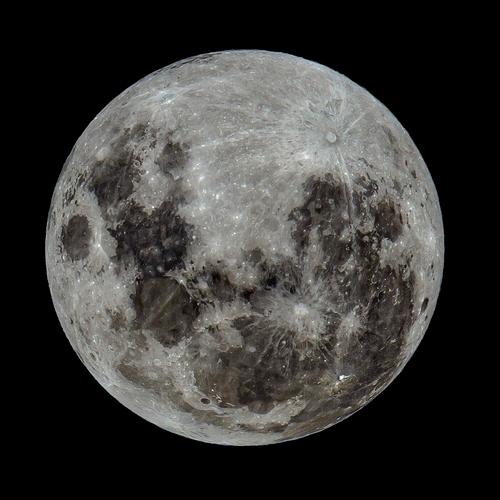
Thank you all for looking and commenting. I am glad you like it. Following Dan's suggestion I added not a contrast but dehaze.
I'm responding to this version because I like it best of the various versions posted. It's quite a fine moon image, with more (fascinating) detail than I usually see in those images and certainly more than I can get with my limited abilities and my humble m43 kit. Mad respect for the photographer and his equipment, which he clearly knows how to use to best advantage.
Agree!
-
@DanHasLeftForum has written:@RoelHendrickx has written:@DanHasLeftForum has written:@RoelHendrickx has written:
I'm not into ultra wide angle or fisheye shots generally but this one seems to work for me because of its composition and/or cropping. I like the glow from the backlight surrounding the building. It helps take me through the scene from foreground to background.
Just some food for thought. Maybe highlight your wife a bit more to help her standout in the scene?
Thank you for sharing 😊
Very good idea, thank you.
(I am really not good at selective PP.
I suppose you turned my wife into a layer
or you lassoed her (it's been a while since I last did that)
or you masked everything but her
or something else like that..
I should remember to use that kind of tricks more.)You're welcome 🙂
I used 2 layers.
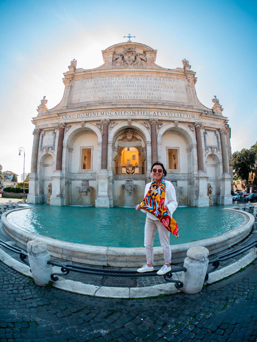
I first selected your wife and used the selection to create a layer mask on a Levels Adjustment Layer to brighten her a bit.
The scarf still looked a bit dull so I selected just the scarf and used the selection to create a layer mask on a Hue/Saturation Adjustment Layer. I bumped up the saturation to help the scarf pop a bit.
Thank you for explaining these good ideas.
-
No problem 🙂
You could also cut your wife onto a separate layer and resize and reposition to anything that might look better. But you would need to use content-aware fill, cloning or similar to fill in where she was cut out of. Here I just enlarged her a bit and brought her forward to help make her standout a bit more. This covers most of where she was originally in the frame so filling in the "hole" is fairly straight forward.
-
LA GRANDE BELLEZZA - ON CLONING/HEALING vs IN SITU COMPOSITION
@DanHasLeftForum has written:No problem 🙂
You could also cut your wife onto a separate layer and resize and reposition to anything that might look better. But you would need to use content-aware fill, cloning or similar to fill in where she was cut out of. Here I just enlarged her a bit and brought her forward to help make her standout a bit more. This covers most of where she was originally in the frame so filling in the "hole" is fairly straight forward.
This is an interesting trick and well done, so I thank you for showing it to me.
But it is something that I would never do (and this is not a value judgement, but just my POV).
At heart I am still a documentary photographer, so moving a subject around in the frame is basically a no-go for me.
I also hardly ever clone/heal anything. I would certainly not extend the frame (although I do crop) or use AI to fill in missing parts of an image.I want my images (in principle) adhere to the rules for photojournalism: no manipulation.
This does not mean : no post-processing.
But in general I limit myself to what could be done in the traditional dark room: cropping, straightening, and such.
I enhance brightness, contrast, saturation and all that just like the next guy.
So basically I will manipulate the LOOK of an image but not the CONTENT.
Distortion correction is borderline. It depends on the objectives.BTW this does not mean that I am holier than the pope.
There have been instances where I have cloned out that one candy wrapper from an otherwise pristine beach.
But I then soothe myself with the thought that I could've also removed the wrapper in real life.
And I only do it in images that are intended as "beauty shots" or "artistic", never in my documentary series.In general, I try to create a good composition at the location, carefully positioning the elements of the frame and choosing my own vantage point and focal length to create the best visual tension without overlaps, and avoiding (or hiding) distractions.
This does not mean that I stage my shots. Obviously this one was posed, but 99% of my images are just snaps of the dynamic situation before me, so that process of positioning and compositioning happens instinctively and super fast.Now to get back to this particular case and your effort and result :
1) Your effort is valiant, but an attentive viewer can still see that the image is manipulated.
That my wife's legs are straight while the little columns behind her are distorted, is a clear give-away.
Being closer to the camera and the edge of the frame should have resulted in bent legs.
That is, BTW, also the reason why I could not ask her to just move closer.
Getting her as close to the center (thus higher in the frame without overlapping the important center balcony behind her) was paramount.2) I thought it was actually a benefit for the image that she was balancing on that precariously slim metal bar.
It adds fun to the image and the pose, and tells you that my wife is willing to jump through a few hoops for me (sometimes).And that is why I value your input in showing me the selective brightening of the image. I might do that in the future.
And I value also you showing me to take it a step further, but I don't see myself doing that in the future. -
@DanHasLeftForum has written:
WATER COLORS
Ovens River running through Bright, North East Victoria, Australia.
I've looked at this image a few times now over the past days.
And I have read some of the comments.
For my own (small) comment, I want to just get back to your original image, whithout all the extra information and opinions.I can recognize what is shown here (a river with rapids), but I was at first unsure of how the effect was achieved.
My initial impression (being the naive documentary photographer that I am) was that we were looking at a "straight" shot, of some kind of event, where patches of coloured light were projected onto the water (a bit like stage lighting, but onto a moving river instead of on ballet dancers). It could have been a theatrical event or an avant-garde performance or experimental art installation.
The title would have been appropriate.But now I realize that this is your own artistic expression, where the photo almost acts as blank canvas for a play with colour and light (and darkness).
And then the title is even more appropriate, because we are more in the realm of painting here, than of photography.
Painting not with oils or acryl, but with ... water colours.It is not really my personal cup of tea (taking as criterium: would I hang this on a wall for me to look at it more often).
But I do appreciate every expression of creativity and the willingness to share it.
Much like with LouHolland actually (a former contributor whose PP experiments went often in the same kind of direction). -
No problem Roel 😊
I don't normally move elements about in a scene unless it's necessary for some reason. But given that "she who must be obeyed" likes to be "featured" in any photos I take of her I thought I would try with your image as well
It needs a bit of tidying up to be a final image that looks totally realistic but this was just meant to be a quick proof of concept without necessarily being perfect.
Anyway, you have some food for thought for the future now 😊
-
@DanHasLeftForum has written:
No problem Roel 😊
I don't normally move elements about in a scene unless it's necessary for some reason. But given that "she who must be obeyed" likes to be "featured" in any photos I take of her I thought I would try with your image as well
It needs a bit of tidying up to be a final image that looks totally realistic but this was just meant to be a quick proof of concept without necessarily being perfect.
Anyway, you have some food for thought for the future now 😊
We are on the same page.
