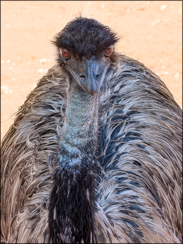
I like this image Mike. The areas in question can be easily removed using a chromatic aberration correction. I realize from reading many many posts that this is a result of using Topaz and not camera induced chromatic aberration. Never the less the tool works well and can be used to get rid of the orange colour between the hair strands.
Andrew
-
-
[quote="@MikeFewster"]
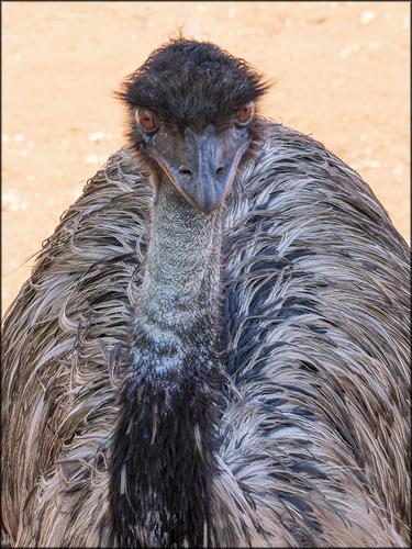
EMU. Central Australia.At eye level with Emu and the backlighting helps make this photo different from what we usually see.
I like it. -
[quote="@minniev"]
Icefields Highway (wish I was there now instead of here in 110 degree heat). One from the archives, so old it was taken with the venerable E30. I never did anything with the picture because there was a worrisome distraction I could not get rid of without making major alterations in the scene, but the sky and light were so dramatic I couldn't delete it. So yesterday I decided to see whether the new lightroom tools would salvage it, and this is the result. Still a few nits but I'm better satisfied with it.Magnificent landscape, very well photographed.
Whatever was necessary to eliminate the disturbing elements is justified in this case. -
[quote="@ChrisOly"]
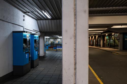
High densityMassive residential development is happening in downtown Toronto recently.
It's a loaded photo with a lot of architectural elements.
But, it caught my attention to take a closer look at the photo.
Well done! -
Good correction and good information - that the CA tools can solve other problems.
-
@Kumsal has written:
[quote="@minniev"]
Icefields Highway (wish I was there now instead of here in 110 degree heat). One from the archives, so old it was taken with the venerable E30. I never did anything with the picture because there was a worrisome distraction I could not get rid of without making major alterations in the scene, but the sky and light were so dramatic I couldn't delete it. So yesterday I decided to see whether the new lightroom tools would salvage it, and this is the result. Still a few nits but I'm better satisfied with it.Magnificent landscape, very well photographed.
Whatever was necessary to eliminate the disturbing elements is justified in this case.Thanks, Kumsal, I feel the same way. I don't hesitate to use any tool available to solve a problem that can't be solved with the camera itself.
-
@Kumsal has written:
Whatever was necessary to eliminate the disturbing elements is justified in this case.
Imo an image creator removing disturbing elements is justifiable in every case unless the aim is to create a close as possible documentary version.
-
@Kumsal has written:
Cold & Warm
Outstanding. One of those rare "breaks every rule in the book" images that finishes up being brilliant because it has broken all the rules. Composition lines running all over the place; eye attracting features and potential subject points that conflict with each other. And so on.
Congrats Kumsal. -
@DanHasLeftForum has written:@MikeFewster has written:
Well spotted. Ref my lengthy explanation following Roel's post.
No problem. Your explanation makes sense.
The good news is that if the fringe is undesirable you can remove pretty much most of it, if not all of it.
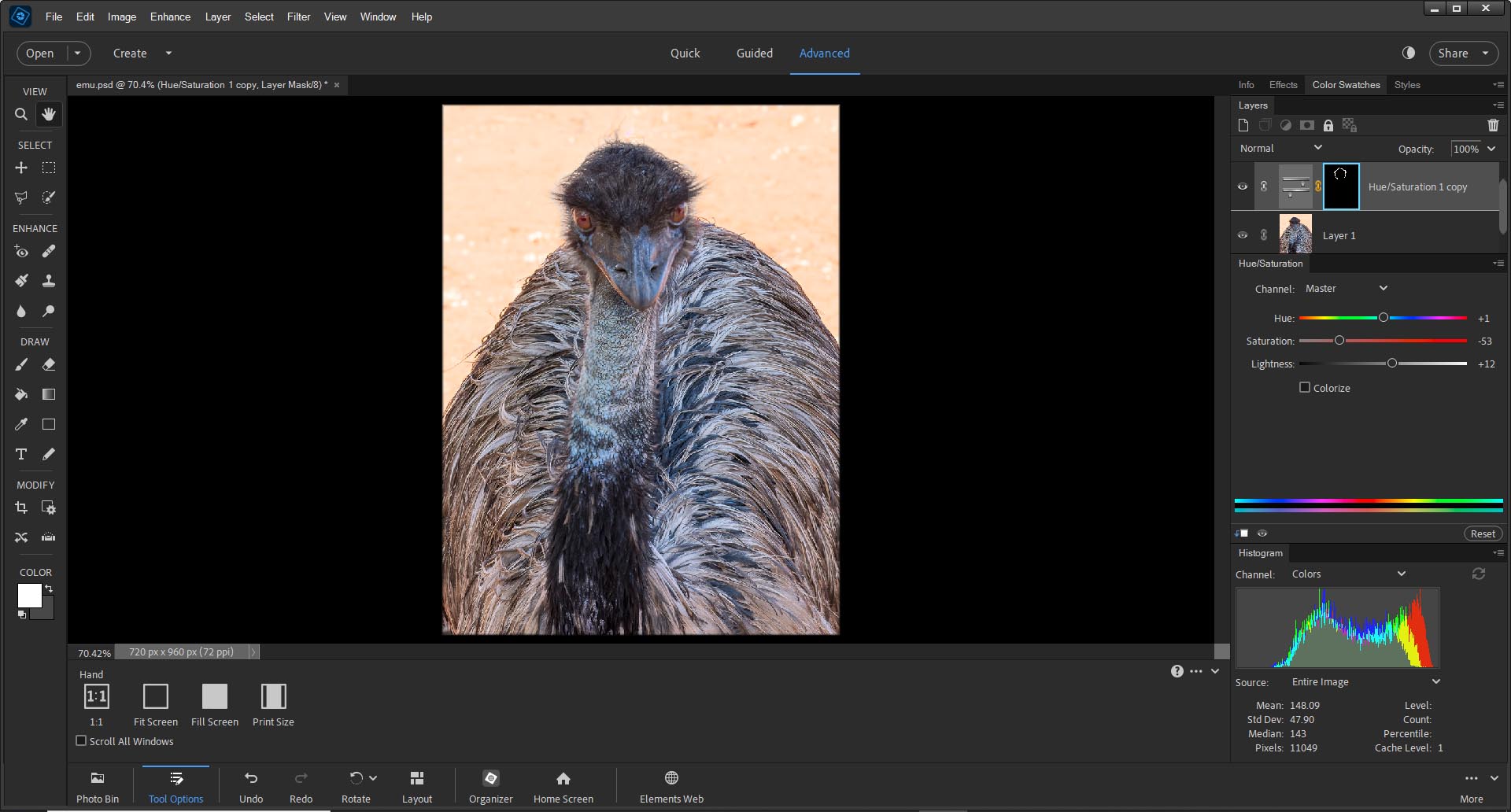
Fwiw this is a quick and basic hue/saturation adjustment that cleans up most of it but it still needs some tidying up. But it already looks much better on my screen.
Yes, that is a definite improvement. I'll adjust the original version I have.
-
@Fireplace33 has written:
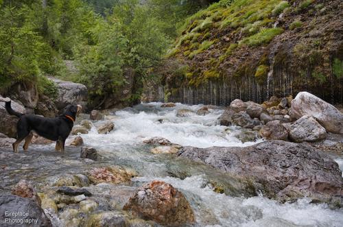
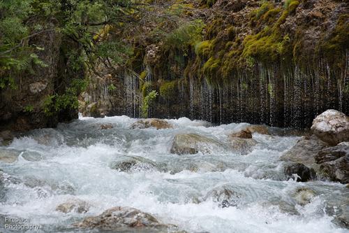
The Triefen
My nephew came to visit us this week. We had planned a walk higher up in the mountains but had to change those plans when a big bank of low hanging cloud decided to sit half way up the mountain all day.
So instead we took him to one of our old favorite walks lower down. This was a path along a wild river to a waterfall called the Triefen at Hinterthal .
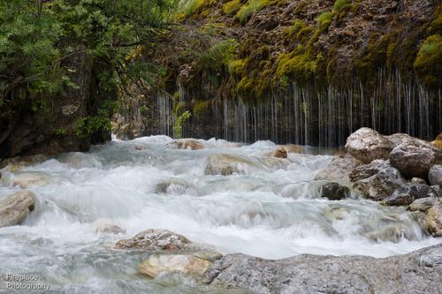
As the name in German sort of suggests it’s like a long curtain of water falling like rain drops out of the riverbank wall. It'a formed by the ground water seeping down untill it meets a horizonal impervious layer where it pours out into the river, It’s only about 2-3 m high but more than 70m long!It's a beautiful place and a bit different everytime we visit, This time the river was very full.
Here’s some shots:A conveniently placed dog takes a look at the waterfall
A slightly more detailed shot showing all the splashes and drops
And of you like it more silky, F22 will get you there. Slow enough at 1/20s , but of course at F22 you get some diffraction effects too
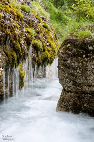
Looking through that gap from the other side, still using F22 to get the silky effect at 1/5 s this time.
Some ND filters would have given me a slower speed without diffraction but with no filters at hand,….
An extraordinary natural feature and a wonderful subject for a photographer.
This is an interesting post. Generally with a series we look to see a story that requires the sequence to make the point. This group from Fireplace takes us into the head of the photographer. Fireplace gives us the thoughts and settings with each shot as he/she considers different angles and settings to capture the spirit of the location.
Generally, I like moving water shots to either totally freeze the moment so we can study the intricacies or to have some blur to convey the movement. I don't like too much blur which reduces the movement to something that looks static. Here, Fireplace gets it about right to my eye and shares the thinking as the settings are chosen.
I like the the last best. The portrait format, narrow contrasting gap and multitude of repeating lines of waterfall, are all reinforcing each other. We can feel the movement and the constriction. -
@minniev has written:@19andrew47 has written:@MikeFewster has written:
EMU. Central Australia.
I like this image Mike. The areas in question can be easily removed using a chromatic aberration correction. I realize from reading many many posts that this is a result of using Topaz and not camera induced chromatic aberration. Never the less the tool works well and can be used to get rid of the orange colour between the hair strands.
Andrew
Good correction and good information - that the CA tools can solve other problems.
Andrew, that's brilliant. Using CA correction never entered my head. I'd assumed that control was limited to purplish edgings. Yes, I'm using Topaz quite a lot. You have added a valuable weapon. Many thanks.
-
@Rich42 has written:
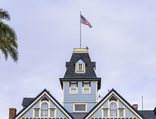
A commercial building at the main intersection in Carlsbad, CA. It houses, what else?, a surf shop.
Not a lot of artistic work for the photographer. Present it honestly. Line it up straight. Correct some perspective distortion.
And include the palm tree to give some SoCal location flavor, as well as the crow saluting Old Glory. Don't get no better'n that.
Rich
I'm fairly sure that I have made similar comments previously. Rich has a collection of shots of roof quirks. He draws the viewer's attention to those little oddities we might otherwise roll past. I feel that the image is strongest when considered as part of a series putting them together as a sort of unifying vision of a heap of disparities.
Same here. A wealth of small details that together make the story. I live that palm. A tiny touch that echoes the flag and gives a clue to location. There are explicit and implicit triangles in the roof structure that form the composition and frame the whimsical tower and flag, Then there are the little details. Bird, poles, chimney, window details. They add character. My standout moment though comes from the dotted lines that break and then continue. Loved your framing with this feature, In a fun way it gives a natural base to the image and triangles of the composition.
Sometime Rich, could you post a collection of these roofline images here? -
@MikeFewster has written:
This group from Fireplace takes us into the head of the photographer. Fireplace gives us the thoughts and settings with each shot as he/she considers different angles and settings to capture the spirit of the location.
I doubt we agree with all your opinions there.
-
@MikeFewster has written:@DanHasLeftForum has written:@MikeFewster has written:
Well spotted. Ref my lengthy explanation following Roel's post.
No problem. Your explanation makes sense.
The good news is that if the fringe is undesirable you can remove pretty much most of it, if not all of it.
Fwiw this is a quick and basic hue/saturation adjustment that cleans up most of it but it still needs some tidying up. But it already looks much better on my screen.
Yes, that is a definite improvement. I'll adjust the original version I have.
No problem but Andrew suggesting the CA tool should normally be quicker and easier still.
If the CA removal doesn't do the job fully then the HueSaturation Adjustment Layer should be able to tidy things up.
-
@MikeFewster has written:@Rich42 has written:
A commercial building at the main intersection in Carlsbad, CA. It houses, what else?, a surf shop.
Not a lot of artistic work for the photographer. Present it honestly. Line it up straight. Correct some perspective distortion.
And include the palm tree to give some SoCal location flavor, as well as the crow saluting Old Glory. Don't get no better'n that.
Rich
I'm fairly sure that I have made similar comments previously. Rich has a collection of shots of roof quirks. He draws the viewer's attention to those little oddities we might otherwise roll past. I feel that the image is strongest when considered as part of a series putting them together as a sort of unifying vision of a heap of disparities.
Same here. A wealth of small details that together make the story. I live that palm. A tiny touch that echoes the flag and gives a clue to location. There are explicit and implicit triangles in the roof structure that form the composition and frame the whimsical tower and flag, Then there are the little details. Bird, poles, chimney, window details. They add character. My standout moment though comes from the dotted lines that break and then continue. Loved your framing with this feature, In a fun way it gives a natural base to the image and triangles of the composition.
Sometime Rich, could you post a collection of these roofline images here?Mike,
Thanks so much for the observations and comments. You're a mind reader.
Among other qualities they have in the image, I see the palm, the flag and the bird, against vertical, replicating the peaks of the base triangles. Everything, including the dormer roof over the tower window is a triangle pointing up.
I am attracted to roof lines. They are stately and taciturn. Enduring.
I look at a lot of my roof images and wonder, "Is anyone else going to see anything in this?"
Horizontal lines dominate, so any display of multiples of these things would require a lot of horizontal wall space - which I would love to see!
I have a few more I'd like to work on before I assemble some together for sharing.
Rich
-
@Rich42 has written:@MikeFewster has written:@Rich42 has written:
A commercial building at the main intersection in Carlsbad, CA. It houses, what else?, a surf shop.
Not a lot of artistic work for the photographer. Present it honestly. Line it up straight. Correct some perspective distortion.
And include the palm tree to give some SoCal location flavor, as well as the crow saluting Old Glory. Don't get no better'n that.
Rich
I'm fairly sure that I have made similar comments previously. Rich has a collection of shots of roof quirks. He draws the viewer's attention to those little oddities we might otherwise roll past. I feel that the image is strongest when considered as part of a series putting them together as a sort of unifying vision of a heap of disparities.
Same here. A wealth of small details that together make the story. I live that palm. A tiny touch that echoes the flag and gives a clue to location. There are explicit and implicit triangles in the roof structure that form the composition and frame the whimsical tower and flag, Then there are the little details. Bird, poles, chimney, window details. They add character. My standout moment though comes from the dotted lines that break and then continue. Loved your framing with this feature, In a fun way it gives a natural base to the image and triangles of the composition.
Sometime Rich, could you post a collection of these roofline images here?Mike,
Thanks so much for the observations and comments. You're a mind reader.
Among other qualities they have in the image, I see the palm, the flag and the bird, against vertical, replicating the peaks of the base triangles. Everything, including the dormer roof over the tower window is a triangle pointing up.
I am attracted to roof lines. They are stately and taciturn. Enduring.
I look at a lot of my roof images and wonder, "Is anyone else going to see anything in this?"
Horizontal lines dominate, so any display of multiples of these things would require a lot of horizontal wall space - which I would love to see!
I have a few more I'd like to work on before I assemble some together for sharing.
Rich
Rather than a straight line of images, I was envisaging something more house shaped, like a square of images, each image the same size with a narrow frame. 9 photos. 3 across and 3 down
Or 16 in a 4x4 grid.
I don't think it could be shown like that here unless you made and framed the images and hung them on the wall and then photographed the wall. -
@MikeFewster has written:
Rather than a straight line of images, I was envisaging something more house shaped, like a square of images, each image the same size with a narrow frame. 9 photos. 3 across and 3 down
Or 16 in a 4x4 grid.
I don't think it could be shown like that here unless you made and framed the images and hung them on the wall and then photographed the wall.You wouldn't need to photograph them on a wall.
It would be quicker and easier to arrange the photos as you like on a canvas in something like Ps and then save it to a jpeg.
-
@DanHasLeftForum has written:@MikeFewster has written:
Rather than a straight line of images, I was envisaging something more house shaped, like a square of images, each image the same size with a narrow frame. 9 photos. 3 across and 3 down
Or 16 in a 4x4 grid.
I don't think it could be shown like that here unless you made and framed the images and hung them on the wall and then photographed the wall.You wouldn't need to photograph them on a wall.
It would be quicker and easier to arrange the photos as you like on a canvas in something like Ps and then save it to a jpeg.
I love this fountain of creativity being fed from many sources.
