I hope to see your documentary version more often in our discussion.
Unfortunately, they rarely appear.
-
-
@Kumsal has written:@DanHasLeftForum has written:@Kumsal has written:@DanHasLeftForum has written:@Kumsal has written:
Then make your photo editing somewhat realistic before criticizing others for minor inconsistencies.
I hope we can find common ground.I call things as I see them and give the reasons why and people are free to call my images as they see them.
No-one has to post images to suit your, my or anyone else's preferred style of images for C & C.
I will continue to post images as I see fit just like everyone else does here.
Some will like my images and some will not. I have no issue with that.
Others think the same.
Others also have the freedoms that you are entitled to.
But with others you cannot be so critical of the details if you allow yourself the greatest possible freedom.In some of my posts on dprevived I have posted both the documentary and artistic versions.
Feel free to comment on any of those if you haven't already done so.
I hope to see your documentary version more often in our discussion.
Unfortunately, they rarely appear.Just like some people post mainly, if not only, B&W images instead of the documentary versions.
They are choosing to alter the original colours to shades of grey. I choose to alter colours to a pallette larger than just shades of grey.
You are being very selective in who you ask to post documentary versions more often.
I have no issue with anyone choosing to post only B&W images.
Do you have any issues with anyone posting mainly B&W images?
-
@AlanSh has written:
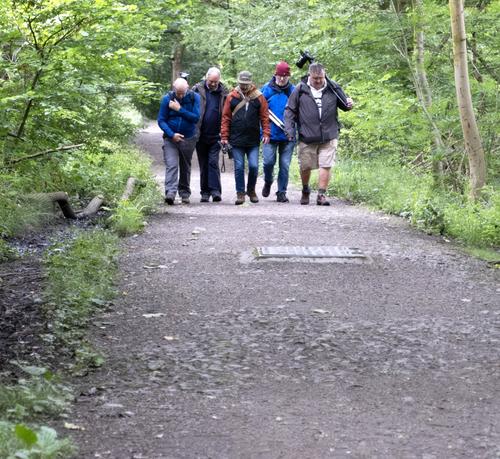
Not happy chappies (zoom in).
We were on a photoshoot and coming to the end of a long uphill walk. Very low light and it's a tight crop.
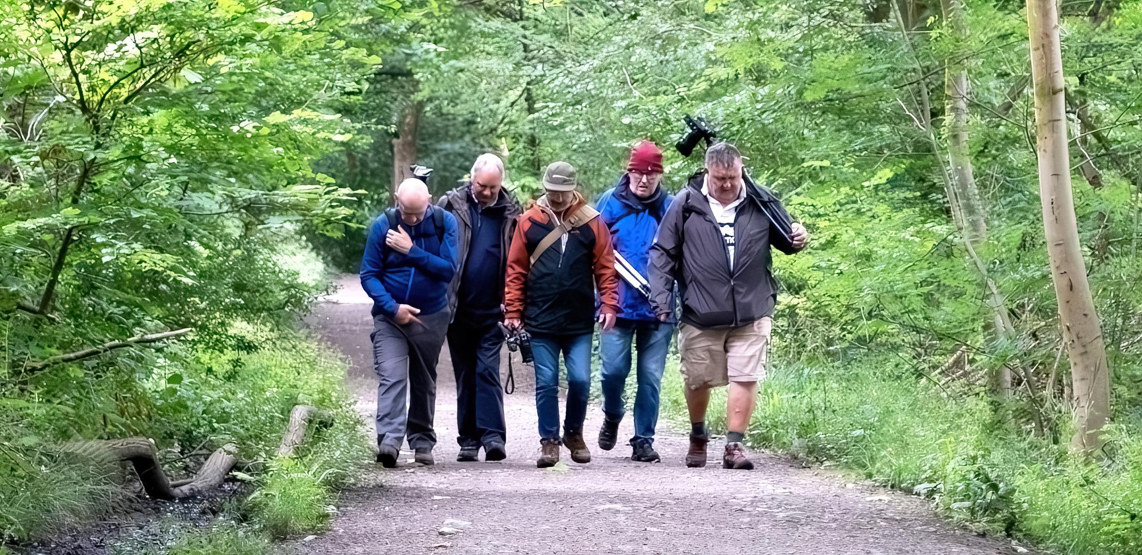
For me, the faces on each of them is "the story" in this scene and so I feel they need to be easily seen and not necessarily have to be zoomed in (as you suggested).
The downcast look on each of the faces offers many possibilities for me to ponder what might be going through their minds at the time.
Are they just happy to reach the top of the long hill you mentioned or are they disappointed because they weren't able to get the shots they hoped for prior to starting out or are they dreading going back home to their wives who wanted them to mow the lawns, fix leaking taps, paint the bathroom, vacuum clean the house etc....or.........😏
In any case this panoramic crop works much better for me in highlighting the faces to help tell whatever story anyone viewing the image might imagine.
-
@Bryan has written:@Rich42 has written:
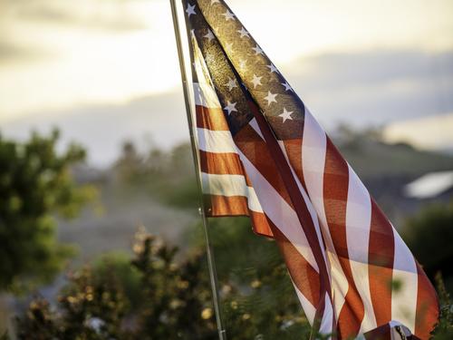
I'm going to post a second image here this week.
Taking down my flag as the sun is about to set on the West coast on this American Independence Day, July 4th.
My fellow citizens, in these unsettled days, pray we preserve our cherished democracy. Citizens of the World, pray for us.
Rich
There are many who are praying. The scary question is will it be enough...
The Cuban Missile Crisis was my scariest moment. The present time is ticking down but it is catching up.
-
This is a stitched panorama, using Photoshop Elements, featuring the Black Rock Yacht Club located on the eastern side of Port Philip Bay, Victoria, Australia.
The HMVS Cerberus is located about 100m or so to the right of this scene.
-
@MikeFewster has written:@Bryan has written:@Rich42 has written:
I'm going to post a second image here this week.
Taking down my flag as the sun is about to set on the West coast on this American Independence Day, July 4th.
My fellow citizens, in these unsettled days, pray we preserve our cherished democracy. Citizens of the World, pray for us.
Rich
There are many who are praying. The scary question is will it be enough...
The Cuban Missile Crisis was my scariest moment. The present time is ticking down but it is catching up.
I was too young to comprehend what was happening then (and quite frankly didn't comprehend the level of fear people felt until somewhat recently). Coincidentally I just watched a doco on TV tonight about Midnight Oil, an Australian band once at the forefront of nuclear disarmament / anti war messages.
-
Dear all,
As from this next Wednesday, I will amend the "C&C thread" text on altering somebody else's images to be even clearer.
Like this :
Unless the original poster specifically states that they do not want their image(s) to be downloaded, altered or reposted, it is understood that within the context of this thread, other participants are free to download and alter the posted image and repost it in a reply for C&C purposes. That reposted image may remain permanently within the week's thread, or you may remove it after a short period of time if you prefer. The downloaded and altered images are not to be used for any other purposes nor uploaded anywhere else than within the context of the C&C in this thread. No copyright disputes here!The aim is not to have any disputes about the downloading or altering or reposting.
And of course we also do not want disputes about these "rules" and their application... 😁 -
That makes it very clear that this thread is aimed at members who by default, for this type of thread, give permission to others to post edited versions in this thread.
Everyone is still invited to submit images for C&C but members not wishing to allow members to repost edited versions must state that with their submitted images.
The only thing I would add for clarity is that since it is unreasonable for members to record (I certainly won't be keeping records) who do not want edited versions of their images to be posted, requests to not post edited versions must be done in each thread.
-
@DanHasLeftForum has written:
That makes it very clear that this thread is aimed at members who by default, for this type of thread, give permission to others to post edited versions in this thread.
Everyone is still invited to submit images for C&C but members not wishing to allow members to repost edited versions must state that with their submitted images.
The only thing I would add for clarity is that since it is unreasonable for members to record (I certainly won't be keeping records) who do not want edited versions of their images to be posted, requests to not post edited versions must be done in each thread.
Good suggestion. I've added it in the first sentence.
Unless the original poster specifically states (for every individual posting offered for C&C) that they do not want their image(s) to be downloaded, altered or reposted, it is understood that within the context of this thread, other participants are free to download and alter the posted image and repost it in a reply for C&C purposes. That reposted image may remain permanently within the week's thread, or you may remove it after a short period of time if you prefer. The downloaded and altered images are not to be used for any other purposes nor uploaded anywhere else than within the context of the C&C in this thread. No copyright disputes here!
-
@RoelHendrickx has written:@DanHasLeftForum has written:
That makes it very clear that this thread is aimed at members who by default, for this type of thread, give permission to others to post edited versions in this thread.
Everyone is still invited to submit images for C&C but members not wishing to allow members to repost edited versions must state that with their submitted images.
The only thing I would add for clarity is that since it is unreasonable for members to record (I certainly won't be keeping records) who do not want edited versions of their images to be posted, requests to not post edited versions must be done in each thread.
Good suggestion. I've added it in the first sentence.
Unless the original poster specifically states (for every individual posting offered for C&C) that they do not want their image(s) to be downloaded, altered or reposted, it is understood that within the context of this thread, other participants are free to download and alter the posted image and repost it in a reply for C&C purposes. That reposted image may remain permanently within the week's thread, or you may remove it after a short period of time if you prefer. The downloaded and altered images are not to be used for any other purposes nor uploaded anywhere else than within the context of the C&C in this thread. No copyright disputes here!
Yes, that handles the situations where a member does not see or read every post in a thread and so might miss seeing a request to not edit images.
-
@MikeFewster has written:
The House of Salvadore Dali.
There are things here that need adjustment. They are deliberate.The most obvious stitching artifact is on the right side of the egg.
That is also where it makes sense (given the location.
I see less point in keeping much of the right side of the image: those OOF trees don't add much for me. -
@RoelHendrickx has written:@MikeFewster has written:
The House of Salvadore Dali.
There are things here that need adjustment. They are deliberate.The most obvious stitching artifact is on the right side of the egg.
That is also where it makes sense (given the location.
I see less point in keeping much of the right side of the image: those OOF trees don't add much for me.I agree about the trees.
Something like this with a natural frame is more interesting for me.
source (10 July 2024): encrypted-tbn0.gstatic.com/images?q=tbn:ANd9GcQ7B85FZvtFsMjlVGBkLYxcaoQ-gkPY1qC3gQ&usqp=CAU
-
@RoelHendrickx has written:@MikeFewster has written:
The House of Salvadore Dali.
There are things here that need adjustment. They are deliberate.The most obvious stitching artifact is on the right side of the egg.
That is also where it makes sense (given the location.
I see less point in keeping much of the right side of the image: those OOF trees don't add much for me.Agreed. The trees don't add anything for me either. They were part of the original sweep that gave the panorama that created the Daliesque stitching errors so I left them in and gave plenty of clues about why I was posting an image with photographic errors.
-
@DanHasLeftForum has written:@RoelHendrickx has written:@MikeFewster has written:
The House of Salvadore Dali.
There are things here that need adjustment. They are deliberate.The most obvious stitching artifact is on the right side of the egg.
That is also where it makes sense (given the location.
I see less point in keeping much of the right side of the image: those OOF trees don't add much for me.I agree about the trees.
Something like this with a natural frame is more interesting for me.
source (10 July 2024): encrypted-tbn0.gstatic.com/images?q=tbn:ANd9GcQ7B85FZvtFsMjlVGBkLYxcaoQ-gkPY1qC3gQ&usqp=CAU
Well, I wouldn't find it interesting. It's the cliche shot that turns up over and over in photos of Dali's house. So what's the point of posting another? There were enough clues in the first of my Dali posts and again in the second post along with a Dali sculpture.
-
@MikeFewster has written:
Well, I wouldn't find it interesting. It's the cliche shot that turns up over and over in photos of Dali's house. So what's the point of posting another? There were enough clues in the first of my Dali posts and again in the second post along with a Dali sculpture.
That's fine 😊
As Rich42 correctly stated at:
dprevived.com/t/wednesday-cc-no-theme-thread-845-revived-065-on-2024-06-26/5991/post/80090/
@Rich42 has written:C&C is not always a string of admiration about postings.
Just because you deliberately left in errors that you personally like does not mean everyone else must find them interesting or like them.
-
@DanHasLeftForum has written:@MikeFewster has written:
Well, I wouldn't find it interesting. It's the cliche shot that turns up over and over in photos of Dali's house. So what's the point of posting another? There were enough clues in the first of my Dali posts and again in the second post along with a Dali sculpture.
That's fine 😊
As Rich42 correctly stated at:
dprevived.com/t/wednesday-cc-no-theme-thread-845-revived-065-on-2024-06-26/5991/post/80090/
@Rich42 has written:C&C is not always a string of admiration about postings.
Just because you deliberately left in errors that you personally like does not mean everyone else must find them interesting or like them.
Of course, but you need to be discussing the posted image and considering what those errors mean to the image.
Let's take your shots of Half Moon Bay this week. I grew up on that beach. Those angles from the Beach Rd car park are also some of Melbourne's regular cliches. But what you did with them with colour patches stopped them from becoming cliches. That's good. Your adding colour patches technique sometimes comes off. It did in the pagoda image (although you seemed to indicate that we were seeing things in the image that you hadn't intended.) I could only see one reason for the changes you made with the Half Moon Bay shots and that was to help the Cerberus stand out more from the ocean. It didn't seem to be a point worth making so I didn't bother. I might have missed something deeper? -
@MikeFewster has written:
Of course, but you need to be discussing the posted image and considering what those errors mean to the image.
And that is what I did but you seem to struggle with the fact that what the errors in the image mean to you is not necessarily what the errors mean to everyone else.
I can only talk about what the errors mean to me, as I did. I don't need to speculate what other people might think of them. They can form their own opinions and post about them if they like.
-
I've moved several posts out of here as they were getting too contentious for my liking.
Alan


