• Members 3959 posts
    July 12, 2024, 1:09 p.m.

    Yes, I always download the enlarged version of an image because it is the image file that was originally uploaded.

    The default "thumbnail" you see in the actual posts is generated by the webpage's backend code from the uploaded image file after you click the "Upload file" icon. The backend code generated "thumbnail" is often slightly softer than the original image.

  • Members 3959 posts
    July 12, 2024, 1:25 p.m.

    It's actually the larger second table that draws us into the image and we don't all feel like we are becoming part of the moment.

    The front table, being separate, is more of a distraction for us.

  • Members 1416 posts
    July 13, 2024, 7:57 a.m.

    Isn't he beautiful.
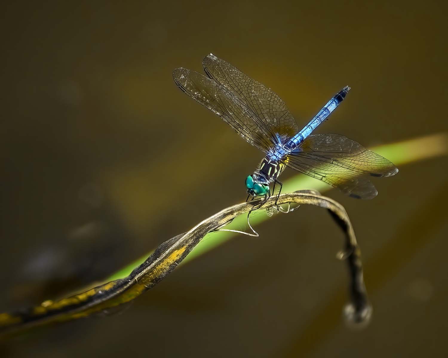
    Your focus is perfect. You bring out the details of the entire boy fro the wing filaments to the little hairs on the head and legs. You need to get the angle exactly right to have the dof along the body to do this.
    The composition is about as good as it gets. The twigs and leaves have the length and width to match our star. East/west and north/south, I wouldn't want to move a thing.
    Quite perfect.

  • Members 1416 posts
    July 13, 2024, 8:08 a.m.

    I wouldn't want to punch it up too much, I wouldn't want to apply the extra contrast to the entire image. The soft movement from front to back is essential here and has to be kept. Just a touch of micro contrast at the closest section of the sunlit field. Just a touch more contrast on the dark under edge of the top framing cloud layer.
    It's quite possible that when I looked at these changes, I'd change my mind as well.

  • Foundation 1506 posts
    July 13, 2024, 8:14 a.m.

    In my opinion, the point is that I can believe in the accuracy of the photo in the post just above, as I have often observed similar layers in the sky from Kahlenberg, just outside Vienna. It seems to be a frequent feature here. I have also seen it in the Blue Ridge mountains in Virginia. I see no reason to „enhance“ this photo.

    David

  • Members 1416 posts
    July 13, 2024, 8:15 a.m.

    Can't agree. In your first suggested alteration, we feel as though we are sitting at the table. The foreground glass feels as though it is ours, waiting to be picked up by our hand. It isn't that one is right or wrong. In one version the viewer feels like a participant. In the other they become an observer. I prefer the participant response.

  • Members 3959 posts
    July 13, 2024, 8:18 a.m.

    You have the option to make the edits you suggest and post it which might make what you mean clearer and easier for Fireplace33 to evaluate.

  • Members 3959 posts
    July 13, 2024, 8:21 a.m.

    That's fine. The whole point of critique is different people posting their opinions.

    We don't feel like we are sitting at the table with the foreground table in the scene. We feel like an observer in both versions.

  • Members 1416 posts
    July 13, 2024, 8:48 a.m.

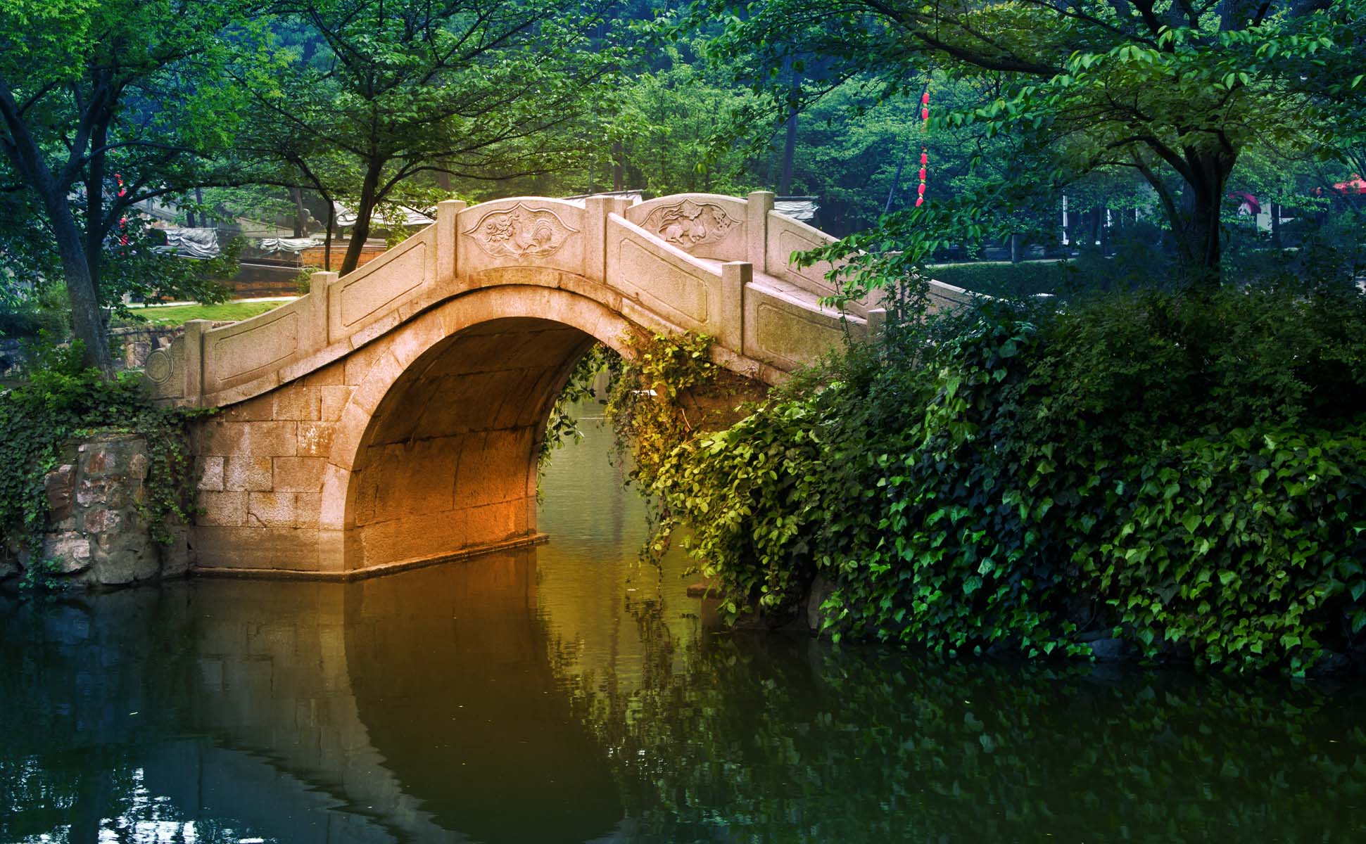
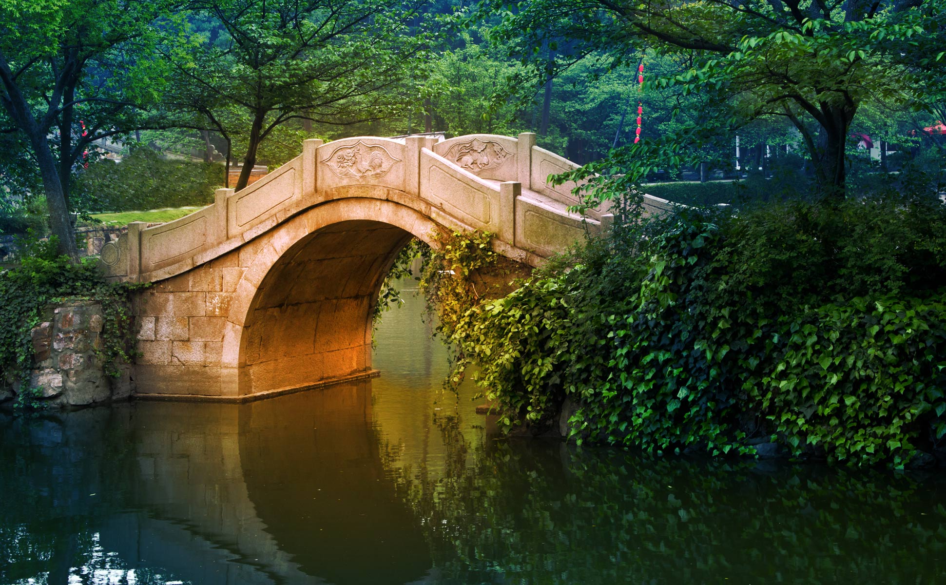
    Generally we expect to see half circle bridges like this, photographed to bring out the perfect circle when the photographer works to include a reflection. This version is refreshingly different. We see a vertical slice with only half the circle. I t doesn't matter that we don't see the lot, we get the idea, The dark green of the leaves on the right arrows into the golden shape. The walkway gracefully descends into the green and again the viewer's imagination fills in the details.
    I like the colour alterations here. The stone comes across as warm and aged and the combination with the rich greens is sumptuous. Quite fitting for what feels like a royal garden.
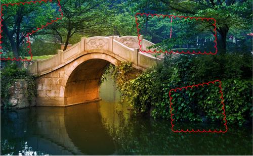
    The largish blue/purple area on the ivy bank didn't concern me. I didn't notice this until it was pointed out and even then I was comfortable with it.
    The bluish patches at the top feel odd though. Was it smoke or some kind of park lighting?
    Dan have you posted this image somewhere before? The shot looks familiar. I'm sure there are other photos of this superb little bridge but I vaguely remember the colour treatment and that is one of your trademarks.

  • Members 3959 posts
    July 13, 2024, 8:50 a.m.

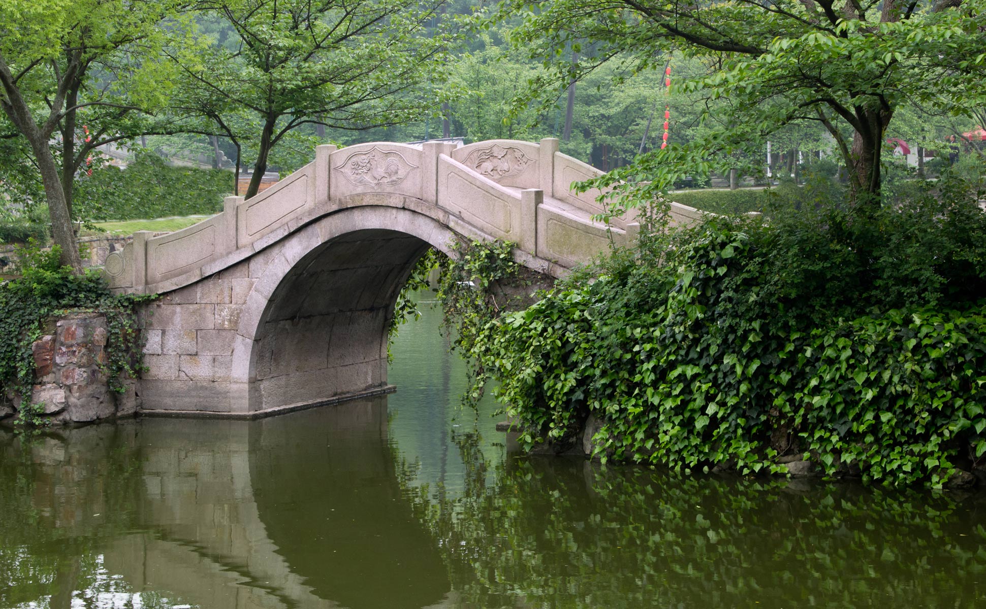
    It depends on how close it is to being an accurate documentary version.

    In any case some photographers choose to enhance their landscapes for artistic effects - colour grading being a popular technique.

  • Members 3959 posts
    July 13, 2024, 9:07 a.m.

    I posted the documentary version as well.

    I have posted several times that I post online only photos that I don’t care about what people do with. They can download them, edit them, sell them, whatever.

    I don't waste time worrying about people potentially downloading my online images or what people might or might not do with any of my online images.

    They are free to do whatever they like with them.

  • Members 1087 posts
    July 13, 2024, 9:23 a.m.

    I am very happy to have inspired you to find this wonderful specimen. Excellent DoF cross the whole subject with a nice variety of colours. I am also happy to pass the mantle of dragon master over to you. With regard to any apparent flaws, with a shot like this, I just don't see them - in that my mind only sees the primary subject.
    We are in winter now, and I haven't seen any dragonflies for some months. I am patiently waiting for spring. They are by far my favourite subject...

  • Members 1087 posts
    July 13, 2024, 10:24 a.m.

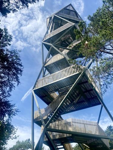
    I am enthralled with the depiction of the geometry in the shot of the tower. I am guessing you were somewhat constrained as to where you could take it but it doesn't matter as we can see the result clearly.
    I have dabbled in the geometry of geodesic domes so the use of triangles here is food for my mind. The rotation of each level, while not giving the usual 4 flat sides all the way up the tower, allows a reduction of material in the super structure.
    May I ask permission to copy the pic and post it on a forum related to geodesic structures that I am involved with?

  • Members 1416 posts
    July 13, 2024, 10:32 a.m.

    None of that is what I was saying, The bluish tones referred to my response to the first post, Clearly it wasn't there once I saw the original. I make what I can of the image I am looking at.

    Then I was asking if you had posted the image before. It looked familiar. Or are you suggesting that someone else has copied one of your photos and reposted it? In which case are you saying that you have posted it before and maybe someone has copied it? I don't follow what you are saying..
    Do you have photos that you do value?

  • Members 1416 posts
    July 13, 2024, 10:38 a.m.

    A general note. I'll be travelling in remote parts of Australia over coming weeks. Net communications up there are often very slow or non existent. There are likely to be longish gaps in my posts. But I'll be back.

  • Members 3959 posts
    July 13, 2024, 10:43 a.m.

    I said I don't care what people do with my images I post online - download them, edit them, repost them, sell them whatever.

    Yes, just like all photographers will have. I don't post them online anywhere because I know it is impossible to stop anyone who wants them, for whatever reason, from taking at least a copy if not the actual uploaded image.

    I also don't post images online of which I sell prints because it would be unfair to those who pay for the prints to see someone steal the images from the www and so get them for free to do what they like with them.

  • Members 1087 posts
    July 13, 2024, 11:01 a.m.

    I am guessing the original already had some pp applied. If so, then that pp appears just about right. If not, then an extra plus to the capture.
    The above edit takes it a bit too far and introduces unwanted effects - namely a pronounced halo around the tail, and the blues, greens and the background are enhanced beyond what might look natural - overly saturated?. Also the resolution has been reduced so we don't get anywhere near as much of a close up when viewed 1:1

  • Members 3959 posts
    July 13, 2024, 11:10 a.m.

    Thank you for your thoughts Bryan. We obviously disagree and that is fine.

    Just like most images, some will like them and some will not. I have no issue with that 😊