• Members 787 posts
    July 19, 2024, 11:13 a.m.

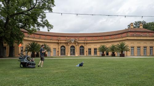
    It's interesting to see the difference of opinion on this image.
    For me, I am somewhat halfway.

    I don't particularly like the lightbulbs but they also don't bother me.

    I am totally in favour of the toddler, because he brings an ironic human touch to the majesty of the buildings.

    The father with second child and stroller are less interesting for me, but their placement also ensures that they do not really stick out.

    I believe that for me, the ideal image would be just the castle orangerie and then a single toddler in the grass before it, but I think I would move in closer and get the kid bigger in the frame with a wide angle that still captures the arch of the building behind (and above) him.

  • Members 787 posts
    July 19, 2024, 11:16 a.m.

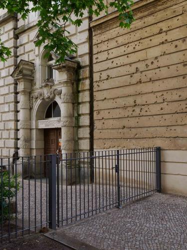
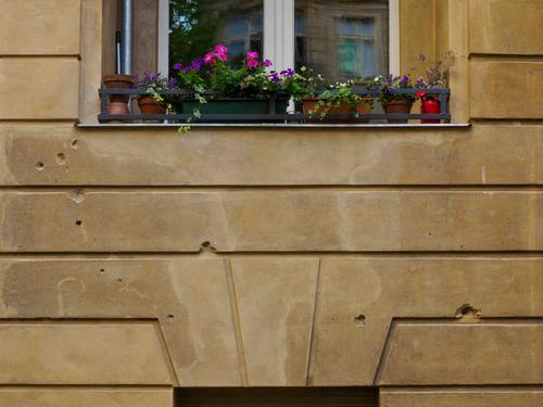
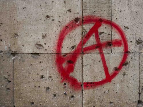
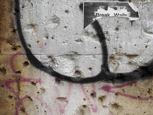
    Concentrating on the scars left by bullet holes in historical buildings is a brilliant concept to evoke history that speaks for itself.
    You have already captured a good handful here, and it surely helps to keep the essay visually interesting that the buildings and their other characteristics (apart from the bullet scars) are quite varied. We see (neo-)classical and mundane; and we even see evidence of another more recent scar in the form of the "Anarchy" graffiti.
    You are really onto something here.

  • Members 3956 posts
    July 20, 2024, 2:09 a.m.

    Some more from the same day as the previous set.

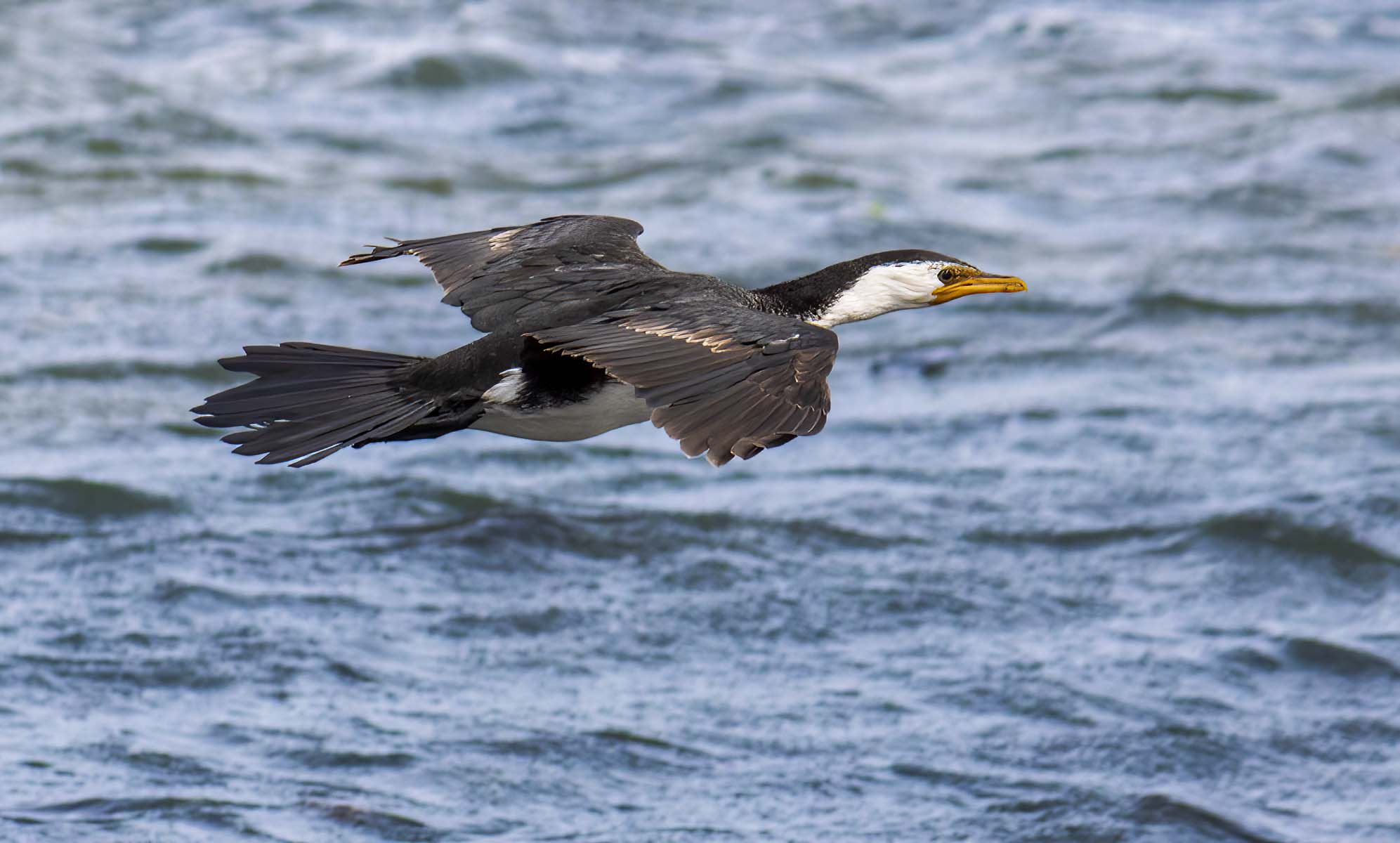
    FLYING UNDER THE RADAR


    dprevived.com/media/attachments/b5/23/n00GAMyJ7Rv9UNHstSUt9Oyyc7i7HfwW6jzcnb4UV7D6TIanoWnFlIxR59HyoYuE/mg-7186.jpg

    TURF WAR


    dprevived.com/media/attachments/24/2c/0Te8Vh4NQHToNz4euuK1rr7jhqT0I9Zatyvyeo11hq1KpEnwMkUCxvrkB5FHHvgd/mg-7452.jpg

    BATH TIME


    dprevived.com/media/attachments/20/7e/rWAzZuTLrF70ahqPiPQXTJGYh1bMJlt8sbNyVWYp7m2gP24XgMMKBpUsYI3heTaq/mg-9393.jpg

    _MG_9393.jpg

    JPG, 258.7 KB, uploaded by DanHasLeftForum on July 20, 2024.

    _MG_7452.jpg

    JPG, 268.8 KB, uploaded by DanHasLeftForum on July 20, 2024.

    _MG_7186.jpg

    JPG, 146.2 KB, uploaded by DanHasLeftForum on July 20, 2024.

  • Members 1260 posts
    July 20, 2024, 10:37 a.m.

    Superb, others are good too.

  • Members 1260 posts
    July 20, 2024, 10:39 a.m.

    I agree. Good choice. Tx.

  • Members 533 posts
    July 20, 2024, 2:26 p.m.

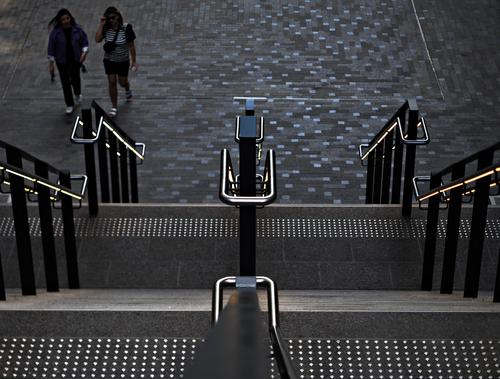
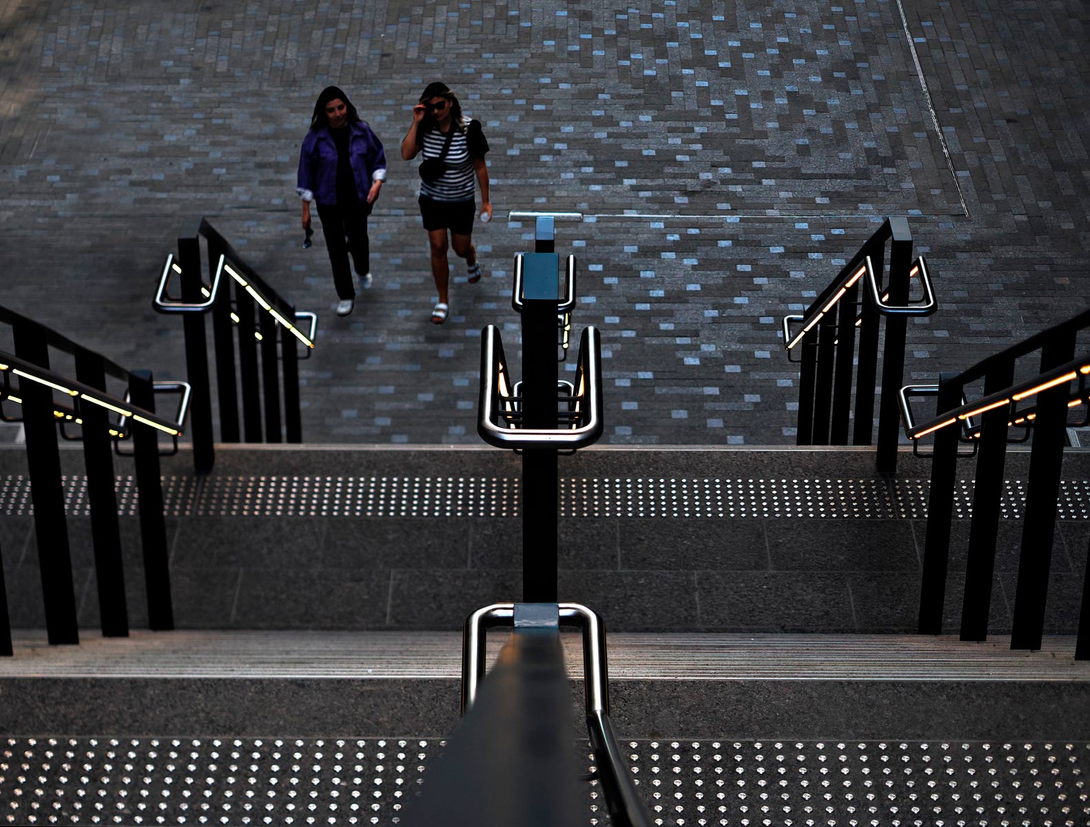
    I really like the high contrast graphic foreground, with the shiny metal railings and studs against the dark stone, and the way the contrast fades away as bright tiles scattered amongst the other paving stones. It is virtually a black and white foreground in a colour image. The angle means the viewer can hardly see the steps themselves and presents an unusual and interesting view of the stairs.
    Brightness and contrast are a good way to attract the viewer‘s eye, but so too are people, but here the people are subdued in colour, contrast and brightness, so they are an important part of the composition, bringing life, but are secondary to the stairs.
    Dan‘s idea to persuade the ladies to move to their left is good and nicely done, as they now interact with the stairs instead of distracting attention away to the left, forming a much stronger composition.

    Pete

  • Members 533 posts
    July 20, 2024, 2:43 p.m.

    Actually, I think these are even better than the three originally posted.
    The first is an excellent bird in flight study. It is flying low, allowing the water to be an interesting background without being a distraction.
    The second is my favourite. The inverted C composition of rocks and birds is quite dynamic, and the yellow sea-bed, showing through in the middle, is a neat highlight to draw attention to the birds themselves and to make the background even more attractive. The interaction between the birds is the key feature though, especially as one of them is making a real effort to make that line of sight with the other as it flies by. Nice one.
    The third is less good, in my opinion. A dramatic moment has been caught, with water droplets frozen, but the posture of the bird is unattractive, and the head and beak barely visible. It is more of a puzzle to mentally turn the shape into a bird. Forcing the viewer to think about and interpret what they see can be beneficial and interesting, but not here, for some reason.

    Pete

  • Members 533 posts
    July 20, 2024, 2:57 p.m.

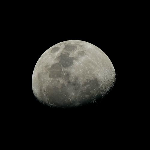
    This is very well captured. We can’t quite see Neil Armstrong‘s footprints, but other than that there is plenty of detail to explore.
    In terms of the composition, I think Roel makes a couple of very good points, to which I will add my weight.

    Pete

  • Members 533 posts
    July 20, 2024, 3:23 p.m.

    Yes, the different opinions are interesting, and I pretty much agree with yours.

    Agreed.

    I agree totally. In fact I would go as far as to say the photo would be quite ordinary without it. The building would still be magnificent, but would be more of a nice photo from a guide book. That extra thought-provoking element of the escaped crawler and then weighing up what is really important, the fine building or the child, would be missing.

    Actually, I like them. As you say, they are decently placed and shaded so they do not dominate, but they are there. The father adds another little dimension as he looks towards his adventurous crawler. He adds a feeling of safety for the baby.

    Yes, this would indeed be an exciting image! The safety net of the father‘s presence would be removed and the viewer would be left to ponder the unusual image of a lone baby in front of a fine building and construct their own narrative, depending on their leaning towards Walt Disney or Stephen King.
    Actually you could even create such an image by cropping, if so inclined.

    Pete

  • Members 533 posts
    July 20, 2024, 4:11 p.m.

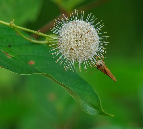
    That really is an interesting flower, and new to me too. It has its own antennae to match those of the butterfly.
    It is beautifully sharp, allowing the viewer to zoom in and study the fine detail, for instance the butterfly’s long tongue. I think it also makes the unusual angle on the butterfly work as well, since all that detail in the head and upper body make up for seeing only the front edge of the wings.
    In terms of lighting, I think you got it right. Looking at the thumbnail, I too thought it could be a bit brighter, but looking at the full-size image, it is actually brighter, or at least seems to be.
    The curled edge of the leaf brings another element to complete the composition, giving it a very attractive balance.

    Pete

  • Members 533 posts
    July 20, 2024, 4:17 p.m.

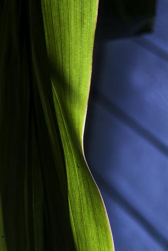
    It’s another nicely balanced graphical study, with attractive colours too. It is a well-chosen portion of a larger scene, which draws attention to its beauty. We can only guess what the larger scene would be, but that is unimportant anyway, as this excerpt is very satisfying.

    Pete

  • Members 533 posts
    July 20, 2024, 4:25 p.m.

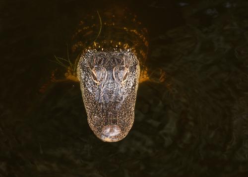
    This is a superb image. The body of the alligator has been almost totally cloned away by the dark water, but it is even better for allowing vague hints of the body and fore-legs. The subtle reflections where the water catches the light are nice too. This leaves the head in all its shiny, textured glory. This is another image where the high contrast draws attention straight to the head, although in this case, I suppose there is not much to distract from the head! The colour palette of yellows, browns and black is attractive too.
    Seeing the head from above and isolated from the body makes this an unusual and very strong image.

    Pete

  • Members 533 posts
    July 20, 2024, 4:34 p.m.

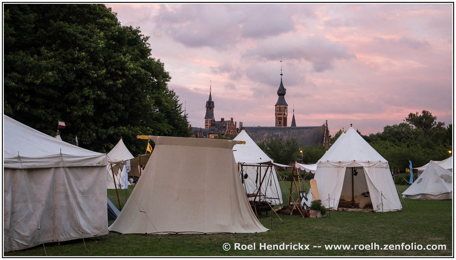
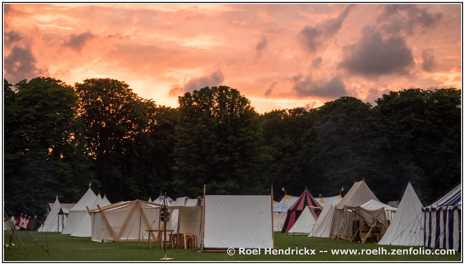
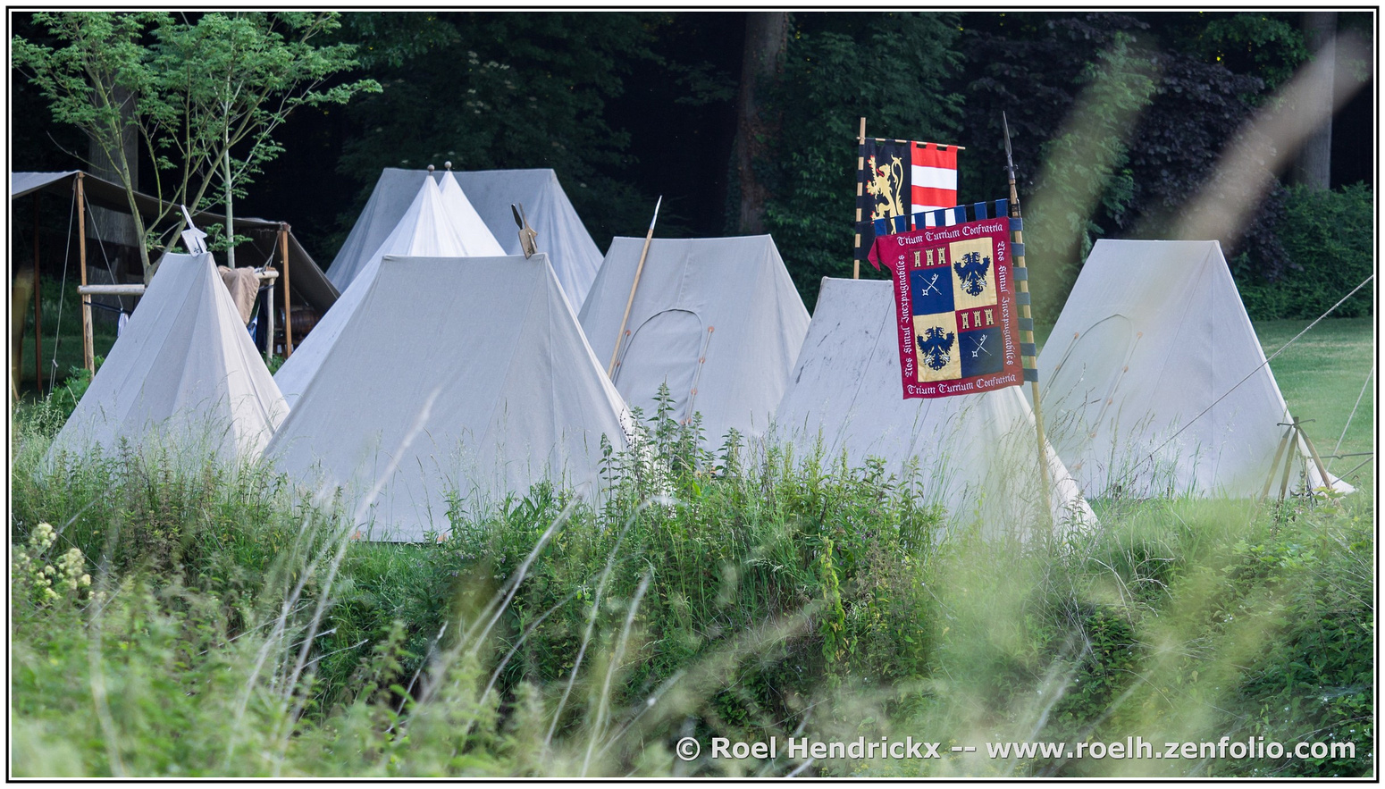
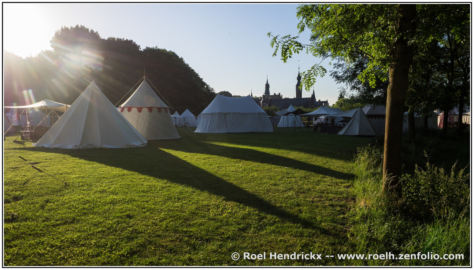
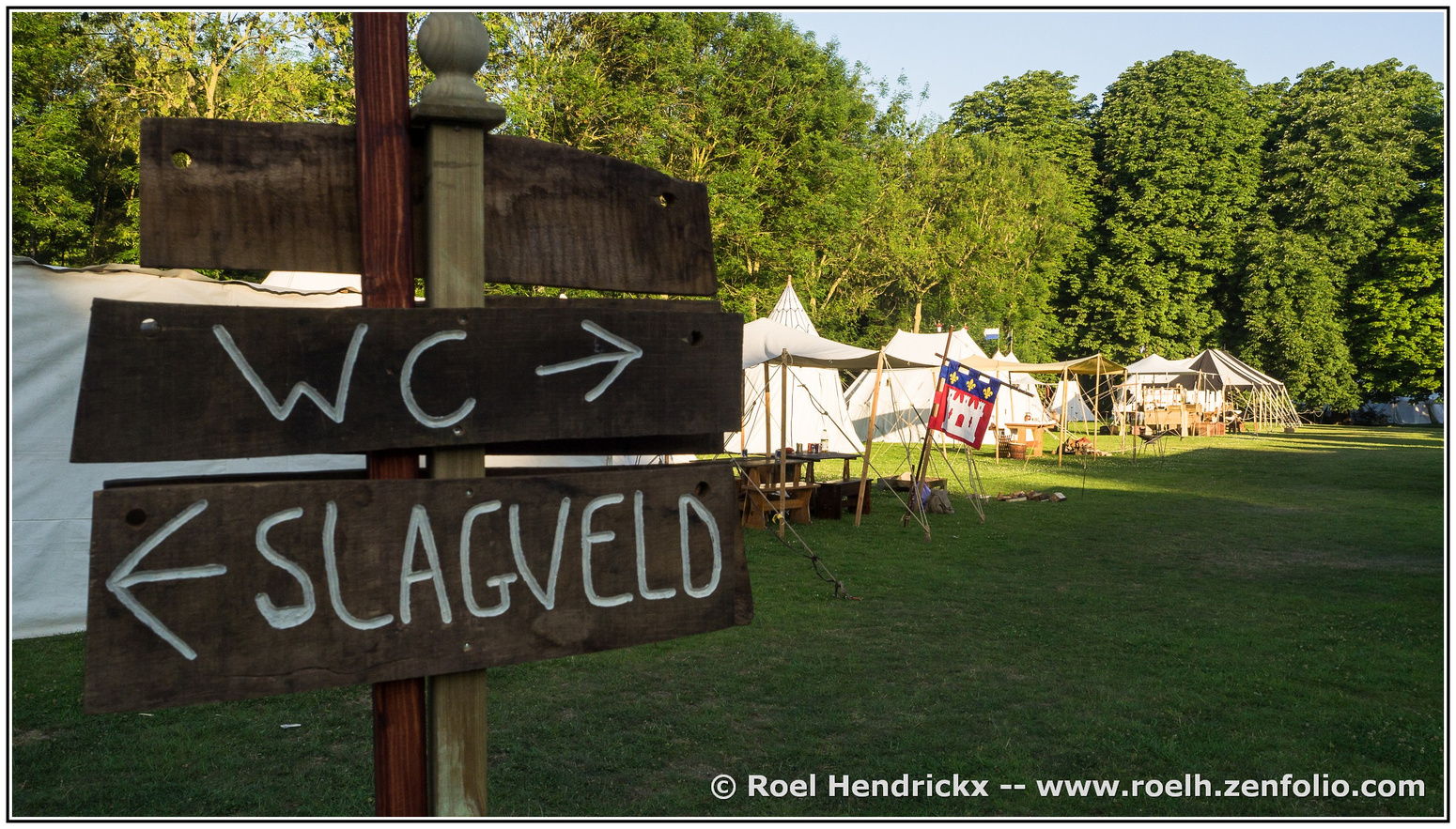
    That‘s a good point about the running theme of triangular shapes, and it is a cohesive and interesting series.
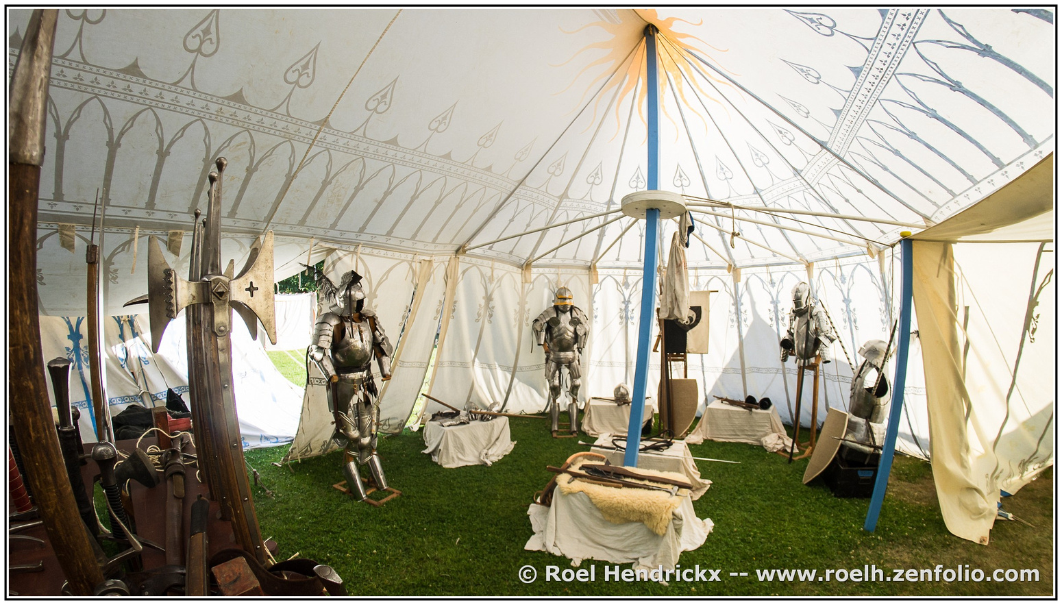
    For what it’s worth, the bent poles in the fisheye image don’t bother me, and in any case the benefits of seeing the entire interior up to the tent‘s apex would outweigh any negative distortion effects. I too like fisheyes.
    I too especially like the photos of the tents with the towers of the medieval skyline in the background. Possibly they are slightly newer than the re-enacted encampment, but it looks right and could well be similar to one of Jan van Eyck‘s photos, if we ever find his SD cards!

    Pete

  • Members 533 posts
    July 20, 2024, 4:42 p.m.

    That is quite a sculpture!
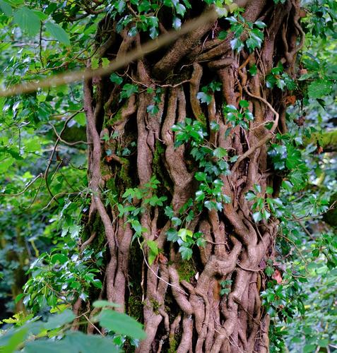
    Others have already mentioned removing the blurry branch from the foreground, and I would agree. If there were more blurry branches spread around the main subject, they may give the impression of peering through the undergrowth, which may have been good, but just the one is simply distracting.
    You could think about making it a touch darker, or maybe even more effective, a gentle vignette to subdue the brightness around the edges, which distract away from the main subject.

    Pete

  • Members 689 posts
    July 20, 2024, 6:12 p.m.

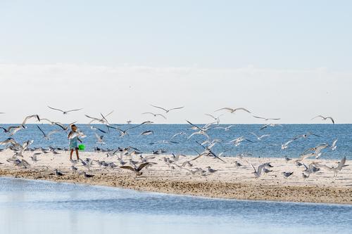
    Girl and birds

    Girl and birds.jpg

    PLEASE DO NOT EDIT THIS IMAGE

    Girl and birds.jpg

    JPG, 1.3 MB, uploaded by Sagittarius on July 20, 2024.

  • July 20, 2024, 7:22 p.m.

    Thanks Pete (and others),

    I am away on camp this weekend. I'll certainly have a play next week and see what I can do.

    Cheers

    Alan

  • Members 533 posts
    July 20, 2024, 7:22 p.m.

    This is a nice peaceful image of the young girl smiling as the birds swirl around her. But… what on Earth is that Thing on the horizon, just to the right of the girl? You seem to have caught an alien starship or a dragon or a sea-monster or…!

    Pete