The color of the sky is wrong in this photo.
Based on the lighting conditions, the sky should have looked completely different.
-
-
Very good!
-
The answer in such circumstances is to use a tripod and a shift lens, though such suggestions dont seem to go down well here! 😀
-
@Sagittarius has written:@RoelHendrickx has written:@Sagittarius has written:@RoelHendrickx has written:@Bryan has written:@RoelHendrickx has written:
SAINT-OMER
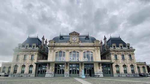
This is the (wonderfully renovated) train station of Saint-Omer, a friendly and inviting small city in the north of France (région Pas-de-Calais).
It's an Iphone image from yesterday.
It had been drizzling a bit and there seems to have been a raindrop on the edge of the little lens.
But I don't care very much about that. This shot is not intended for eternity.Certainly a capture to form the basis of correction discussions.
Am I correct that you took the photo from a low position? To get the lines of tiles in the pavement to appear to converge? I feel the keystoning would be less if taken from a standing position.
Either way I don't mind the image as it is because we still see the fascinating architecture of the buildings. Unfortunate about the rain drop on the lens but as you say, not a keeper.
With regard to the correction attempts, I wonder if, instead of removing all keystoning, a version that left some might be the happy medium?I was not crouching.
But I did use the iphone’s wide angle lens to get all of the building (center and wings) in my shot.
I like that my (then revolutionary, now old) iphone 11 PRO has a “x0.5” wide angle and a ”x2” tele setting and lenses next to the “x1” main lens. That main lens is the best one (most resolution and best in low light). The other lenses allow me to use the phone for more adventurous shots. But specifically the wide angle lens has more distortion (keystone AND barrel) than a well-constructed REAL wide angle lens (like my beloved Oly 7-14 or 9-18 or 8-25 lenses) would have.
So the image was not taken from a low position but from closer than you might expect. There is a kiosk on the center of the station square so I could not get back any further and use the “normal” lens.
Correct me if I am wrong, but the center of the image is right under the clock which means camera has been tilted up. Therefore such a bad distortion in addition to the lens' native distortion. I wander if this image would be for a client, would it be accepted as is? 😀
Of course not.
But it wasn’t (intended for a client).
Believe it or not, but sometimes I shoot just for fun. 🤪(More on vantage point:
Of course the shot was pointed up, because I was on ground level (the square) and I am slightly less tall than the building. Even if I raise my camera, I barely reach 2 meters.
For buildings, the ideal position is in another building, opposite the subject and on a floor halfway up. That is rare.
Another solution is more distance and a longer lens, but so much open space is rare too. Hence the use of tilt-shift lenses…)Third solution is to shoot several images and stitch. Fourth solution is to correct distortion which was shown in this thread.
I always shoot for fun, except when I shoot real estate for my wife or daughter. I also shot images that were distorted because of the nowhere to back up. But I never left them uncorrected if I wanted to show them. YMMV.There is no easy correction for this photo.
The photographer had no other choice, he was standing very close to the building.
A photo like this with prespective distortions can only be credibly corrected if you add a sufficient foreground during editing, i.e. AI.
Everything I have seen so far looks half-baked. -
@davidwien has written:@RoelHendrickx has written:@Sagittarius has written:@RoelHendrickx has written:@Bryan has written:@RoelHendrickx has written:
SAINT-OMER
This is the (wonderfully renovated) train station of Saint-Omer, a friendly and inviting small city in the north of France (région Pas-de-Calais).
It's an Iphone image from yesterday.
It had been drizzling a bit and there seems to have been a raindrop on the edge of the little lens.
But I don't care very much about that. This shot is not intended for eternity.Certainly a capture to form the basis of correction discussions.
Am I correct that you took the photo from a low position? To get the lines of tiles in the pavement to appear to converge? I feel the keystoning would be less if taken from a standing position.
Either way I don't mind the image as it is because we still see the fascinating architecture of the buildings. Unfortunate about the rain drop on the lens but as you say, not a keeper.
With regard to the correction attempts, I wonder if, instead of removing all keystoning, a version that left some might be the happy medium?I was not crouching.
But I did use the iphone’s wide angle lens to get all of the building (center and wings) in my shot.
I like that my (then revolutionary, now old) iphone 11 PRO has a “x0.5” wide angle and a ”x2” tele setting and lenses next to the “x1” main lens. That main lens is the best one (most resolution and best in low light). The other lenses allow me to use the phone for more adventurous shots. But specifically the wide angle lens has more distortion (keystone AND barrel) than a well-constructed REAL wide angle lens (like my beloved Oly 7-14 or 9-18 or 8-25 lenses) would have.
So the image was not taken from a low position but from closer than you might expect. There is a kiosk on the center of the station square so I could not get back any further and use the “normal” lens.
Correct me if I am wrong, but the center of the image is right under the clock which means camera has been tilted up. Therefore such a bad distortion in addition to the lens' native distortion. I wander if this image would be for a client, would it be accepted as is? 😀
Of course not.
But it wasn’t (intended for a client).
Believe it or not, but sometimes I shoot just for fun. 🤪(More on vantage point:
Of course the shot was pointed up, because I was on ground level (the square) and I am slightly less tall than the building. Even if I raise my camera, I barely reach 2 meters.
For buildings, the ideal position is in another building, opposite the subject and on a floor halfway up. That is rare.
Another solution is more distance and a longer lens, but so much open space is rare too. Hence the use of tilt-shift lenses…)The answer in such circumstances is to use a tripod and a shift lens, though such suggestions dont seem to go down well here! 😀
I would love to have this with me whenever I'm on vacation...🤣
-
@RoelHendrickx has written:
SAINT-OMER
This is the (wonderfully renovated) train station of Saint-Omer, a friendly and inviting small city in the north of France (région Pas-de-Calais).
It's an Iphone image from yesterday.
It had been drizzling a bit and there seems to have been a raindrop on the edge of the little lens.
But I don't care very much about that. This shot is not intended for eternity.Quite a wonderful building. The wide angle upward-focused approach is an effective alternative to a straightforward capture. You've always been able to make the most out of such scenes. An extra benefit to the wide angle capture in this image is the sky. Everything - architectural lines, cloud formation, shadows and highlights, all see to flow out of the clock, which is interesting. The blurry water drop is a bit of a distraction but as you pointed out, this one isn't for publication, and if you wanted to fight the blur, the little brush adjustment in LR set to dehaze would probably improve it sufficiently that it wouldn't be a bother. Nice one.
-
@ChrisOly has written:
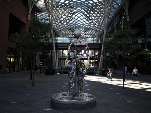
Child's curiosity.
A well spotted scene and well taken image. Having the boy highlighted as he cuts across the the rectangular light-forms is a brilliant compositional concept - highlighted main subject in a most unusual location but easily findable because of the powerful leading line of light. And just in case we miss him, he sits dead center in the crosshairs of the shadow lines. I do like Danno's edit which brings the shadowed surroundings more alive without sacrificing the emphasis on the boy. Nicely done.
-
@Rich42 has written:
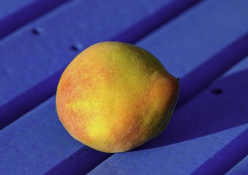
The last peach from our tree this season. As usual, a small but delicious crop.
Sitting on a bench in the yard just before sunset. Its colors are great, but I love its funny shape.
Rich
Beautiful rich complementary colors and textures, and a pleasing set of simple contrasting shapes make this a very satisfying image.
-
@Fireplace33 has written:
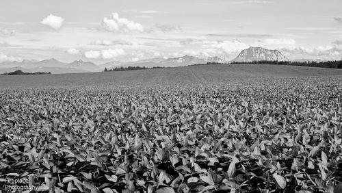
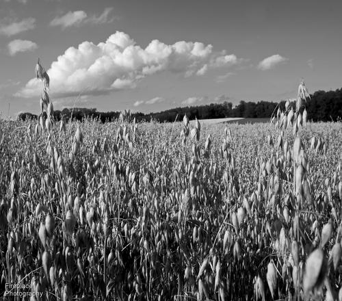
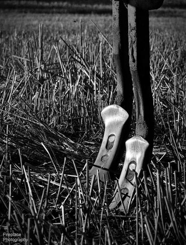
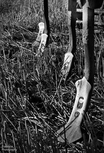
B&W impressions from an evening walk in the countryside
Here's 4 shots from a walk last night in the countryside around our local village
Endless crops all the way to the mountains
And lastly, 2 details of a seed planting farm machine catching the evening light on the shiny metal spikes
Interesting photo essay that shows the fields set within their surrounds of mountains and sky, both of which are majestic in contrast to the simple farm atmosphere of the fields. I think I miss the colors, though. I've grown spoiled to the ridiculously beautiful colors you treat us to every week.
-
@Kumsal has written:
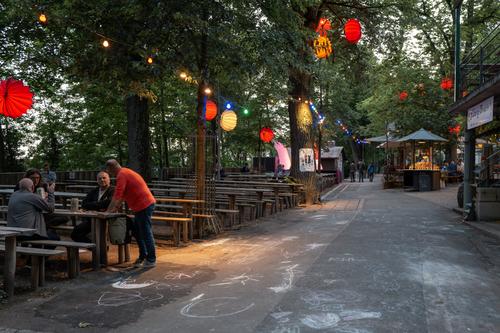
Beer garden
This image is brought from mildly interesting to engaging by colorful paper lanterns you've included in the composition. They pull our eyes in a zigzag formation through the entire photo, and while traveling about, we notice other items of interest: the graffiti on the ground, the booth in the background, the fellow in the red shirt. Red has visual weight and you've used it well here.
-
@Sagittarius has written:
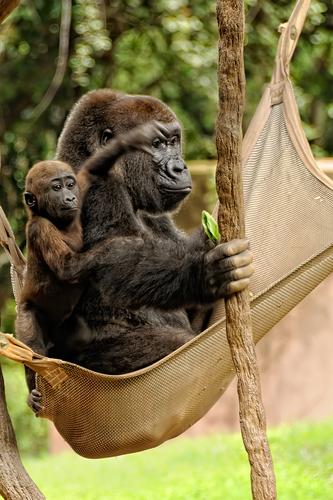
Time together
What a wonderful moment! I am of two minds about the resulting image. In one mind, I am bothered visually by the blurred hand of the baby. In my more creative mind, however, I am enchanted by the way his blurred hand encircles his mother's eye, and her bland expression about the whole affair. Lovely animal family.
-
@DanHasLeftForum has written:
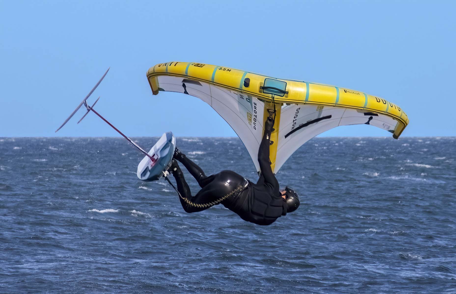
LOOP THE LOOP
Really nice action image that has plenty of tension and excitement, bright colors and contrast. One of those photos that looks better if you don't enlarge it, as there's something a bit wonky going on with the edges around the subject if you pixel peep, making me wonder if the background has been altered (which I have no objection to - I love tinkering with images).
-
@PeteS has written:
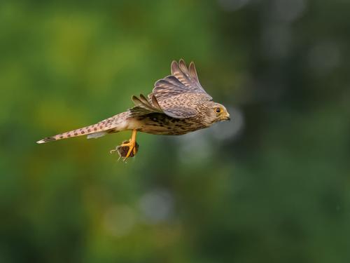
Kestrel and Prey
During Covid, and especially during lock-down, I couldn't really go anywhere, except within walking distance of home. However, the variation in the route was limited, so taking a camera was important to help break the monotony. I started dabbling in bird photography, and discovered it was fun, but more for the process itself and attempts to improve rather than the results themselves, which were awful initially.
I still look for birds whilst walking to this day, and although I now have better gear, it is still a challenge to get anything that is worth showing.
Anyway, here is a kestrel with a mouse I took earlier this week.Pete
Wonderful nature-in-action image. Beautiful bird captured quite sharply. Poor short tailed mouse.
-
@minniev has written:@Sagittarius has written:
Time together
What a wonderful moment! I am of two minds about the resulting image. In one mind, I am bothered visually by the blurred hand of the baby. In my more creative mind, however, I am enchanted by the way his blurred hand encircles his mother's eye, and her bland expression about the whole affair. Lovely animal family.
minniev, I beg you!
There is no such family.
We don't always have to be so diplomatic.
My opinion: simply very bad photomontage. -
@Kumsal has written:@DanHasLeftForum has written:
LOOP THE LOOP
The color of the sky is wrong in this photo.
Based on the lighting conditions, the sky should have looked completely different.Thank you Kumsal.
Posting an opinion that the sky appears wrong on your screen doesn’t really mean much unless you post a version that looks correct on your screen.
In any case the sky is very easy to alter in this scene so if anyone wanted the image for any reason they can alter it to whatever looks better to them.
-
@Kumsal has written:@Sagittarius has written:@RoelHendrickx has written:@Sagittarius has written:@RoelHendrickx has written:@Bryan has written:@RoelHendrickx has written:
SAINT-OMER
This is the (wonderfully renovated) train station of Saint-Omer, a friendly and inviting small city in the north of France (région Pas-de-Calais).
It's an Iphone image from yesterday.
It had been drizzling a bit and there seems to have been a raindrop on the edge of the little lens.
But I don't care very much about that. This shot is not intended for eternity.Certainly a capture to form the basis of correction discussions.
Am I correct that you took the photo from a low position? To get the lines of tiles in the pavement to appear to converge? I feel the keystoning would be less if taken from a standing position.
Either way I don't mind the image as it is because we still see the fascinating architecture of the buildings. Unfortunate about the rain drop on the lens but as you say, not a keeper.
With regard to the correction attempts, I wonder if, instead of removing all keystoning, a version that left some might be the happy medium?I was not crouching.
But I did use the iphone’s wide angle lens to get all of the building (center and wings) in my shot.
I like that my (then revolutionary, now old) iphone 11 PRO has a “x0.5” wide angle and a ”x2” tele setting and lenses next to the “x1” main lens. That main lens is the best one (most resolution and best in low light). The other lenses allow me to use the phone for more adventurous shots. But specifically the wide angle lens has more distortion (keystone AND barrel) than a well-constructed REAL wide angle lens (like my beloved Oly 7-14 or 9-18 or 8-25 lenses) would have.
So the image was not taken from a low position but from closer than you might expect. There is a kiosk on the center of the station square so I could not get back any further and use the “normal” lens.
Correct me if I am wrong, but the center of the image is right under the clock which means camera has been tilted up. Therefore such a bad distortion in addition to the lens' native distortion. I wander if this image would be for a client, would it be accepted as is? 😀
Of course not.
But it wasn’t (intended for a client).
Believe it or not, but sometimes I shoot just for fun. 🤪(More on vantage point:
Of course the shot was pointed up, because I was on ground level (the square) and I am slightly less tall than the building. Even if I raise my camera, I barely reach 2 meters.
For buildings, the ideal position is in another building, opposite the subject and on a floor halfway up. That is rare.
Another solution is more distance and a longer lens, but so much open space is rare too. Hence the use of tilt-shift lenses…)Third solution is to shoot several images and stitch. Fourth solution is to correct distortion which was shown in this thread.
I always shoot for fun, except when I shoot real estate for my wife or daughter. I also shot images that were distorted because of the nowhere to back up. But I never left them uncorrected if I wanted to show them. YMMV.There is no easy correction for this photo.
The photographer had no other choice, he was standing very close to the building.
A photo like this with prespective distortions can only be credibly corrected if you add a sufficient foreground during editing, i.e. AI.
Everything I have seen so far looks half-baked.I disagree with your opinion as shown earlier.
-
@DanHasLeftForum has written:@Kumsal has written:@DanHasLeftForum has written:
LOOP THE LOOP
The color of the sky is wrong in this photo.
Based on the lighting conditions, the sky should have looked completely different.Thank you Kumsal.
Posting an opinion that the sky appears wrong on your screen doesn’t really mean much unless you post a version that looks correct on your screen.
In any case the sky is very easy to alter in this scene so if anyone wanted the image for any reason they can alter it to whatever looks better to them.
The question is not what I see on my screen, I see the colors pretty correctly on my screen anyway.
The question is: what went wrong with a Photoshop artist that the color of the sky looks so unnatural. -
@DanHasLeftForum has written:@Kumsal has written:@Sagittarius has written:@RoelHendrickx has written:@Sagittarius has written:@RoelHendrickx has written:@Bryan has written:@RoelHendrickx has written:
SAINT-OMER
This is the (wonderfully renovated) train station of Saint-Omer, a friendly and inviting small city in the north of France (région Pas-de-Calais).
It's an Iphone image from yesterday.
It had been drizzling a bit and there seems to have been a raindrop on the edge of the little lens.
But I don't care very much about that. This shot is not intended for eternity.Certainly a capture to form the basis of correction discussions.
Am I correct that you took the photo from a low position? To get the lines of tiles in the pavement to appear to converge? I feel the keystoning would be less if taken from a standing position.
Either way I don't mind the image as it is because we still see the fascinating architecture of the buildings. Unfortunate about the rain drop on the lens but as you say, not a keeper.
With regard to the correction attempts, I wonder if, instead of removing all keystoning, a version that left some might be the happy medium?I was not crouching.
But I did use the iphone’s wide angle lens to get all of the building (center and wings) in my shot.
I like that my (then revolutionary, now old) iphone 11 PRO has a “x0.5” wide angle and a ”x2” tele setting and lenses next to the “x1” main lens. That main lens is the best one (most resolution and best in low light). The other lenses allow me to use the phone for more adventurous shots. But specifically the wide angle lens has more distortion (keystone AND barrel) than a well-constructed REAL wide angle lens (like my beloved Oly 7-14 or 9-18 or 8-25 lenses) would have.
So the image was not taken from a low position but from closer than you might expect. There is a kiosk on the center of the station square so I could not get back any further and use the “normal” lens.
Correct me if I am wrong, but the center of the image is right under the clock which means camera has been tilted up. Therefore such a bad distortion in addition to the lens' native distortion. I wander if this image would be for a client, would it be accepted as is? 😀
Of course not.
But it wasn’t (intended for a client).
Believe it or not, but sometimes I shoot just for fun. 🤪(More on vantage point:
Of course the shot was pointed up, because I was on ground level (the square) and I am slightly less tall than the building. Even if I raise my camera, I barely reach 2 meters.
For buildings, the ideal position is in another building, opposite the subject and on a floor halfway up. That is rare.
Another solution is more distance and a longer lens, but so much open space is rare too. Hence the use of tilt-shift lenses…)Third solution is to shoot several images and stitch. Fourth solution is to correct distortion which was shown in this thread.
I always shoot for fun, except when I shoot real estate for my wife or daughter. I also shot images that were distorted because of the nowhere to back up. But I never left them uncorrected if I wanted to show them. YMMV.There is no easy correction for this photo.
The photographer had no other choice, he was standing very close to the building.
A photo like this with prespective distortions can only be credibly corrected if you add a sufficient foreground during editing, i.e. AI.
Everything I have seen so far looks half-baked.I disagree with your opinion as shown earlier.
I disagree with your opinion too.
What you showed is worse than the original.
