I really do need to get my ceyboard kalibrated again... 😁
-
-
@GreatBustard has written:@Bryan has written:
It is said that as we get older, we become more tolerant.
I had thought it was quite the opposite, actually!
Quoted message:To a point. I will say we also come to know what we want, so we might push back a bit more.
I think we become more entrenched in our opinions. Not me though -- I've always been entrenched in my opinion. 😁
Quoted message:...At my age, I have become quite intolerant of destructive behaviour - because what do we have if we are not being constructive?
The internet! 😂
Quoted message:There are those who don't understand their motivations - all we can do is support them. But those who know full well and are deliberate? I have zero time for them.
I'm of the opinion that you engage when you want to engage, and you walk away when you are no longer entertained.
Quoted message:I am here to learn, to grow and to enjoy photography - as, I believe, are most.
You forgot a comma after "grow". 😁😂😁
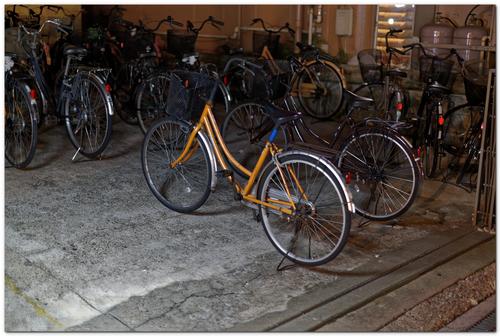
As penance for my annoying post, I shall post a photo here for C&C (or A&A -- whatever floats your boat):
There's one technical "flaw" in the photo that I was debating on "fixing" (I mean, I'm sure there are tons of flaws, but I mean one in particular), and I'm wondering if others see the same thing I'm seeing and would say to "fix" it, too. Of course, I can just do it and compare, but, well, you know. 😉
Your penance and your post are welcome here and you are too. We would love to have you in the mix. A fleet of bicycles is always a good subject regardless of what country, city or village it may be found in. A bike is a universal message. It's fine as is (compositionally) but I might raise the shadows a bit, straighten a bit and possibly remove those roundish light spots in the window. None of those are what I'd call flaws, though; moreso they are just preferences of mine, Hope you'll tell us what flaw you've identified...
-
@Kumsal has written:@minniev has written:@Sagittarius has written:
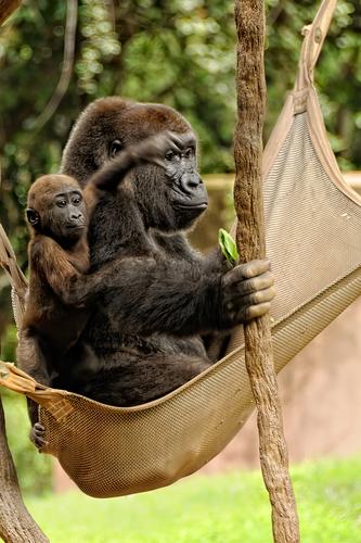
Time together
What a wonderful moment! I am of two minds about the resulting image. In one mind, I am bothered visually by the blurred hand of the baby. In my more creative mind, however, I am enchanted by the way his blurred hand encircles his mother's eye, and her bland expression about the whole affair. Lovely animal family.
minniev, I beg you!
There is no such family.
We don't always have to be so diplomatic.
My opinion: simply very bad photomontage.There is never harm in diplomacy. Our world seems somewhat short of diplomacy in recent times. So I admit to taking the high road when I can.
But I said what I meant. I've noted the firestorm of argument that followed about whether it is or is not a composite or a single photo. I didn't/don't have any suspicion that it was a composite though I can see how some of the focus anomalies might lend to that impression. The photographer says it is not a composite and as you stated, we should take his word for it. I once got caught in a similar dilemma and was accused (in a forceful way by a very accomplished photographer) of having submitted a composite in a critique forum where composites were frowned upon. It was not a composite, but when I tried to explain, the fellow accused me of lying. It upset me because I was new at the hobby, had taken a photo with a legitimate technical error that I didn't understand and needed help with, and instead got publicly slammed. It was hard for me to go back with more images, and I never really felt comfortable there again.
We cannot read each others' minds here, we don't all speak the same native language, and our brains are not all wired the same, so a portion of grace is sometimes helpful as we swap genuine/heartfelt ideas and opinions.
-
@minniev has written:@Kumsal has written:@minniev has written:@Sagittarius has written:
Time together
What a wonderful moment! I am of two minds about the resulting image. In one mind, I am bothered visually by the blurred hand of the baby. In my more creative mind, however, I am enchanted by the way his blurred hand encircles his mother's eye, and her bland expression about the whole affair. Lovely animal family.
minniev, I beg you!
There is no such family.
We don't always have to be so diplomatic.
My opinion: simply very bad photomontage.There is never harm in diplomacy. Our world seems somewhat short of diplomacy in recent times. So I admit to taking the high road when I can.
But I said what I meant. I've noted the firestorm of argument that followed about whether it is or is not a composite or a single photo. I didn't/don't have any suspicion that it was a composite though I can see how some of the focus anomalies might lend to that impression. The photographer says it is not a composite and as you stated, we should take his word for it. I once got caught in a similar dilemma and was accused (in a forceful way by a very accomplished photographer) of having submitted a composite in a critique forum where composites were frowned upon. It was not a composite, but when I tried to explain, the fellow accused me of lying. It upset me because I was new at the hobby, had taken a photo with a legitimate technical error that I didn't understand and needed help with, and instead got publicly slammed. It was hard for me to go back with more images, and I never really felt comfortable there again.
We cannot read each others' minds here, we don't all speak the same native language, and our brains are not all wired the same, so a portion of grace is sometimes helpful as we swap genuine/heartfelt ideas and opinions.
I certainly respect your opinion, minniev.
I have been using Photoshop since 1997 and have been doing photomontage for a long time.
And this photo still seems suspect to me.
But my opinion may be wrong.
What I absolutely want to avoid in this forum is: allowing yourself to do anything in Photoshop and criticizing others for little things.
What I want to say is: should this forum become a Photoshop forum?
Where photography has nothing to do with reality?
In my opinion, that is the trend. -
@Kumsal has written:
What I absolutely want to avoid in this forum is: allowing yourself to do anything in Photoshop and criticizing others for little things.
What I want to say is: should this forum become a Photoshop forum?In the op it clearly states
"Post one image or essay that you would like to get comments on."
If you want to limit submissions to documentary type sooc jpegs then perhaps consider starting your own thread or forum where you can run it how you would like it to be run.
"Image" in the context of Roel's thread I interpret to mean the image can be documentary, artistic or a combination of both.
If you have no interest in an image posted in Roel's thread then you have the option to simply ignore it.
-
@Kumsal has written:
A question to everyone: what is wrong with this photo
That is a meaningless question unless you define the criteria for what is right and wrong because what you might see as being "wrong" might not be seen as "wrong" by someone else but as just a different preference or taste.
-
@DanHasLeftForum has written:@Kumsal has written:
What I absolutely want to avoid in this forum is: allowing yourself to do anything in Photoshop and criticizing others for little things.
What I want to say is: should this forum become a Photoshop forum?In the op it clearly states
"Post one image or essay that you would like to get comments on."
If you want to limit submissions to documentary type sooc jpegs then perhaps consider starting your own thread or forum where you can run it how you would like it to be run.
"Image" in the context of Roel's thread I interpret to mean the image can be documentary, artistic or a combination of both.
If you have no interest in an image posted in Roel's thread then you have the option to simply ignore it.
I agree. This thread about images, not forensic photography. Even in a film era there were quite a few ways to manipulate photographs.
-
@Sagittarius has written:@DanHasLeftForum has written:@Kumsal has written:
What I absolutely want to avoid in this forum is: allowing yourself to do anything in Photoshop and criticizing others for little things.
What I want to say is: should this forum become a Photoshop forum?In the op it clearly states
"Post one image or essay that you would like to get comments on."
If you want to limit submissions to documentary type sooc jpegs then perhaps consider starting your own thread or forum where you can run it how you would like it to be run.
"Image" in the context of Roel's thread I interpret to mean the image can be documentary, artistic or a combination of both.
If you have no interest in an image posted in Roel's thread then you have the option to simply ignore it.
I agree. This thread about images, not forensic photography. Even in a film era there were quite a few ways to manipulate photographs.
Exactly!!.
Even if someone did post a composite I have no issue with that in the context of this type of thread because there is nothing in the op that says composites are not welcome.
Anyone interested would have the option to comment on the technical and/or artistic aspects of the composite.
-
@Kumsal has written:
I certainly respect your opinion, minniev.
I have been using Photoshop since 1997 and have been doing photomontage for a long time.
And this photo still seems suspect to me.
But my opinion may be wrong.
What I absolutely want to avoid in this forum is: allowing yourself to do anything in Photoshop and criticizing others for little things.
What I want to say is: should this forum become a Photoshop forum?
Where photography has nothing to do with reality?
In my opinion, that is the trend.Thank you for that. I find that is wise for us to allow room for our opinions to be mistaken. The fellow who accused me of trying to pass off a composite all those years ago was wrong, though I doubt he ever figured that out. I agree with you that conversations about the use of editing tools are indeed a worthy topic, if we can keep our objectivity and open minds about it. Personally, I would come down on the side of tolerance for all manner of images made from photographs, as long as we are honest about what we did. I create all sorts of stuff from my pictures, from SOOC photos to multi layer edits to realistic or creative composites to complex digital paintings. I don't submit much creative stuff on this forum because I don't see much interest in it here. There are other places where I share that part of my work (I just finished a painting based on a composite of an emu and a victorian lady).
I have some misgivings about where AI is creeping into our softwares, and I'm still sorting out my feelings about that. I objected to the first few years of HDR, too, till we learned how to tame it. And I've asked myself why, when I am willing to happily insert a dragon into my grandson's water bottle in a photo, I would object to a fake sky? Maybe it's simply because I usually don't like the way it looks. My general responses to edited or non edited images are based not on what was or wasn't done but on how the end product looks and feels to me.
-
@DanHasLeftForum has written:@GreatBustard has written:
There's one technical "flaw" in the photo that I was debating on "fixing" (I mean, I'm sure there are tons of flaws, but I mean one in particular), and I'm wondering if others see the same thing I'm seeing and would say to "fix" it, too. Of course, I can just do it and compare, but, well, you know. 😉
Obviously I wasn't there but the two "flaws" that stick out to me initially are the scene being crooked slightly and the WB in the background seems to be incorrect assuming the plastic pipes were white.
It seems there are 2 light sources - one for the foreground and one for the background for which the WB should be set separately for a documentary version of the scene.
Any other flaws don't readily jump out at me.
Those flaws are on point, but not the flaw I was thinking of. I'm not going to say what the flaw is right now, since I want to see if anyone else sees it.
@minniev has written:Your penance and your post are welcome here and you are too. We would love to have you in the mix. A fleet of bicycles is always a good subject regardless of what country, city or village it may be found in. A bike is a universal message. It's fine as is (compositionally) but I might raise the shadows a bit, straighten a bit and possibly remove those roundish light spots in the window. None of those are what I'd call flaws, though; moreso they are just preferences of mine, Hope you'll tell us what flaw you've identified...
I already raised the shadows a decent amount, but didn't press further 'cause I wanted to still have the front bike stand out. As sensitive as I am to having a proper level, I don't know why I let it go on this photo. Perhaps because leveling it out resulted in too much of the negative space at the top being lost, which was already a very small amount and unbalanced by the large amount of negative space at the bottom. In short, I framed the photo poorly when taking the photo by not giving more space at the top.
And, you'd be right to call these "flaws", not merely "preferences". Not so serious as to "ruin" the photo, but flaws, nonetheless.
-
TO BE CLEAR:
A. This thread is open to all images that are photo-based.
Meaning :
1) "straight" (documentary) photos are welcome, whether they are straight OOC or have undergone processing.
2) equally welcome are images that have undergone extensive creative processes (collages, composites, layered photos, whatever)
(Basically, anything visual and 2D that has a photo as starting point, just to distinguish from straight drawings and paintings and other processes that do not involve any form or degree of photography.)B. Discussions on all aspects of the entries are welcome : content, visual impact, technique.
Suggestions for improvement are welcome.
(If the poster agrees, you may work on his/her image. This agreement is implied. If you do NOT want it, please be explicit.)C. There is no right or wrong, just differences of opinion.
The point of this thread is not only to learn to get (and accept) feedback on our own images.
But also to learn to express our opinions on other people's images in a motivated and respectful manner.
(I have been doing this for 15 years, and I have learnt as much if not more from GIVING feedback and having to think about it, as from GETTING feedback.)D. Our skill levels are varied. Some are good at composition, others at processing.
We admire in others what they do well and try to help them within our own skill set.E. With our differences in skill, comes a difference in focus and attention.
Something that is not good for a person with processing focus, may be alright for the person who just looks at composition.F. Ideally we can learn from eachother.
Learning (and tutoring) requires respect.
There will be no looking down on someone nor on his/her work (images), nor on his/her comments.
Be constructive, not disruptive. Say what can be improved, not what is "wrong" or "bad".G. Just like our photo skills, our language skills are also not equal (native speakers should have an advantage).
Keep that in mind when the desire hits to jump to conclusions about how someone expressed his/her thoughts. -
@GreatBustard has written:
Is it possible that Kumsal on this site is the same person as misterodd on DPR? That would explain things. If not, however, then an explanation as to why this is not image theft needs to be spelled out.
Yes it is possible the Kumsal on dprevived is also misterodd on dpreview but highly unlikely imo because misterodd joined dpreview in 2014 and there is also a kumsal on dpreview who joined in 2019.
I suspect the kumsal on dprevived is the same kumsal on dpreview.
I have no reason to believe kumsal on dpreview is also misterodd on dpreview.
-
@RoelHendrickx has written:
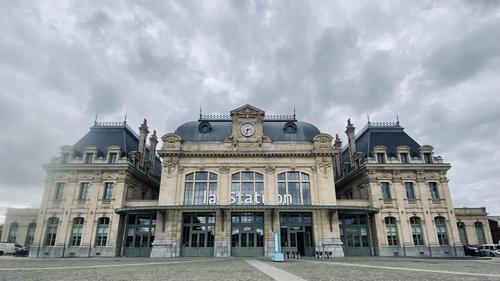
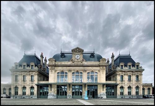
SAINT-OMER
This is the (wonderfully renovated) train station of Saint-Omer, a friendly and inviting small city in the north of France (région Pas-de-Calais).
It's an Iphone image from yesterday.
It had been drizzling a bit and there seems to have been a raindrop on the edge of the little lens.
But I don't care very much about that. This shot is not intended for eternity.What I like most about this image is the visual trick it plays on my senses. The lines in the paving and particularly the sloping sides of the building, but also the rows of clouds lead directly to the centre of the image, and I feel pulled in.
From the above, you can see I am quite ok with the uncorrected image, and obviously Roel, the photographer, is too. However, if I had been standing there, would I have taken this photo in this way? Probably not. I would probably have tried a pano or something to get a less distorted image. And that is another reason I like the image, because it is opens my eyes to a way of taking the scene that I would never have considered.Pete
Pete
-
@minniev has written:
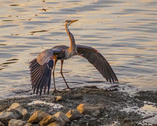
Wanna Fight?
This young blue heron sailed into a landing spot on the banks of the Pearl near an even younger one, and decided to practice his posturing. It is the blue heron version of flexing your muscles to show how tough and handsome you are, and offer to rough it up a bit if necessary to prove who's boss. It scares off the pacifists and is appealing to any ladies nearby.
The lighting and pose of the heron are striking, and the photo illustrates your text perfectly, bringing out the character intake bird.
Nice one.Pete
-
@minniev has written:@Rich42 has written:
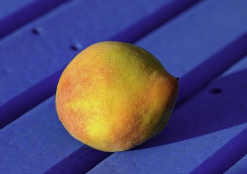
The last peach from our tree this season. As usual, a small but delicious crop.
Sitting on a bench in the yard just before sunset. Its colors are great, but I love its funny shape.
Rich
Beautiful rich complementary colors and textures, and a pleasing set of simple contrasting shapes make this a very satisfying image.
I like this very much, but will just add a +1 to what Minnie said, as I cannot think of anything to add.
Pete
-
@Fireplace33 has written:
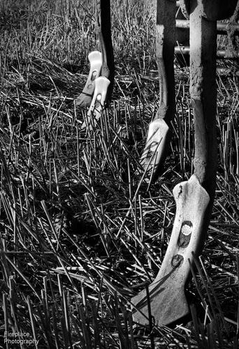
B&W impressions from an evening walk in the countryside
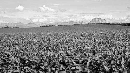
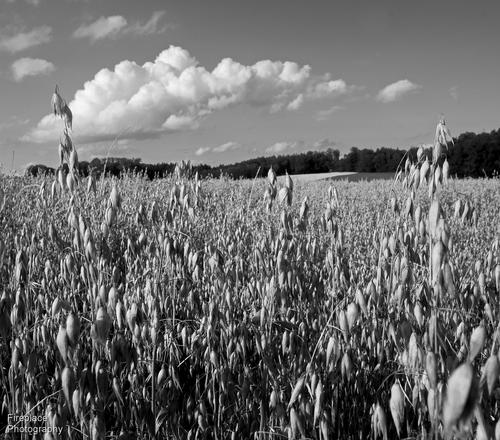
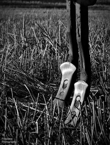
Here's 4 shots from a walk last night in the countryside around our local village
Endless crops all the way to the mountains
And lastly, 2 details of a seed planting farm machine catching the evening light on the shiny metal spikes
These are nicely processed, and work well in B&W.
I especially like the way the mountains are kept in high key in the first one. The fact they are visible, but vague, makes me look harder and keeps my attention. I am surprised it works that way, as I would have expected the more contrasty foreground to dominate. Maybe it is because the foreground is very uniform, without much to study, despite the contrast.
The shiny metal in the last two is very attractive, and it’s smoothness plays off nicely against the roughness of the stubble.Pete
-
@DanHasLeftForum has written:@ChrisOly has written:
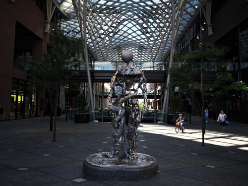
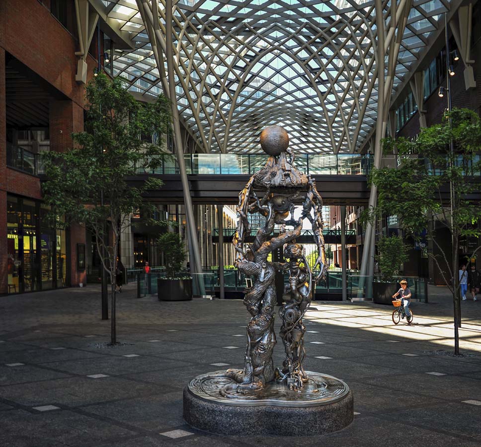
Child's curiosity.
I'm not convinced the child was actually interested in the sculpture but he does provide interest as part of the background. The left and right sides of the image are a little too dark with dull colours for my liking.
I would have gone with something like this.
Anyway, just some food for thought.
The sculpture is very complicated and so is the background, but the photo works quite well. The statue is lit and so too is the structure above and behind that also forms an arch, further highlighting the sculpture. The sides are kept dark and do not intrude, except for the lady in the white coat. The boy is small, but is spotlighted by the sunlight.
I also think Dan‘s version is a good alternative.Pete
-
@DanHasLeftForum has written:@GreatBustard has written:
Is it possible that Kumsal on this site is the same person as misterodd on DPR? That would explain things. If not, however, then an explanation as to why this is not image theft needs to be spelled out.
Yes it is possible the Kumsal on dprevived is also misterodd on dpreview but highly unlikely imo because misterodd joined dpreview in 2014 and there is also a kumsal on dpreview who joined in 2019.
I suspect the kumsal on dprevived is the same kumsal on dpreview.
I have no reason to believe kumsal on dpreview is also misterodd on dpreview.
Easy to put to the test, then. An admin should just ask kumsal to post a particular phrase on DPR as misterodd. If he does, problem solved. If he refuses, then the only conclusion I can think of is that it is because he is not misterodd, the photo was stolen, and the admins should take action if no other explanation stands to the test. Image theft should not be taken lightly, especially on a photography site!
-
-
I have moved the posts with the questionable image to the Dumpster.
Alan
