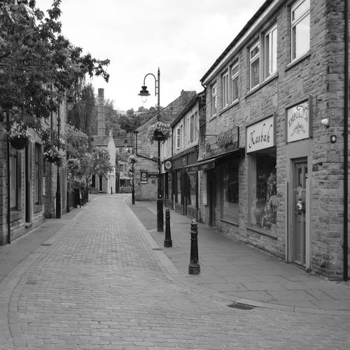
I like your series. All different and interesting. I favour the last one, b&w treatment is very appropriate. This empty street is absolutely awesome.
-
-
The colours are fab in this image. 3 distinctive areas all play together very well.
Different size, shape but all cohesive. -
What a treat to be so exposed to the outside world. I quess some people don't mind...
-
😏
Yeah.
Anyone who has ever done street photography has gotten in the face of a subject almost without warning. And had to deal with the situation.
If you look close, there's a low glass wall on the edge of their patio that is all that separates their weekend heaven from me (and the street). I was actually much closer than the photograph seems to show as this was a 45mm lens on a medium format camera, giving a wide-angle view.
I was walking from left to right and walked right past them the first time, not believing my eyes and having no time, nor the nerve to frame the shot.
I stopped a few dozen yards down the path, worked up the courage and walked back past them and got this one shot, grinning "smile" as I took it. They just had time to look at me and I was gone.
One either has to congratulate them on their chutzpah or advise them that people who look like that should keep their clothes on!
Rich
-
@Rich42 has written:
One either has to congratulate them on their hutzpah or advise them that people who look like that should keep their clothes on!
I was wondering if that might have been the intent of your, umm, documentary photo.
-
@Bryan has written:@Rich42 has written:
One either has to congratulate them on their hutzpah or advise them that people who look like that should keep their clothes on!
I was wondering if that might have been the intent of your, umm, documentary photo.
Just a humble, dedicated street photographer, documenting the masses!
My simple lens sees all, tells all!
🙄
Rich
-
@Rich42 has written:@Bryan has written:@Rich42 has written:
One either has to congratulate them on their hutzpah or advise them that people who look like that should keep their clothes on!
I was wondering if that might have been the intent of your, umm, documentary photo.
Just a humble, dedicated street photographer, documenting the masses!
My simple lens sees all, tells all!
🙄
Rich
Brings back a memory from a long time ago - at my brother's wedding reception. I was given the camera, and some alcohol. My Aunty was a ravenous type, and me believing I should "document" all, I managed a few of mouth agape, food disappearing. Needless to say they didn't make it into the wedding album... 😏
-
@MikeFewster has written:
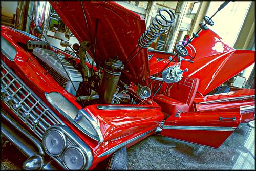
Boyz Toyz
Having known a few "petrol heads" in my time, I am not sure they could have appreciated this shiny abstract nor your suitably angular capture. Excellent DoF providing sharp detail throughout.
-
@AlanSh has written:
I was out last night with my camera club. Here's a few
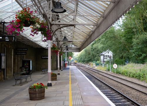
I like the perpendicular to plane yellow line providing a reference for all the other vanishing lines in this classic rural train platform shot. It is refreshing to see the signal man's box nestled among trees instead of the grey hubbub of a city. I might have tried to take the capture a little further back to get more of the platform buildings on the left, but that's neither here nor there. Would get a vote from me in the Photo of the Week comp.
-
-
@PeteS has written:
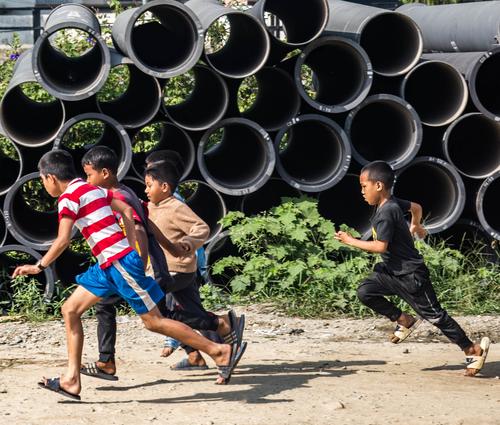
Junior Olympics
This seemed an appropriate picture to post this week.
Pete
Very nice opportunistic shot.
Looks like a photo finish for gold 🙂
-
@ChrisOly has written:
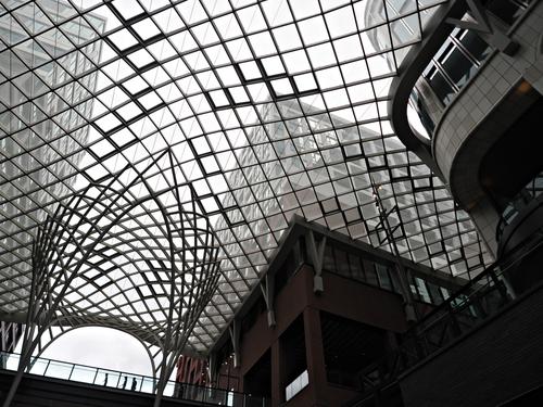
Beehive
Latest award-winning community development downtown
The b&w version works very well here helping the pattern in the roof standout.
I would suspect in the colour version it wouldn't stand out as much.
-
@AlanSh has written:
I was out last night with my camera club. Here's a few
Very nice set. I like 2 and 4 the most, especially 2 with their perspective aspects.
-
@ChrisOly has written:@DanHasLeftForum has written:
WORKING BEE
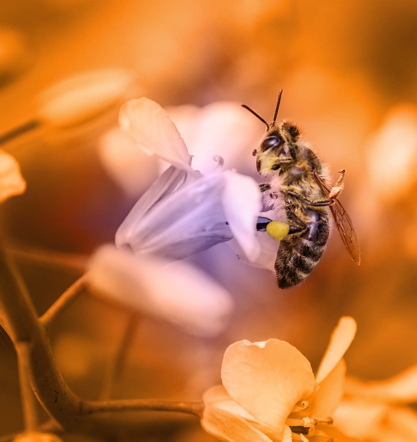
Incredible sharpness of the main subject against the mild background draws viewers to this image.
Thank you Chris. The large print in my home certainly attracts eyes.
The bee is pretty much as I saw it with the the rest colour graded to help give more punch to the overall scene.
-
@MikeFewster has written:
Boyz Toyz
I like the way the body parts appear to radiate out from the centre of the vehicle.
-
@DanHasLeftForum has written:
WORKING BEE
A really nice "insect at work" portrait.
The bee is nice and sharp, with a lump of pollen hanging on one of the legs to provide insight in what is happening.
The background and surroundings are detailed enough to show us we are in a flower bed, but the shallow DOF prevents distraction.Colour treatment focuses the attention.
It is only upon a second look, that we realize that it is odd that the central flowers is pink/purplish, while the lower flower (presumably from the same plant) is orange (not the flower itself, but there is an orange light shining on what looks a pale pink or white).
This makes us realize that there has been selective toning.
The fact that this information takes a moment to come to the surface, is testament that the effect looks pretty natural at first glance.
(And then we realize that even the top of the central flower bathes in that same strange orange light. But then we are over-analyzing rationally.
The initial impression is pleasing and natural. Only scrutiny with the eyes of someone who knows the tricks of colour treatment, reveals what has happened.) -
@DanHasLeftForum has written:@MikeFewster has written:
Boyz Toyz
I like the way the body parts appear to radiate out from the centre of the vehicle.
Agree. The skewed angle adds dynamism and makes the inanimate object (just a car, after all) come alive.
With the very bright red colour (almost cartoon-like) the car looks like it is in the midst of a Transformers transformation to Robot. -
@minniev has written:
Harbinger
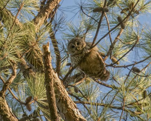
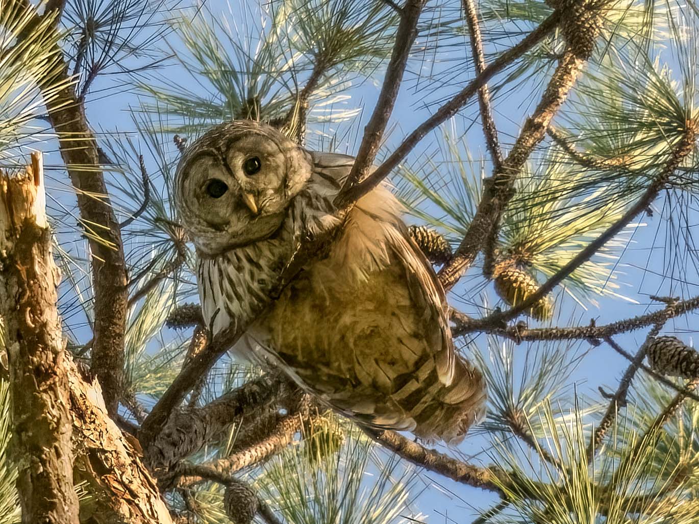
Our Choctaw friends believe that owls, when found in one's yard, are delivering warnings of imminent misfortune. My husband reminded me of this when an owl landed just outside the kitchen window recently, our first visit from one of these guys at the country house. My husband became ill that night and before the sun rose next morning, he was in an ambulance on the way from the small rural hospital near us to a larger urban hospital for an emergency appendectomy. He's recovered well but it was quite an adventure. Our Choctaw friends were unsurprised by this story. I was impressed with the timeline.
A good shot but unfortunately the owl is a little too small in the frame for my liking and the nearly vertical branch in the foreground is a distracting eye-magnet for my eyes. When I crop in, the noise on the owl is much more visible and detracts from the image.
This crop after denoising, a little sharpening, adding a little contrast and selective dodging and burning to lighten up the owl a bit and highlight its eyes a bit more, especially the catch light in its left eye, works much better for me.
Anyway, as always, just some food for thought.
