• Members 3959 posts
    Aug. 16, 2024, 5:53 a.m.

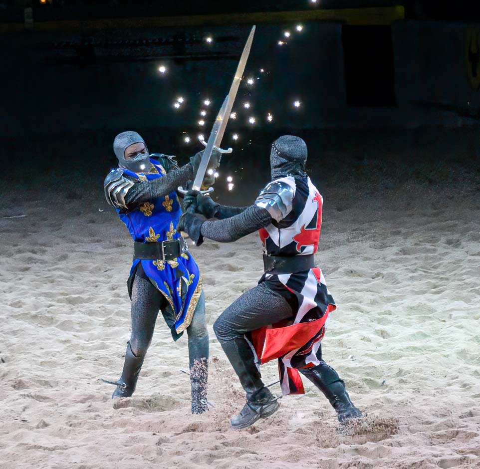
    Sensational photo but I would crop out the logo/shield/whatever it is near the top left in the background and darken the back wall because it doesn't add anything for me. For me it's a distracting eye-magnet taking my eyes off the subject of the photo - the combatants.

    This crop works much better for me.

    As always, just some food for thought.


    dprevived.com/media/attachments/a1/ba/4day5ozxvIzxW8JGKi1aOembwmtMcFOEe5KyuyT7ZmURbvNTgCfeFRCEG7zRoXr2/fighters.jpg

    fighters.jpg

    JPG, 157.6 KB, uploaded by DanHasLeftForum on Aug. 16, 2024.

  • Members 3959 posts
    Aug. 16, 2024, 6:11 a.m.

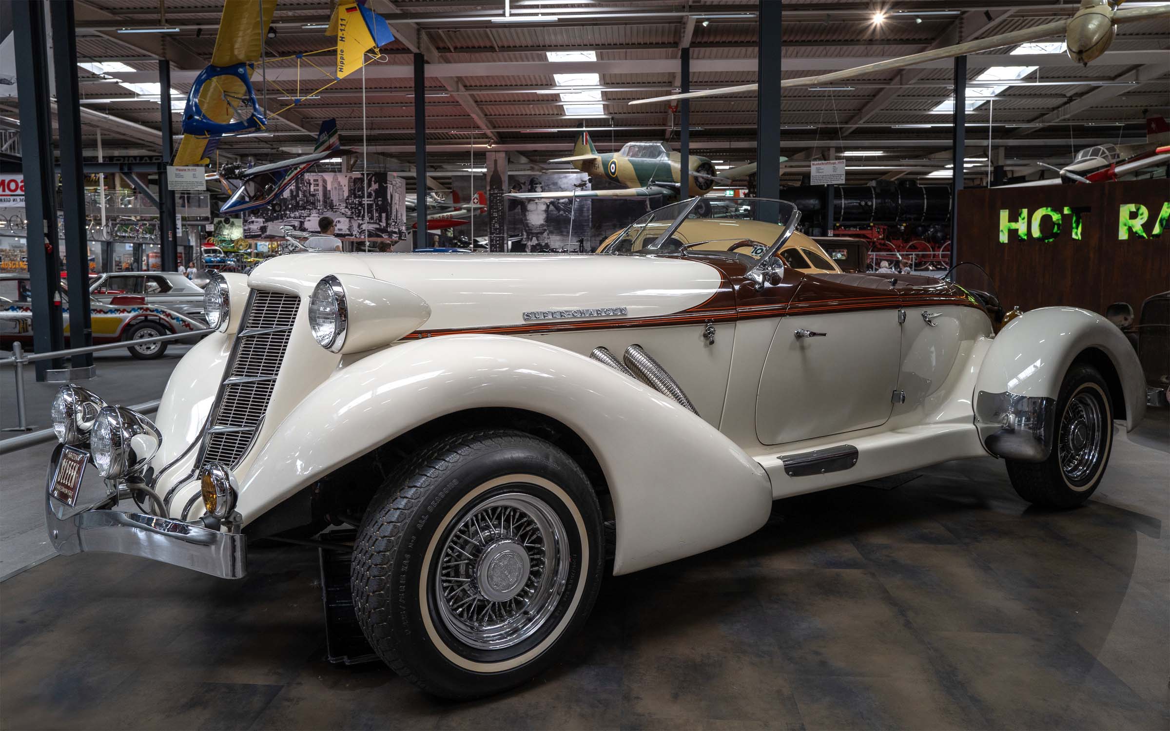
    I like these much more than last week's where the cars had those barrier bars in front of them.

    It's up to you of course, but you are leaving a lot of highlight and contrast headroom which makes the images look a little flat on my screen.

    This version has much more punch on my screen.

    Just some food for thought.


    dprevived.com/media/attachments/89/da/8TjD9TEkJJmLIGS5oe8rtEnK1FQiKxFT7dyMIVbQ4hUXvZan5eNp1MZw8vSaHKwt/classiccar.jpg

    classicCar.jpg

    JPG, 353.4 KB, uploaded by DanHasLeftForum on Aug. 16, 2024.

  • Members 3959 posts
    Aug. 16, 2024, 6:16 a.m.

    Thank you minniev 😊

  • Members 3959 posts
    Aug. 16, 2024, 6:19 a.m.

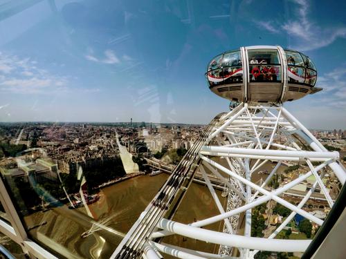
    Potentially a sensational photo but unfortunately the reflections from the glass spoil it somewhat for me because they are very distracting.

    I find putting the lens up against the glass often cuts out most if not all of the reflections.

  • Members 3959 posts
    Aug. 16, 2024, 6:22 a.m.

    Amazing photo especially with the back story 😊

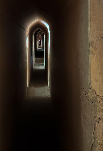
    It reminds of the reflections of the reflections of the reflections of the reflections of the reflections of the reflections of the reflections....................... of two mirrors which I just love to watch.

  • Members 3959 posts
    Aug. 16, 2024, 6:32 a.m.

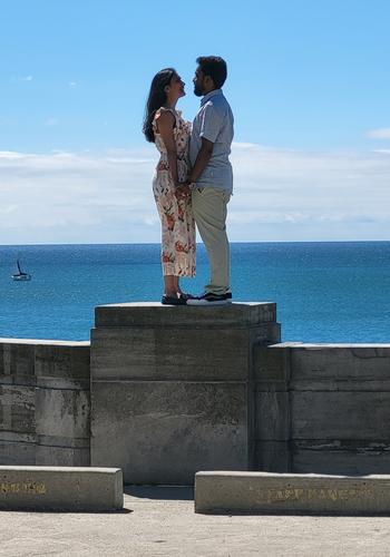
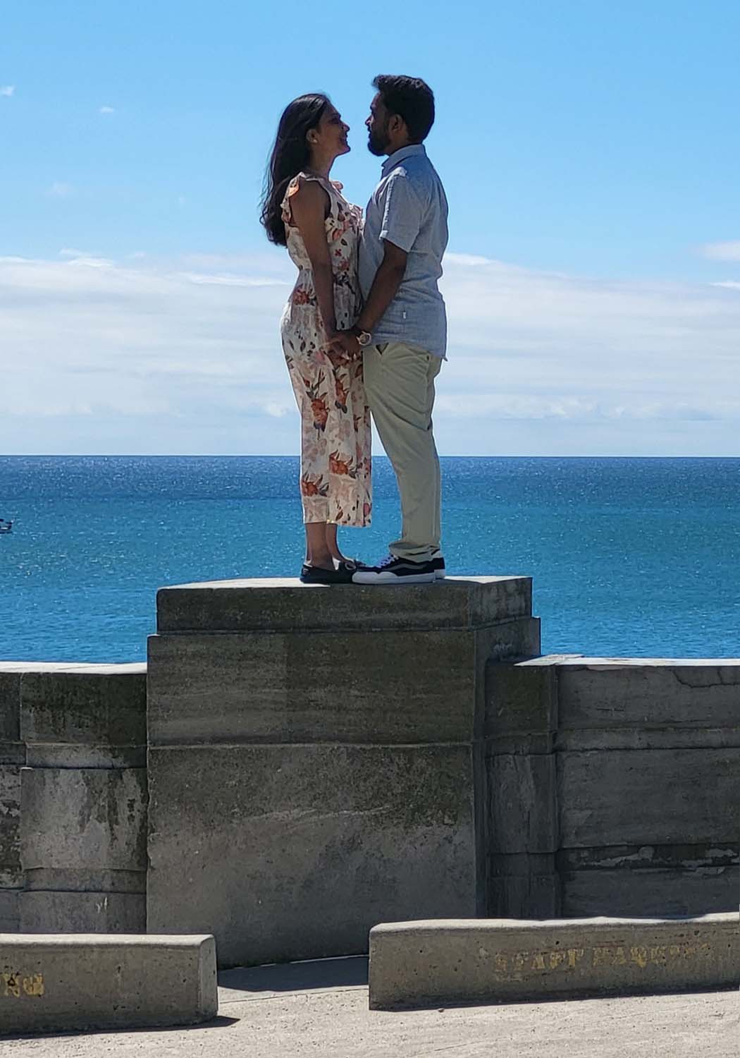
    Sensational opportunistic photo. Well caught !!! 😊

    But maybe it's the way my eyes are wired to my brain but the top of the wall not being parallel to the horizon is really messing with my head.

    This version is much easier on my eyes.

    As always, just some food for thought.


    dprevived.com/media/attachments/ba/e6/aoXM7T8dxCO72XAfMNe8ifn0P3d97fvSwujFsiOHZvuhGcRIFMGeH4KeSRE1TBRA/proposal.jpg

    proposal.jpg

    JPG, 127.0 KB, uploaded by DanHasLeftForum on Aug. 16, 2024.

  • Members 3959 posts
    Aug. 16, 2024, 6:47 a.m.

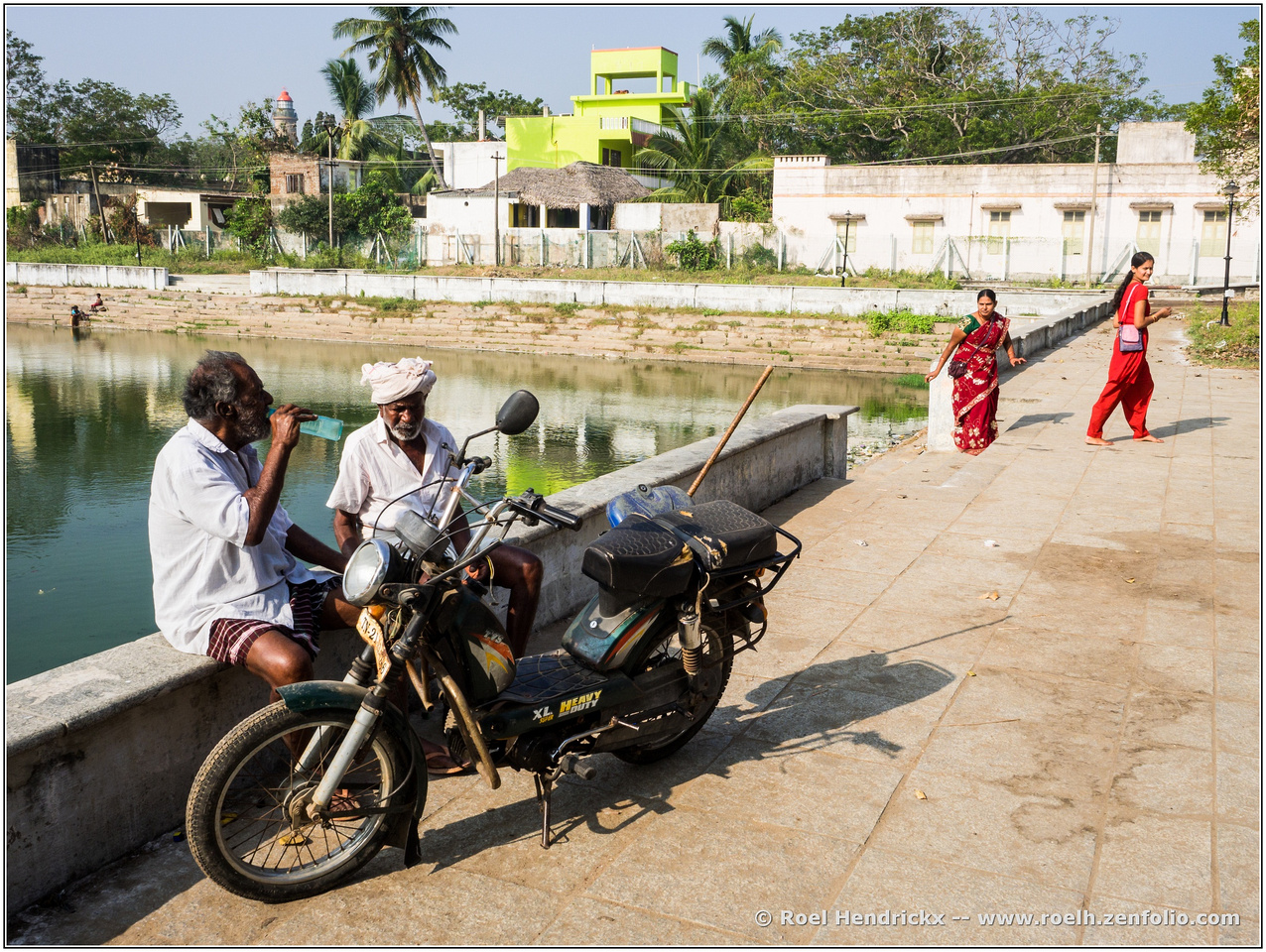
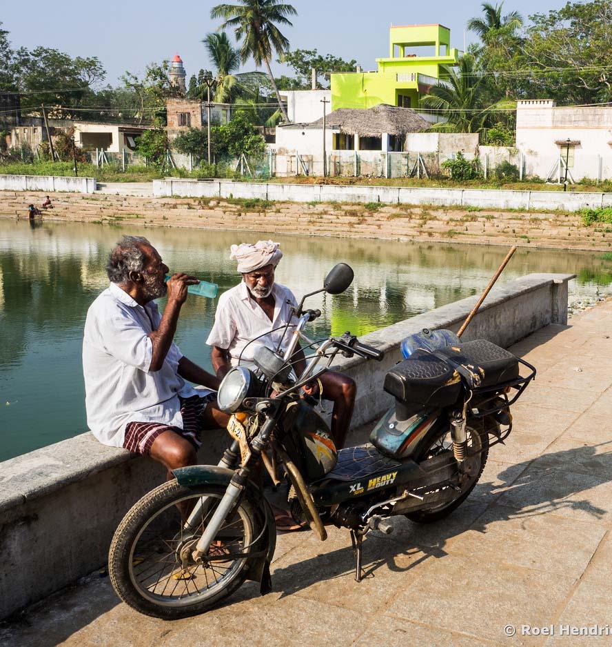
    Very nice story telling scene allowing it to be just about anything someone might want to imagine. However the two women in the background don't do much for me and the guys and their bike needs to stand out more imo.

    This crop with a little more detail extracted from the faces and bike and the harshness of the light in the background toned down somewhat works much better for me with the 2 guys standing out more leaving you to wonder what the heck they might be discussing or planning.

    Just some food for thought 😊


    dprevived.com/media/attachments/16/3c/c93uPpXt0lkq3BQR2w7rt8G6tlyS7DpFcEx8eP2VBazhhY2sEcjUTZeC3YErW2kj/heavyduty.jpg

    heavyDuty.jpg

    JPG, 216.4 KB, uploaded by DanHasLeftForum on Aug. 16, 2024.

  • Members 3959 posts
    Aug. 16, 2024, 7:01 a.m.

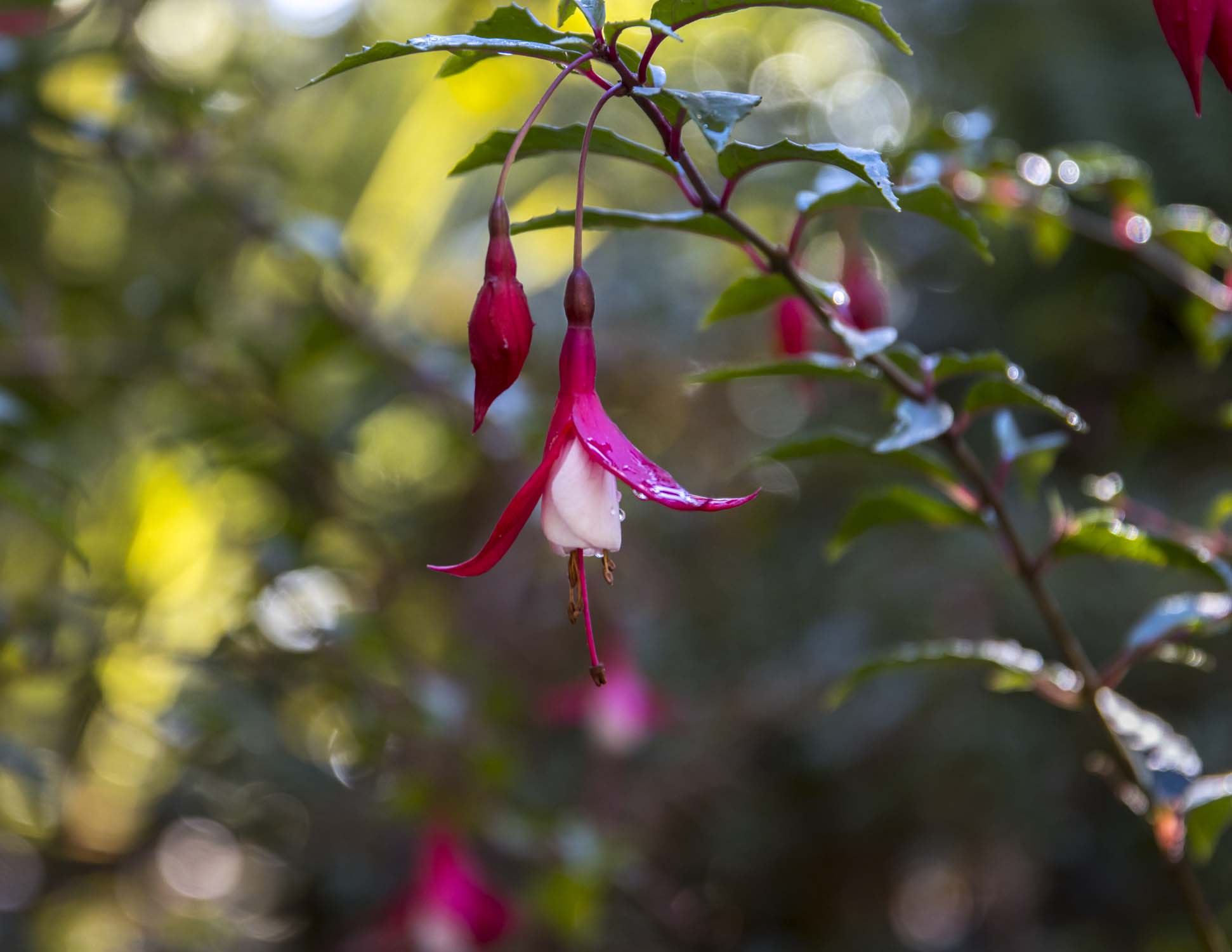
    Thank you but you never cease to amaze me regarding how much more you "read" into my images than I ever envisaged when I took the photo or during post processing.

    Anyway, below is the original. It didn't really do much for me at the time because the flower didn't stand out enough for my liking and the scene lacked atmosphere and/or mood. The flower just blended too much into the background for me, hence the "artistic" version posted above.


    dprevived.com/media/attachments/f5/b4/YdTOSy5n55xl1MQVKJeCKHZO93WPSzZGS3kG2PxjcOWBj7h88IGvaHniMnT4TNzD/flower-orig.jpg

    flower_orig.jpg

    JPG, 131.8 KB, uploaded by DanHasLeftForum on Aug. 16, 2024.

  • Members 1416 posts
    Aug. 16, 2024, 7:04 a.m.

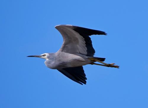
    What I meant was that if you started taking photos when I did, the idea that you might be able to take a shot at 1/3200 of second at 800 iso with an 800 mm lens would be insane. I know it can be done today. With shooting exif like that, being able to get any image at all still amazes me. Yes, as bird photos might be evaluated, the plumage is lacking a little in detail and so on. Doesn't matter. I'm awestruck that the tech can make such an image possible. ie., when I look at it I'm very aware of the tech miracle that makes it possible and this somewhat drowns out my response.

  • Members 3959 posts
    Aug. 16, 2024, 7:09 a.m.

    Wow !!!!!!!!, then your head will really spin when you realise that most modern digital cameras allow shutter speeds up to 1/8000s, yes, 1/8000s; it's not a typo 😀 Maybe even yours will 👍

  • Members 1416 posts
    Aug. 16, 2024, 7:13 a.m.

    Let me guess. Mondrian? Now I''ll write what I was going to say, then I'll check later posts to see if we are on the same correlation bus.
    I often see places as flat planes and shapes of colour, especially compilations of rectangles. I have always liked Mondrian's painting. Stylistically, Rich's image could hardly be further removed from Roel's when Roel uses diagonal lines to build depth.
    Often I look at images like this with my eyes squinting a bit to remove the small details. Everything gets reduced to blocks of colour. Alternatively the image can become a kind of "Where's Wally " where the viewer searches for and interprets the small features that paradoxically hidden in the large flat spaces. I think what then happens is that there is an immediate response of something like calmness from the blue, regular blocks. Then there is a discovery period that contrasts with the first response.
    I have been called away so have to leave this. Still struggling to try to put what I want to say into words.

  • Members 1087 posts
    Aug. 16, 2024, 8:11 a.m.

    Ah OK I get your meaning now. I am similarly impressed because I had done a bit of surfing and general photography 40 odd years ago with an SLR - at that time auto exposure had just become the fashion...
    It was a long shot with heavy crop. I don't expect the detail to be high...

  • Members 787 posts
    Aug. 16, 2024, 11:28 a.m.

    It's interesting to see how much our intentions with this kind of image seem to diverge.
    Indeed : food for thought and that is what this thread is all about.

    To me, the women are an essential anchor point (and visual magnet with their dress colours), that are the culmination of the leading diagonal.
    Additionally, I like the juxtaposing of two older men at leisure with two younger women who are active in the frame.

    I like square crops in general, but would thus not consider one in this case.
    And if I did, I would regret losing a part of the bike's shadow.

  • Members 3959 posts
    Aug. 16, 2024, 11:39 a.m.

    No problem Roel. We all see and interpret images differently.

  • Members 567 posts
    Aug. 16, 2024, 2:05 p.m.

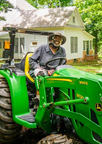
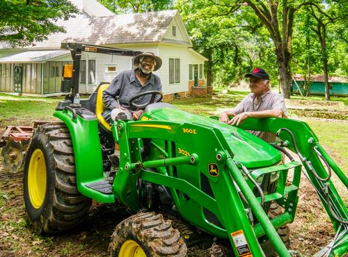
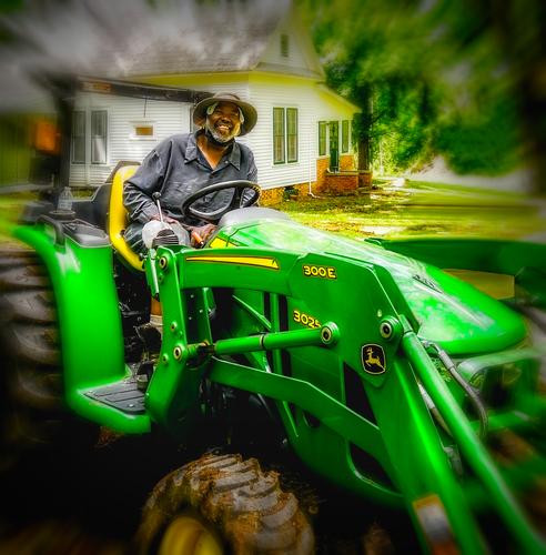
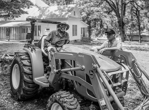
    It is difficult to lose friends and family Paula. Sylvester looks much too young to leave life and he is obviously happy on his green machine.

    For your crop I would leave a tad more on the left side so as not to abbreviate the fender. As I recall you are using PS. Assuming you are on the cloud plan with the Ai abilities you could ask it to remove your brother from the image. It does a pretty good job of that sort of thing from the examples I have seen. I could not do it manually and get a decent result. If you do have it and you can get it to do a good job then I would crop the image as shown in the example below. I also like the close up crop that was shown that crops out most of the tractor. Dan's result is good too but I have no idea what the family will like and they may prefer a more straight up image.

    I am sure you will make an excellent choice as always.

    Andrew
    sylvesternocrop2.jpg

    sylvesternocrop2.jpg

    JPG, 3.0 MB, uploaded by 19andrew47 on Aug. 16, 2024.

  • Members 689 posts
    Aug. 16, 2024, 3:14 p.m.

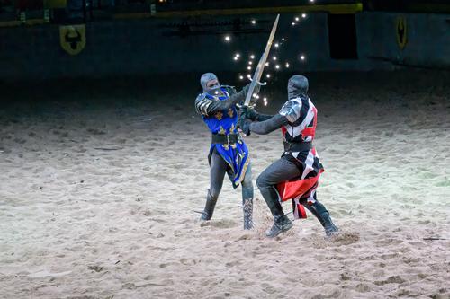
    Thank you for looking and commenting. The reason I left a hint of the background is to show that this fight is in the arena and not on the beach. 😀

  • Members 1578 posts
    Aug. 16, 2024, 3:39 p.m.

    Thanks Kumsal, I hadn't even thought of that but monochrome has its advantages, there's a reason why it is so classic. The crop you added later is especially nice.

  • Members 1578 posts
    Aug. 16, 2024, 3:42 p.m.

    Nice sparring match. The lights (unsure how that was done) make it even more interesting. I think I would crop more to get in closer and eliminate the distraction in the dark part of the left side.

    When I first glanced I thought this might be a mockup using action figures but these guys are real! (I have had a lot of fun with mockups my grandsons set up so that's probably why I thought of it).