• Members 787 posts
    Aug. 14, 2024, 7:10 a.m.

    Welcome to the Wednesday Comments and Critique (No Theme & No Brand) thread!

    We are dedicated to continuing the great tradition of this C&C thread because we are convinced that looking at, and talking about images is vital for better photography.

    Our tried and tested concept (15 years and running!) is a weekly "peer-to-peer" photo comments & critique encounter, in which you GIVE and RECEIVE.

    The idea is simple: you post a photo or photo-based image that you have made and get critique on it. And in return you give other people your honest but constructive opinion of their images.

    Any Theme, Any Camera, Any Style, Any Subject.

    We are still figuring out how to create the convenience of threaded view on this new forum.
    For now, let us agree that you post an image or essay with a title and short explanation, and that all comments include the image as a quote.
    Replies to comments may or may not include quotes.

    THREAD GUIDELINES – THE SHORT & SWEET VERSION
    • This thread does not care about brands. It’s not about the tool, but the image.
    • Post one image or essay that you have made and would like to get comments on.
    An entry can either be a single image or a short essay. With an essay we mean not a collection of random images without any connection, seeking C&C on more than one of them. We mean instead a limited number (3 to 10) of connected images that together try to tell a story, create a fuller picture of a situation, event or location, etc.
    • Add a clear title to your post to distinguish your entry.
    • Look at the other images/essays and give your comments on at least one of those.
    • For comments, try to go beyond a simple pat on the back or a short dismissal.
    • Do you like an image (or essay) ? Try to explain WHY it appeals to you.
    • Negative feedback is OK (we all want to learn), but be polite and constructive. Try to explain why the image (or essay) does not appeal to you and how it might be improved.
    • Please stay on topic, i.e. concentrate on the image and the photographic comments, without getting into politics or other distractions. No non-photographic arguments.

    The critique you give is vital.
    What was your first impression? What catches your eye about an image? Why?
    What do you like, and what distracts you? What would you change?

    Fiddle with the image in your head - composition, perspective, color balance, exposure.

    PLEASE NOTE CLEARLY:
    Unless the original poster specifically states (for every individual posting offered for C&C) that they do not want their image(s) to be downloaded, altered or reposted, it is understood that within the context of this thread, other participants are free to download and alter the posted image and repost it in a reply for C&C purposes. That reposted image may remain permanently within the week's thread, or you may remove it after a short period of time if you prefer. The downloaded and altered images are not to be used for any other purposes nor uploaded anywhere else than within the context of the C&C in this thread. No copyright disputes here!

    Encourage - it is a scary business putting your work up for other people to judge!

    More general feedback is also welcome.
    Do you know something about taking the same sort of image that would make matters easier - share your own as an example in your reply.

    Have fun, be respectful and let’s stick together!
  • Members 787 posts
    Aug. 14, 2024, 7:13 a.m.

    TO BE CLEAR - SOME GENTLE REMINDERS

    In an ideal world, one would hope that further guidelines for respectful forum behaviour are not necessary.
    But apparently this is not an ideal world, so here are some additional gentle reminders about how to behave in this thread.
    I hope not to have to repeat this every week.

    A. This thread is open to all images that are photo-based and the personal creation of the contributing poster.
    Meaning :
    1) "straight" (documentary) photos are welcome, whether they are straight OOC or have undergone processing.
    2) equally welcome are images that have undergone extensive creative processes (collages, composites, layered photos, whatever)
    (Basically, anything visual and 2D that has a photo as starting point, just to distinguish from straight drawings and paintings and other processes that do not involve any form or degree of photography.)

    B. Discussions on all aspects of the entries are welcome : content, visual impact, technique.
    Suggestions for improvement are welcome.
    (If the poster agrees, you may work on his/her image. This agreement is implied. If you do NOT want it, please be explicit.)

    C. There is no right or wrong, just differences of opinion.
    The point of this thread is not only to learn to get (and accept) feedback on our own images.
    But also to learn to express our opinions on other people's images in a motivated and respectful manner.
    (I have been doing this for 15 years, and I have learnt as much if not more from GIVING feedback and having to think about it, as from GETTING feedback.)

    D. Our skill levels are varied. Some are good at composition, others at processing.
    We admire in others what they do well and try to help them within our own skill set.

    E. With our differences in skill, comes a difference in focus and attention for what we value most in images..
    Something that is not good for a person with processing focus, may be alright for the person who just looks at composition.

    F. Ideally we can learn from eachother.
    Learning (and tutoring) requires respect.
    There will be no looking down on someone nor on his/her work (images), nor on his/her comments.
    Be constructive, not disruptive. Say what can be improved, not what is "wrong" or "bad". Don’t call eachother offensive names. In general, do not post any comment that you yourself would be offended by if it was written about your own images or opinions.

    G. Just like our photo skills, our language skills are also not equal. Keep that in mind when the desire hits to jump to conclusions about how someone expressed his/her thoughts. (Native English speakers are bound to have a linguistic advantage. Do not abuse that.

  • Members 787 posts
    Aug. 14, 2024, 7:23 a.m.

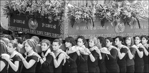
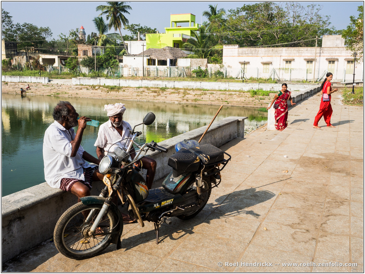
    HEAVY DUTY

    An image from the very first day of a wonderful trip to Tamil Nadu and Kerala in Dec 2016 and January 2017.
    (I always think of that trip of comprising indeed those two regions and not as being a trip "to India", because I am sure that the subcontinent is so diverse that we need to go back a few more times to start to get a bit of a grasp on the full country.).

    We landed in Chennai (aka Madras) and then spent two nights in Mammalapuram (aka Mahabalipuram) to explore the rock temples and hugely impressive elephant and chariot statues there.

    In that sense, as western tourists we joined the hundreds if not thousands of Hindu pilgrims, for whom a visit to these temples (and the adjoining fairs and markets) was often their first confrontation with the ocean (Sea of Bengal). Lovely experiences.

    Because, yes, the temples were indeed very nice.
    But much more than the archeological sites, it was the constant overflow of sensory input and the constant presence of interesting people with whom we had to communicate mostly with body language, that gave us our first taste of the country.

    roelh.zenfolio.com/img/s/v-10/p918486198-6.jpg

    (For a somewhat bigger view, right-click on the image and open in a new tab.)

  • Members 3984 posts
    Aug. 14, 2024, 8:15 a.m.

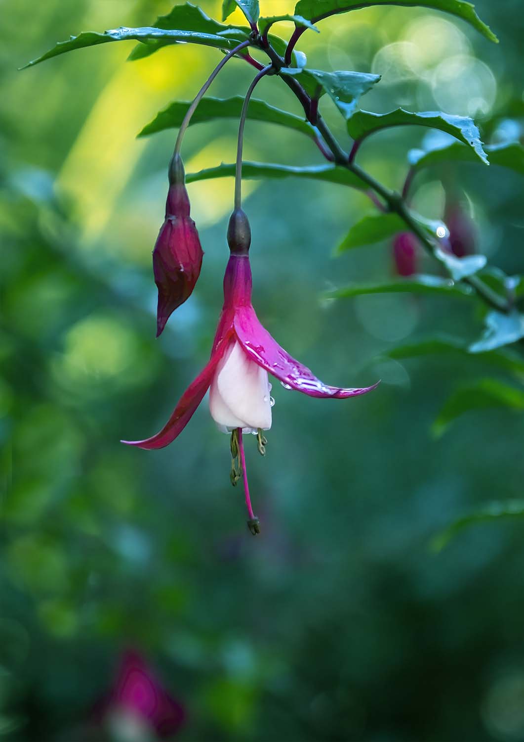
    I have no idea what flower this is but it looked nice.


    dprevived.com/media/attachments/cb/1b/SvaYGAbCJQnzmVYiQvjucj1FY3R8rfClhLqs3q2hYw9rttkCJlTAdBdnQl3rZmBM/flower.jpg

    flower.jpg

    JPG, 82.1 KB, uploaded by DanHasLeftForum on Aug. 14, 2024.

  • Aug. 14, 2024, 9:58 a.m.

    I like that too. Beautiful colours.

    [And I have no idea what it is either]

    ALan

  • Foundation 172 posts
    Aug. 14, 2024, 10:11 a.m.
  • Members 3984 posts
    Aug. 14, 2024, 11:38 a.m.

    Thank you 😊

  • Members 1416 posts
  • Members 1093 posts
    Aug. 14, 2024, 12:31 p.m.

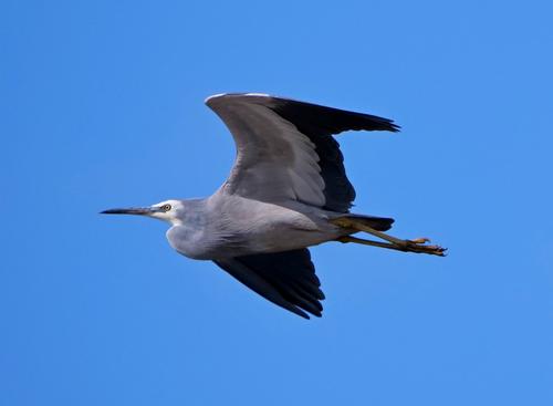
    White Faced Heron - I believe...

    P1262077a.JPG

    P1262077a.JPG

    JPG, 1.2 MB, uploaded by Bryan on Aug. 14, 2024.

  • Members 1266 posts
    Aug. 14, 2024, 1:18 p.m.

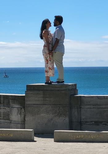
    Will you merry me?!

    20240630_110156.jpg

    I was passing by and heard the question...

    20240630_110156.jpg

    JPG, 4.0 MB, uploaded by ChrisOly on Aug. 14, 2024.

  • Members 1266 posts
    Aug. 14, 2024, 1:23 p.m.

    B&W treatment is ideal to reflect the occasion.

  • Members 1266 posts
    Aug. 14, 2024, 1:25 p.m.

    Like the colours and shape and dof. Sharpness is excellent.

  • Members 1266 posts
    Aug. 14, 2024, 1:26 p.m.

    Dream shot of bif.

  • Members 1266 posts
    Aug. 14, 2024, 1:30 p.m.

    Great docu/travel image. The colours are vibrant and go with the scene.

  • Members 1588 posts
    Aug. 14, 2024, 2:45 p.m.

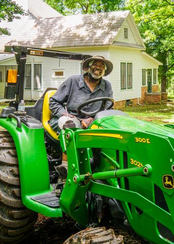
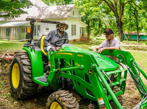
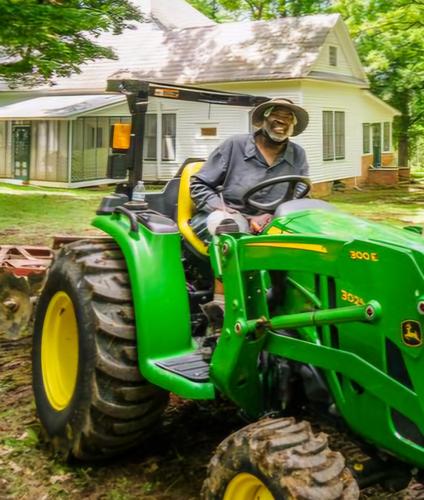
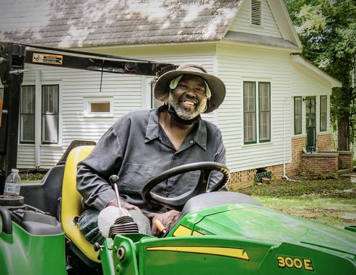
    In Memory of a friend -

    I'd like to get some helpful suggestions before I make a print for the family of my friend and neighbor Sylvester who died last week. I took this a few weeks before his death. His family really liked this casual shot because Sylvester, though always full of joy, usually pulled a serious face whenever his picture was taken. So I want to make a decent print for his mom and son. I'm sorry I didn't have a better lens on the camera at the time but it is what it is in terms of capture and I never dreamed I wouldn't have more opportunities.

    I'd like feedback on the crop, color, possible repairs, etc. I am attaching an uncropped version so you can see what other real estate is available or even show me what you think I should do. (I cropped out my brother and some of the extraneous area of the yard and tractor). I am undecided about fixing things. Do I repair the dental bridge Sylvester kept putting off? Do I remove the cooling towel under his hat and the dust mask around his neck or just consider them part of what he was doing at the moment (working with his much-beloved tractor). Do I clean up the background or ignore it? I don't want to get it too pristine because a man who works a farm is never pristine. Thanks in advance for your ideas.

    sylvester crop.jpg

    sylvesternocrop.jpg

    sylvesternocrop.jpg

    JPG, 5.1 MB, uploaded by minniev on Aug. 14, 2024.

    sylvester crop.jpg

    JPG, 3.6 MB, uploaded by minniev on Aug. 14, 2024.

  • Members 1266 posts
    Aug. 14, 2024, 3:14 p.m.

    Interesting proposal to comment - you will probably get as many ideas as there are people looking at this image. My personal view is not to change anything, keep it as authentic and real as possible. The only suggestion is to "trim" your brother to showcase the tractor as a integral part of the main person you intend to present.

    sylvesternocrop.jpg

    sylvesternocrop.jpg

    JPG, 499.1 KB, uploaded by ChrisOly on Aug. 14, 2024.

  • Members 711 posts
    Aug. 14, 2024, 3:18 p.m.

    Minnie,

    Making prints for your friend's family will be a wonderful gift that they will cherish.

    Don't over think this. Don't worry about any "photographic" qualities you see in the images. His family will see none of those. They will only see him, and experience memories triggered by his facial expression and other cues in the image that escape you. I would make prints of both the versions you show here. Just as they are.

    Rich

  • Aug. 14, 2024, 3:20 p.m.

    No, no, no - IMO best approach is not to fix anything.

    Your crop looks pretty good already.
    My idea, a bit different:

    sylvesternocrop_1_2.JPG

    sylvesternocrop_1_2.JPG

    JPG, 1.1 MB, uploaded by ArvoJ on Aug. 14, 2024.