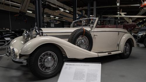
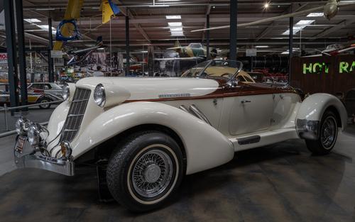
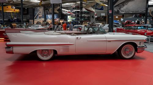
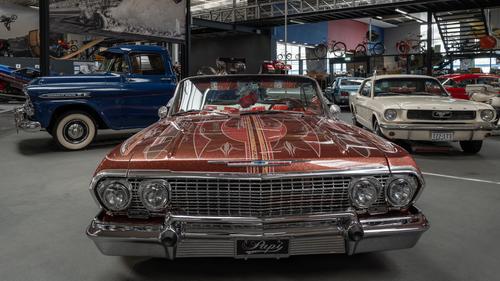
Fine cars and you have presented them well under the difficult museum conditions.
-
-
Your trademark leading lines connect the two women to the two men. The men have the motorbike as a centre of attention, but the bright clothes of the women have helped attract the attention of one of them away from the boys’ toy and the viewer follows a similar route. The theme of groups segregated by sex, but joined by eye-contact, is one that I found often in India , and enjoyed trying to photograph, and which you have done so well here.
-
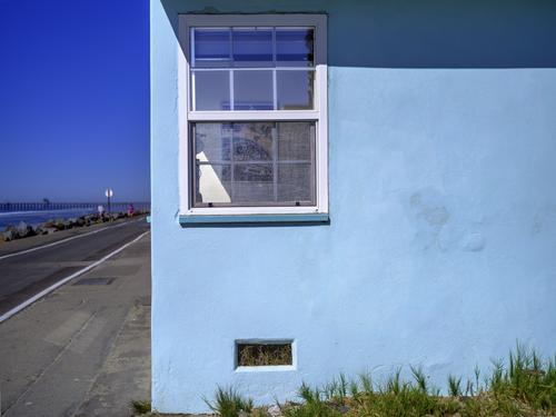
I didn’t pick up on the similarity to Hopper, but can see why you think that now. The details of the interior are sparse, but give a hint of character in a way Hopper could do.
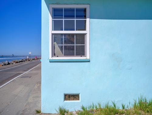
The expanse of blue wall has two openings, one of which shows the interior and the other dried grass, which is a fun contrast. The grass at the bottom hints at the way Hopper liked to have nature encroaching into the scene, and the road too is a common feature, and in this case it points towards a couple of figures, which are very small, but with a number of lines leading towards them, so the take on an importance greater than their size. Hopper also kept his figures quite small, but they too were important in the composition. -
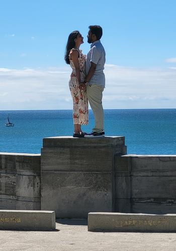
Hearing the proposal really adds to the attraction of this photo, and judging by their looks and body language, I think we can guess the answer! Standing on the pillar of the wall, they have become a Statue to Love and Affection.
-
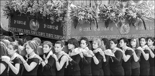
You have captured the women's faces in a row underneath what must be a heavy religious object. This suggests their feeling of community and also a subservience or sense of duty to the religion. Their faces show a determination and perseverance rather than joy. Their dark clothes and the B&W treatment underline these feelings.
A strong and thought-proving image. -
-
@RoelHendrickx has written:@MikeFewster has written:@minniev has written:@minniev has written:
In Memory of a friend -
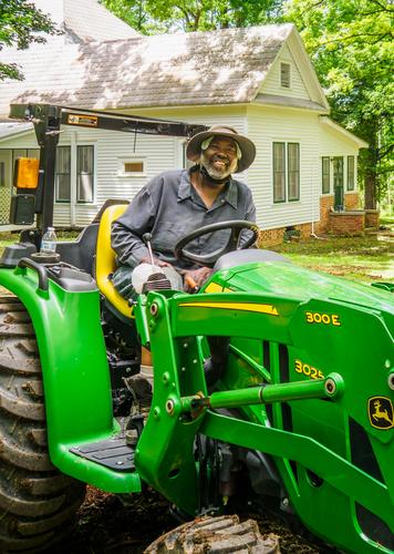
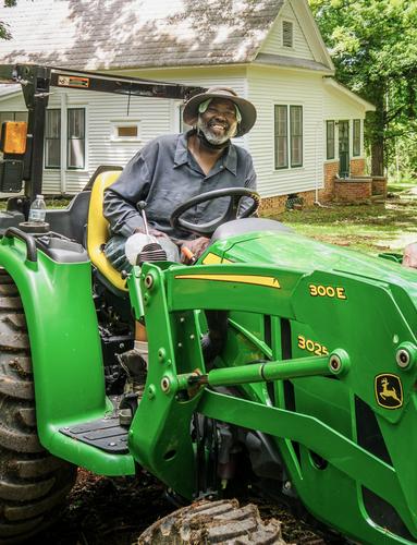
Thanks for all the thoughtful ideas so far on this project that I care a lot about. More may come in so I won't finalize anything yet, but I wanted to go ahead and start working on some of the ideas. So far I have cropped in further, sort of a cross between Arvo and JS's versions. I did some color correction based on Pete's ideas and Arvo's demo. I lowered brightness along the edges but kept it in the middle because his face was already shaded by his hat. I won't be able to go up there to see his mom till next week so I've just printed up a sample on a good luster paper and have it in the matt so I can study it and see if time or other ideas change my thinking.
@ChrisOly has written:Interesting proposal to comment - you will probably get as many ideas as there are people looking at this image. My personal view is not to change anything, keep it as authentic and real as possible. The only suggestion is to "trim" your brother to showcase the tractor as a integral part of the main person you intend to present.
Thank you Chris. My crop is of just Sylvester, and enough of the tractor to recognize it. He loved that thing.
@Rich42 has written:Minnie,
Making prints for your friend's family will be a wonderful gift that they will cherish.
Don't over think this. Don't worry about any "photographic" qualities you see in the images. His family will see none of those. They will only see him, and experience memories triggered by his facial expression and other cues in the image that escape you. I would make prints of both the versions you show here. Just as they are.
Rich
The main thing to me was catching his contagious smile, which almost always disappeared if he knew you were taking his picture. I caught him off guard while we were having a fun afternoon tearing up an old stump together and pulling treasures out of the roots, stuff that was cast off by both our grandparents long ago.
@ArvoJ has written:No, no, no - IMO best approach is not to fix anything.
Your crop looks pretty good already.
My idea, a bit different:Thanks Arvo, you got me thinking more creatively about the crop and the color balance. Mississippi in summer throws a yellow-green cast over everything, so I did need to beat that back a bit more.
@davidwien has written:(referencing Arvo's version) It seems to me that the important part of the picture is your friend. This crop really allows one to see him well. I like it very much!
David
thanks David. I agree.
@PeteS has written:It’s a fine portrait, and I am sure the family will be delighted. No doubt they are most interested in seeing him, so I like this crop. I also agree that the mask, teeth and cooling cap should be left, showing him true to life.
On my iPad, the photo seems to have a slight green cast and is a bit too bright, so have tried to fix that. The adjustments used in iPad Lightroom were
Red +12
Yellow +2
Exposure -0.37
Highlights -27Appreciate it Pete. So far I'm leaving the broken dental crown, the head cooling cloth in there. They are part of him, I agree. The color numbers were helpful. I didn't tone it down quite as much as you and Arvo did, because Mississippi in summer paints us all yellow green. Cropping further made him jump out more, a good thing.
@JSPhotoHobby has written:I think simple, spontaneous headshots make a nice way to remember someone.
If the tractor is something he is known for, then I would keep it in the image.
If not, then I would crop in pretty close to make him easier to see.
In a perfect world, assuming you could retake an image, the arm from the tractor wouldn't intersect with his head and a mild background blur to increase his separation.When my Uncle passed, my cousin and I scanned hundreds of photos from his life time and choose random ones from different eras. Everyone remembers a person from different times and experiences. We didn't remove or alter the images, we left in all the friends and family members to help every one remember the times they were there with him. We played them on a loop on a tv from a memory stick.
For family, my cousin uploaded all the images to a cloud drive so family members could get copiesI agree, and wished I'd taken some closer shots that day, but I had no reason to think there wouldn't be many more opportunities. I did leave enough of the tractor for it to be recognizable, since he loved it so. He had never bought a piece of brand new farm equipment before and it was his darling. The crop I used for the version I'm with right now is like yours but closer in like Arvo's. Appreciate the help.
More thinking about this shot. I prefer minniev's original crop for another reason. The tractor beam thing that is behind Sylvester's head looks odd when the crop becomes tighter. More tractor in the shot and the beam is more easily recognized as part of the tractor and the viewer doesn't think about it. The beam is simply part of Sylvester;s much loved tractor. Less tractor in the shot and the viewer is distracted in trying to work out what the beam is. I prefer the more vertical crop from minniev as well. The shape is called portrait mode for a reason. We need to ask psychologists why but it really does feel appropriate for people whereas wider views do take the eye more to the surroundings.
I have read through most if not all of the input that you have received on this image, and I am glad that the thread participants are actively helping you here with your decision process, giving lots of options and ideas, but also lots of motivations why some of the PP ideas would be less suited.
Obviously you, having known the man and his family, will be the ultimate judge of what you think those left behind, will cherish most as a memory.
We can only offer our two cents and - in view of all the feedback already received - I will give mine by referring to previous ideas.
1) I would certainly not glamourize the image by "correcting" perceived flaws in the person's own appearance (like "correcting" his teeth): the man is who he is (or rather: was who he was). An idealized version is not what his relatives lived with. To me it would feel like applying make up to a dead person.
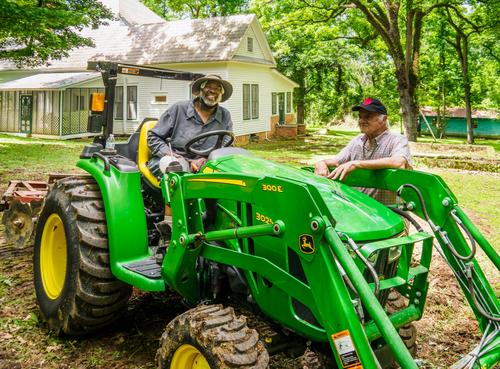
2) The crop you initially used is good. It shows the man in his environment and doing his thing (without the distraction of the second person in the wider view).
You might consider going just a bit tighter even, but you should avoid losing the clarity of him sitting on the tractor. Square might work.3) I am not in favour of gimmicky processing tricks like selective colouring, a vignette etc. The portrait is about the person, not about the photograph and even less about the photographer/dark room artist. That kind of tricks distract from the pure beauty of the spontaneous portrait and smile. The only PP trick I might consider doing, would be to do what you would have achieved with a faster lens, i.e. create a bit more blur in the far background. But I do not think it is necessary.
4) However, I am really in favour of the B&W treatment : it will make the image timeless and soften the impact of the bright hard green of the tractor.
I'm kind of liking the black and white too. I wouldn't have thought of it till Kumsal brought it up but it is indeed a nice idea, and it looks good on my screen. I'll do a test print and compare it to the color version. Thanks for your ideas Roel.
-
@Andrew546 has written:@minniev has written:
In Memory of a friend -
I'd like to get some helpful suggestions before I make a print for the family of my friend and neighbor Sylvester who died last week. I took this a few weeks before his death. His family really liked this casual shot because Sylvester, though always full of joy, usually pulled a serious face whenever his picture was taken. So I want to make a decent print for his mom and son. I'm sorry I didn't have a better lens on the camera at the time but it is what it is in terms of capture and I never dreamed I wouldn't have more opportunities.
I'd like feedback on the crop, color, possible repairs, etc. I am attaching an uncropped version so you can see what other real estate is available or even show me what you think I should do. (I cropped out my brother and some of the extraneous area of the yard and tractor). I am undecided about fixing things. Do I repair the dental bridge Sylvester kept putting off? Do I remove the cooling towel under his hat and the dust mask around his neck or just consider them part of what he was doing at the moment (working with his much-beloved tractor). Do I clean up the background or ignore it? I don't want to get it too pristine because a man who works a farm is never pristine. Thanks in advance for your ideas.
You have a good photo there, it needs very little. Do not "fix" things, they are part of the personality, they are unique, and would only look odd, out of place if you did. You do not need to clean up the background, the smile and the personality already does that far more effectively, and again it would look odd. The family already like the photo because it shows the person, they connect with that, don't change the person.
If you're going to print you need to make sure that it's bright enough, so very quickly and all done in Camera Raw:
Decrease vibrancy a touch (tractror is a little too vibrant)
Subtly raise the brightness with a rough painted mask on the subject and tractor (don't try to be precise just use a brush with a feathered edge - precise masks look too clinical, by using your hand and a feathered brush you soften and preserve local transitions). You can use more than one brush on the mask and control the opacity so you can bring the face up slightly more.
Use a local brush on the face and shirt with a colour balance, just to counter the green light reflected off the tractor.
Final mask to add a very subtle vignette.
Don't look at the photo with a photographers eye and try to make it conform to your idea of a photo, it's a good shot of a person, trust that.
I hope this helps.
It is hard not to look at a photo with a photographer's eye but you're right, in these circumstances we have to look with more than just that. Thank you for your feedback especially that reminder, Andrew, I am incorporating some of your ideas into my color version. The tractor is just a bit too green, I agree. I had already used a LR mask (those tools are so much better than they once were) to brighten his face under that hat brim, but it may need a bit more brightening.
-
@DanHasLeftForum has written:
This is one of several scenic lakes we came across walking around Jichang Garden, Wuxi, about 90 minutes from Shanghai on a bullet train.
The right two thirds of the photo would be very appealing, if you didn't have this color toning applied. I think the image would benefit from cropping the left third off and going back to a more realistic color treatment. The colors in the warm bright patch are jarring to my eye and conflict with the rest of the image.
-
@Kumsal has written:
Classic Cars
Wonderful cars, well taken shots that maximize their beauty. I'd still enjoy creative versions of these beauties, but they are nicely done for documentary images.
-
@minniev has written:@DanHasLeftForum has written:
This is one of several scenic lakes we came across walking around Jichang Garden, Wuxi, about 90 minutes from Shanghai on a bullet train.
The right two thirds of the photo would be very appealing, if you didn't have this color toning applied. I think the image would benefit from cropping the left third off and going back to a more realistic color treatment. The colors in the warm bright patch are jarring to my eye and conflict with the rest of the image.
Thank you minniev. The original scene had very dull and flat lighting which didn’t really do much for me.
In the past I found that if I changed something to please someone it often upset someone else who liked the previous version.
Bur thank you for your thoughts.
-
@PeteS has written:@MikeFewster has written:@DanHasLeftForum has written:@MikeFewster has written:@DanHasLeftForum has written:
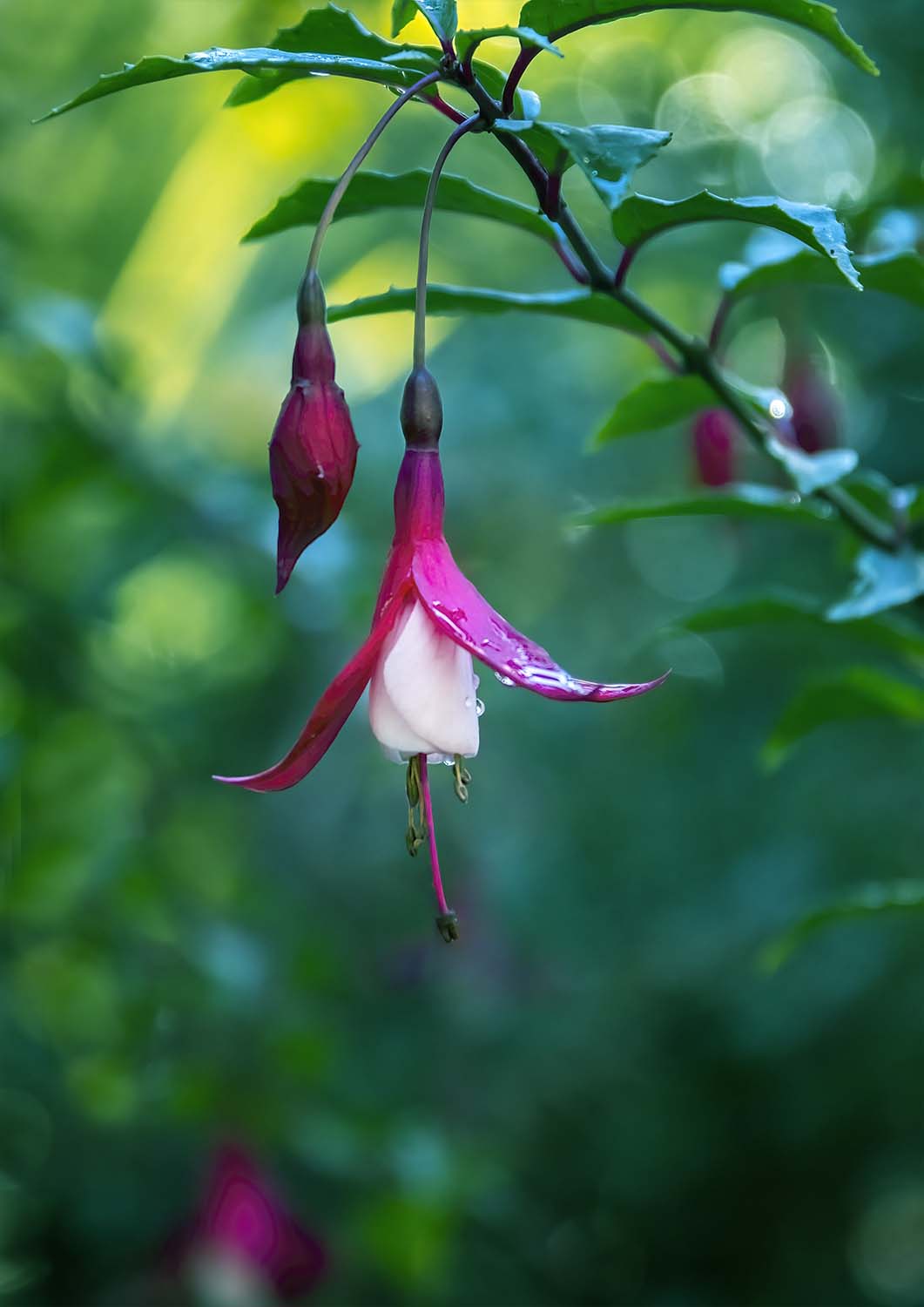
I have no idea what flower this is but it looked nice.
Fuschias are rich coloured with a delicate hanging form. You have captured both aspects here. The curving long this line of the stalk is continued in the stamens beneath the petals and the curve of the bud nestles alongside the curve of the main flower. I like the space left below the flower. The "hanging" nature of the flowers is one of the attractions of fuschias and the space below the subject makes the point.
Without going into pixel peeping, I think the flower has probably been brightened a little. Perhaps, perhaps not. If so, it has been carefully so it doesn't distract by being immediately obvious.
Dof/bokeh carefully selected to lift the flowers from the background.Thank you but you never cease to amaze me regarding how much more you "read" into my images than I ever envisaged when I took the photo or during post processing.
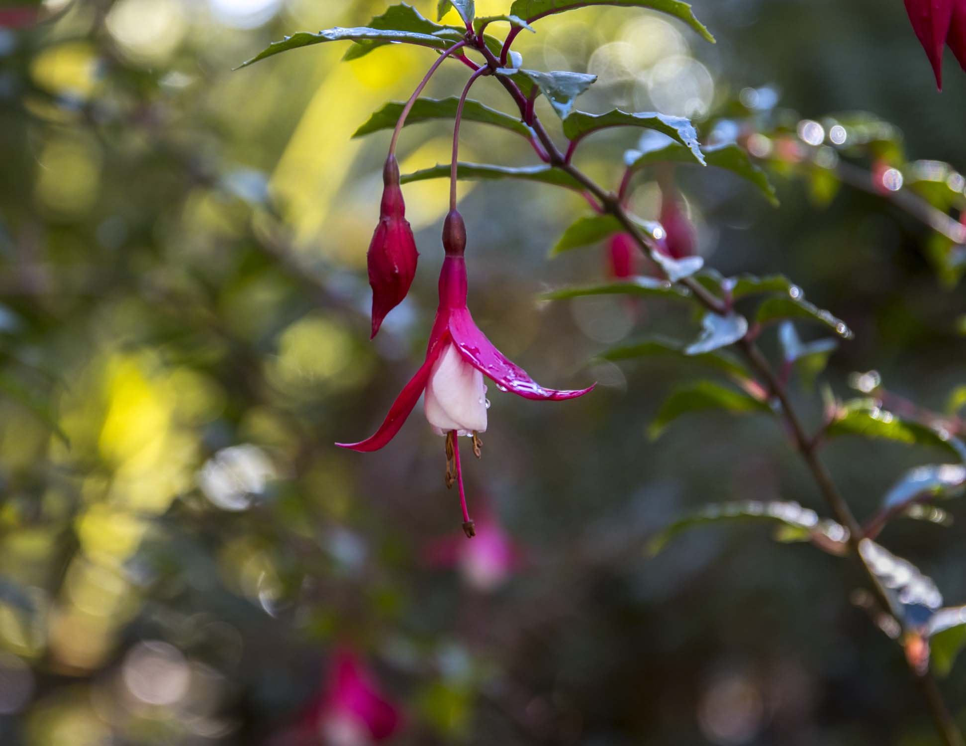
Anyway, below is the original. It didn't really do much for me at the time because the flower didn't stand out enough for my liking and the scene lacked atmosphere and/or mood. The flower just blended too much into the background for me, hence the "artistic" version posted above.
I appreciate it when sometimes a photographer shows the original image. We get a window into the creative thinking that went into the final image. It's the difference between a snapshooter and a photographer.
I too enjoyed seeing both versions. Actually it made me appreciate your edited version even more, especially as you edited it in a way I almost certainly would not have tried. I may well have cropped the same way, but I would not have made the image more blue, and I think doing that has made the background seem darker and less inviting, allowing the flower to stand out more, even though it too has a blue cast. Nice touch.
Thank you Pete 😊
-
@PeteS has written:
Into the Unknown
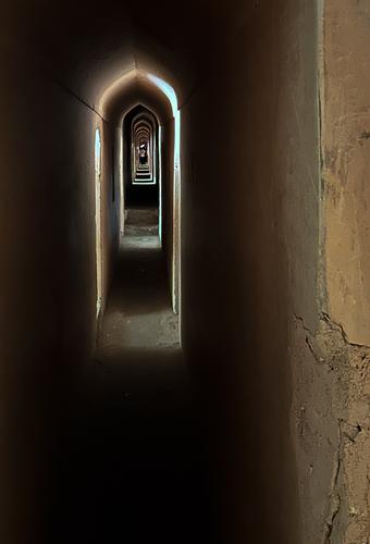
The Bara Imambara in Lucknow, India, has a huge 18th century hall, which is one of the largest rooms in the world with a vaulted roof without any beams. It was built on marshy ground, so the huge walls and arches needed for the support could not be solid, and are hollow, with hundreds of arches and passageways within the walls and foundations. Almost inadvertently the builders created a massive maze, which formed a useful escape route for the royal family. Tourists are shown around the upper galleries, with many glimpses of the ornate rooms below, but the lower levels are too difficult to navigate and are out of bounds. Apparently a British explorer, who insisted he was up to the task, is still down there.
Interestingly this huge, ornate building was started by the local ruler during a famine to provide income for farmers who would otherwise have starved. He knew their pride would not allow them to simply take a gift of money. It is said that each night the nobility would knock down what had been built the previous day, thus prolonging the building work until the end of the famine.
The photo shows one of the galleries in the maze.
(I am on a rainy beach holiday with grandchildren at the moment, so had to find something stored on my phone. Only phone cameras were allowed in the Bara Imambara, so that is what I used. Pixel-peepers will be disappointed!)
Thanks for the comments.
Minnie, I am glad you saw the arches of light as floating, because that is how they appeared to me too. It only works if the wall on the right is included in the composition.Since many people were interested in the story and structure, here are some more, which give a bit more detail of the building.
Hmmm, can’t seem to do it from my phone, I’ll try the iPad
-
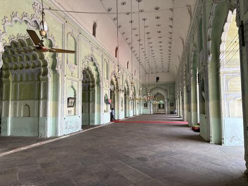
This gives an idea of the size of the hall and shows the openings above the green lower parts of the wall, which provided the light to create the “arches” in my photo.
Well, I was going to add more photos, but for some unknown reason the process is very hit and miss at the moment. Bandwidth? In any case I will have to leave it there. Sorry.
-
@MikeFewster has written:
Devotees.
Impressive, very well captured.
-
@PeteS has written:
This gives an idea of the size of the hall and shows the openings above the green lower parts of the wall, which provided the light to create the “arches” in my photo.
Well, I was going to add more photos, but for some unknown reason the process is very hit and miss at the moment. Bandwidth? In any case I will have to leave it there. Sorry.
Nice photo.
Where is it taken? -
@ChrisOly has written:
Will you merry me?!
I was passing by and heard the question...
Without your text I would have thought that the photo was staged.
Very good photo 👍 -
@Rich42 has written:
The Strand, Oceanside, CA, south of the pier.
Rich
It's about composition and colors.
In this photo it's worked, simple but effective, I like it.
