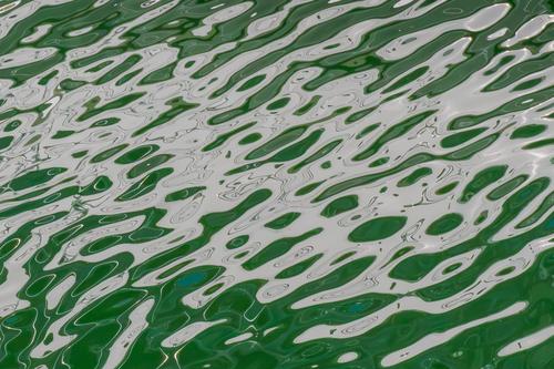
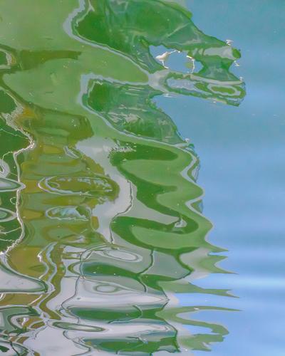
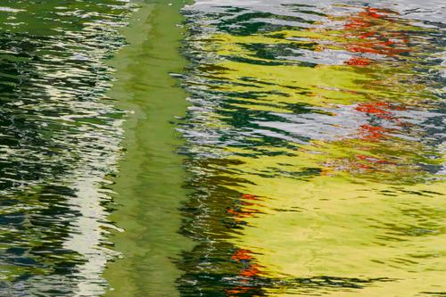
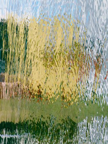
Welcome home, Mike! We've missed ya. These are quite wonderful. I love water abstracts, and these are fine ones. There are almost always surprises to be found in such adventures. I am fascinated with the colors in these, particularly the last two.
-
-
Gorgeous captures of some stunning water lilies. Your titles are as compelling as your pictures. That last one will hold its own outside the collection, as an individual flower portrait. I do think I might clone out the reflected contrails though. Very nice.
-
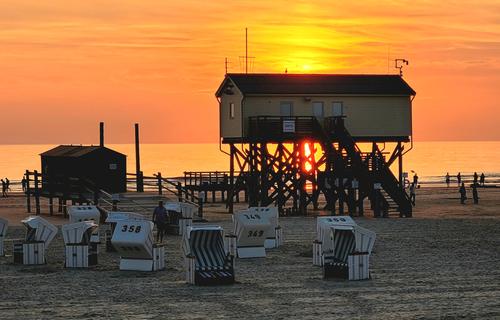
Glorious sunset colors. Restaurants on stilts usually have great seafood! Stilts are a sign of seriousness in regard to the sea. I like how you placed the bottom of the structure right on the sea's horizon line. I like the sprinkling of busy, silhouetted humans milling about, and all the verticals sprinkled about. I'm not fond of the hooded beach chairs which seem to detract more than they add, but I'm not thinking of a solution for that. I don't really think the offered crops have improved it, and I tried a couple of my own but didn't like them any better. I'd be interested to see what AI would do if asked to sweep them all away. I haven't experimented much with what it's really capable of but am not above trying it out.
-
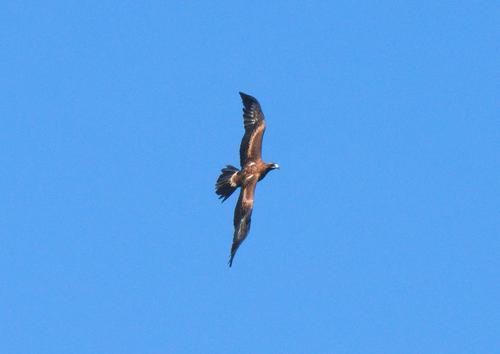
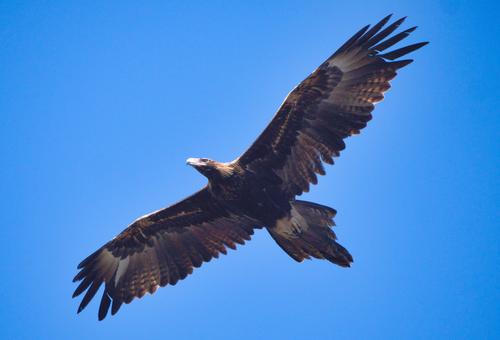
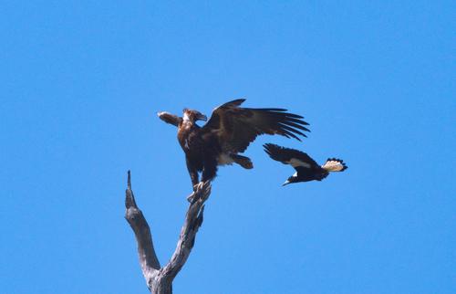
What a wonderful bird, another that we don't have. Nicely detailed captures. Hats off to you for going back to the drawing board for editing to get more out of the files than you first found. Dan's done a quite nice edit to give you an idea of what's hiding in that file. For all of us who use software to get more from our captures: it is a journey. There is no perfect software, some does better with certain tasks than others, and it takes a while to master whatever choice you make. For me, it's been worth the time (and some money though not a lot). Haloing is a particularly devilish beast but it can be solved.
No different than our cameras/lenses. With birds in bright light, there's lots of shooting considerations as well, to get a resulting file that has maximum information you can then use software to extract and shape. A forum like this is a great place to sharpen our skills (pay particular attention to Mike PDX who is an accomplished wildlife specialist).
-
That you did this with a 50 year old camera with such limited controls is impressive. Lots of detail (which is the attraction of the images in this set), and a classic film look. Love the colors and the angles you chose. I might have tried raising the shadows on the second one a bit in a scan to see what would come of it, to relieve the weight in the blocked up area, but it might have ended badly. At any rate, I suspect they look quite nice in your printed versions.
-
Thanks minniev,
The "Strandkorb" (hooded Beach chair) is an iconic feature of beaches up in North Germany so I won't be removing them, in fact I even like them in the picture :-), but if anyone wants to remove them, go ahead :-)
The food was excellent, although quite expensive.
The restaurant we were in was a much bigger structure, also on stilts, just opposite to the one in my pic :-) -
@DanHasLeftForum has written:
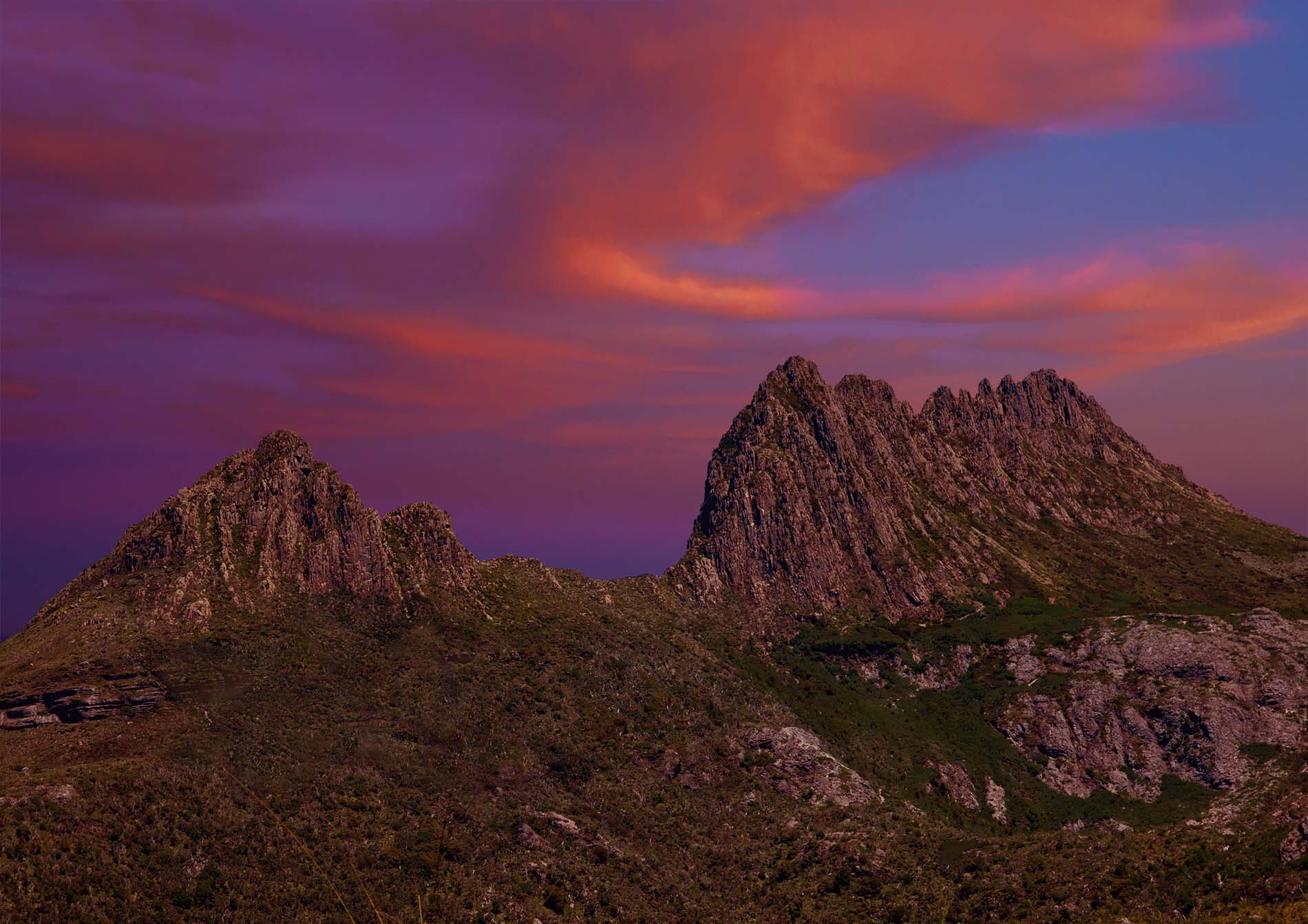
CRADLE MOUNTAIN - Tasmania
I don't care for the lurid sky replacement, which doesn't seem to match the mountains in time of day or color or lighting. There is a jarring dissonance here that is sort of painful to look at. I've followed the comments and the original looks just about as I expected. Your actual compositing is skillful in that you avoided the dreaded haloing that often goes with this kind of remodeling, but you haven't solved the overall problem of visual acceptance. I can see why you undertook it. A beautiful iconic location is disappointing when we arrive and atmospheric conditions render it dull and unimpressive. I don't know of anything to suggest except a less lurid version, perhaps in monochrome, with more attention to light and shadow via brushwork/masking.
-
@minniev has written:@Rich42 has written:
Rich
That you did this with a 50 year old camera with such limited controls is impressive. Lots of detail (which is the attraction of the images in this set), and a classic film look. Love the colors and the angles you chose. I might have tried raising the shadows on the second one a bit in a scan to see what would come of it, to relieve the weight in the blocked up area, but it might have ended badly. At any rate, I suspect they look quite nice in your printed versions.
Thanks Minnie.
Actually, Aperture Priority is the exposure method I use 90% of the time with any camera. So I didn't find the EM's exposure capability limiting. I was just glad that the 50 year old control circuitry was still working! I knew the metering was OK as I could see the "match needle" in the viewfinder for "normal" exposures in the range of fractions of a second, but the fact that the circuit could reliably count off 30 seconds and silently nail these "available darkness" shots was amazing. I truly could not see what I was photographing in those deep shadows! I just hoped for the best and got it!
I made every attempt to "lift" the shadows in processing as much as possible. There is just is no more detail in them than what can be seen here.
Rich
-
Strong text
@minniev has written:@Bryan has written:After the prompting, I finally dived into RawTherapee, which I had installed ages ago, but always balked at the learning curve...
I lifted shadows to what I thought the naked eye might have seen. The perched one could have perhaps gone a bit further...
What a wonderful bird, another that we don't have. Nicely detailed captures. Hats off to you for going back to the drawing board for editing to get more out of the files than you first found. Dan's done a quite nice edit to give you an idea of what's hiding in that file. For all of us who use software to get more from our captures: it is a journey. There is no perfect software, some does better with certain tasks than others, and it takes a while to master whatever choice you make. For me, it's been worth the time (and some money though not a lot). Haloing is a particularly devilish beast but it can be solved.
No different than our cameras/lenses. With birds in bright light, there's lots of shooting considerations as well, to get a resulting file that has maximum information you can then use software to extract and shape. A forum like this is a great place to sharpen our skills
(pay particular attention to Mike PDX who is an accomplished wildlife specialist).
Thanks Paula! I'm definitely sure I wouldn't go that far. But here is something I learned after a lot of hours in the field.
On a bright, cloudless day I almost always increase the exposure by about a full stop brighter than what the meter is telling me. Checking the histogram frequently to be sure I'm not blowing out any highlights. This is especially useful with dark birds with a full sky background. There are a few techniques that will work to accomplish this in-camera. My go-to is full manual mode where I can set shutter speed to capture the action, and set the aperture to give me the depth of field I want. Then I use exposure compensation to adjust for situations like this, dialing in +1 EV or so. I also use auto ISO, over the range of 100 to 25600, to let the ISO fall wherever it will. I have no problem on my equipment cleaning up noise in that range using Lightroom Classic or Topaz Photo AI. Notice that my water abstracts this week all had very high ISO, and they cleaned up quite well.
For the OP's shots under consideration here, my personal taste would be to go ahead and lighten up the sky a bit. Unless, of course, that was exactly what you wanted. In that case ignore this. 😃 I might suspect that the sky wasn't that deep a blue to your eye. In Lightroom this is easily done by selecting background and subject in separate masks and adjusting each to get the look you're after. It's a bit of a balancing act to get both the bird and the sky to look pleasing.
-
@minniev has written:@MikePDX has written:
Abstract Distractions
Having been gone from this thread for awhile, I thought I'd pop back in this week.
I'm primarily a wildlife shooter, but I'm attempting to expand my comfort zone a bit. So I've been trying my hand at abstracts. Here is a set of four water reflections, shot at very high shutter speeds (1/1000 - 1/2500 sec.) The results seem amazing compared to what you can see with the naked eye.Welcome home, Mike! We've missed ya. These are quite wonderful. I love water abstracts, and these are fine ones. There are almost always surprises to be found in such adventures. I am fascinated with the colors in these, particularly the last two.
Thanks! Just a few comments behind the scenes. They were all shot in a marina with the piers and boats casting the reflections. You don't know what you're going to get, so take lots of images and weed out the junk. The third and fourth photos were of the same scene, shot about one or two seconds apart. I simply rotated the second 90 degrees counterclockwise in Lightroom and cropped it differently. For me, an abstract doesn't need to be true to the original scene. It isn't photojournalism, after all. So I'm perfectly happy to use all of Lightroom's color management tools to tweak the image until I like the result. These were both at 10,000 ISO, 1/1000 sec. to freeze the rippling water, f/22 for maximum DOF.
-
@minniev has written:@DanHasLeftForum has written:
CRADLE MOUNTAIN - Tasmania
I don't care for the lurid sky replacement, which doesn't seem to match the mountains in time of day or color or lighting. There is a jarring dissonance here that is sort of painful to look at. I've followed the comments and the original looks just about as I expected. Your actual compositing is skillful in that you avoided the dreaded haloing that often goes with this kind of remodeling, but you haven't solved the overall problem of visual acceptance. I can see why you undertook it. A beautiful iconic location is disappointing when we arrive and atmospheric conditions render it dull and unimpressive. I don't know of anything to suggest except a less lurid version, perhaps in monochrome, with more attention to light and shadow via brushwork/masking.
Thank you minniev 😊
I like overall strong colours.
-
@MikePDX has written:
On a bright, cloudless day I almost always increase the exposure by about a full stop brighter than what the meter is telling me. Checking the histogram frequently to be sure I'm not blowing out any highlights. This is especially useful with dark birds with a full sky background. There are a few techniques that will work to accomplish this in-camera. My go-to is full manual mode where I can set shutter speed to capture the action, and set the aperture to give me the depth of field I want. Then I use exposure compensation to adjust for situations like this, dialing in +1 EV or so. I also use auto ISO, over the range of 100 to 25600, to let the ISO fall wherever it will.
I do pretty much the same when the background or lighting don't vary much.
But when either is likely to, and with BIF they often do vary quite a bit, another setup that works well for me is aperture priority with auto iso and a minimum shutter speed set.
Again, widest aperture that will give the dof I want and the slowest shutter speed to freeze flapping wings etc.
The overall aim is to get as much light onto the sensor as possible within dof and blur requirements without clipping important highlights.
-
@minniev has written:@Fireplace33 has written:
Seaside sunset
No time for hiking and photography!
This week was all taken up with a biz trip to North Germany
Here's a quick snapshot from my phone. Taken as the sun went down while enjoying a fine fish dinner in a restaurant on stilts in the North Sea :-)Glorious sunset colors. Restaurants on stilts usually have great seafood! Stilts are a sign of seriousness in regard to the sea. I like how you placed the bottom of the structure right on the sea's horizon line. I like the sprinkling of busy, silhouetted humans milling about, and all the verticals sprinkled about. I'm not fond of the hooded beach chairs which seem to detract more than they add, but I'm not thinking of a solution for that. I don't really think the offered crops have improved it, and I tried a couple of my own but didn't like them any better. I'd be interested to see what AI would do if asked to sweep them all away. I haven't experimented much with what it's really capable of but am not above trying it out.
Imo the image is much better with the seats removed. The seats, especially to the left, are too much of an eye-magnet for me.
The image creator likes them and that's fine 🙂
-
@Fireplace33 has written:@minniev has written:@Fireplace33 has written:
Seaside sunset
No time for hiking and photography!
This week was all taken up with a biz trip to North Germany
Here's a quick snapshot from my phone. Taken as the sun went down while enjoying a fine fish dinner in a restaurant on stilts in the North Sea :-)Glorious sunset colors. Restaurants on stilts usually have great seafood! Stilts are a sign of seriousness in regard to the sea. I like how you placed the bottom of the structure right on the sea's horizon line. I like the sprinkling of busy, silhouetted humans milling about, and all the verticals sprinkled about. I'm not fond of the hooded beach chairs which seem to detract more than they add, but I'm not thinking of a solution for that. I don't really think the offered crops have improved it, and I tried a couple of my own but didn't like them any better. I'd be interested to see what AI would do if asked to sweep them all away. I haven't experimented much with what it's really capable of but am not above trying it out.
Thanks minniev,
The "Strandkorb" (hooded Beach chair) is an iconic feature of beaches up in North Germany so I won't be removing them, in fact I even like them in the picture :-), but if anyone wants to remove them, go ahead :-)
The food was excellent, although quite expensive.
The restaurant we were in was a much bigger structure, also on stilts, just opposite to the one in my pic :-)Whether or not the chairs stay depends on the story the photographer is telling. I see the image as shown as a statement about the chairs in relation to the setting.. Here they look sad and lonely with their backs turned to the glories behind them. Having them in lower light increases their isolation and suggests they are inappropriate.
If the aim is to dazzle with a sunset sht, then take them out.Two different stories.
As the image is shown here with them in, I see the purpose of the shot as the former. In this case I'd want to give a little more detail to the chairs. Only a little, I'd still want them to clearly be in shadow.
Apart from that, they aren'tt the kind of beach additions I'm likely to bump into on an Australian beach so I appreciate a look into different ways of doing things. -
@ChrisOly has written:@DanHasLeftForum has written:@ChrisOly has written:@DanHasLeftForum has written:
CRADLE MOUNTAIN - Tasmania
Personally, a bit too much red, but...it's the prerogative of an image taker to interpret what they see.
Thank you Chris. This image is actually an edited composite as described a few posts back.
That's the problem with the existing setup:
Threaded vs flat. Hopefully we will have a solution in the fall or winter...Couldn't agree more.
-
@Rich42 has written:
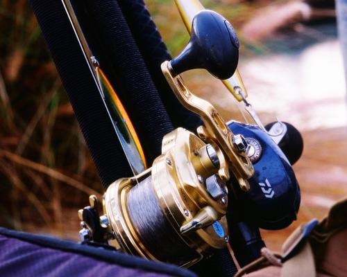
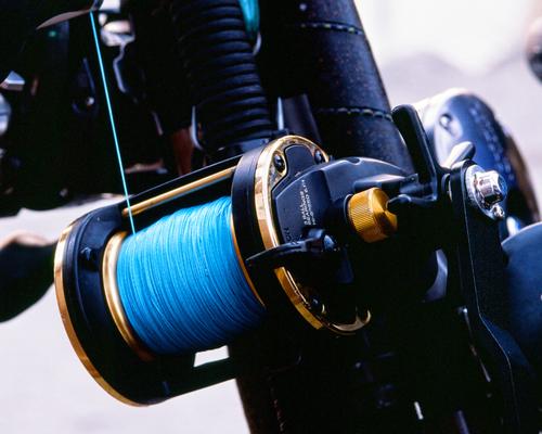
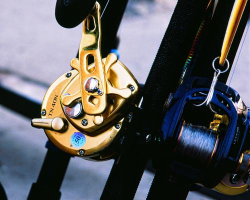
"Hey mister! Can I take some pictures of your fishing gear?"
This post is sort of a continuation of the one from last week. I posted a shot of the Oceanside, CA Harbor Lighthouse at sunset with activity starting to ramp up at the various eateries there.
I was putting a mid-1970s era Nikon EM film SLR through its paces that I had gotten off eBay for $19.
After taking the lighthouse images, I had some dinner. When I left the restaurant it was dark. Walking back toward the parking lot, I passed a group of guys lined up against one of the sea walls, waiting to board a boat in the harbor’s night fishing fleet. Their gear was on the ground, leaning against a low railing. The only light was the last dim glow from the sky and some light spilling out from the harbor shops.
I don’t know anything about fishing gear. But I’m a sucker for shiny equipment of any kind. I asked them if I could photograph their gear. Slightly bemused they all said, “Yeah!”
This was a 50 year old camera I was using for the first time. All I had done was unpack it, put in a fresh battery and a roll of color negative film. My tripod legs were as short as possible, so the tripod was very sturdy. It was dark! I barely could see to focus. I concentrated on the shiniest metal parts visible.
The camera has only aperture priority metering. I set the Nikkor 105 Macro lens to f/8, tripped the shutter and waited each time. The ancient exposure meter dutifully set the shutter speed. Each shot lasted about 20-30 seconds! The first time, I was sure the camera was just sitting there, doing nothing. I heard the shutter open, but it was an act of faith to wait for it to close!
What a great little camera.
The images make a nice grouping on a wall in my office.
Rich
A noble little project. I admire mechanisms where I can follow how the mechanism operates. Cogs and gears and spools and the ingenious ways they are linked can be appreciated whereas I rapidly lose the plot on bigger stuff. No doubt, the blue line was selected by the fisherman because it perfectly complemented the bronze components.
As a series, I like either one or two with three. One and two are a bit close in what they are showing. -
@ChrisOly has written:
End of Summer?
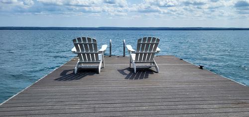
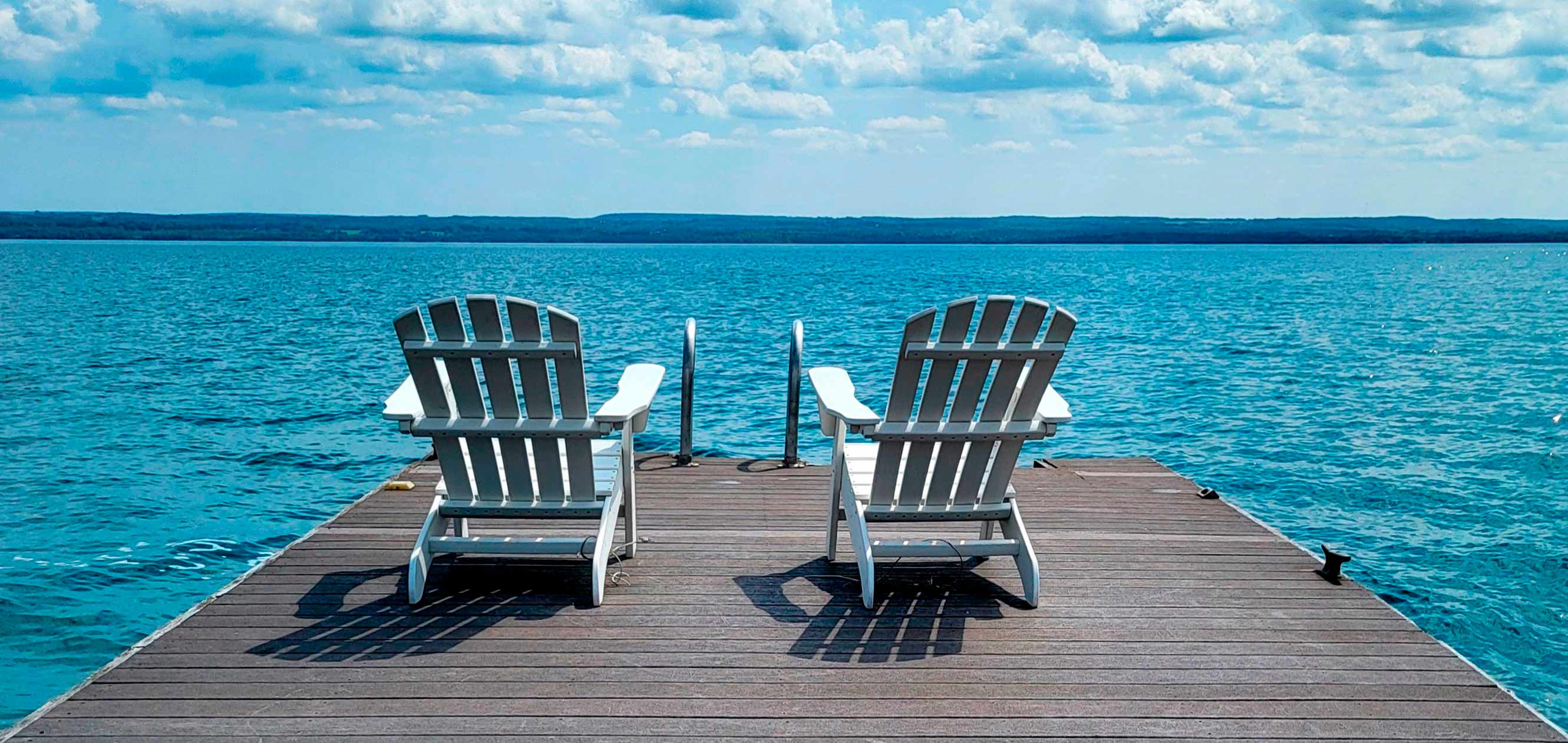
The decking not being parallel to the horizon is a bit off-putting for me.
Straightening the decking and cropping for "balance", this version is easier on the eyes for me. It also cuts out some of the "plasticky" looking water near the bottom left and right corners I mentioned earlier.
Anyway, just some more food for thought.
-
