• Members 153 posts
    Sept. 8, 2024, 7:46 a.m.

    Neither of these images are mine, I found them on the web at pixabay.

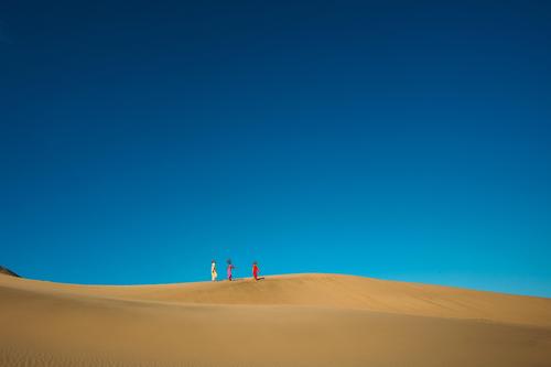
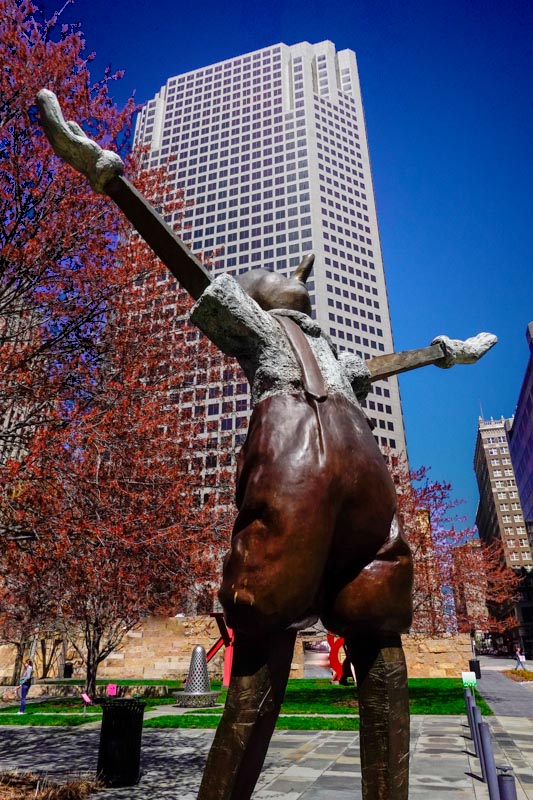
    One of these has a solid blue sky and the other has a blue gradient to black. This would happen naturally if the air is rather dry. But without a polarizer, it gets lost when a photo is taken. Blue sky always gives me a sense of being inside something, where the fading to black makes it seem like you are looking through a ceiling or there isn't one.
    Years ago I experienced a day that was very dry and there was almost no blue sky on a sunny day. I noticed people looked at the ground and didn't want to spend any time outside. So I assume most people get a similar sense when this happens.

    It felt like that when I took the image and I also had a image like the opening of The Hudsucker Proxy where someone arrives to the big city with the 'I have arrived' feelings before reality sets in. The statue is slightly tarnished.

    It just seemed to fit so well. Pinnochio's expectation of adulthood , the push into the west by pensive but determined wagon trains, the hope of youth and the tarnish of reality. Maybe you had to be there because it is an art piece, but I was trying to get that vibe. Beginnings as reality starts to set in. Maybe your edits will have a different vibe because the image can't express the way I saw it and that's fine, I'd still like to see what others make of it. A different way for me to see it.
    I fixed the permissions on the link, it should work now.
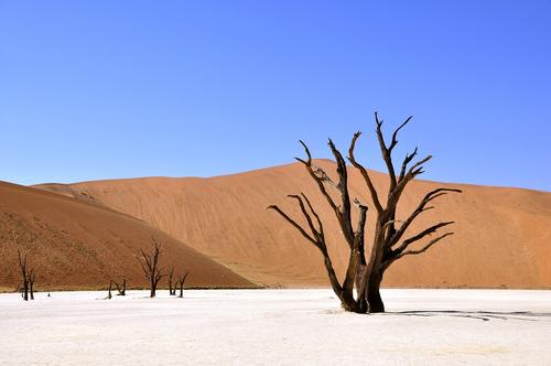
    tree-64310_1280.jpg

    sand-4221565_1280.jpg

    sand-4221565_1280.jpg

    JPG, 75.9 KB, uploaded by JSPhotoHobby on Sept. 8, 2024.

    tree-64310_1280.jpg

    JPG, 240.3 KB, uploaded by JSPhotoHobby on Sept. 8, 2024.

  • Members 3972 posts
    Sept. 8, 2024, 9:25 a.m.

    The second image has a radial colour gradient in the sky.

    If that is the type of sky you are after then you can add a black to transparent gradient layer on top of the image in your editor with Linear Burn blend mode. Apply a mask for the sky to the gradient layer so that the gradient is applied to only the sky.

    This is just a quick and basic edit. The mask for the sky needs a bit of tidying up and the gradient itself can be adjusted to taste.

    Maybe something like this.


    dprevived.com/media/attachments/bd/ad/wMSmxUwasZqkB0QnoTBtUVWBuPbulxCaSmyf8NYd2T67WFf7OReTZwt6GzLs1R6M/pinocchio-v2.jpg

    pinocchio_v2.jpg

    JPG, 160.0 KB, uploaded by DanHasLeftForum on Sept. 8, 2024.

  • Members 1260 posts
    Sept. 8, 2024, 9:35 p.m.

    Very appealing simplicity of this image caught my eye. And the vine with a blue flower following the wire. Excellent.

  • Members 1260 posts
    Sept. 8, 2024, 9:40 p.m.
  • Members 1260 posts
    Sept. 8, 2024, 9:42 p.m.

    That's my fave. I can't put a finger on why, but imho it's the best.

  • Members 1260 posts
    Sept. 8, 2024, 9:44 p.m.

    Just superb in its simplicity.

  • Members 1260 posts
    Sept. 8, 2024, 9:45 p.m.

    Thank you kindly.

  • Members 1260 posts
    Sept. 8, 2024, 10:05 p.m.

    My all time favorite image in photography.
    Barren tree against sand dunes and brilliant sky. Natural art at it's best, hands down.

  • Members 3972 posts
    Sept. 8, 2024, 11:10 p.m.
  • Sept. 9, 2024, 8:01 a.m.

    Contentious posts moved to the Dumpster. If you can't see them and want to, PM me and I'll let you have access.

    Alan

  • Members 153 posts
    Sept. 9, 2024, 6:18 p.m.

    Yup, that is the sky I was looking for. I gotta learn to edit or start carrying a polarizer around with me. Or both. I think it adds to it, do you think it makes a difference?

  • Members 153 posts
    Sept. 9, 2024, 6:31 p.m.

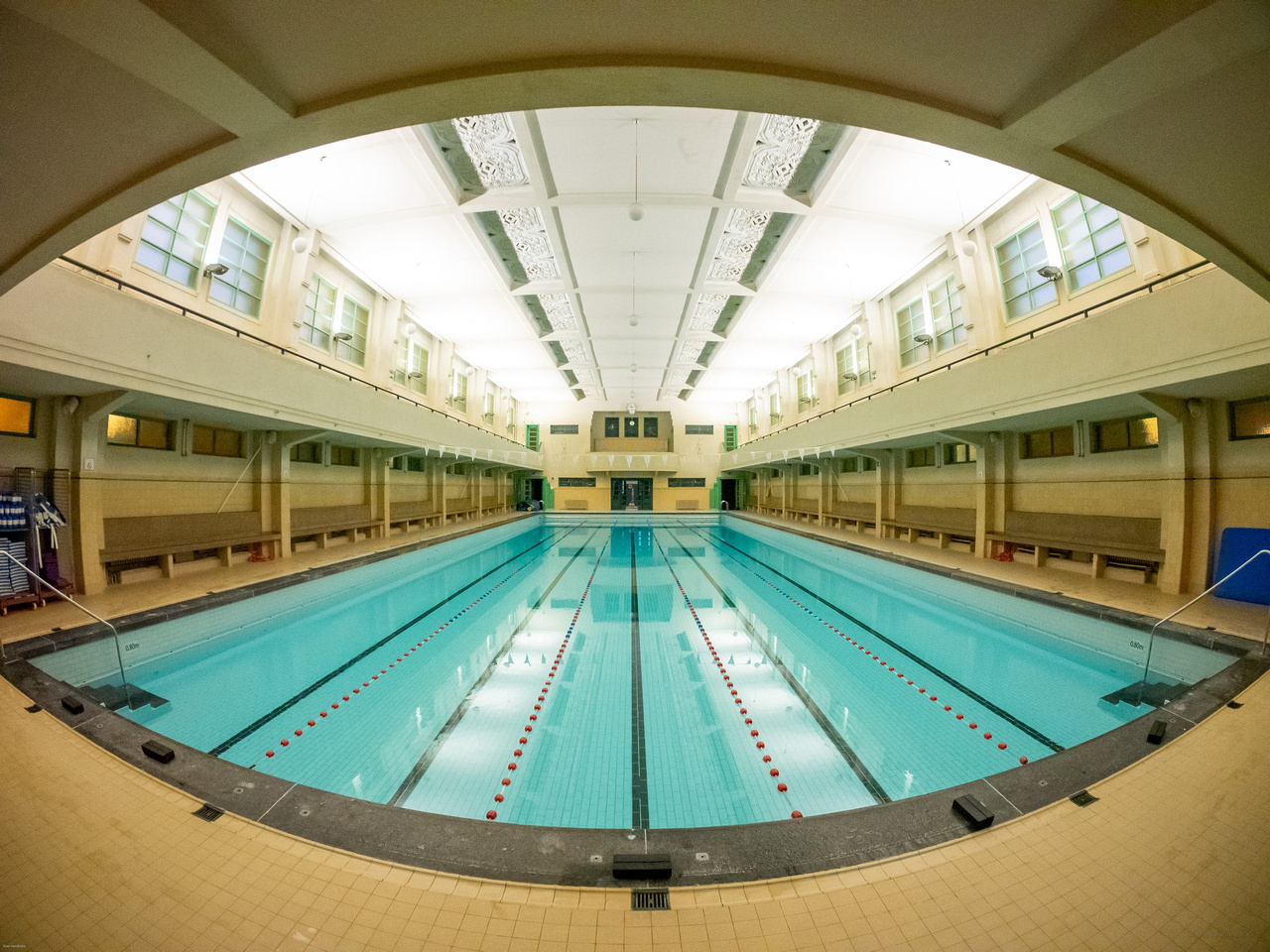
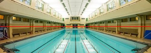
    Is it me or is it slightly not parallel with the horizon?

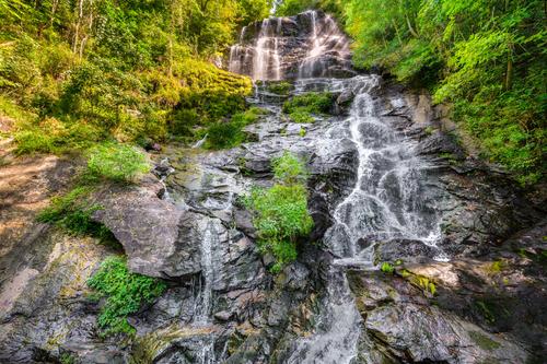
    I like the shape of the frame, similar to the shape of a human's eyesight. The vanishing lines make it look super long. I get a feeling of looking down something, like a ski slope. If I just lean forward a little, I can jump in or fall in.

  • Members 153 posts
    Sept. 9, 2024, 6:41 p.m.

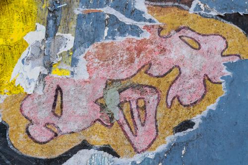
    I went to full size on my monitor and I like the image this way. There is a lot of fine detail in the stem, buds and texture of the wall to trace along with. Maybe a greater depth of field, blown up you can see the closest buds are out of focus and the stem in focus, but the buds are more toward the viewer and on a rule of thirds line so it feels like I get lost trying to move around the image. But this is only relevant to the way I'm viewing it.

  • Members 422 posts
    Sept. 9, 2024, 7:03 p.m.

    Hard to tell, depending on what is meant by "it".

    p334652194-6 ted ed.jpg

    p334652194-6 ted ed.jpg

    JPG, 454.5 KB, uploaded by xpatUSA on Sept. 9, 2024.

  • Members 3972 posts
    Sept. 9, 2024, 9:16 p.m.

    Imo a darker blue sky here helps to highlight the building in the background a little more than a lighter blue sky which in turn helps to tell a potential story of the "pinocchios" the office building might be housing.

  • Members 3972 posts
    Sept. 9, 2024, 9:59 p.m.

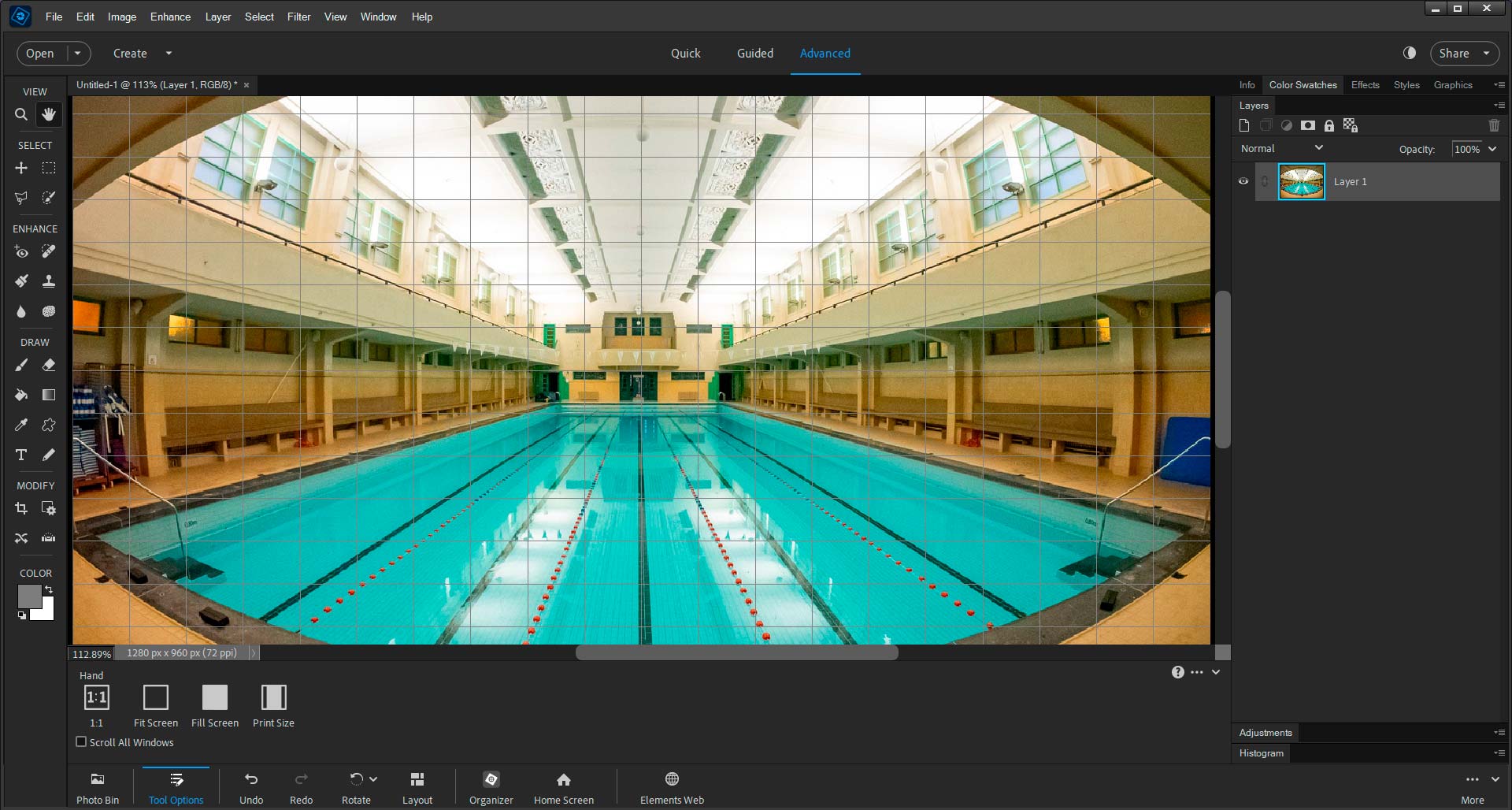
    It could be an optical illusion due to the fish-eye lens.

    The overlaid grid shows the image is pretty much dead level.


    dprevived.com/media/attachments/92/36/Y8ILRYRZCS7AjHczHkcDSiplaQq8gJ0Fv0qNVL4sAadtknV17oLj8SSHkKSLDGGv/screenshot.jpg

    screenshot.jpg

    JPG, 222.8 KB, uploaded by DanHasLeftForum on Sept. 9, 2024.