I think you are right, it is an illusion.
-
-
@JSPhotoHobby has written:@Rich42 has written:
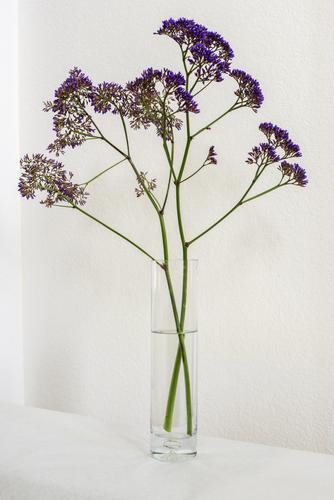
My wife was trimming Sea Lavender in our yard. She came in the kitchen and plunked these trimmings in the bud vase. She started washing her hands, saying she was going to trim and re-arrange them.
"Don't touch them!," I said.
I put the vase in a shallow wall alcove and photographed it with available light coming down the hallway.
Rich
I went to full size on my monitor and I like the image this way. There is a lot of fine detail in the stem, buds and texture of the wall to trace along with. Maybe a greater depth of field, blown up you can see the closest buds are out of focus and the stem in focus, but the buds are more toward the viewer and on a rule of thirds line so it feels like I get lost trying to move around the image. But this is only relevant to the way I'm viewing it.
Thanks.
The lens is 50mm at f/8 on full frame. At this distance there just isn't much depth of field.
Rich
-
@Rich42 has written:@JSPhotoHobby has written:@Rich42 has written:
My wife was trimming Sea Lavender in our yard. She came in the kitchen and plunked these trimmings in the bud vase. She started washing her hands, saying she was going to trim and re-arrange them.
"Don't touch them!," I said.
I put the vase in a shallow wall alcove and photographed it with available light coming down the hallway.
Rich
I went to full size on my monitor and I like the image this way. There is a lot of fine detail in the stem, buds and texture of the wall to trace along with. Maybe a greater depth of field, blown up you can see the closest buds are out of focus and the stem in focus, but the buds are more toward the viewer and on a rule of thirds line so it feels like I get lost trying to move around the image. But this is only relevant to the way I'm viewing it.
Thanks.
The lens is 50mm at f/8 on full frame. At this distance there just isn't much depth of field.
Rich
Assuming a focus distance of 2m, the DOF on full frame at f/8, 50mm is ~77cm.
With 1m focus distance DOF is ~18cm.
-
@ChrisOly has written:@Rich42 has written:
Sea Lavender
Rich
Just superb in its simplicity.
I agree with Chris‘s comments, which apply to the photo and the arrangement, so full marks for seeing the potential and recognising where you wanted to photograph it, with those white walls giving a beautiful and appropriate soft light.
I like the transition of colour caused by seeing the reverse of the flowers, with more stem than petals as well as the front of the flowers themselves.
The corners of the wall, although faint, do not cross the subject. On the left, it just touches the flower, and the line, where the wall meets the shelf, is exactly in line with the bottom of the stems - a nice touch, which may seem unimportant, but is another little detail towards the overall aesthetics of the image.
The only negative is the small unsharp area of the nearest part of the flower, as mentioned by Dan. I don’t see this as a huge issue, as the overall effect of the photo is still excellent, but still, the sharpness would be better placed there than at the rear. -
@RoelHendrickx has written:
VELDSTRAAT SWIMMING POOL
I shot new images for an upcoming update of the book "500 Hidden Secrets Antwerp".
One of the newly featured locations is a renovated Public Swimming Pool in the Veldstraat.The pool dates from the early 20th Century and is a nice example of functional art deco style (not TOO many ornaments but done tastefully).
This image is an outtake that will not be included in the book.
For the book, more "objective" and less arty images are preferred.It is very rare that a fisheye image gets selected by the publisher.
In this case, other, more classic images of the pool and some of the decorations were chosen.
I still like it though.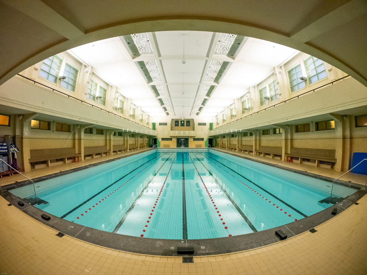
EXIF is incomplete because the Rokinon 7.5mm fisheye is a manual lens that does not communicate with the camera.
Aperture was probably close to wide open. Shutter speed was just good enough for hand-holding.One of your trade-mark fish-eye shots, this has made a really attractive image of an interesting building. Actually, the whole image looks like an eye itself.
The rich creams and pale blues go well together, and the high-key gives it an airy feel.
The lines lead straight to the centre, and, even though there is no real centre of attention, or maybe because of that, helps draw attention to the whole interior rather than any particular feature.
I can see why architects may not appreciate the image, but luckily I am not an architect! -
@DanHasLeftForum has written:
GOD'S RAYS
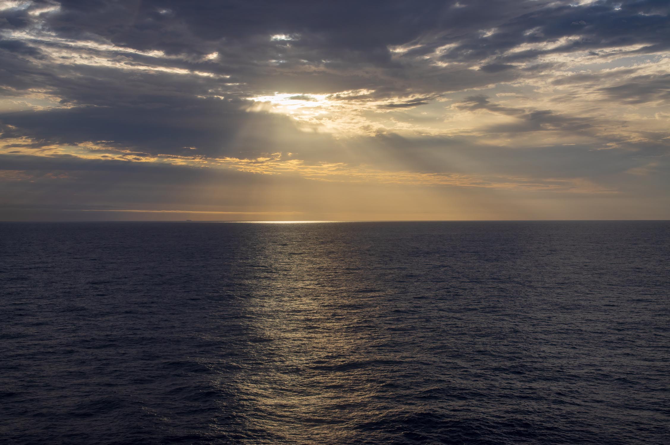
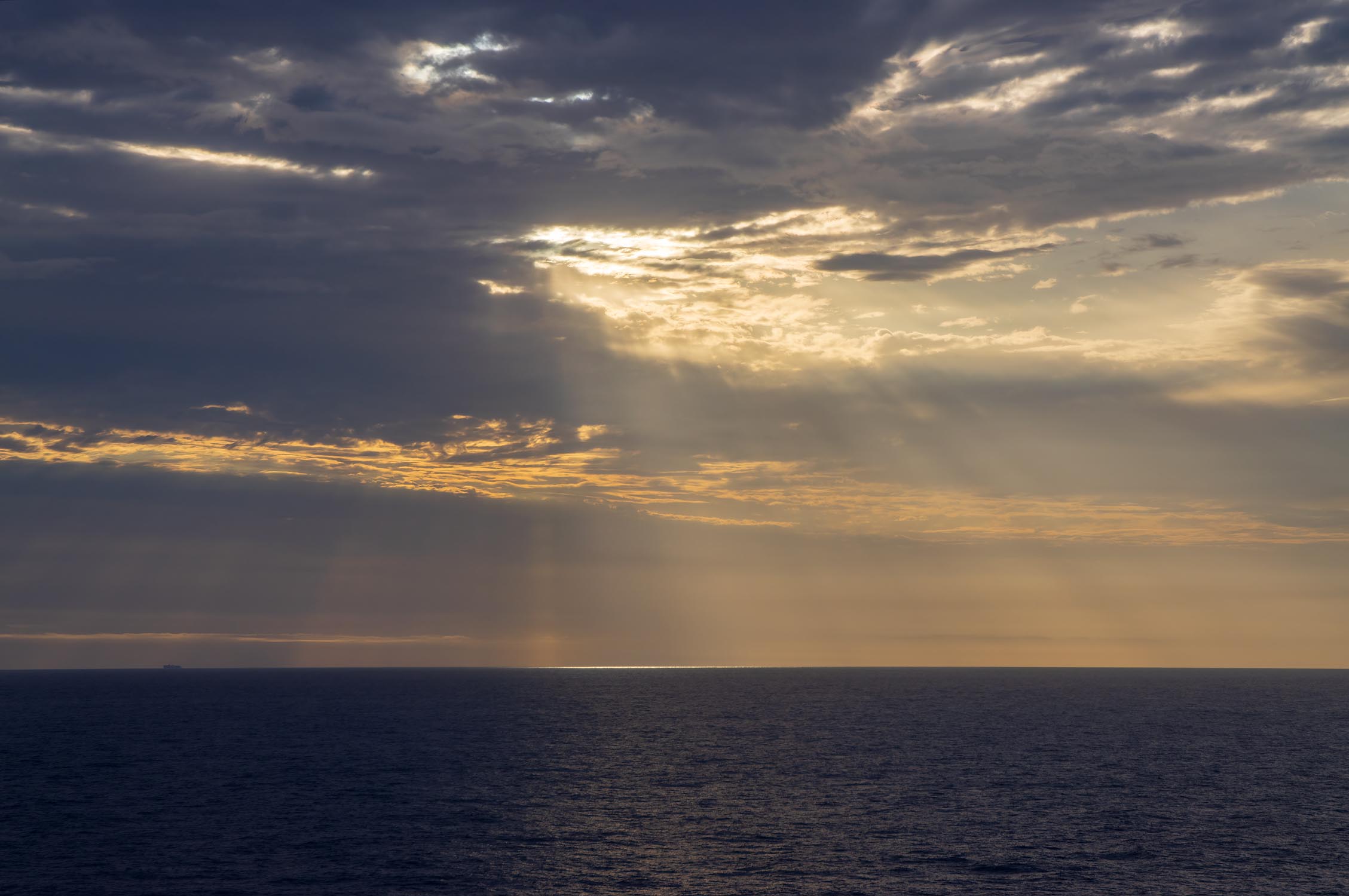
The rays are the centre of attention in these two, and are more prominent in the second photo. However, you are right, I do prefer the first photo, thanks to the light reflecting on the ripples of the sea. I think they lead in nicely towards that impressive sky, and makes the sea a worthy subject in its own right, even if it remains secondary to the main subject of rays and sky.
It is very easy to over process shots like this, as I am noticing with some similar shots of my own at the moment, but resisting the temptation to outdo nature is usually the best, as these images prove. -
@MikePDX has written:
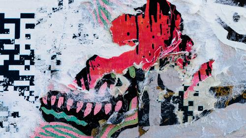
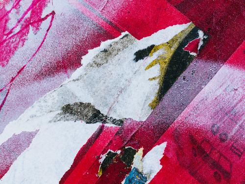
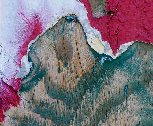
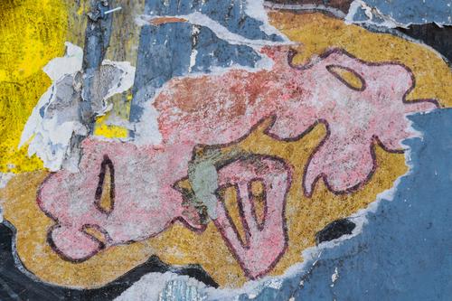
Abstract Distractions 2 - Revenge of the Graffiti.
Another set of abstract photos. This time it's is closeup details of multilayered graffiti. I was trying out my new 90mm macro lens while looking for things that caught my eye. Not sure if these are quite as successful as the water abstracts from last week.
Mike, I like these very much. I too am drawn to torn posters, but usually try to find juxtapositions between their remnants, so I enjoy your different, more macro and abstract treatments. In addition to the more obvious ingredients of shape and colour, this approach makes a feature of the differences in texture, which is something I never considered before when photographing them.
As to trying these as a refreshing break from your (excellent) wildlife photos, I think it injects enthusiasm back into the hobby and will even help your wildlife photography. Actually I am doing something similar, but in the other direction, and started photographing birds during lockdown, and have continued to do so. -
@minniev has written:
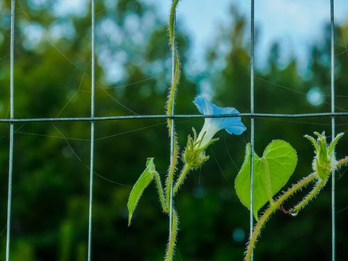
Imprisoned
Much of nothing, the usual fare for a morning walk at the country house, bindweed and spiderwebs on the garden fence
This is simple, graphic and well spotted. The fine detail of the web and the hairs on the stems is very nice.
It has a bit of a green cast, which may be deliberate and even beneficial.
It is also thought provoking. The fence initially seems to be imprisoning the bindweed, but then webs do their own imprisoning. Finally, it dawns on me that bindweed imprisons other plants and objects too, thus proving the old wisdom that just because it is pretty, it is not necessarily innocent! -
@Sagittarius has written:
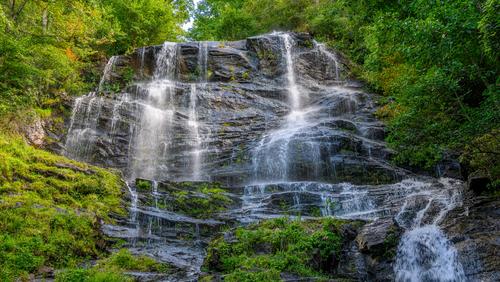
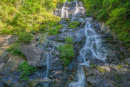
Top potion of the Amicolola Falls. To get close one has to go a quarter of a mile on steep uphill trail and than 175 steps up.
More of the waterfall
The photos we’re definitely worth the effort, especially the first. The second is mainly in shadow, so it’s lack of contrast compared to the first is disadvantageous. But it is not just that, the more extensive branches of rivulets in the first just make for a more attractive subject.
-
@PeteS has written:@ChrisOly has written:@Rich42 has written:
Sea Lavender
Rich
Just superb in its simplicity.
I agree with Chris‘s comments, which apply to the photo and the arrangement, so full marks for seeing the potential and recognising where you wanted to photograph it, with those white walls giving a beautiful and appropriate soft light.
I like the transition of colour caused by seeing the reverse of the flowers, with more stem than petals as well as the front of the flowers themselves.
The corners of the wall, although faint, do not cross the subject. On the left, it just touches the flower, and the line, where the wall meets the shelf, is exactly in line with the bottom of the stems - a nice touch, which may seem unimportant, but is another little detail towards the overall aesthetics of the image.
The only negative is the small unsharp area of the nearest part of the flower, as mentioned by Dan. I don’t see this as a huge issue, as the overall effect of the photo is still excellent, but still, the sharpness would be better placed there than at the rear.Thanks Pete,
I was focused slightly under 3 ft. Standard DOF calculations give about 6 inches as the DOF at that distance for f/8. But DOF scales and calculators are all over the place as far as the assumed "Circle of Confusion" for the calculation. They all assume numbers common from the film era and are much too generous. We all demand a much smaller number from digital images than is usually "built in" to the "math."
In any case, as can be seen, there was no way I could get all of the branches and blooms in focus well enough for the sharp eyes on this forum!
It's the form of the arrangement that caught my attention. It was just an instant of happenstance.
😉
Rich
-
@RoelHendrickx has written:@JSPhotoHobby has written:
Pinocchio
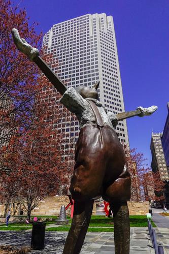
The statue of Pinocchio in its own right is interesting.
But your angle and how that includes that specific background, is for me what elevates the image from "just a shot of a statue" to an image filled with possibilities of interpretation.
The background building is not exactly known to me, but it is the kind of building that one probably associates with big business or high finance or maybe government. Combining any one of those interpretations with the image of a perennial liar who seems to even relish his status as a liar, infuses the image with meaning.
Coincidentally, I also like how the red-leafed tree nicely fills the area under Pinocchio's right arm, almost as if he is leaning down into it, while the other tree further behind him, almost gets a continuation in the reflection on his pants. It is a very odd effect, but I helps bringing harmony to the image.
The low angle you chose really makes this photo. It emphasises Pinocchio‘s outstretched arms, as he seems to embrace the sky.
I also like the possible interpretations, as pointed out by Roel, making the photo even more enjoyable.
The red tinge to the sky could by removed, as demonstrated by Dan, if you wished. -
@minniev has written:@ChrisOly has written:
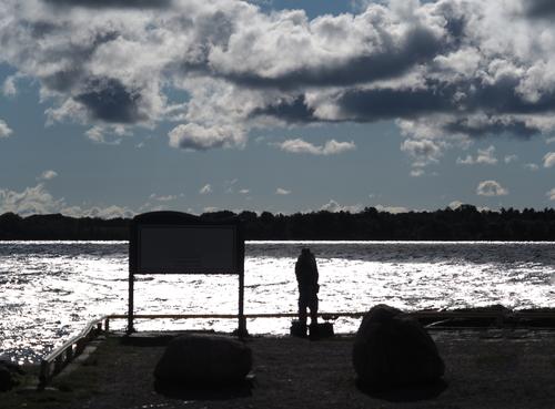
Early cast off
I see this as a semi abstract silhouette image, and as such it is much like those drawings where you see either a young woman or an old withered crone depending on how you interpret it. My own first impression was of an embracing couple, and now I can't get that out of my head. A bulked up fisherman is visible only after looking twice again, and an enlargement of the download version didn't help get me there, only the title did that. So it has become hard for me to assess the fisherman picture because I'm attending to the romantic couple. But in truth, an image with some ambiguity is, for me, a successful image. The lines and shapes and light provide setting and context, but the story is in the figure(s).
Either story, I think I would tend to remove all color since most has left already.
Whether
I read Minnie‘s reply and now I cannot unsee the lovers‘ embrace! But it doesn’t matter, as I also agree with her that ambiguity is a good thing.
-
@minniev has written:@Bryan has written:
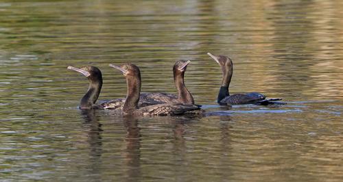
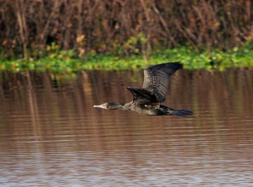
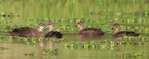
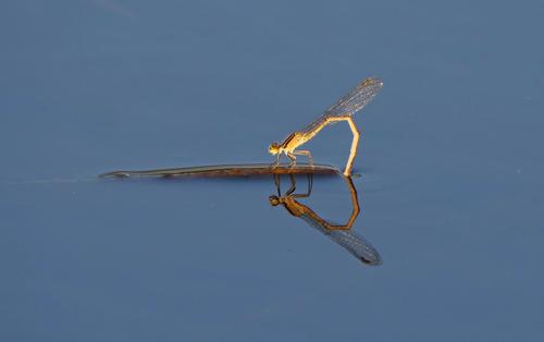
Life at the Lagoon
Cormorants
Ducks
Damselfy
Dog
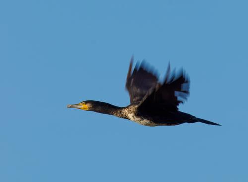
Nice set, held together by their shared location. They are all winners. The birds, both in flight and sailing, are caught nicely. The cormorants are in my favorite cormorant pose, beaks up and showing their lovely turquoise eyes. See Pete's cormorant for my notes on why our local cormorants are sometimes called Katrina Birds.
Your damselfly is as well caught as your dragons and the reflection makes it doubly engaging, as its rear meets the reflection of itself to form a sideways heart shape.
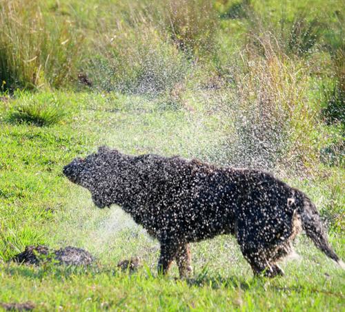
The dog shaking off the water after a swim made me smile. Makes me feel I should step back to keep from getting soaked.
Something about the reflection in the one of the flying cormorant worries my eye, and I wonder if you tried to correct for the grassy growth along the edge, but had to tilt it in the process? If so, I don't know which is more worrisome, a tilted grassy growth or tilted trees in the reflection. I can't see a way to easily correct both. You will have to decide. Perhaps you already fought that battle and decided on this version.
Again, I have to agree with what Minnie wrote, except the cormorant. The sloping lines behind the bird, whether caused by rolling shutter or not, do not bother me. I accept them as indications of movement without too much analysis. That said, Dan‘s final attempt to remove all verticals from the background, leaving just speed-streaks, works very well and highlights the fine detail you have captured in the cormorant.
-
@minniev has written:
Imprisoned
Much of nothing, the usual fare for a morning walk at the country house, bindweed and spiderwebs on the garden fence
@Rich42 has written:Evidence of the ceaseless and inexorable push of life of all kinds, usually un-noticed. Until we stop and look.
Rich
yes. The pictures I take on the farm are usually along this theme. The rise and fall and rebirth of life with time and seasons. I've had to settle for less dramatic subjects than I once required!
@MikePDX has written:Two tenuous shoots reaching for the sun. One seems to have found the way, producing a bloom in the process. The other lost it's way and was sidetracked. Is this an example of Darwinism in it's purest form? Even the spider web adds interest. Nicely seen!
Thanks. Nature demands that everything strive, and that much of it fails. All my photos on the farm are pretty unexciting so I look for the small stuff.
@DanHasLeftForum has written:I like the "grid overlay" caused by the wire mesh.
But I wonder if experimenting with shots from different angles (down low looking up for example) could make a more compelling image through the use of the perspective aspects of the mesh when viewed from different vantage points.
Below is just a basic simulation of what I mean which might give you some ideas to experiment with next time. I can't push the simulation too much because too much of the image would be lost in the crop
I had to smile when I saw your idea and demo! Because that's kind of how the original looked. The fence is about 7 feet, so I had to point upwards, then spent time straightening it out to remove the perspective that you created in post. Maybe I should look again at the originals...
@Bryan has written:A pleasant image with some structure provided by the mesh, but the detail is in the 1:1 view where we see the tiny dew drops on the plant filaments, web and more of the quite pretty flower. I wonder if a crop would bring that detail to the initial view, guaranteeing the viewer would expand for a close up.
I've cropped it a lot already, so afraid to go more, but I agree with you. Will try a different lens to get closer ups.
@ChrisOly has written:Very appealing simplicity of this image caught my eye. And the vine with a blue flower following the wire. Excellent.
Thank you Chris. Simple is what I do at the farm!
@PeteS has written:This is simple, graphic and well spotted. The fine detail of the web and the hairs on the stems is very nice.
It has a bit of a green cast, which may be deliberate and even beneficial.
It is also thought provoking. The fence initially seems to be imprisoning the bindweed, but then webs do their own imprisoning. Finally, it dawns on me that bindweed imprisons other plants and objects too, thus proving the old wisdom that just because it is pretty, it is not necessarily innocent!Thanks Pete. You figured out the puzzle! Bindweed binds stuff up, and gets bound in return. The ongoing battle of nature playing itself out. I do think bindweed is a pretty thing and I look forward to its blooming season. Probably there is a greenish cast, summers here are richly green, and I've let the forest grow up around the farm so everything seems to reflect green. It won't abate for another month. Then it'll be yellow a while before going gray. Sometimes I mitigate the casts and sometimes I don't.
-
@Sagittarius has written:
Top potion of the Amicolola Falls. To get close one has to go a quarter of a mile on steep uphill trail and than 175 steps up.
More of the waterfall
I really like the first. Lots of sharp detail to explore and the exposure allows just enough of a sense of water movement. Waterfalls are mostly in valleys so will often be in shadow. In the second you have balanced sunlight and shadow very well - good shadow management of what would have been a quite dark area. The touch of blown highlights in the sunlit area is not overly apparent in full screen view so I don't mind it at all. Nice captures.
-
@PeteS has written:
Moving Bird
The last three weeks were spent on a family holiday with young grandchildren and no spare time or computer access.I didn't have much timefor photography, except very early. when everyone was still asleep.
The first week was spent on the Baltic coast, near a lake separated from the sea by a smill strip of land. At dawn, dozens of cormorants left the lake one or two at a time, flew out to sea to eat, then returned. This gave me ample opportunity to shoot hundreds of photos of cormorants, many of which looked good enough in camera, and I didn't want to shoot yet more. So I decided to set myself the challenge of shooting with a slow shutter speed to show movement in the wings, but still keep the head sharp. Needless to say this yielded a vast collection of blurry cormorants, some of which looked quite interesting, and a handful more or less as I envisioned. This is my favourite, with the cormorant lit from the front by the low rising sun.Pete
Nicely executed idea. I like the sharp eye and head colours of this cormorant. As you say difficult to do but achieving a high level of wing blur (like we see in humming bird pics) would be an absolute winner.
