• Members 3952 posts
    Sept. 21, 2024, 11:08 p.m.


    dprevived.com/media/attachments/98/9b/1M3NCqaECCIvdRVw5RDSasIQBd9cHRt4kfGqTG0v7XXt54IbQgGKi4VbyrTDRW5W/bamberg-edited.jpg

    Obviously edits like I did are very subjective and open to interpretation by whoever is doing the editing.

    Some will like them and some will not.

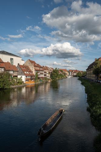
    The bow of the canoe is tied to a mooring and with the canoe's stern pointing towards the bottom of the image the canal's water is flowing away from the point of convergence.

    If the canoe was my subject I would put as much light as practical onto it in post.

    Imo, yes because it makes the canoe stand out more.

    For me, the overall impact an image has on me plays a very large part in what I think of it and how I edit it.

    For some people yes, for some people no.

  • Members 3952 posts
    Sept. 21, 2024, 11:56 p.m.

    Thank you Mike. I can see why he could pop into one's mind 🙂

    I like the "psychedelic symmetry", for want of a better description, the twirling technique creates.

  • Members 3952 posts
    Sept. 22, 2024, 7:23 a.m.

    In that case I would throw any need I might have had for total reality out the window and go with something like this -


    dprevived.com/media/attachments/7e/65/T9Rf1Oqx8Etmf19fcGhQOE1PDoml7g8qRj1iNuvbHrYLsw6U6LXd91FFrnZCLfdE/bamberg-edited-v.jpg

    or this -


    dprevived.com/media/attachments/d2/a7/Dc2EaITWOt8n04c1BxP0ENNOxHAWK1haDiKmIALllCBmVabWdq6LR1P1lJCHyGY0/bamberg-edited-v.jpg

    bamberg_edited_v3.jpg

    JPG, 221.8 KB, uploaded by DanHasLeftForum on Sept. 22, 2024.

    bamberg_edited_v2.jpg

    JPG, 136.8 KB, uploaded by DanHasLeftForum on Sept. 22, 2024.

  • Members 3952 posts
    Sept. 22, 2024, 9:07 a.m.

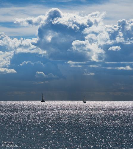
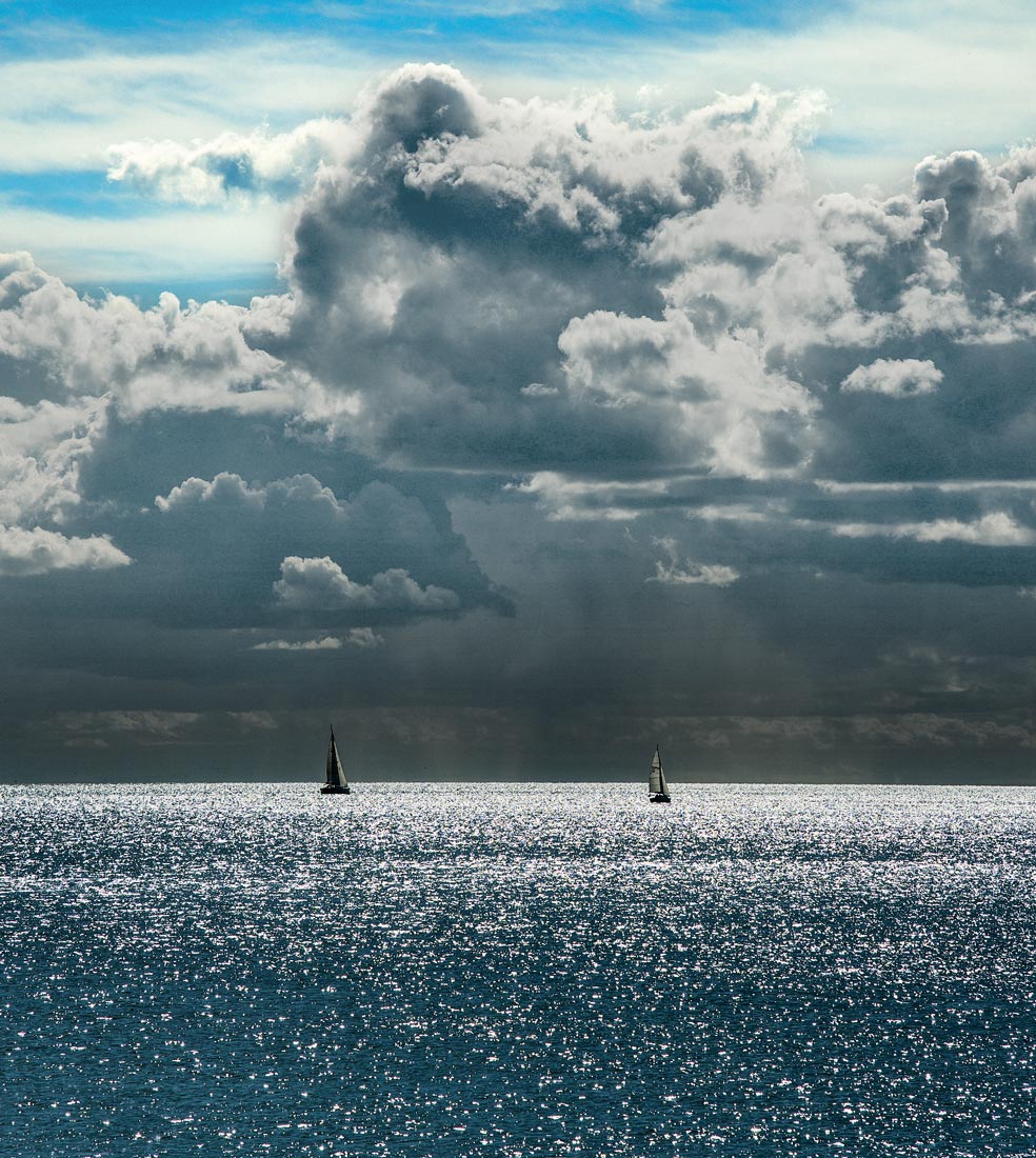
    I love specular highlights on water Trevor and so this one would have easily been my favourite if not for the blue-ish cast in the clouds and the red-ish cast in the water.

    This version looks much better on my screen in terms of colours


    dprevived.com/media/attachments/5b/9f/sjWxOevpVHccIhGLc81OI1zGOaHc6b2PvyA8yguLCbnVX4t1BbO0PbBxhknvlxP2/dsc-6528-smaller.jpg

    dsc-6528-smaller_edited.jpg

    JPG, 258.6 KB, uploaded by DanHasLeftForum on Sept. 22, 2024.

  • Sept. 22, 2024, 11:41 a.m.

    Hmm, this is the first time, when I have to ask - [how] is your monitor calibrated?
    I can understand cloud colors (and appreciate bringing clouds out), but open sky is kinda bright turqouise - and this doesn't look right to me. Sure I have not seen the real scene.

  • Members 3952 posts
    Sept. 22, 2024, 11:50 a.m.

    What brightness is your screen calibrated to and how is your screen profiled?

    Do you have color management enabled in your browser?

    In any case, if the colours don't look right on your or Trevor's screen, just adjust them yourself to what does look right on your screen if you think the suggested quick edit is an improvement.

    I have posted several times in other threads that suggested edits are not necessarily final images for me. For final images I would need to start from the raw file.

  • Members 1415 posts
    Sept. 22, 2024, 12:52 p.m.

    I presume these are more of your not final edits or you didn't read the rest of the paragraph when you quoted me out of context. Or both.

  • Members 3952 posts
    Sept. 22, 2024, 1:05 p.m.

    I didn’t quote you out of context because the rest of your post did not influence my suggested edits at all.

    I did read your opinions but your opinions do not influence how I edit images.

    You stated that for you the canoe is the subject and so I posted some of the things I would consider if the canoe was my subject.

    I posted earlier that if the canoe was my subject I would put as much light as practical on it in post.

  • Members 1085 posts
    Sept. 22, 2024, 1:09 p.m.

    Yes using masks is going to take a whole lot of extra work to get things right.

    Thanks for the explanations.

    I went back and had a play. I was able to raise contrast to 100% without it looking too contrived. It was a bit darker so I also had a play with the levels curve. Just a small push up mid curve did the trick - where highlights and shadows hadn't...

  • Members 3952 posts
    Sept. 22, 2024, 1:13 p.m.

    Yes that is correct.

    I don’t see any value for me to spend a large amount of time editing other people's jpegs, especially when the creators of the originals might not even like them.

    I post suggested edits as food for thought without them necessarily being final images.

  • Members 3952 posts
    Sept. 23, 2024, 1:20 p.m.

    Very nice set minniev 😊. I know you like your images with a little less "punch" than I do.

  • Members 3952 posts
    Sept. 23, 2024, 1:27 p.m.

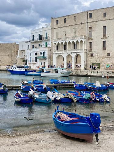
    Interesting scene but I'm not sure what to make of it in terms of any message/story it could tell. Maybe the building has some significance but I suspect a more compelling image might be possible by making the image more about the boats.

    Perhaps a crop something like this could have more impact?

    As always, just some food for thought.


    dprevived.com/media/attachments/56/b2/maIjZEatGQPYzhT5DgpT3pJWVAYbZulYjmFPnlO5oKM6JjmZx3di1vvFY11Gyl5V/boats.jpg

    boats.jpg

    JPG, 465.6 KB, uploaded by DanHasLeftForum on Sept. 23, 2024.

  • Members 187 posts
    Sept. 24, 2024, 9:09 a.m.

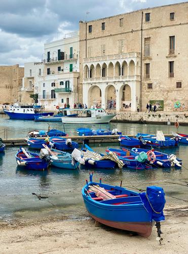
    Colour separation/WB? I do agree with the blue in the boats, but overall the image appears too blue like a global change. Shouldn't the sandstone be slightly warmer? Has a little more life if it is:

    mon-1.jpg

    mon-1.jpg

    JPG, 3.5 MB, uploaded by Andrew546 on Sept. 24, 2024.

  • Members 3952 posts
    Sept. 24, 2024, 9:48 a.m.

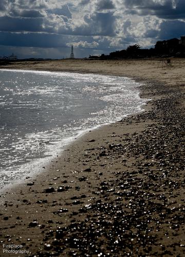
    This is a nice scene with the dramatic clouds but the foreground and shadows are way too dark for me.

    This version works better for me on my screen.

    dprevived.com/media/attachments/4a/91/wCC0eHwphgaQw1TZFCbYh8CoceWc6MomBWyjMNWbLNQneZ4qkvuf6BTaAF5PqZZV/beach-edited.jpg

    beach_edited.jpg

    JPG, 286.4 KB, uploaded by DanHasLeftForum on Sept. 24, 2024.

  • Members 1578 posts
    Sept. 24, 2024, 3:53 p.m.

    A wonderfully composed and captured image of a really beautiful scene. I do think I'd probably brighten the darks in the lower third a bit to get more detail in the canoe and the shore and ease some of the digital-capture look in that lower 1/3 area because capture has darkened the shadows and muddied the colors there. I've looked at Dan's various edits and think that while they do bring out the shadowed area more (similar to an HDR), they go too far for me into the unrealistic spectrum (greens in deep shadow are not that fiercely green). Something in between would be a nice compromise. In some such cases, I have created two versions on layers, similar to yours and Dan's, overlaid them, and tinkered with opacity and masks to get a pleasing balance.

    The human eye does not see as a camera does. When seeking a realistic image, which seems to be your goal, it is often a challenge to get a semblance of what we saw as opposed to what the camera saw and saved for us.

  • Members 3952 posts
    Sept. 24, 2024, 4:20 p.m.

    The greens look realistic on my screen.

    Feel free to adjust them to what looks better on your screen.


    dprevived.com/media/attachments/d2/a7/Dc2EaITWOt8n04c1BxP0ENNOxHAWK1haDiKmIALllCBmVabWdq6LR1P1lJCHyGY0/bamberg-edited-v.jpg