• Members 1585 posts
    Sept. 26, 2024, 1:51 p.m.

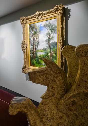
    These are breathtakingly beautiful, the first as a travel type photo and the second as a fine art image that would be equally at home framed on the wall or printed on a Hallmark card.Same location, different concepts. Same beauty. They have a Life Of Pi feel to them that's hypnotic. Superb work with a beautiful scene.

    The second is another example this week of the subject being correctly and effectively located in dead center.
  • Members 874 posts
    Sept. 26, 2024, 6:50 p.m.

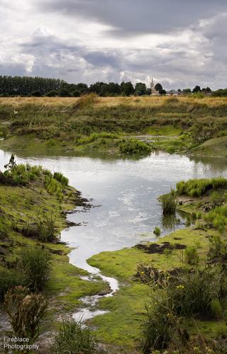
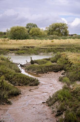
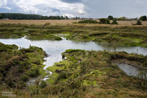
    I'm a little late for the party this week, but here are a few shots from a recent trip back to England with a short walk along the sea wall at Wakering near Southend-on-Sea.
    It's a muddy estuary creek with all the typical fauna and flora and the familiar sounds and smells that go with it.

    DSC_6437 smaller.JPG

    DSC_6457 smaller.JPG

    and a little closer with Wakering church in the background
    DSC_6461 - Copy smaller3.JPG

    Please do not edit these photos.

    DSC_6461 - Copy smaller3.JPG

    JPG, 4.6 MB, uploaded by Fireplace33 on Sept. 26, 2024.

    DSC_6457 smaller.JPG

    JPG, 4.2 MB, uploaded by Fireplace33 on Sept. 26, 2024.

    DSC_6437 smaller.JPG

    JPG, 4.0 MB, uploaded by Fireplace33 on Sept. 26, 2024.

  • Members 874 posts
    Sept. 26, 2024, 7:01 p.m.

    A nicely framed view of the red huts with the realistic blue mountains behind. If you were to remove that blue you'd reduce the depth in the image.
    Artists will often deliberately add blue to the background to add depth to their paintings.

  • Members 874 posts
    Sept. 26, 2024, 7:03 p.m.

    Beautiful images, great reflections in the shallow water and those lovely colours

  • Members 353 posts
    Sept. 26, 2024, 7:38 p.m.

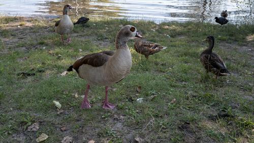
    Egyptian Goose

    L1000866.jpg

    L1000866.jpg

    JPG, 6.7 MB, uploaded by Kumsal on Sept. 26, 2024.

  • Members 1585 posts
    Sept. 26, 2024, 8:11 p.m.

    Nice trio of calm, soothing photos with a subtle brand of beauty. I like how you've framed the winding rivulets of water at the bottoms of the images, leading into the larger pool of water. These are such small features that without careful framing, they could be missed, but they are key to the beauty of the images and they provide such a good anchor for the composition. You could have chosen to ramp up the drama with editing, but I think they are best served as you've presented them.

    The second one gives the impression of falling rightwards downstream though I think it may be a false impression. Sometimes I fiddle with such pictures to mitigate the sensations and see if it improves things or not.

  • Members 1585 posts
    Sept. 26, 2024, 8:13 p.m.

    Nice documentary photo of a kind of geese we don't see here. Striking eye the nearest one has. Obviously the geese feel at home in the area, since they have decorated it with plentiful goose poop and feathers.

  • Members 3973 posts
    Sept. 26, 2024, 8:27 p.m.

    Adding contrast adds depth to a scene. The bluish cast tends to flatten the depth of the mountain.

  • Members 353 posts
    Sept. 26, 2024, 8:33 p.m.

    I can't get enough of photos like these.
    Please, more of them...

  • Members 3973 posts
    Sept. 26, 2024, 8:51 p.m.

    I'm not so sure.

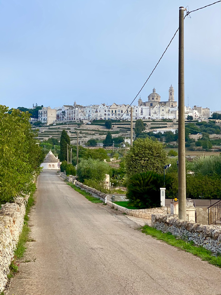
    The pole covering the greenery in the foreground and part of the building in the background takes the viewer's eyes away from the road leading into the scene.

    For the viewer, the pole acts as a distracting eye-magnet and leading line near the right edge of the image.

  • Members 689 posts
    Sept. 26, 2024, 9:22 p.m.

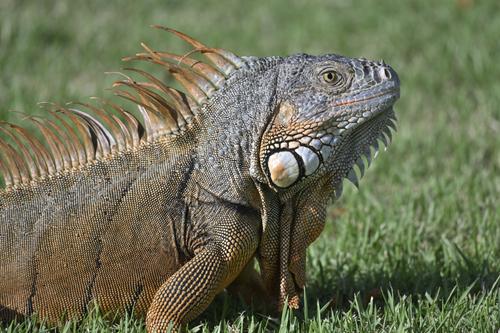
    Am I pretty or what!?
    _Z8N2322.JPG

    PLEASE DO NOT EDIT THIS IMAGE

    _Z8N2322.JPG

    JPG, 5.0 MB, uploaded by Sagittarius on Sept. 26, 2024.

  • Members 1416 posts
    Sept. 26, 2024, 11:23 p.m.

    Not necessarily. It depends on your camera and how you have set it up. You will have choices over things like Aperture priority, shutter priority and Program modes. Within these you can (probably, I'm not familiar with your camera) set limits on variables such as iso, the camera chooses. For most landscape photos generally Aperture priority is selected and the user chooses the aperture that will give the depth of field they want in the image to ensure the areas they want sharp are sharp. If you had closed down the aperture a couple of stops you would have had wider dof and still have had easily enough shutter speed to freeze the waves, assuming that freezing the waves was also what you wanted.
    From your title, here, you were chasing all the highlights of the whites of the waves and the patterns they made. You caught that by having a lot of contrast. If you cropped out most of the sky I think it it would help in clarifying that the pattern of the sea highlights is the subject.

  • Members 1416 posts
    Sept. 26, 2024, 11:33 p.m.

    Everything that minniev has said.
    Quite sublime. A masterclass in the use of muted colour and dynamic range.

  • Members 3973 posts
    Sept. 26, 2024, 11:36 p.m.

    Chris is clearly referring to Av mode and so his understanding is totally correct when iso is set to Auto.

    If iso is set manually then only the shutter speed is set by the camera.

  • Members 1416 posts
    Sept. 27, 2024, 12:01 a.m.

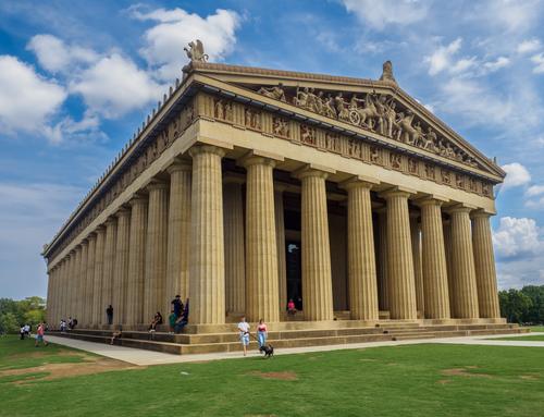
    The building first. Amazing. I didn't know that such a thing existed. Between friends in the museum business and Greek friends, I get caught up sometimes in the crossfire around the Elgin marbles. How do USA citizens of Greek background feel about the Nashville version?
    The images selected cover the territory. Photo one gives the scale and proportions. I prefer doric columns and your angle makes the most of them along both sides. It also gets the frieze in detail. To do all that in one image is an achievement. The Parthenon of course is famed for its use of proportion.
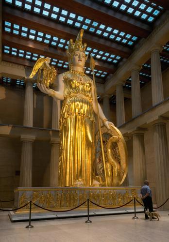
    The Athena statue is a surprise. I knew of the historical record. The richness of the statue contrasts starkly with the doric lines of the pillars. minniev's photo brings this home.
    Finally, the present use of the building with a replay of the use of gold to link the series.

  • Members 1416 posts
    Sept. 27, 2024, 12:29 a.m.

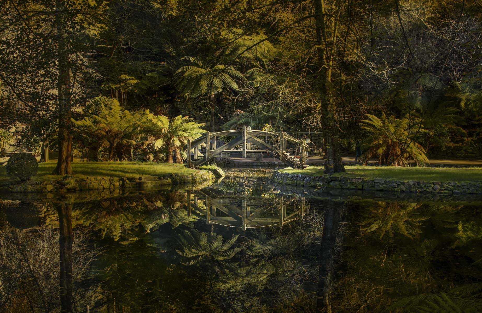
    It's a beautiful spot and the bridge fits the quiet night mood. I like the composition that makes the most of the symmetry of the large trees, the position of the bridge and the perfection of the reflection.
    Adjusting the lighting to bring out the bridge is fine but it needs to be done with more care. The shadows are all over the place and don't match the lighting suggested by the highlighted areas. The same happens in some of the reflected areas. Check the reflection for example of the large tree on the left. The brightening of the reflection adds to the initial appeal of the shot but eventually it doesn't stack up.

  • Members 3973 posts
    Sept. 27, 2024, 12:35 a.m.

    Thank you Mike.

    If I edit it according to your taste then it will most likely put off those who like it as is.

    With images like this one you obviously can't please everyone.

  • Members 3973 posts
    Sept. 27, 2024, 1:57 a.m.

    That is exactly what I aimed for.

    Below is the original "documentary" version. The bridge blends way too much into the background for me so I wanted to highlight the bridge and draw attention to it and its reflection.


    dprevived.com/media/attachments/05/0f/2nt0rj7iOJz9TZ1FTTI0xV5YYHWmr0DP3tPK7BczKtptUKRcseDapmVoG5LrFiJk/reflection-orig.jpg

    Feel free to tinker with it and repost what would be better for you.

    reflection_orig.jpg

    JPG, 640.3 KB, uploaded by DanHasLeftForum on Sept. 27, 2024.