Very calming images with humans blending with environment.
-
-
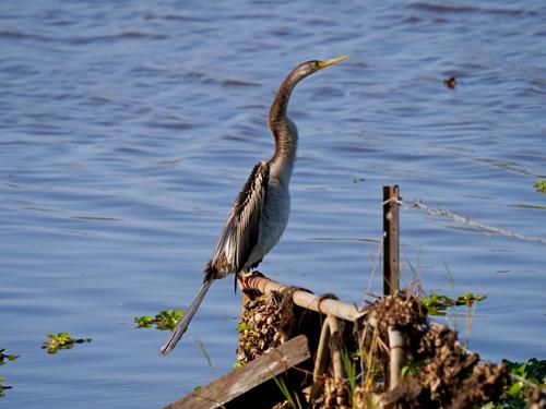
Magnificent showcase of a specimen.
-
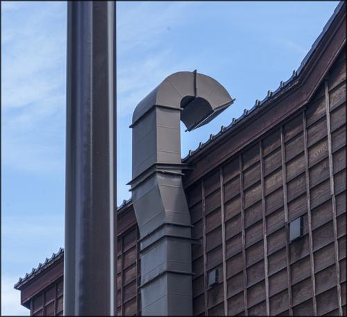
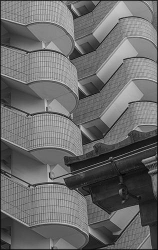
Love both of them for different reasons. That image of wooden structure with metal vents in amazing. And those extremely interesting balconies of what I presume is apartment building are just incredible in their intricate design. Great catch.
-
Dream like shot. Amazing. Well done.
-
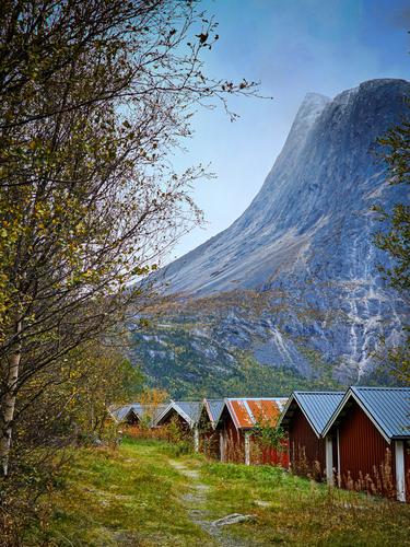
This juxtaposition of huts vs massive mountain is truly winning shot, bluish cast notwithstanding...
-
Yes, that is true if you set Auto ISO.
If you manually set ISO then in aperture priority only the shutter speed is set by the camera.
With that scene I would have set a smaller aperture to get a larger DOF resulting in more of the scene being sharp.
-
@ChrisOly has written:@DanHasLeftForum has written:
Dream like shot. Amazing. Well done.
Thank you 😊
-
@ChrisOly has written:@RoelHendrickx has written:
LOCOROTONDO
Still traveling ...
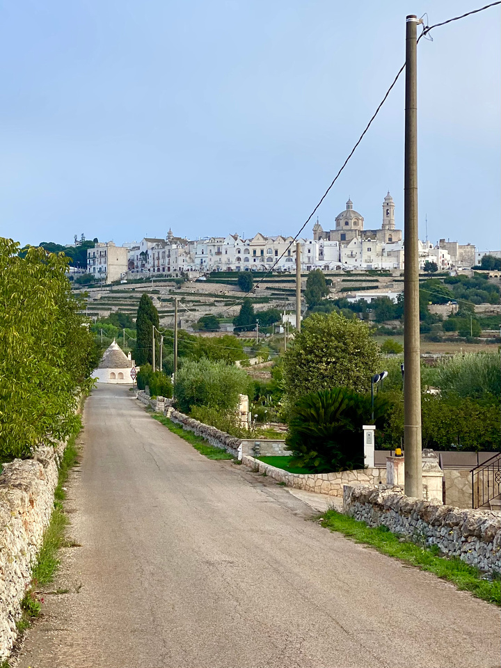
Not sure about that electrical post on rhs( but understand the predicament - you are limited by smartphone capability), but otherwise great Pic. Love the architecture surrounding that village.
FWIW: I could have easily avoided the pole/wires by stepping off the road but its inclusion is deliberate to continue the triangular shapes in a natural frame.
I like that kind of stuff, but realize that tastes may vary.
-
@RoelHendrickx has written:@ChrisOly has written:@RoelHendrickx has written:
LOCOROTONDO
Still traveling ...

Not sure about that electrical post on rhs( but understand the predicament - you are limited by smartphone capability), but otherwise great Pic. Love the architecture surrounding that village.
FWIW: I could have easily avoided the pole/wires by stepping off the road but its inclusion is deliberate to continue the triangular shapes in a natural frame.
I like that kind of stuff, but realize that tastes may vary.
I get why you like the pole and cable (personally I see them as a distraction) but someone's gotta see what it looks like without the pole 😉
-
@ChrisOly has written:
Shimmer
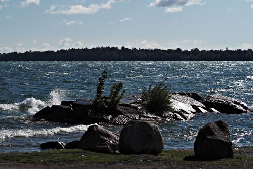
Nice scene but the shadows, especially the foreground, are way too dark for me given the bright sunny day.
This version looks much better on my screen.
Just some food for thought.
-
@RoelHendrickx has written:
LOCOROTONDO
Still traveling and now in Albania (actually on the Macedonian border, on Lake Ohrid, that is mutual to both countries.
I will probably not be able to be as active as usually in this thread (and apologize for the same situation last week).
Both time and internet connection can be scarce.Although Albania proves to be a treasure trove of images, I'll share an (Iphone) image from last week, when we were still in Puglia (IT).
This is a view towards Locorotondo, a small village that is almost perfectly circular on the hilltop.
I took a morning drive around the countryside surrounding the village, in order to find a vantage point that allowed me to include not only the town with it church and belltower on the hill, but also the rural buildings with the triangular roof (trulli) that are typical for the region; and some other elements.

Sometimes poles and wires are distractions. Sometimes they are compositional elements, as they are here. That is why it is so hard to make "rules" about how photography should be done.
The leading line road leads me to a conical roofed structure that defines where this is. Presumably the road extends left or right, and will eventually take me to the white painted city on the hill, clearly an ancient place with plentiful interesting and historical structures. But at the same time, the cone-topped structure is a blockage, an end point. How to keep up the journey? The triangle formed by the wire and pole form a triangular snapshot of the destination, a magnificent domed structure amid the old city. An interestingly constructed image, kind of like a landscape with a small telescoped portion tucked to one side.
-
@JSPhotoHobby has written:
Lovely scene with great colors, and it seems you spotted a wonderful composition with that curving row of huts moving from the right lower corner to the vanishing point on the opposite thirds mark, where it converges with the descending curve from the mountain, sinking in a curve from the upper right edge. The image feels well balanced and the colors are rich without being extreme. Technically, your camera will have captured an image you'll be happier with simply because of the loss of detail/posterization of the sky and parts of the mountain (the tribulations of a phone camera's sensor). Phone captures sometimes won't hold up to the burden of editing and will begin to fall apart much more quickly than a camera capture. You'll have fun with this one when you get home!
-
@DanHasLeftForum has written:
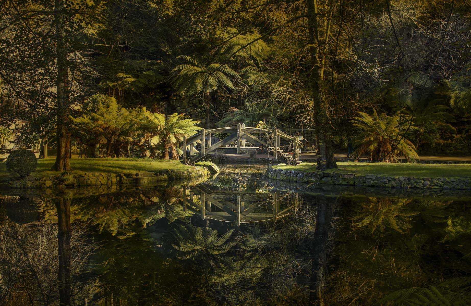
Nicely composed image of a lovely scene (nothing nicer than an arched bridge with a reflection surrounded by natural beauty). There are some who will always fuss about the subject being smack in the center, but I think it works quite well here. There is a visual line to follow, guided by light, and there's the two large trees providing balance, and the shapes of the palms providing counterbalance. I'm liking, at least to a point, the creative processing. But, I would probably mitigate the muddy blobs left and right of center in the upper half by tinkering with the overlay's color and intensity using a mask.
-
@RoelHendrickx has written:
LOCOROTONDO
Still traveling and now in Albania (actually on the Macedonian border, on Lake Ohrid, that is mutual to both countries.
I will probably not be able to be as active as usually in this thread (and apologize for the same situation last week).
Both time and internet connection can be scarce.Although Albania proves to be a treasure trove of images, I'll share an (Iphone) image from last week, when we were still in Puglia (IT).
This is a view towards Locorotondo, a small village that is almost perfectly circular on the hilltop.
I took a morning drive around the countryside surrounding the village, in order to find a vantage point that allowed me to include not only the town with it church and belltower on the hill, but also the rural buildings with the triangular roof (trulli) that are typical for the region; and some other elements.

At first look, the pole and wire seem to spoil the scene. It pays to look more closely. The road takes the eye to the tulli. Now the viewer can appreciate what the pole and wire are doing visually as the triangular shape is repeated. The downward angle of the wire further ensures the connection is made to the tulli.
additionally, there are a number of smaller verticals that echo the vertical of the distant tower on the right. The triangular framing of the far tower helps bring foreground and background together.
It's a clever shot that succeeds with the aims Roel shared with us. -
@MikeFewster has written:
Please don't edit these images.
Interesting architectural images, particularly as a pair, since they are built on the same design motif, a question mark shape. The architecture around the motif is different, and the color use, though if displayed as a pair I do think I'd stick to the same monochrome tones as the second image since it would help connect the two more thoroughly. Both are well composed and well taken technically. More extremity in blacks/whites would make them more striking, especially as a pair, the kind of processing I associate with luminosity masks, which I confess I have never mastered.
-
@ChrisOly has written:
Shimmer
Though the scene itself is interesting, the dark dull colors (no doubt caused by an over bright day fooling your sensor) detract from te interesting elements. A slower shutter would have given you truer colors and more detail in the shadows. Sometimes we have to over-rule some of the settings our cameras choose when we know conditions warrant it. I wonder what the automated HDR feature of your camera would have produced? I sometimes try that when in an overbright situation with lots of specular highlights. I set the camera where it creates the auto HDR jpg but also retains the raw files it created the thing from. That way I have several exposure options from which to pick the best to work with. A lazy woman's way of wrangling a difficult scene...
-
@JSPhotoHobby has written:
A mountain with presence. It dominates the human structures and their own little peaks. The mountain rules and that's what you have captured.
Your colours help. Some touches of orange stand out but they are overwhelmed by the blue.
I reread what I had written. I didn't mean "overwhelmed by the blue" in a negative way. Simply noting that they are dominated by the mountain. -
@Bryan has written:
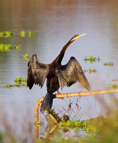
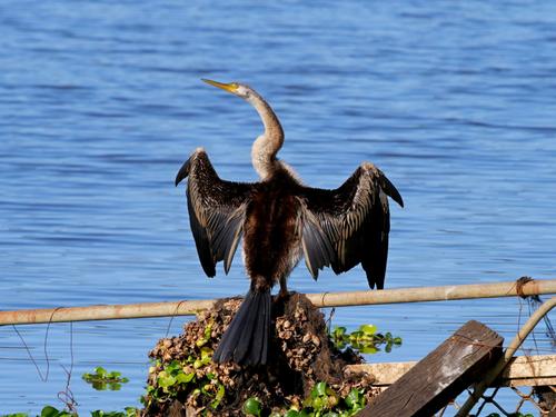
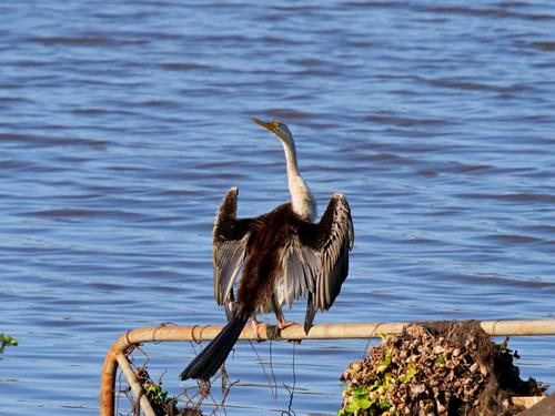
Study of an Australasian Darter (Anhinga Novaehollandiae)
Over the last month or so I have taken many of this bird in flight (because they fly away as soon as they see you). But none were worth showing.
The other day I managed the first shot but that was as close as he let me get. A few days later I was really surprised that I was able to get him basically fully in the frame and in the last had to zoom out!
(Make sure you have a look at his eye in the closeups)Please don't edit these images without asking.
And what an eye that is! More exotic even than a cormorant's eye! Sharp as a pin too, in your captures.
The first is technically less compelling, since it's apparently a tight crop of a larger image, hampered by the greenery Mr. Anhinga was hiding behind. But those others are magnificently detailed and show off his amazing eye, his fascinating wing-drying position, and all his other intriguing details. I love the ratty gate or fence, with all its attached debris. It lends interest and authenticity to the image beyond a biological portrait. Well done.
