Agreed. But what I was getting at is that different cameras may allow different parameters to also be set within the mode. What is available depends on the camera. Perhaps the iso need not be set to either Auto or manual when in Av (or what Sony would call Aperture Priority.) On most Sony for example, limits can be set on the iso and shutter speed speeds that will be auto selected when in various modes. I think Chris might find it useful to explore these possibilities on his camera.
-
-
@MikeFewster has written:
Perhaps the iso need not be set to either Auto or manual when in Av (or what Sony would call Aperture Priority.)
This makes no sense because on every camera I have used iso must be set either manually to a fixed value until set again or to Auto where an upper limit can be set.
Iso cannot be set neither manually or to auto.
@MikeFewster has written:On most Sony for example, limits can be set on the iso and shutter speed speeds that will be auto selected when in various modes.
Most cameras have those features on at least above entry level models.
-
Gents, let's get back to the pictures. You can start a new thread on what it means to set (or not) certain aspects of camera settings.
Alan
-
-
@minniev has written:@MikeFewster has written:
Please don't edit these images.
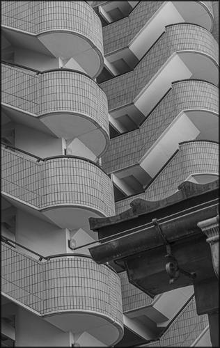
Interesting architectural images, particularly as a pair, since they are built on the same design motif, a question mark shape. The architecture around the motif is different, and the color use, though if displayed as a pair I do think I'd stick to the same monochrome tones as the second image since it would help connect the two more thoroughly. Both are well composed and well taken technically. More extremity in blacks/whites would make them more striking, especially as a pair, the kind of processing I associate with luminosity masks, which I confess I have never mastered.
I was interested in picking up the kind of small roof details that Rich 42 finds over and over. In Kanazawa the traditional Japanese roof lines and guttering sit everywhere alongside the modern lines. The second shot is a bit of an anomaly and doesn't fit with the rest I took around the same theme. The background makes it quite different and it is the only one I moved to B&W. It wasn't the best choice to put these together, I liked them both and this lost track of the pairing. Dan has made the same point about the B&W contrast in the second. I had tried it but didn't like it. I think this is because I took the shot in late evening and remembered it in low light.
-
@Fireplace33 has written:
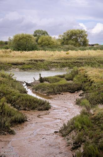
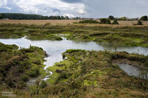
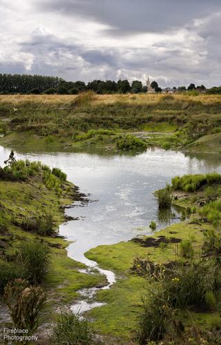
I'm a little late for the party this week, but here are a few shots from a recent trip back to England with a short walk along the sea wall at Wakering near Southend-on-Sea.
It's a muddy estuary creek with all the typical fauna and flora and the familiar sounds and smells that go with it.and a little closer with Wakering church in the background
Please do not edit these photos.
Number three gets my "looks best" vote but saying that feels unfair.
Three has the twists and turns of the water run to explore and the church here is big enough to be a feature while continuing the vertical movement. The evident age of the church helps the interpretation of traditional landscape. It's all very country romantic. Number one is more "scientific." A look at the environment and plants. The romanticism is replaced with details that may be equally as fascinating in their own right.
Both are part of the joys of the walk. -
@ChrisOly has written:@MikeFewster has written:
Please don't edit these images.
Thanks Chris. Ref the reply I made to minniev re these shots.
Love both of them for different reasons. That image of wooden structure with metal vents in amazing. And those extremely interesting balconies of what I presume is apartment building are just incredible in their intricate design. Great catch.
-
@DanHasLeftForum has written:@MikeFewster has written:
Please don't edit these images.
There is significant highlight headroom left behind in both of those images. They look better if the headroom is made use of.
I'd want to leave 1 as is but you might be right about 2. Ref the response I made to minniev.
-
@Kumsal has written:
Egyptian Goose
Handsome, isn't he! When viewed at small size, the bird looks a little too dark. When viewed larger, the eye and beautifully dappled breast foliage are perfectly clear. A bird in his element. The common duck behind your main subject didn't help you by standing behind. He messes up the head profile of our hero. I'd be inclined to crop tighter around the main bird and make it the unchallenged subject.
-
@MikeFewster has written:@DanHasLeftForum has written:@MikeFewster has written:
Please don't edit these images.
There is significant highlight headroom left behind in both of those images. They look better if the headroom is made use of.
I'd want to leave 1 as is but you might be right about 2. Ref the response I made to minniev.
The first one looks too flat for me and needs more contrast (which is available) to give it more punch.
Cropping out the corner of the roof in the B&W because it breaks up the repeating patterns in the background, which for me is much more interesting than the foreground you had, makes a more compelling image.
-
@Kumsal has written:
Egyptian Goose
I would clone out the duck under the goose's head. Very quick and simple.
-
@MikeFewster has written:@minniev has written:@Rich42 has written:
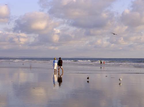
September 20, just south of the pier, Oceanside, CA beach.
Low, low tide, sunset, a few cooperative clouds.
Rich
These are breathtakingly beautiful, the first as a travel type photo and the second as a fine art image that would be equally at home framed on the wall or printed on a Hallmark card.Same location, different concepts. Same beauty. They have a Life Of Pi feel to them that's hypnotic. Superb work with a beautiful scene.
The second is another example this week of the subject being correctly and effectively located in dead center.
Everything that minniev has said.
Quite sublime. A masterclass in the use of muted colour and dynamic range.Chris, Minnie, Fireplace, Mike,
Thanks everyone for the kind words.
When Nature puts on a show, just hang on and enjoy the ride!
I had "planned" this shoot for more than a month, according to the tide tables with very low tide coinciding with late afternoon-sunset. The key dates were Thur 9/19 and Fri 9/20. These were 9/20.
Just hours before, the Oceanside, CA "Super Girl Surf Pro" competition was taking place exactly where I was standing. It was scheduled for the full weekend. From early morning to just after Noon, the water would have been several feet over the top of my head at that spot.
But now the tide was out. Really out. Giving that wonderful reflective surface.
I was actually standing on the ocean floor, as were the people in the shots. The Oceanside Pier, just to my right, out of the shot was festooned with banners of the event. There's a plastic balloon visible in the water that acted as a marker buoy for the surfing contestants. It's in the low breakers here, but during the event, was actually in very deep water far beyond any waves.
To my back was the dry beach. There was a rock band playing. It was very festive and alive, with crowds milling around, in shops and restaurants, unlike the "Lonely, End of Summer" scenes in front of me.
This was a prime example of "F/8 and Be There" photography. I just aimed the camera around and gobbled up the goodness that Nature presented. Gorgeous light, color, sea gulls, people. These scenes just composed themselves. I was simply there at the time with a camera.
Rich
-
@DanHasLeftForum has written:@MikeFewster has written:@DanHasLeftForum has written:@MikeFewster has written:
Please don't edit these images.
There is significant highlight headroom left behind in both of those images. They look better if the headroom is made use of.
I'd want to leave 1 as is but you might be right about 2. Ref the response I made to minniev.
The first one looks too flat for me and needs more contrast (which is available) to give it more punch.
Cropping out the corner of the roof in the B&W because it breaks up the repeating patterns in the background, which for me is much more interesting than the foreground you had, makes a more compelling image.
Taking out the foreground completely changes the point of the original image. You have to consider what is being done in the photo. As I said to minniev, I'd played with the black and white points but doing so changed the time of day implied and I didn't want that.
-
@MikeFewster has written:@DanHasLeftForum has written:@MikeFewster has written:@DanHasLeftForum has written:@MikeFewster has written:
Please don't edit these images.
There is significant highlight headroom left behind in both of those images. They look better if the headroom is made use of.
I'd want to leave 1 as is but you might be right about 2. Ref the response I made to minniev.
The first one looks too flat for me and needs more contrast (which is available) to give it more punch.
Cropping out the corner of the roof in the B&W because it breaks up the repeating patterns in the background, which for me is much more interesting than the foreground you had, makes a more compelling image.
Taking out the foreground completely changes the point of the original image. You have to consider what is being done in the photo. As I said to minniev, I'd played with the black and white points but doing so changed the time of day implied and I didn't want that.
That's fine but the point I am making is that I find your background much more interesting and compelling than your foreground for the reasons I posted.
Isn't one of the purposes of C&C to exchange ideas and suggestions?
In any case, I don't feel any implied time of day in the image because it's B&W. With B&W it is not difficult in post to make a scene look just about any time of day.
What I see is a low contrast image that imo could do with a boost to add "punch" to it.
-
-
@Rich42 has written:@MikeFewster has written:@minniev has written:@Rich42 has written:
My preference is the first one, if I had to say breath taking beautiful then it would be the absolute first wonderfull.
LouSeptember 20, just south of the pier, Oceanside, CA beach.
Low, low tide, sunset, a few cooperative clouds.
Rich
These are breathtakingly beautiful, the first as a travel type photo and the second as a fine art image that would be equally at home framed on the wall or printed on a Hallmark card.Same location, different concepts. Same beauty. They have a Life Of Pi feel to them that's hypnotic. Superb work with a beautiful scene.
The second is another example this week of the subject being correctly and effectively located in dead center.
Everything that minniev has said.
Quite sublime. A masterclass in the use of muted colour and dynamic range.Chris, Minnie, Fireplace, Mike,
Thanks everyone for the kind words.
When Nature puts on a show, just hang on and enjoy the ride!
I had "planned" this shoot for more than a month, according to the tide tables with very low tide coinciding with late afternoon-sunset. The key dates were Thur 9/19 and Fri 9/20. These were 9/20.
Just hours before, the Oceanside, CA "Super Girl Surf Pro" competition was taking place exactly where I was standing. It was scheduled for the full weekend. From early morning to just after Noon, the water would have been several feet over the top of my head at that spot.
But now the tide was out. Really out. Giving that wonderful reflective surface.
I was actually standing on the ocean floor, as were the people in the shots. The Oceanside Pier, just to my right, out of the shot was festooned with banners of the event. There's a plastic balloon visible in the water that acted as a marker buoy for the surfing contestants. It's in the low breakers here, but during the event, was actually in very deep water far beyond any waves.
To my back was the dry beach. There was a rock band playing. It was very festive and alive, with crowds milling around, in shops and restaurants, unlike the "Lonely, End of Summer" scenes in front of me.
This was a prime example of "F/8 and Be There" photography. I just aimed the camera around and gobbled up the goodness that Nature presented. Gorgeous light, color, sea gulls, people. These scenes just composed themselves. I was simply there at the time with a camera.
Rich
-
@lhphoto has written:
Hello everyone I'm back after again a long time in an hospital and some medical rehabilitation. Oh btw for minniev and some others
who were so kind to comment on my photos a few months ago, thanks for that.
I won't write many comments but will try my best every now and then.
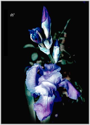
LouWelcome home, Lou, so glad to see you back. Hope you are continuing to improve. That iris is quite beautiful. The purple against the black backdrop gives it a classic, somewhat Victorian look. Lovely color treatment.
-
@lhphoto has written:
Hello everyone I'm back after again a long time in an hospital and some medical rehabilitation. Oh btw for minniev and some others
who were so kind to comment on my photos a few months ago, thanks for that.
I won't write many comments but will try my best every now and then.
LouI'm so happy that you're back, Lou.
Hopefully for a long time...
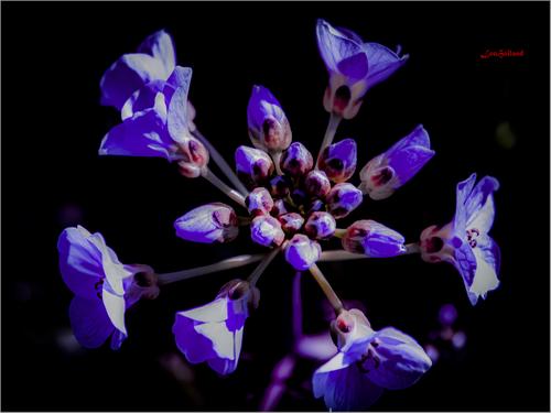
I really like the first photo, you took the post-processing to an artistic level.
Very well done!
