It seems like my welcome message of yesterday got stuck in albanian wifi limbo.
So I will say it again:
- glad to hear that you overcame your health issues
- welcome back!
- this forum thread is always a richer place with your unique images and salty comments!
Cheers, Roel
-
-
@DanHasLeftForum has written:@MikeFewster has written:@DanHasLeftForum has written:@MikeFewster has written:
Please don't edit these images.
There is significant highlight headroom left behind in both of those images. They look better if the headroom is made use of.
I'd want to leave 1 as is but you might be right about 2. Ref the response I made to minniev.
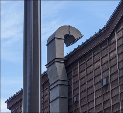
The first one looks too flat for me and needs more contrast (which is available) to give it more punch.
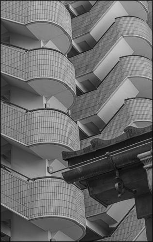
Cropping out the corner of the roof in the B&W because it breaks up the repeating patterns in the background, which for me is much more interesting than the foreground you had, makes a more compelling image.
When I have some time back home I'll revisit 2 however if anything I'll be fading the background out a little to increase the contrast with the foreground roof from another era.
-
@MikeFewster has written:@DanHasLeftForum has written:@MikeFewster has written:@DanHasLeftForum has written:@MikeFewster has written:
Please don't edit these images.
There is significant highlight headroom left behind in both of those images. They look better if the headroom is made use of.
I'd want to leave 1 as is but you might be right about 2. Ref the response I made to minniev.
The first one looks too flat for me and needs more contrast (which is available) to give it more punch.
Cropping out the corner of the roof in the B&W because it breaks up the repeating patterns in the background, which for me is much more interesting than the foreground you had, makes a more compelling image.
When I have some time back home I'll revisit 2 however if anything I'll be fading the background out a little to increase the contrast with the foreground roof from another era.
No problem.
I just posted how I see your image.
-
@MikeFewster has written:@DanHasLeftForum has written:@MikeFewster has written:@DanHasLeftForum has written:@MikeFewster has written:
Please don't edit these images.
There is significant highlight headroom left behind in both of those images. They look better if the headroom is made use of.
I'd want to leave 1 as is but you might be right about 2. Ref the response I made to minniev.
The first one looks too flat for me and needs more contrast (which is available) to give it more punch.
Cropping out the corner of the roof in the B&W because it breaks up the repeating patterns in the background, which for me is much more interesting than the foreground you had, makes a more compelling image.
When I have some time back home I'll revisit 2 however if anything I'll be fading the background out a little to increase the contrast with the foreground roof from another era.
Another flat thread view induced error. Dan, I missed the previous comment from you when I answered here.
Yes, I like the staircases on their own. But this was part of a series I did with many posts from Rich42 in mind. All in my series use juxtapositions of details that cross time barriers. Taking out the foreground corner would make it a completely different image. -
@MikeFewster has written:@MikeFewster has written:@DanHasLeftForum has written:@MikeFewster has written:@DanHasLeftForum has written:@MikeFewster has written:
Please don't edit these images.
There is significant highlight headroom left behind in both of those images. They look better if the headroom is made use of.
I'd want to leave 1 as is but you might be right about 2. Ref the response I made to minniev.
The first one looks too flat for me and needs more contrast (which is available) to give it more punch.
Cropping out the corner of the roof in the B&W because it breaks up the repeating patterns in the background, which for me is much more interesting than the foreground you had, makes a more compelling image.
When I have some time back home I'll revisit 2 however if anything I'll be fading the background out a little to increase the contrast with the foreground roof from another era.
Another flat thread view induced error. Dan, I missed the previous comment from you when I answered here.
Yes, I like the staircases on their own. But this was part of a series I did with many posts from Rich42 in mind. All in my series use juxtapositions of details that cross time barriers. Taking out the foreground corner would make it a completely different image.No problem but that is just a rinse and repeat of your earlier post and so the way I see your images is still the same.
-
@lhphoto has written:
Hello everyone I'm back after again a long time in an hospital and some medical rehabilitation. Oh btw for minniev and some others
who were so kind to comment on my photos a few months ago, thanks for that.
I won't write many comments but will try my best every now and then.
LouLou. It's pleasure to hear from you again and it's good to know that you are still creating. Post more as you feel up to it.
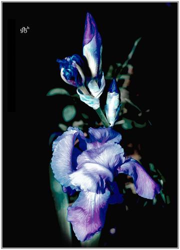
I'm in Japan and Japan definitely has a thing about irises and art. I've been surprised by the numbers of Monet's to be found in galleries here and the frequency that irises are used in Japanese painting.
1 hooks with the colours. The Wimbledon colours always look great to me.
Your PP treatment brings out the veining that is a feature of these flowers. The lower blooms are soft and floppy while framed by just enough out of focus foliage to make the most of the complementary colours without distracting. The yet to break open upper blooms give the apex of a triangle. The sharp/soft combination of shapes is striking. The surrounding black adds drama. -
@lhphoto has written:
Hello everyone I'm back after again a long time in an hospital and some medical rehabilitation. Oh btw for minniev and some others
who were so kind to comment on my photos a few months ago, thanks for that.
I won't write many comments but will try my best every now and then.
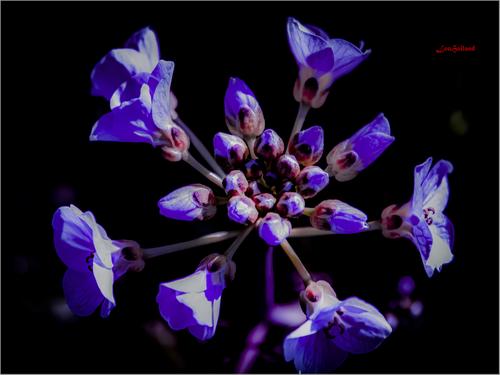
LouI like the background very much. It helps the flowers to really pop.
I'm not sure how much of the black background is natural and how much is done in post but I find that spot metering the highlights on a flower usually creates a very nice pretty much natural black/very dark background, especially if the background is in shadow, and then fine tune in post.
Wonderful images 😊
-
@DanHasLeftForum has written:@MikeFewster has written:@MikeFewster has written:@DanHasLeftForum has written:@MikeFewster has written:@DanHasLeftForum has written:@MikeFewster has written:
Please don't edit these images.
There is significant highlight headroom left behind in both of those images. They look better if the headroom is made use of.
I'd want to leave 1 as is but you might be right about 2. Ref the response I made to minniev.
The first one looks too flat for me and needs more contrast (which is available) to give it more punch.
Cropping out the corner of the roof in the B&W because it breaks up the repeating patterns in the background, which for me is much more interesting than the foreground you had, makes a more compelling image.
When I have some time back home I'll revisit 2 however if anything I'll be fading the background out a little to increase the contrast with the foreground roof from another era.
Another flat thread view induced error. Dan, I missed the previous comment from you when I answered here.
Yes, I like the staircases on their own. But this was part of a series I did with many posts from Rich42 in mind. All in my series use juxtapositions of details that cross time barriers. Taking out the foreground corner would make it a completely different image.No problem but that is just a rinse and repeat of your earlier post and so the way I see your images is still the same.
I am quite certain that we don't look at images the same way. I was adding to what I had said previously. I have changed my mind somewhat about the background treatment and I was explaining to any one who might be following the discussion, why. As I said, this is the kind of thing that makes discussions of the kind we now have in this thread tedious. The discussions don't become group exchanges with the participants communicating together. They become exchanges between two individuals.
Not for a moment did I think you would be likely to change your opinion. -
@MikeFewster has written:@DanHasLeftForum has written:@MikeFewster has written:
...
Taking out the foreground corner would make it a completely different image.No problem but that is just a rinse and repeat of your earlier post and so the way I see your images is still the same.
I am quite certain that we don't look at images the same way. I was adding to what I had said previously. I have changed my mind somewhat about the background treatment and I was explaining to any one who might be following the discussion, why. As I said, this is the kind of thing that makes discussions of the kind we now have in this thread tedious. The discussions don't become group exchanges with the participants communicating together. They become exchanges between two individuals.
Not for a moment did I think you would be likely to change your opinion.I don't see what you are rambling on about. I simply pointed out your rinse and repeats - see your bolded and italicized text above and below here.
@MikeFewster has written:Taking out the foreground completely changes the point of the original image.
I still see your images the same way as posted earlier - the background in the B&W is much more interesting and compelling for me. Both images have highlight headroom and imo both would benefit from making use of it in post.
You obviously disagree and that is fine. I have no issue with that.
-
@RoelHendrickx has written:@minniev has written:@lhphoto has written:
Hello everyone I'm back after again a long time in an hospital and some medical rehabilitation. Oh btw for minniev and some others
who were so kind to comment on my photos a few months ago, thanks for that.
I won't write many comments but will try my best every now and then.
LouWelcome home, Lou, so glad to see you back. Hope you are continuing to improve. That iris is quite beautiful. The purple against the black backdrop gives it a classic, somewhat Victorian look. Lovely color treatment.
It seems like my welcome message of yesterday got stuck in albanian wifi limbo.
So I will say it again:
- glad to hear that you overcame your health issues
- welcome back!
- this forum thread is always a richer place with your unique images and salty comments!
Cheers, RoelAre you in Albania, Roel?
A very beautiful country, especially in autumn.
I'm already looking forward to seeing what beautiful photos you will share with us. -
-
@Sagittarius has written:
PLEASE DO NOT EDIT THIS IMAGE
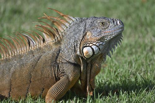
For me, this image is viewed in two somewhat different ways.
First, I'm looking at a creature and I'm studying it as an unfamiliar animal that I don't usually see in this way. The scales, spikes, skin folds, eye details and colour are captured in very fine detail. I enjoy the information it gives.
Secondly, prompted a bit by your title, is the attitude. This isn't a study of the complete lizard. The eye and head dominate and whenever this happens with an image we start interpreting and transferring feelings. Your lizard is static and passive so, yes, interpreting the image as self absorbtion is entirely appropriate. He/she is handsome too and has posed themselves against a background with colours chosen to complement their own beauty. -
@ChrisOly has written:@Bryan has written:
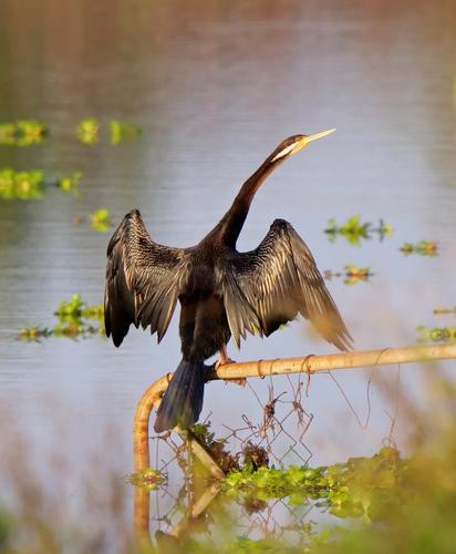
Study of an Australasian Darter (Anhinga Novaehollandiae)
Magnificent showcase of a specimen.
As Chris says.
Bryan caught him at a moment where the Darter is on full display. Wings, neck, beak, feathers, colouring, habitat. It's all there.
And more. I like the correlations between the extended line of the neck and beak and the metal rail. The whole composition and the relationship of the bird to the corners displays the extended wings and neck beautifully as well. -
@Bryan has written:
Study of an Australasian Darter (Anhinga Novaehollandiae)
Over the last month or so I have taken many of this bird in flight (because they fly away as soon as they see you). But none were worth showing.
The other day I managed the first shot but that was as close as he let me get. A few days later I was really surprised that I was able to get him basically fully in the frame and in the last had to zoom out!
(Make sure you have a look at his eye in the closeups)Nice moments of the birds to capture but all the images, imo, benefit from tighter cropping and a bit of noise reduction and sharpening. They're all a little too soft for me.
Just some food for thought 😊
-
@JSPhotoHobby has written:
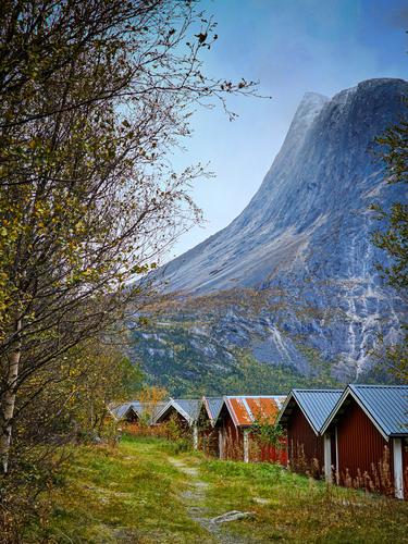
I find it an interesting photo. You have managed to squeeze many subjects into a narrow portrait view. The peak is especially impressive and you have captured a view where the curve leading up to the vertical parts accentuates its steepness and presence. You have framed it between trees and cabins and a pleasant grassy path.
I think the colour cast over the peak is quite natural. If we were there we probably wouldn't notice it - such is the way our mind filters what we see. Given the less than full light conditions, it is a realistic rendition of the scene. -
@Rich42 has written:
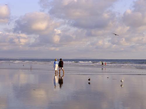
September 20, just south of the pier, Oceanside, CA beach.
Low, low tide, sunset, a few cooperative clouds.
Rich
I can only agree with everyone else. Capturing the sky reflected off the wet sand so well is quite something else.
-
@minniev has written:
And what an eye that is! More exotic even than a cormorant's eye! Sharp as a pin too, in your captures.
The first is technically less compelling, since it's apparently a tight crop of a larger image, hampered by the greenery Mr. Anhinga was hiding behind. But those others are magnificently detailed and show off his amazing eye, his fascinating wing-drying position, and all his other intriguing details. I love the ratty gate or fence, with all its attached debris. It lends interest and authenticity to the image beyond a biological portrait. Well done.
Appreciated...
-
@minniev has written:
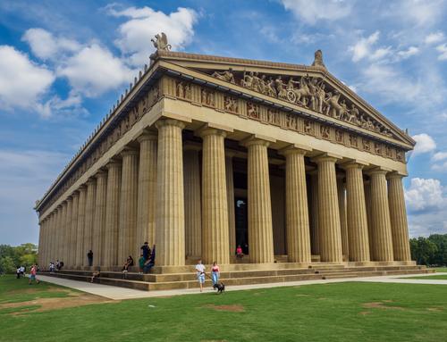
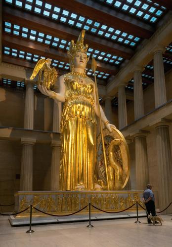
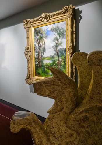
The Parthenon (Animals, both fur and stone, are welcome)
I spent last week in Nashville with eldest son, and we visited the only full size replica of the Parthenon anywhere. It was constructed in 1897 for the centennial of Tennessee's statehood and is the last surviving building of that exhibition. It was renovated in 1920 to make it a more permanent structure using new/modern materials (concrete!) to shore up the original wood and plaster. In 1982, the to-scale statue of Athena was added, replacing a smaller version which remains on display. The original exhibition used the structure as an art gallery, and it is still used that way, with permanent and temporary art exhibits.
I just can't get my head around a full size Parthenon in the USA. Maybe my view of Americana is stereotyped / limited, and I am open to correction - it is a large country, with many diverse elements...
I am not sure if the perspective we see is as captured or altered in post. It does appear that the leading corner is more close and the rest stretches away but in a crop that could well be telescopic compression...
An imposing structure - in the fields of Tennessee...
