For longest time that country did not allow vistors. Interesting, but leaves me short. It's an attempt, playful one and it should be taken as such.
-
-
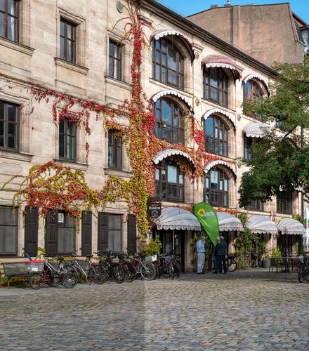
I like the scene, the colours and the fact the buildings almost meet at the angle...
-
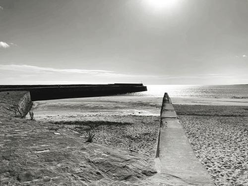
Interesting shot since landscape features meet at a distant point. Great variety.
-
Reminds me about landing craft...
-
Well spotted and b&w is a good choice.
-
Those ropes at various stages of decomposition create almost time capsule.
-
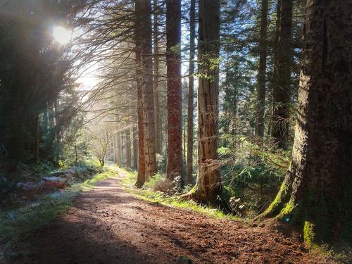
Looks quite realistic to me, if anything I'd bring the sunlit areas up further, or not reduce the highlights so much. There's a tendency to to believe that all tones in a digital image must reside within the histogram. "Nothing may be clipped!" Don't know why. Problem is that the global tools we use to bring "one number into the correct range" affects all the visible parts of the image. And our understanding of clipping "blowing out detail" is not entirely correct.
When we clip a channel in a system where a colour is represented by three co-ordinates it only means that one of those co-ordinates has reached a maximum. There is still some colour represented because the other two co-ordinates can still vary. If you say is that you must reduce all three "channels" until they are all within the histogram there is a loss of brightness. However on computer screens this is less visible when you have your screen set too bright, but it makes a heck of a difference in a print.
I've deliberately raised this so one "channel" is "well clipped", so not definitive. And also pay less attention to the "absolute" nature of the raised bit but the the compressed appearance of the original when placed alongside. One thing I learnt from A Adams when processing film was to use the headroom and to use it for the subject, then see where the shadows and highlights fall. If you set the shadows and highlights and see where the subject falls you are defining the photo by the bits people look at the least.
-
-
There is nothing wrong with clipping unimportant highlights or a single channel of important highlights where appropriate.
That is why in post I prefer to use a Luminosity Histogram and not an RGB Histogram.
-
Spot on 👍
-
There is nothing wrong with clipping highlights.
As soon as you qualify it with things like how histograms look, you allowing the ability of the camera to limit your photography rather than your imagination. Photography has always been nuanced by the way it abstracts and so it helps to develop a visual understanding rather than a logical one. We are human and irrational, not mechanical and logical, so which would best describe the way we view photos? Try it, what's the worst that can happen?
iPhone/Afterlight, for C&C.
-
@Andrew546 has written:
... There's a tendency to to believe that all tones in a digital image must reside within the histogram. "Nothing may be clipped!" <> and our understanding of clipping "blowing out detail" is not entirely correct ...
Not I.
Another tendency is to believe that clipped highlights in a post-processed image mean that the shot was over-exposed.
-
@RoelHendrickx has written:
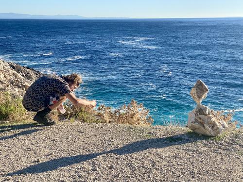
BALANCING ACT
Interesting image with a story inside. Is he trying to build a stack as impressive as the one on the right? Did he build the one on the right and now is adding a companion stack? Or trying to surpass the remarkably balanced stack? The shadows create interesting diagonals to follow in case we missed the story and need a path to it. Rich background scene increases the interest.
-
@JSPhotoHobby has written:
Another phone edit. Working on my compositions. I still feel like I'm just missing the shot.
Do these come out over saturated or low res or anything like that? I can't tell.
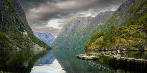
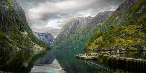
I've tried to keep up with the interesting conversation about your image, so hard in flat view. I agree with most posters that your original raw file will be easier to deal with once you get home and have it on a computer with a nice big calibrated screen! The composition is just fine: a beautiful lake in a valley amongst impressive mountains, with the vanishing point at approximately at the lower intersection of rule of thirds lines. The green slopes on the left mountain and its reflection take us there, meeting with the slightly less distinct point of the right side mountains. The pier and its reflection points an arrow at it in case we missed it. The clouds have detail. Where you've fallen a bit short is in the editing, which you can improve on at home so no big deal. Using the phone version of lightroom is not easy for me either, and it seems to have some new quirks in the latest version.
The sky is unnecessarily overworked, and caused a mismatch with the reflection and the landscape as a whole. I'd cut back on the intensity of the sky mask quite a bit, and add a mask for the reflection , then a separate mask for middle set of mountains. I'd reduce the blue saturation in that distant mountain. The greens don't look that oversaturated. Not sure what the gray mountaintops really looked like but they may need adjustment as well. It is possible in LR mobile to create multiple masks, which you should do here. I'd stick with the radial or brush tool to make the masks, and adjust each one separately.
Using your initial image, I made some adjustments using LR on my phone. I had fair success in mitigating everything I mentioned except adding blue to the single patch of blue in the sky. You're still stuck with a halo on the edge of the left mountains that I could not repair using LR mobile alone, but it should be easy to fix on a desktop using PS or other similar. Here's what I came up with, with phone and LR.
-
@Kumsal has written:@DanHasLeftForum has written:
** GOING HOME **
Mother and father taking the kids home after a big day out 😊
A decent photo ruined by post-processing.
A sweet family portrait that works well. Perhaps the colors are adjusted but they are enough within the realm of possibility that the colors don't distract from the story and may well be authentic. (my local ducks sometimes swim in purple water though here more likely in the blue hour of morning than at evening).
I would remove the blurred twigs of grass that intrude from the left.
-
@Bryan has written:
I took this a few days before the one I posted some weeks ago. This one came up a lot better after some DxO de-noise.
Please don't edit without permission
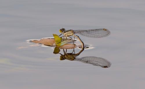
Lovely nature image. The lacy wings are so beautifully detailed. There's thorough detail in her head as well, and the delicate hairs on her legs. The muted color palette allows the detail to become the story. Well caught
-
@AlanSh has written:
This thing was just sitting there, waiting to be photographed. I like the juxtaposition with the blue water.
A mating between Bryan's dragonfly image and my pool images! I like the angle you've caught, with the diagonal line not quite corner to corner, but offset slightly. The complementary colors of the orange dragonfly and the turquoise water is very effective as well. Nicely spotted and captured.
-
@Rich42 has written:
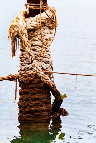
Decaying mooring in an abandoned small boat harbor, Kaunakakai, Molokai, HI.
Rich
Love the subject matter, the composition (along the vertical thirds line), the texture and the limited color palette. Love the subtle reflection and how it adds to the subject. A very slight adjustment to the highlights makes the upper third more visually detailed.
