Another beautiful bird I don't have here. All sharply caught with nice detail and color in the bird and even in the nice texture of his chosen perch. The first and third are my favorites for expression and posture. The last one might benefit from raising the shadows just a bit (more?) though sometimes that can create new problems to solve. Well done.
-
-
Nice shots but they all look better when the shadows are lifted a little.
-
Thank you Chris.
-
@minniev has written:@DanHasLeftForum has written:
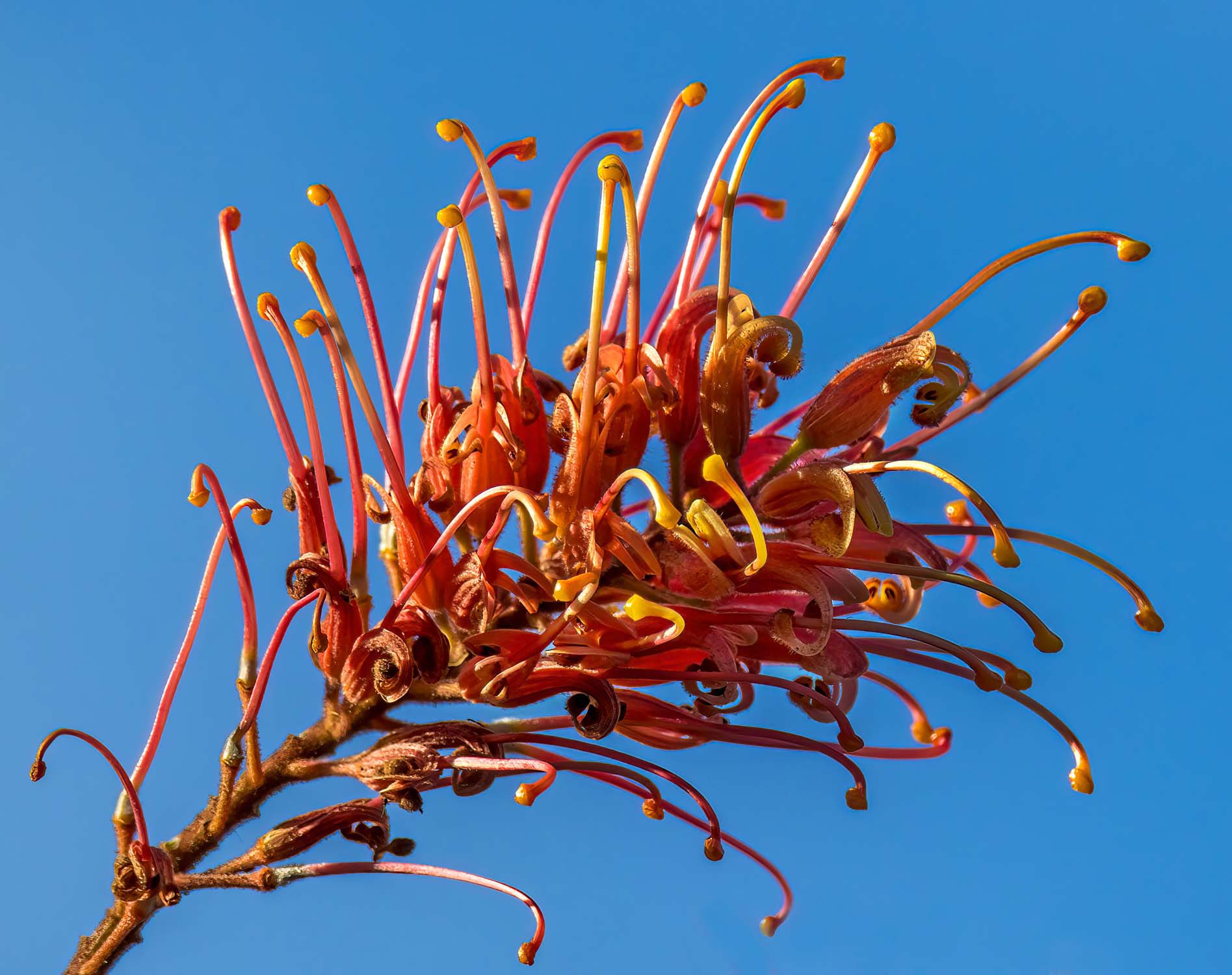
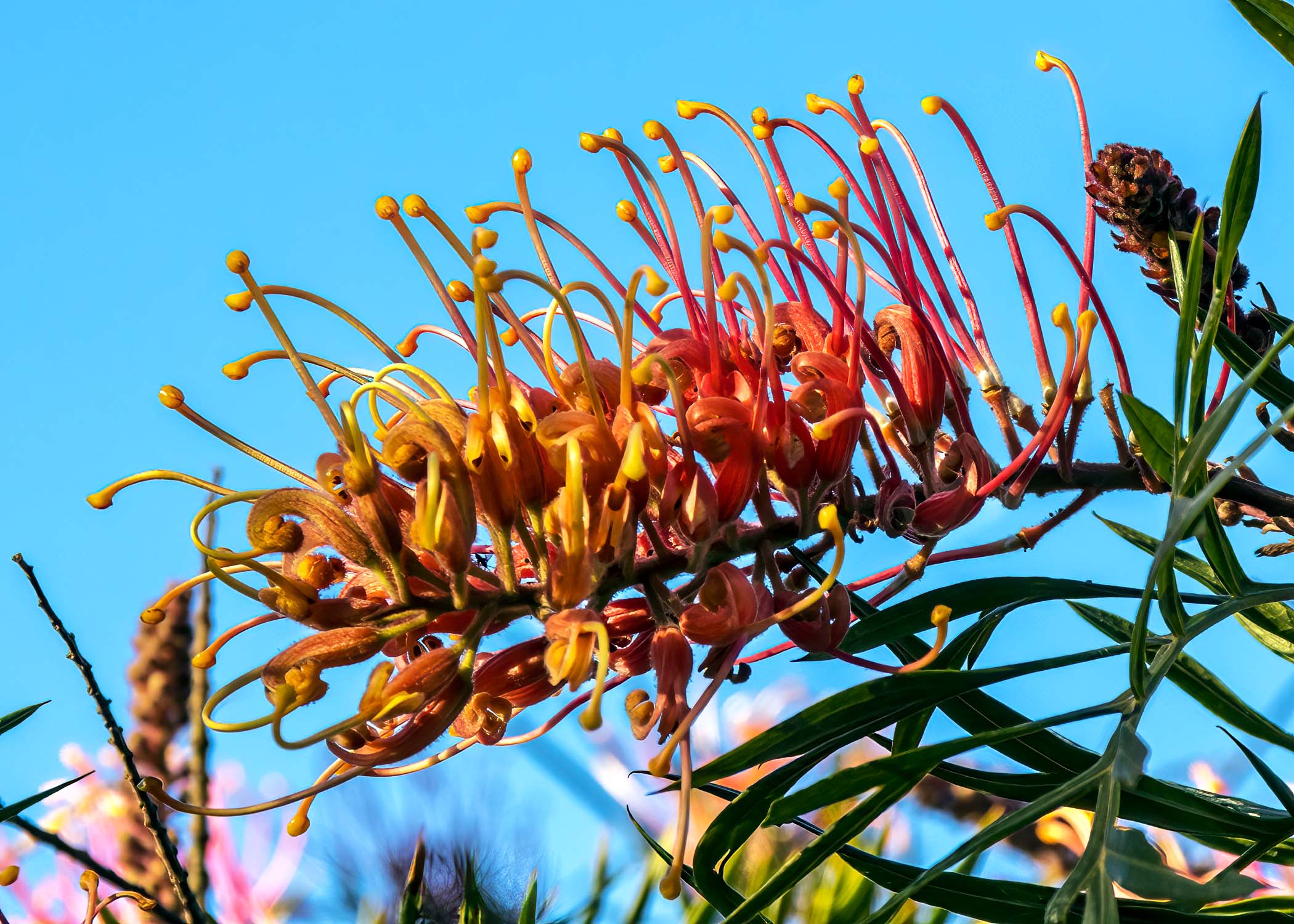
I have no idea what the tree/shrub is called but it looks stunning when flowering.
Sharply detailed, appealing colors. These frame filling and unusual flowers are fun to look at. There's a little spot about 1/3 the way across the bottom of the second one that has some speckledy stuff you might want to take a second look at, but overall the background foliage is well handled.
Thank you minniev.
-
-
@minniev has written:@Bryan has written:
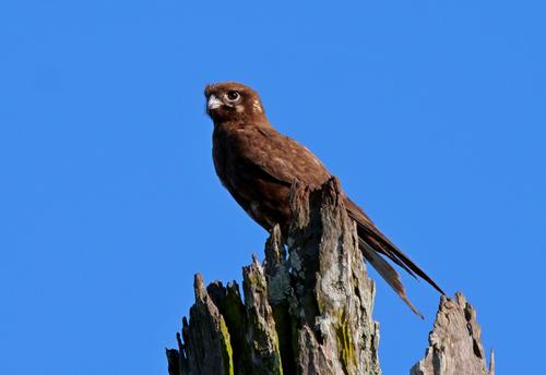
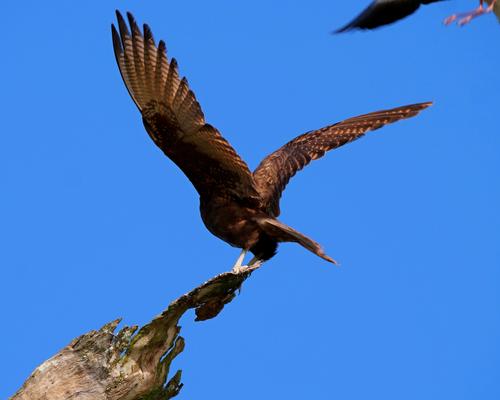
This Brown Falcon lets me get reasonably close now. The dead tree is about 7 or 8 metres high at a guess and I can move to a similar distance from the base.
He flew over to another dead branch among a clump of trees. Just as I got over there I heard a plover squawking. I never realised it would get so close and didn't get the opportunity to zoom out a bit.
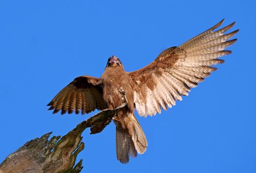
The Falcon was pretty agitated while the plover was still flying around...
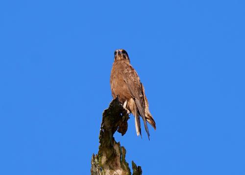
Kept a wary eye on it as it flew off
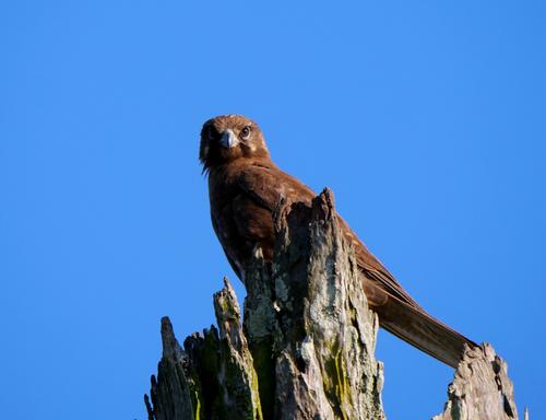
Another from a few days ago. It mostly ignores me but I waited till it was looking my way
Please don't edit without permission
Another beautiful bird I don't have here. All sharply caught with nice detail and color in the bird and even in the nice texture of his chosen perch. The first and third are my favorites for expression and posture. The last one might benefit from raising the shadows just a bit (more?) though sometimes that can create new problems to solve. Well done.
Bird photography is tricky, especially as here when you are shooting a mix of a bird at rest and other moments where the wings are beating. Often it becomes a choice between feather and eye detail, freezing motion or having some blur that conveys motion. The photographer's eternal choice.
Then there is the size of the image that the viewer looks at. Viewing the image at a larger size often fills in the details. especially fine details like plumage, that are lost when viewed at smaller size. Take shot two. Seen at the smaller size, yes it needs the shadows raised. Seen at large size, no. All the needed detail is there and the deeper shadows give more drama to the uplifted wing. While talking about shot 2, the repetition of shape between the wing and the top of the stump, plus the joint diagonal line, is visually pleasing.
Shot 1 would benefit from a small amount of shadow lift. The bird is stationary and I feel there is more expectation from the viewer to see those details. This is where the dilemma of camera settings happens. From the exif, you are set up to catch movement. As the hawk is stationary, more light in exposure could have fixed the shadows. That's easy to say looking at the images later but it isn't realistic for the photographer in the field at the time so therefore, yes, shadow raising PP is the way to go. But not much, you are already at iso 800 with an APS-C sensor.
Shot 3. I'd leave as is. The shadows give roundness and when viewed large, still have plenty of detail. As well as the wing like stump end, I like the hint of movement along the wings while the head remains steady.
Shot 4, perhaps crop in a little as there is a lot of space available. I'd raise the shadows a little but only on the top of the stump, not the bird.
Shot 5. You are at 1/1300 sec and your bird has decided to remain stationary. This is a candidate for a little shadow lifting as well.
A series around a hawk being harassed by a plover has loads of promise. It's nice that your hawk has developed a measure of trust with you. -
It depends to some extent on how the shadows are enhanced.
All the bird shots benefit from raising the shadows, even when viewed at full size.
-
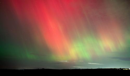
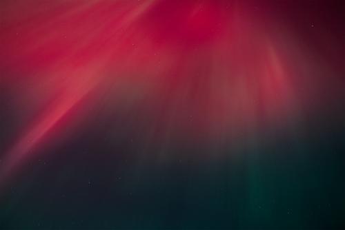
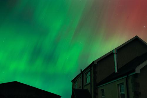
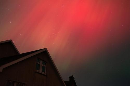
Some of last night's Aroura.
Does an artist look at your picture and say pass me that brush and I'll fix it for you? Damn right they do, at least one I know of was famous for it. Plus you can't expect to create 1000's of digital copies and not expect at least one person to draw a comedy 'tash and glasses on it.
Help yourself... I'd let you have one of the RAW files but have no way of posting it that I know of.
-
@MikeFewster has written:@RoelHendrickx has written:@MikeFewster has written:
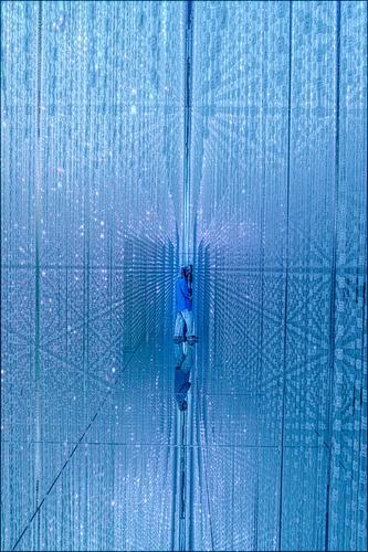
Infinite Crystal World. Tokyo.
Please do not edit this image without permission.That is a wonderful almost-abstract.
It may be my eyes deceiving me, but I have the impression that there is a slight lean to the right (top) (a few degrees max).
This makes the image "human", but it kinda diminishes the abstract quality.
A perfectly symmetrical image, split in half by a straight vertical, would be even more abstract.
And that would even enhance the surprise of discovering a human shape in the center.It wouldn't surprise me if verticals and horizontals are way out of kilter. This isn't a PP or constructed image. This is what I was seeing, which is another reason why I didn't want the original edited without knowing what the editor intended doing with it. The whole chamber is built to deceive and dazzle. Mirrors and lights everywhere and the patterns and colors kept changing. A most disorientating experience. Look in another direction and the world turned inside out.
Here's a self portrait. Different lighting and looking in a different direction. It stayed fixed for long enough for me to get a shot.Cool self-portrait. Say hi to Suzette for me.
-
@PeteS has written:
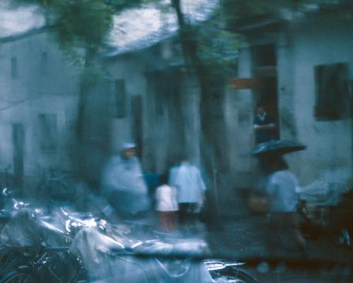
Rainy Day in China
I have been sorting through scanned slides this week and this was of one taken in Suzhou in 1984, whilst sheltering from a heavy shower.
Pete
My oldest old slides are from that same era.
I like this one a lot.
It is all about atmosphere more than subject.
My first-glance, sideways superficial look at it (scrolling down the page rapidly) was, strangely, that it was a completely different scene than a rainy street.
That initial impression was of an operation room / surgery theatre, where a patient was lying (bottom left), waiting for the doctors and nurses (just above him/her) in their surgery robes to get going. And then I saw the umbrella. -
@PeteS has written:
Rainy Day in China
I have been sorting through scanned slides this week and this was of one taken in Suzhou in 1984, whilst sheltering from a heavy shower.
Pete
Lovely abstract that somehow says rain, colours really work well in this.
-
@minniev has written:
There's a little spot about 1/3 the way across the bottom of the second one that has some speckledy stuff you might want to take a second look at,......
I have had a closer look at the "spekeldy" stuff you mentioned but being on the bottom edge of the image, it doesn't really concern me. I didn't even notice it until you mentioned it in your post.
Thanks for pointing it out though 😊
-
@Andrew546 has written:
Does an artist look at your picture and say pass me that brush and I'll fix it for you? Damn right they do, at least one I know of was famous for it
Yeah, and he was damn good at it if we are talking about the same artist 🙂
-
@DanHasLeftForum has written:@Andrew546 has written:
Does an artist look at your picture and say pass me that brush and I'll fix it for you? Damn right they do, at least one I know of was famous for it
Yeah, and he was damn good at it if we are talking about the same artist 🙂
Just to be clear, those are my feelings regarding only how you may treat my images in my post. Just as valid as any other photographers opinion about their images which should also be respected.
-
@Andrew546 has written:@DanHasLeftForum has written:@Andrew546 has written:
Does an artist look at your picture and say pass me that brush and I'll fix it for you? Damn right they do, at least one I know of was famous for it
Yeah, and he was damn good at it if we are talking about the same artist 🙂
Just to be clear, those are my feelings regarding only how you may treat my images in my post. Just as valid as any other photographers opinion about their images which should also be respected.
That goes both ways, obviously 🙂
-
@Andrew546 has written:
.. I'd let you have one of the RAW files but have no way of posting it that I know of.
If you need someone to help you fix those images post a link to the raw file in the cloud somewhere - Dropbox, for example.
If they're interested, someone might help.
-
@Andrew546 has written:@PeteS has written:
Rainy Day in China
I have been sorting through scanned slides this week and this was of one taken in Suzhou in 1984, whilst sheltering from a heavy shower.
Pete
Lovely abstract that somehow says rain, colours really work well in this.
Yes it says "rain." The soft focus, blurred movement, and limited colour palette create a subjective, impressionistic image. Rather than being an observer, the viewing experience is more like being a participant who also experiences rain in their eyes.
Pete, you have caught it beautifully.
I just edited to add this bit. The plastic sheeting. Quintessential Asian warm wet day material. I very much like the prominence it is given here. The very soul of a wet Asian day.
Sharp edges and popped colour are not the best approach for many photos. -
@MikeFewster has written:
Sharp edges and popped colour are not the best approach for many photos.
In Pete's image definitely not but in many photos they help a lot.
It just comes down to personal taste.
