That's all well and good but I'm just posting on how I see the images and why.
-
-
@DanHasLeftForum has written:@Andrew546 has written:@DanHasLeftForum has written:
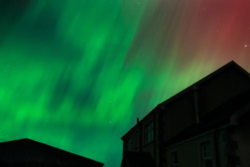
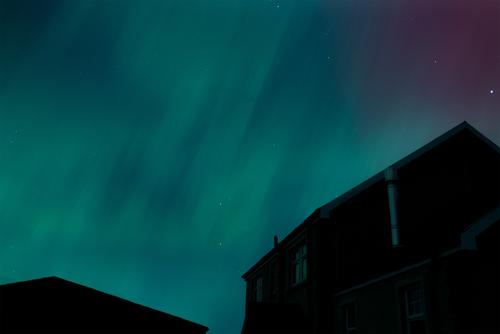
I like 1 and 2 and I don’t like 3 and 4.
In 3 and 4, the structures in the forground obscure the subject, the aurora, which is in the background.
You don't normally put the subject in the background and I don't see any valid reason to make an exception in the last two images.
See above:
That's all well and good but I'm just posting on how I see the images and why.
No worries Dan. Though I have to say that your opinion seems quite static as in you don't even seem to attempt to see that of others. Even in your reply above you have cut everything but your opinion. In my experience a static opinion is one that also stops learning and so has a shelf life amongst those that move on.
-
@Andrew546 has written:@DanHasLeftForum has written:@Andrew546 has written:@DanHasLeftForum has written:
I like 1 and 2 and I don’t like 3 and 4.
In 3 and 4, the structures in the forground obscure the subject, the aurora, which is in the background.
You don't normally put the subject in the background and I don't see any valid reason to make an exception in the last two images.
See above:
That's all well and good but I'm just posting on how I see the images and why.
No worries Dan. Though I have to say that your opinion seems quite static as in you don't even seem to attempt to see that of others.
Your opinion is static as well.
You're not giving me any reason to consider changing my oponion.
-
@minniev has written:
Since you said we could edit, I'll show you a rough approximation of what I had in mind. I agree the houses add something in terms of story and geometry but the bright parts of the rightmost house in this one were a little bothersome for me so I toned the bright parts down by adding shadow.
Also added a little clarity to bring out more of those beautiful stars.Absolutely you can edit. I posted some of the raw files earlier, please have a go if you want, I'd be interested. There is are an number of problems with photographing the Aroura which I'd like to try and get an angle on. One is it is huge, and deceptive as you only have one viewpoint and no accurate frame of reference. It is a ring that forms round a latitude dependent on strength. When right overhead it looks like shot 2, Look along it toward the NE and the ribbons tower up into the upper atmosphere (200 miles up). It also moves, so any photo is blurred compared to reality and the closer you are to the action/the more active it is the blur is quite apparent and hides the shape further reducing any reference points. Another is that although it is fairly low light the red is clearly visible so probably not so dim that our vision vision has shifted towards blue/green and luminosity as it does in low light. All photos are abstracted.
With the shot you edited, my wide angle is a 35mm lens on a Z5 so I have to be close to the house to be able to tilt the camera far enough up. If I did actually have a wider angled lens it may help. But it's a perspective problem when it's overhead, it may appear to fill the sky but try conveying that in a single photo, the wider you go the smaller it may look. You need to be standing back from it to get that fill the frame look, see Photo 1 which is exactly that. My neighbor took some shots earlier in the evening with a wider lens that I'm eager to see.
The colour is the other problem. Below is a far more accurate depiction of how it looks to the human eye, with the correct W/B (you need to see it full screen, the thumbnail against the white of the web page is like viewing with a light on). It's not as luminous green to saturated yellow as I've seen in some photos. But hey, when vying for attention on social media that yellow/blue contrast and those reds that a warmer colour balance and pushed vibrance/contrast sliders give... Who can compete?
-
@Andrew546 has written:@minniev has written:
Since you said we could edit, I'll show you a rough approximation of what I had in mind. I agree the houses add something in terms of story and geometry but the bright parts of the rightmost house in this one were a little bothersome for me so I toned the bright parts down by adding shadow.
Also added a little clarity to bring out more of those beautiful stars.Absolutely you can edit. I posted some of the raw files earlier, please have a go if you want, I'd be interested. There is are an number of problems with photographing the Aroura which I'd like to try and get an angle on. One is it is huge, and deceptive as you only have one viewpoint and no accurate frame of reference. It is a ring that forms round a latitude dependent on strength. When right overhead it looks like shot 2, Look along it toward the NE and the ribbons tower up into the upper atmosphere (200 miles up). It also moves, so any photo is blurred compared to reality and the closer you are to the action/the more active it is the blur is quite apparent and hides the shape further reducing any reference points. Another is that although it is fairly low light the red is clearly visible so probably not so dim that our vision vision has shifted towards blue/green and luminosity as it does in low light. All photos are abstracted.
With the shot you edited, my wide angle is a 35mm lens on a Z5 so I have to be close to the house to be able to tilt the camera far enough up. If I did actually have a wider angled lens it may help. But it's a perspective problem when it's overhead, it may appear to fill the sky but try conveying that in a single photo, the wider you go the smaller it may look. You need to be standing back from it to get that fill the frame look, see Photo 1 which is exactly that. My neighbor took some shots earlier in the evening with a wider lens that I'm eager to see.
The colour is the other problem. Below is a far more accurate depiction of how it looks to the human eye, with the correct W/B (you need to see it full screen, the thumbnail against the white of the web page is like viewing with a light on). It's not as luminous green to saturated yellow as I've seen in some photos. But hey, when vying for attention on social media that yellow/blue contrast and those reds that a warmer colour balance and pushed vibrance/contrast sliders give... Who can compete?
I'd hazard a guess that almost all photos of auroras are time exposures taken on tripods. Longer exposures are needed to see the colour range. Nope. I'm not going to open the can of worms about what is and isn't "natural" in these cases. Or other cases.
-
@MikeFewster has written:
I'd hazard a guess that almost all photos of auroras are time exposures taken on tripods. Longer exposures are needed to see the colour range. Nope. I'm not going to open the can of worms about what is and isn't "natural" in these cases. Or other cases.
Yes, between 2 and 3 secs at ISO1600. The problem is not about reality, that's long out of the window. It's about finding a level of WOW that's different but still relates to the actual Aroura. The colours in most photos are the result of heavy contrast and saturation adjustments on top of a far too warm W/B because that produces the biggest WOW colours, they are the result of what the software will always do when you use the global sliders in the most common way, and as such they have become the common standard of what Aroura photos are expected to look like. If you see what I mean. I'm trying to find something different.
-
@Andrew546 has written:@MikeFewster has written:
I'd hazard a guess that almost all photos of auroras are time exposures taken on tripods. Longer exposures are needed to see the colour range. Nope. I'm not going to open the can of worms about what is and isn't "natural" in these cases. Or other cases.
Yes, between 2 and 3 secs at ISO1600. The problem is not about reality, that's long out of the window. It's about finding a level of WOW that's different but still relates to the actual Aroura. The colours in most photos are the result of heavy contrast and saturation adjustments on top of a far too warm W/B because that produces the biggest WOW colours, they are the result of what the software will always do when you use the global sliders in the most common way, and as such they have become the common standard of what Aroura photos are expected to look like. If you see what I mean. I'm trying to find something different.
I certainly see what you mean.
A couple of months ago I was in central Australia and saw some shots taken during the last big burst of auroras around the globe. The photographer thought he was taking shots of stars above Uluru and had set exposure for around 20 seconds, iso 1600 and about F2. He was stunned when he looked at the image and found he had a green curtain aurora behind Uluru - way too far north to see an aurora australis, you would have thought. He hadn't seen anything in the sky as he took the shot. It needed the time exposure to show what was lurking. -
@minniev has written:
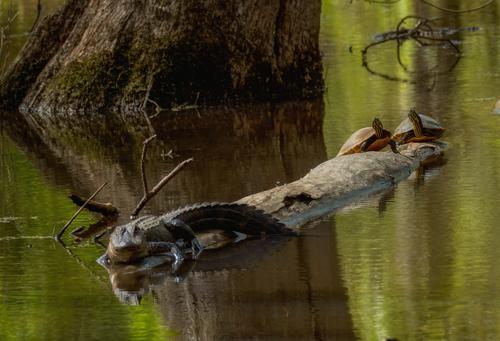
The One Eyed King Of the Swamp
For those who want details about post processing: This one has been run through Topaz AI for noise and detail. It is a crop of a deliberately underexposed image taken with an m43 camera (ISO choices are always a devil's bargain with m43 cameras) and a not-great kit lens. A few twigs have been removed from the water in post. The gators and turtles and trees and water are as-found. I am always interested that the turtles feel so comfortable sharing logs with the gators, who might eat them, but they know much more than I do about about their relationships...
It is about time for the gators to take a long snooze. I'll miss them.
This photo plays some tricks on me until I properly look at it full screen and allow the other cues to put things right. The vertical lines of the reflections to the right of the tree dominate the horizontal lines of the water ripples and the other elements and I get the impression I am looking at an image rotated to the left 90 degrees.
I like the subdued tones. They are what we would expect in a dark murky swamp with creatures we may not want to be too personal with - although the turtles are a wonderful catch along with one eye - lost in an argument or maybe blinking? Viewed up close his claws look quite metallic, alien. I wonder if that's a play of the light or result of Topaz or a bit of both?
Very nice image that I imagine would have been a hard one to get right under the conditions. -
@Fireplace33 has written:
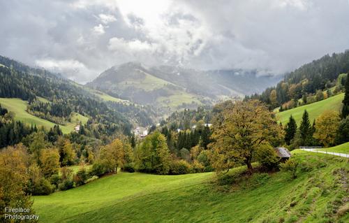
On the way to Pronebengut
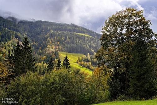
A pleasant walk near Mühlbach, Austria, to a place we had surprisingly never visited before.
A mostly overcast day with the sun occasionally peeking though the clouds.Please do not edit these images without permission
There were also some showers, if you look closely in this second shot, in the distant forest on the left you can see it was sunny, but also raining a bit.
Your scenery shots of the hills / valleys, fields / forests are always captivating. I read people saying certain lenses render very well and cameras capturing colours a certain way. I can't know but I guess you may have what they are talking about. The yellows of the sunlit field in the second are quite surreal.
-
@Bryan has written:@Fireplace33 has written:
On the way to Pronebengut
A pleasant walk near Mühlbach, Austria, to a place we had surprisingly never visited before.
A mostly overcast day with the sun occasionally peeking though the clouds.Please do not edit these images without permission
There were also some showers, if you look closely in this second shot, in the distant forest on the left you can see it was sunny, but also raining a bit.
Your scenery shots of the hills / valleys, fields / forests are always captivating. I read people saying certain lenses render very well and cameras capturing colours a certain way. I can't know but I guess you may have what they are talking about. The yellows of the sunlit field in the second are quite surreal.
Hi Bryan
Thanks, glad you like them 😊You can usually see the equipment I’m using in the EXIF.
Recently, it is nearly always been the Nikon Z7 + the lenses I have with me.
My current favourite lens is the Nikon Z 24-120 /F4. It is a sharp “S-grade” lens with a versatile focal range and plenty fast enough for landscape work.
It has some really nice optical properties. And works often as a one-lens solution for hiking. Both of these images came through that lens.For wider angle shots I usually take the Nikon Z 14-30 /F4. It’s also a very good quality “S-grade” lens, reasonably small with a flexible range of focal lengths
Recently I bought the new Viltrox 16mm /F1.8 which seems to be even better in terms of sharpness all the way out to the edge.
I think when people talk about “the nice colours” that one particular camera shows vs. another, they are usually talking about JPG images “straight out of the camera”.
But I never use that method and only process from RAW.
When using RAW and developing yourself, the resulting colours you’ll get in the final image are more or less “up to you”.
I try and keep them sort of realistic and similar to what I experienced at the scene. Which is not necessarily the same as what the camera will record!
I will modify the WB and increase the saturation and/or brightness of the different colours accordingly. I’ll change the tone curve values for the whole image and also for particular areas of the image to achieve that “reality” and a pleasing image.
But I think the main factor that effects the final image is looking for scenes where the natural light is good and interesting to start with 😊 -
@minniev has written:@Bryan has written:
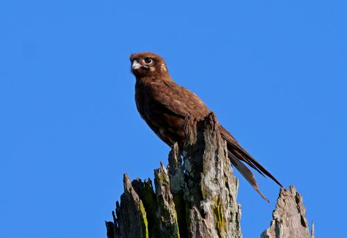
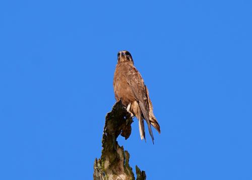
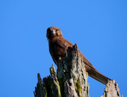
This Brown Falcon lets me get reasonably close now. The dead tree is about 7 or 8 metres high at a guess and I can move to a similar distance from the base.
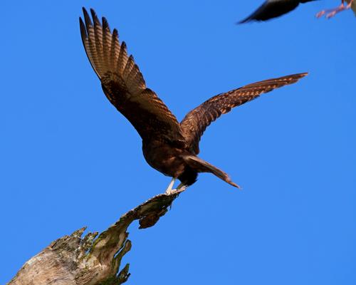
He flew over to another dead branch among a clump of trees. Just as I got over there I heard a plover squawking. I never realised it would get so close and didn't get the opportunity to zoom out a bit.
The Falcon was pretty agitated while the plover was still flying around...
Kept a wary eye on it as it flew off
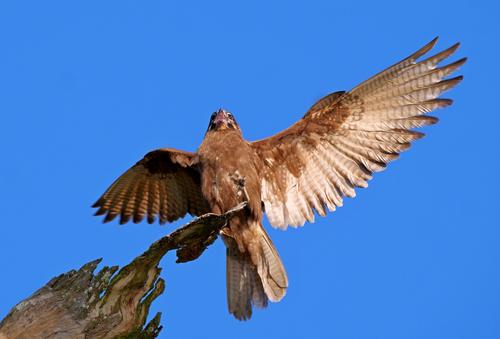
Another from a few days ago. It mostly ignores me but I waited till it was looking my way
Please don't edit without permission
Another beautiful bird I don't have here. All sharply caught with nice detail and color in the bird and even in the nice texture of his chosen perch. The first and third are my favorites for expression and posture. The last one might benefit from raising the shadows just a bit (more?) though sometimes that can create new problems to solve. Well done.
Thank you minnie.
My DxO free trial finished a week or so ago so I am without access to a tool I am happy to raise shadows with. It is quite expensive but I believe they have good black Friday deals and not too long to wait.
@ChrisOly has written:Wonderful capture of a special specimen.
Thanks Chris,
not the largest raptor but he has all the attributes.@MikeFewster has written:Bird photography is tricky, especially as here when you are shooting a mix of a bird at rest and other moments where the wings are beating. Often it becomes a choice between feather and eye detail, freezing motion or having some blur that conveys motion. The photographer's eternal choice.
Then there is the size of the image that the viewer looks at. Viewing the image at a larger size often fills in the details. especially fine details like plumage, that are lost when viewed at smaller size. Take shot two. Seen at the smaller size, yes it needs the shadows raised. Seen at large size, no. All the needed detail is there and the deeper shadows give more drama to the uplifted wing. While talking about shot 2, the repetition of shape between the wing and the top of the stump, plus the joint diagonal line, is visually pleasing.
Shot 1 would benefit from a small amount of shadow lift. The bird is stationary and I feel there is more expectation from the viewer to see those details. This is where the dilemma of camera settings happens. From the exif, you are set up to catch movement. As the hawk is stationary, more light in exposure could have fixed the shadows. That's easy to say looking at the images later but it isn't realistic for the photographer in the field at the time so therefore, yes, shadow raising PP is the way to go. But not much, you are already at iso 800 with an APS-C sensor.
Shot 3. I'd leave as is. The shadows give roundness and when viewed large, still have plenty of detail. As well as the wing like stump end, I like the hint of movement along the wings while the head remains steady.
Shot 4, perhaps crop in a little as there is a lot of space available. I'd raise the shadows a little but only on the top of the stump, not the bird.
Shot 5. You are at 1/1300 sec and your bird has decided to remain stationary. This is a candidate for a little shadow lifting as well.
A series around a hawk being harassed by a plover has loads of promise. It's nice that your hawk has developed a measure of trust with you.In times like this I may switch back to single point focus and single shot to get a few sharper images but quickly revert to burst settings in case he takes off. Always a dilemma because I don't want to miss in flight if it presents.
@Fireplace33 has written:These are pretty good!
Bird photography is definitely a genre of its own. Needing special equipment and the skills to use it and also needing the skills to get close enough and make well composed shots that look good and artistic. You are well under way here!
Number 3 is my favouriteThanks Fireplace,
I have to say I didn't specifically acquire my kit for birding nor wildlife although they have to be my favourite subjects. My Panasonic G9 m43 was the next step up from my little FZ300 and the PL 100-400mm a budget breaking jump (even though 2nd hand) to a lens fit for the task. It is interesting to note that a lot of the passionate birders mostly use m43 OM 1s as they are the best camera for moving and or distant wildlife. The point is that 20MP is enough for good IQ (if not the best) and the smaller sensor allows faster readout therefore higher % of action shot keepers and also for smaller, lighter, less expensive lenses for equivalent reach. One day I may venture into FF for better scenery shots etc, but I doubt I would buy the necessary lenses for wildlife. My 100-400mm weighs ~ 1Kg and gives 800mm equivalent. Lower quality 600mm FF lenses start about 2Kg and the better they are the heavier they get. That's a lot to hold still for any length of time.
-
@Bryan has written:
It is interesting to note that a lot of the passionate birders mostly use m43 OM 1s as they are the best camera for moving and or distant wildlife.
That's certainly not my experience.
Personally, I wouldn't use smaller than APS-C.
-
@minniev has written:@minniev has written:
The One Eyed King Of the Swamp
For those who want details about post processing: This one has been run through Topaz AI for noise and detail. It is a crop of a deliberately underexposed image taken with an m43 camera (ISO choices are always a devil's bargain with m43 cameras) and a not-great kit lens. A few twigs have been removed from the water in post. The gators and turtles and trees and water are as-found. ...
@Fireplace33 has written:I like the rich colours in the reflections, that nice big tree and the diagonal line made by that log, but then, in the next second, looking a bit closer,... there's a surprise with a big aligator on the log !!
Wow, I'm glad we don't have those down by our local stream !
As you said, I guess the turtles know what they are doing :-)Thank you. The swamp is richly colored in spring and summer, and that is the only time we see the swamp creatures out and about. If you look closely you'll spot another alligator in the background on the right. There were about a half dozen there the day I took this one.
@Rich42 has written:The composition is great. It's one of those situations where one has little say in the matter and the lines, form and color are just there and just "work."
The image tells its tale very well - It's a very tough existence.
Rich
Thanks. Since the swamp was decimated in a storm several years ago, my once pristine compositions are now littered with the debris from the many trees that tumbled into the water back then. Cypress and tupelo don't rot easily so they'll be there a while. I'm trying to learn to love its new look.
@MikeFewster has written:There's a balance here between extended neck, synchronized the turtles on one end of the log and the "gator on the other. The turtles are keeping a close eye on their buddy and that tension makes the shot. I wouldn't trust a 'gator that winked at me. The brighter light along the log makes it stands out from the shadows, concentrates the area of subject and plays up the spiky bits along the backbone and tail. Those spiky things are part of the mystique of these critters.
A Topaz note. I use it too for the same reasons. In my shots and this one from you, I don't like what it sometimes does in adding an overemphsis to some lines. The section I'm talking about here is the line of short ripples running along the edge of the log from behind the alligator's tail.The gator in front appears to me to have lost an eye. He is the biggest of the residents, usually the swamp is just a hangout for the young ones.
Thanks. I totally agree with you about Topaz and I don't use it much because of these quirks. I was hoping for a fix I didn't have to mitigate with layers and brushes but it appears that's not gonna be possible. I made a quick revision to the problem areas, attached below.
@DanHasLeftForum has written:Yes. Topaz sometimes "over emphasises" the edits in some elements in a scene.
These are quick and easy to fix by either using a mask in Topaz and/or blending the Topaz output back into the original with a layer mask until it looks right.
Thanks, I always hope these companies will find ways to mitigate within the ap, but for me, the best solution is usually what you suggested here, layers and masks. I'm attaching a quick revision with your suggestion below.
@ChrisOly has written:Good catch. Did you run away after taking the shot?
Thanks Chris. No, I'm used to these guys. We have them turn up in subdivisions, in people's garages, on golf courses. This summer one showed up on the kids' soccer field. A common occurrence I encounter at the swamp is out of state folks who pull up planning to hike the trail, and when I or someone else excitedly tells them "there's alligators sunning in there today!", they turn and bolt to their cars.
[
]
(/a/Rxndnxp7iAjeh9QVRWSwsjrCvh7RSRi6kKM8eCLfMwwL3ekPfXaAzsJwEXpyfnV2/27101/?shva=1)Revision to fight off the effects of Topaz...
Swamps like this are a distant world for me, and flooded woods in Spring are as close as we get around here. And there are no alligators - the frogs just don't have quite the same fear factor! You have found a great one-eyed character to star in your photo and he takes the main position in your composition.
I too use Topaz regularly and agree it does a good job, but is a bit of a precocious talent, which often needs to be reigned in. The smaller version of the photo looks good, but when looking at the large version, the turtles in particular look a bit over-processed. They jar slightly, because they are a second area of sharpness beyond the main subject, but mainly because their bright yellow stripes draws too much attention away from the alligator. I think slightly less contrast / sharpness would be better.
Now that all sounds far too negative, which is a shame, because I like it! -
@Bryan has written:@minniev has written:@Bryan has written:
This Brown Falcon lets me get reasonably close now. The dead tree is about 7 or 8 metres high at a guess and I can move to a similar distance from the base.
He flew over to another dead branch among a clump of trees. Just as I got over there I heard a plover squawking. I never realised it would get so close and didn't get the opportunity to zoom out a bit.
The Falcon was pretty agitated while the plover was still flying around...
Kept a wary eye on it as it flew off
Another from a few days ago. It mostly ignores me but I waited till it was looking my way
Please don't edit without permission
Another beautiful bird I don't have here. All sharply caught with nice detail and color in the bird and even in the nice texture of his chosen perch. The first and third are my favorites for expression and posture. The last one might benefit from raising the shadows just a bit (more?) though sometimes that can create new problems to solve. Well done.
Thank you minnie.
My DxO free trial finished a week or so ago so I am without access to a tool I am happy to raise shadows with. It is quite expensive but I believe they have good black Friday deals and not too long to wait.
@ChrisOly has written:Wonderful capture of a special specimen.
Thanks Chris,
not the largest raptor but he has all the attributes.@MikeFewster has written:Bird photography is tricky, especially as here when you are shooting a mix of a bird at rest and other moments where the wings are beating. Often it becomes a choice between feather and eye detail, freezing motion or having some blur that conveys motion. The photographer's eternal choice.
Then there is the size of the image that the viewer looks at. Viewing the image at a larger size often fills in the details. especially fine details like plumage, that are lost when viewed at smaller size. Take shot two. Seen at the smaller size, yes it needs the shadows raised. Seen at large size, no. All the needed detail is there and the deeper shadows give more drama to the uplifted wing. While talking about shot 2, the repetition of shape between the wing and the top of the stump, plus the joint diagonal line, is visually pleasing.
Shot 1 would benefit from a small amount of shadow lift. The bird is stationary and I feel there is more expectation from the viewer to see those details. This is where the dilemma of camera settings happens. From the exif, you are set up to catch movement. As the hawk is stationary, more light in exposure could have fixed the shadows. That's easy to say looking at the images later but it isn't realistic for the photographer in the field at the time so therefore, yes, shadow raising PP is the way to go. But not much, you are already at iso 800 with an APS-C sensor.
Shot 3. I'd leave as is. The shadows give roundness and when viewed large, still have plenty of detail. As well as the wing like stump end, I like the hint of movement along the wings while the head remains steady.
Shot 4, perhaps crop in a little as there is a lot of space available. I'd raise the shadows a little but only on the top of the stump, not the bird.
Shot 5. You are at 1/1300 sec and your bird has decided to remain stationary. This is a candidate for a little shadow lifting as well.
A series around a hawk being harassed by a plover has loads of promise. It's nice that your hawk has developed a measure of trust with you.In times like this I may switch back to single point focus and single shot to get a few sharper images but quickly revert to burst settings in case he takes off. Always a dilemma because I don't want to miss in flight if it presents.
@Fireplace33 has written:These are pretty good!
Bird photography is definitely a genre of its own. Needing special equipment and the skills to use it and also needing the skills to get close enough and make well composed shots that look good and artistic. You are well under way here!
Number 3 is my favouriteThanks Fireplace,
I have to say I didn't specifically acquire my kit for birding nor wildlife although they have to be my favourite subjects. My Panasonic G9 m43 was the next step up from my little FZ300 and the PL 100-400mm a budget breaking jump (even though 2nd hand) to a lens fit for the task. It is interesting to note that a lot of the passionate birders mostly use m43 OM 1s as they are the best camera for moving and or distant wildlife. The point is that 20MP is enough for good IQ (if not the best) and the smaller sensor allows faster readout therefore higher % of action shot keepers and also for smaller, lighter, less expensive lenses for equivalent reach. One day I may venture into FF for better scenery shots etc, but I doubt I would buy the necessary lenses for wildlife. My 100-400mm weighs ~ 1Kg and gives 800mm equivalent. Lower quality 600mm FF lenses start about 2Kg and the better they are the heavier they get. That's a lot to hold still for any length of time.
This is a very enjoyable series, and you did well to get so close, in fact 4 is maybe a bit too close for the pose, but 3 is great. Similarly it is taken from almost underneath, but the open beak and view inside and a raised foot makes a very unusual and eye-catching pose.
I agree, if you have the tools. then raising the shadows would be worth playing with, but it is really a matter of taste, and the dark shadows have something attractive about them too. I think 5 is the only one where I definitely tink raised shadows would be a definite improvement.
-
@Fireplace33 has written:@Bryan has written:@Fireplace33 has written:
On the way to Pronebengut
A pleasant walk near Mühlbach, Austria, to a place we had surprisingly never visited before.
A mostly overcast day with the sun occasionally peeking though the clouds.Please do not edit these images without permission
There were also some showers, if you look closely in this second shot, in the distant forest on the left you can see it was sunny, but also raining a bit.
Your scenery shots of the hills / valleys, fields / forests are always captivating. I read people saying certain lenses render very well and cameras capturing colours a certain way. I can't know but I guess you may have what they are talking about. The yellows of the sunlit field in the second are quite surreal.
Hi Bryan
Thanks, glad you like them 😊You can usually see the equipment I’m using in the EXIF.
Recently, it is nearly always been the Nikon Z7 + the lenses I have with me.
My current favourite lens is the Nikon Z 24-120 /F4. It is a sharp “S-grade” lens with a versatile focal range and plenty fast enough for landscape work.
It has some really nice optical properties. And works often as a one-lens solution for hiking. Both of these images came through that lens.For wider angle shots I usually take the Nikon Z 14-30 /F4. It’s also a very good quality “S-grade” lens, reasonably small with a flexible range of focal lengths
Recently I bought the new Viltrox 16mm /F1.8 which seems to be even better in terms of sharpness all the way out to the edge.
I think when people talk about “the nice colours” that one particular camera shows vs. another, they are usually talking about JPG images “straight out of the camera”.
But I never use that method and only process from RAW.
When using RAW and developing yourself, the resulting colours you’ll get in the final image are more or less “up to you”.
I try and keep them sort of realistic and similar to what I experienced at the scene. Which is not necessarily the same as what the camera will record!
I will modify the WB and increase the saturation and/or brightness of the different colours accordingly. I’ll change the tone curve values for the whole image and also for particular areas of the image to achieve that “reality” and a pleasing image.
But I think the main factor that effects the final image is looking for scenes where the natural light is good and interesting to start with 😊These are two delightful landscapes. As Mike pointed out, the first uses lines and the second brightness and colour to draw the eye into the image, and both work very well. I think you have processed them well, and made them your landscapes, rather than a forensic copy of what was captured, which is good.
-
@MikeFewster has written:@Andrew546 has written:@minniev has written:
Since you said we could edit, I'll show you a rough approximation of what I had in mind. I agree the houses add something in terms of story and geometry but the bright parts of the rightmost house in this one were a little bothersome for me so I toned the bright parts down by adding shadow.
Also added a little clarity to bring out more of those beautiful stars.Absolutely you can edit. I posted some of the raw files earlier, please have a go if you want, I'd be interested. There is are an number of problems with photographing the Aroura which I'd like to try and get an angle on. One is it is huge, and deceptive as you only have one viewpoint and no accurate frame of reference. It is a ring that forms round a latitude dependent on strength. When right overhead it looks like shot 2, Look along it toward the NE and the ribbons tower up into the upper atmosphere (200 miles up). It also moves, so any photo is blurred compared to reality and the closer you are to the action/the more active it is the blur is quite apparent and hides the shape further reducing any reference points. Another is that although it is fairly low light the red is clearly visible so probably not so dim that our vision vision has shifted towards blue/green and luminosity as it does in low light. All photos are abstracted.
With the shot you edited, my wide angle is a 35mm lens on a Z5 so I have to be close to the house to be able to tilt the camera far enough up. If I did actually have a wider angled lens it may help. But it's a perspective problem when it's overhead, it may appear to fill the sky but try conveying that in a single photo, the wider you go the smaller it may look. You need to be standing back from it to get that fill the frame look, see Photo 1 which is exactly that. My neighbor took some shots earlier in the evening with a wider lens that I'm eager to see.
The colour is the other problem. Below is a far more accurate depiction of how it looks to the human eye, with the correct W/B (you need to see it full screen, the thumbnail against the white of the web page is like viewing with a light on). It's not as luminous green to saturated yellow as I've seen in some photos. But hey, when vying for attention on social media that yellow/blue contrast and those reds that a warmer colour balance and pushed vibrance/contrast sliders give... Who can compete?
I'd hazard a guess that almost all photos of auroras are time exposures taken on tripods. Longer exposures are needed to see the colour range. Nope. I'm not going to open the can of worms about what is and isn't "natural" in these cases. Or other cases.
I agree. Leave the worms in their can and process them as you see fit, and if it is too much or too little for others, well who cares, they are your works and you are the artist. For what its worth, I think they are superb. I am also jealous, as I have been reading articles about the current likelihood of a rare chance to see Northern Lights in our latitudes and how to find the comet, which is at its brightest at the moment. Unfortunately they forgot to mention the thick clouds....
-
@minniev has written:@Kumsal has written:
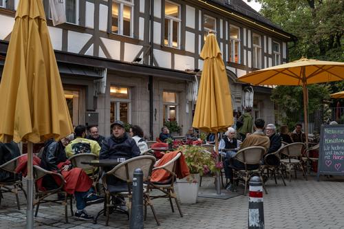
Warm tones in autumn
Nice fall colors in a well captured public outdoor cafe scene.
Agreed. The interesting thing is that this image screams Autumn, but it does so without the traditional hook of brightly coloured leaves. Instead the appropriate colours come from the sun-shades and the season implied by the people still happy to sit outside, albeit with warm clothing. Clever.
-
@PeteS has written:
Unfortunately they forgot to mention the thick clouds....
LOL, the Aroura does tend to happen in the latitude that has the most weather! :-)
