Thanks for sharing this quirky Albanian tribute to George, an ex US president who receives few tributes even at home. I'd never have known! He's the only president I ever spent any significant time in conversation with, though I met a couple of others. Though I never voted for him and opposed most of his policies, I found him charming and relatable so I'm not entirely surprised that he made some friends when visiting there. Your pictures are nicely taken with good angles to show off the architecture as well as the subjects.
-
-
This is quite wonderful. My first reaction to it was "Fan Ho" which of course is a tremendous compliment. It's not as contrasty as most of his wonderful photographs, but it has something of his use of shape, figure, and scale.
The slight figure peeping from behind the off kilter opening is quite wonderful to discover, but even better when we find him (and you?) reflected in the metallic balls resting in the corner. The textures and toning are smoothe, subtle, and perfect for the image. The opening serves as a frame for these discoveries, and the light colored triangle that crowns it has an escape route for the elements to escape, or perhaps a funnel that delivered them there.
An image I am enjoying looking at again and again.
-
The illusion works. That gentle editing gives these beautiful images a painterly impact even though they clearly photographs. I love them. They remind me of Constable, Bierstadt, and others. They are delicate and magical rather than bold.
Dan's edits take those same captures and shape them into bolder versions, more like something I'd see on 500 px. Both are valid approaches, and neither is better or worse. Your version is more to my taste.
-
What a cool abstract architectural image! Kudos to you for spotting and capturing it. The colors grab my attention and push me to examine every line and square on this checkerboard. I love the twisted reflection of the windows, they make the image. Excellent!
-
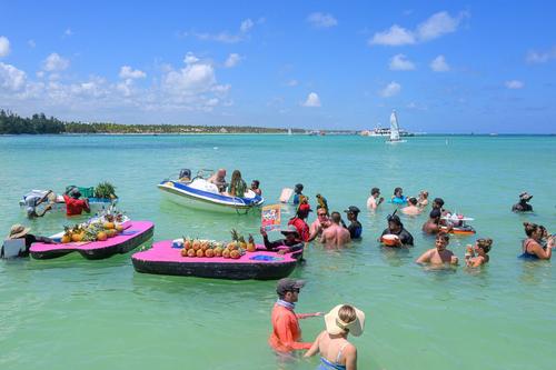
Great colors and an interesting window into the kooky entertainment we see at Oceanside resorts, particularly in the Caribbean.
-
Lovely light that is almost palpable. This one needs to be looked at full size for the intricate detail in the grasses
-
For the sake of clarity, I edited only one of Fireplace's three images.
-
It's so typical of your modesty that you just casually mention having met several US Presidents and spoken at length with at least one of them..
I was also charmed by his presence here.
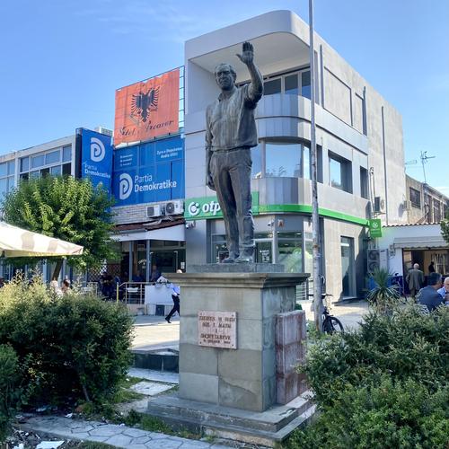
If you look again at the second image, you will notice that I tried not only to frame him within the natural frame of the building behind him, but that the flag and wording of the "advertisement" on that building are also an ironic footnote in the current climate. -
@RoelHendrickx has written:
AN ALBANIAN HERO
Having just landed on Tirana's Mother Thereza airport, we had picked up our car and headed north towards our first stop, the mountain city Krujë, from where Albanian hero Skanderbeg had started his campaign against the Ottomans who had held him as captive/hostage/ward, in order to free Albania. A good place to start an exploration of the geography and history of this intriguing country.
Our first night was to be spent in a guesthouse right in the center of the ancient citadel, next to a new Skanderbeg historical museum and above the Old Bazaar.
(Quite tricky to get there, actually, with a car on steep roads through the actual bazaar, especially on a Sunday, when the place is crowded and when also the site of the old fortress ruins is filled with cars parked quite randomly... Anyway: my first driving experience in Albania was a good baptism of fire.)Before reaching the ancient and mountainous Krujë (very touristic) and its certified local hero (Skanderbeg is to the Albanians as George Washington is to the USA) we passed through a more "modern" and bigger village/city in the plains, called Fushë-Krujë, and this gave us our first big surprise of our fantastic Albania travels.
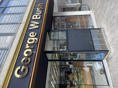
Driving up and almost at the foot of the actual old city, I noticed a "George W. Bush bakery" in the corner of my eye.
Obviously, this intrigued me, so at night I googled a bit and found out that Dubya Bush is somewhat of a hero in Albania and specifically in this town, because he visited the town on one of his foreign trips. The occasion was something to do with Albania and NATO.
georgewbush-whitehouse.archives.gov/news/releases/2007/06/images/20070610-1_d-0958-515h.html
This is what made me want to find that bakery again the next morning.(This is a photo of that bakery on the next morning, taken on my sunrise morning walk. Not the one I aim for feedback on, just a quirky mental note)
Googling a bit further after breakfast and before leaving Krujë, I found an article on Atlas Obscura telling me that there is not only a bakery, but even a statue of the US President in the town.
www.atlasobscura.com/places/george-bush-statue
Obviously, as we headed back south to start our Albanian adventure proper with a drive past Tirana and Elbasan to Lake Ohrid on the North-Macedonian border, I just HAD to go find that statue. It stands proudly on the center of a Y-shaped and very busy intersection in the business/commercial part of the town.
Having seen the various images of the statue in the Atlas Obscura online article, I spent a minute or so looking for a better angle on the statue, with a natural frame and some interesting background.
Our Albanian expedition had only just begun and I had already found a first quirky gem!
"You won't believe it" travel discoveries. As photos, first and foremost these are considered angles from the photographer so we blink at the quirkiness. In shot 1, the accompanying text is needed for us to get the point. It prepares us for shot 2. Given the text on the buildings, I'd never have guessed who the genial waving fella might be without the lead-in. There isn't much a photographer can do with a subject like this. Shot 2 is probably positioned about as well as possible to include the nameplate, the text behind so we understand where the statue is and also to minimize the influence of lines behind. The positioning of the upraised hand against its backdrop is no accident.
-
@Fireplace33 has written:@Andrew546 has written:@Fireplace33 has written:
The valley and waterfalls at Riedingtal
I have posted the waterfalls at Riedingtal many times before.
Today's post is the same again, but from slightly different angles, and from along a different route, and this time, with some nice autumn colours and even some snow at the top.
With warm colours in the foreground and the cooler colours further back, the illusion of 3D in the image is enhanced a bit.Nice. I can see where you're going here. But looks as though you're still hanging on to rationality, reason and realism. Don't forget that the effect that you're looking for, a sense of depth in a 2D image, is irrational, illogical and unreal. In part an optical illusion, which rely mainly on presenting the brain with a conflict or an ambiguity which forces the brain to make a choice when rationalising what it sees between what it is (2D)/what it reminds you of (3D).
Yes, quite agree. I didn't take them too far from reality. but I think we are on the same page here.
Seeing 3D from a flat 2D print is an "illusion" where our brain tries to use clues in the image to make us imagine that what we see is sort of 3D.
It is what an artist has to do when making a painting, adding in such clues onto the flat canvas that will suggest depth to the viewerOne of those clues, that I used in these images, is to adjust the WB. by adding more warmth, but only to the foreground compared to the background, this makes the foreground "look" closer and the background "look" further away. Outside in nature we expect to see the "far away" background looking bluer because of normal scattering in the air. so if part of the image looks bluer then we assume it must be further away.
There are some good articles in internet showing several other commonly used "tricks" to achieve "depth" in paintings. And they are nearly all applicable to photography as well :-)@Fireplace33 has written:@Andrew546 has written:@Fireplace33 has written:The valley and waterfalls at Riedingtal
I have posted the waterfalls at Riedingtal many times before.
Today's post is the same again, but from slightly different angles, and from along a different route, and this time, with some nice autumn colours and even some snow at the top.
With warm colours in the foreground and the cooler colours further back, the illusion of 3D in the image is enhanced a bit.Nice. I can see where you're going here. But looks as though you're still hanging on to rationality, reason and realism. Don't forget that the effect that you're looking for, a sense of depth in a 2D image, is irrational, illogical and unreal. In part an optical illusion, which rely mainly on presenting the brain with a conflict or an ambiguity which forces the brain to make a choice when rationalising what it sees between what it is (2D)/what it reminds you of (3D).
Yes, quite agree. I didn't take them too far from reality. but I think we are on the same page here.
Seeing 3D from a flat 2D print is an "illusion" where our brain tries to use clues in the image to make us imagine that what we see is sort of 3D.
It is what an artist has to do when making a painting, adding in such clues onto the flat canvas that will suggest depth to the viewerOne of those clues, that I used in these images, is to adjust the WB. by adding more warmth, but only to the foreground compared to the background, this makes the foreground "look" closer and the background "look" further away. Outside in nature we expect to see the "far away" background looking bluer because of normal scattering in the air. so if part of the image looks bluer then we assume it must be further away.
There are some good articles in internet showing several other commonly used "tricks" to achieve "depth" in paintings. And they are nearly all applicable to photography as well :-)I agree that photographers should study painting. Painting has multi hundreds of years of thought about how images work on the perception and interpretation of a viewer. There is no doubt that Dan's version has photographic impact and I'm not dissing it. Comparing his version and the original is the kind of exercise used in photography courses. By bringing the background forward, Dan's version flattens the image. That's fine but it is a completely different purpose to that of Fireplace who has shared with us what he was trying to do with these images and how he went about it.
The three of them have to be viewed at large size so the foreground foliage details can be appreciated. Seen at the small size there isn't much interest in the foreground and the eyes go straight to the mountains at the rear. This loses the movement from front to rear that is what these are about. Dan's version crops out much of the foreground and makes the falls the subject. -
@ChrisOly has written:
reflections
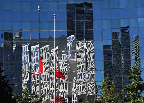
Fyi - convex glass in the background.
There's an attractive build up of layer overlaying layer here. The sky first, Then buildings then zebra like patterns over some of the buildings and finally the red moments of the flags. I've no idea what might be creating the zebra pattern but it's visually bold and jumps out from the other layers.
Chris's note about the convex surface is useful. It would have been difficult to make sense of the flag, its reflection and the position of the reflection otherwise.
Now I'm curious. I take it that the flags, foreground, are not reflections. That convex surface must be unusually large for a convex surface. What is it? -
@MikeFewster has written:
There is no doubt that Dan's version has photographic impact and I'm not dissing it. Comparing his version and the original is the kind of exercise used in photography courses. By bringing the background forward, Dan's version flattens the image.
Not everyone sees the edit as flattening the image.
The foreground foliage in the edit still gives us a sense of depth with the waterfall a long way behind the "new" foreground.
-
@MikeFewster has written:
Dan's version crops out much of the foreground and makes the falls the subject.
Yes, making the falls stand out more is what I posted was the intention while maintaining a sense of depth with the falls still a long way behind the foreground foliage.
-
@MikeFewster has written:@Fireplace33 has written:@Andrew546 has written:@Fireplace33 has written:
The valley and waterfalls at Riedingtal
I have posted the waterfalls at Riedingtal many times before.
Today's post is the same again, but from slightly different angles, and from along a different route, and this time, with some nice autumn colours and even some snow at the top.
With warm colours in the foreground and the cooler colours further back, the illusion of 3D in the image is enhanced a bit.Nice. I can see where you're going here. But looks as though you're still hanging on to rationality, reason and realism. Don't forget that the effect that you're looking for, a sense of depth in a 2D image, is irrational, illogical and unreal. In part an optical illusion, which rely mainly on presenting the brain with a conflict or an ambiguity which forces the brain to make a choice when rationalising what it sees between what it is (2D)/what it reminds you of (3D).
Yes, quite agree. I didn't take them too far from reality. but I think we are on the same page here.
Seeing 3D from a flat 2D print is an "illusion" where our brain tries to use clues in the image to make us imagine that what we see is sort of 3D.
It is what an artist has to do when making a painting, adding in such clues onto the flat canvas that will suggest depth to the viewerOne of those clues, that I used in these images, is to adjust the WB. by adding more warmth, but only to the foreground compared to the background, this makes the foreground "look" closer and the background "look" further away. Outside in nature we expect to see the "far away" background looking bluer because of normal scattering in the air. so if part of the image looks bluer then we assume it must be further away.
There are some good articles in internet showing several other commonly used "tricks" to achieve "depth" in paintings. And they are nearly all applicable to photography as well :-)@Fireplace33 has written:@Andrew546 has written:@Fireplace33 has written:The valley and waterfalls at Riedingtal
I have posted the waterfalls at Riedingtal many times before.
Today's post is the same again, but from slightly different angles, and from along a different route, and this time, with some nice autumn colours and even some snow at the top.
With warm colours in the foreground and the cooler colours further back, the illusion of 3D in the image is enhanced a bit.Nice. I can see where you're going here. But looks as though you're still hanging on to rationality, reason and realism. Don't forget that the effect that you're looking for, a sense of depth in a 2D image, is irrational, illogical and unreal. In part an optical illusion, which rely mainly on presenting the brain with a conflict or an ambiguity which forces the brain to make a choice when rationalising what it sees between what it is (2D)/what it reminds you of (3D).
Yes, quite agree. I didn't take them too far from reality. but I think we are on the same page here.
Seeing 3D from a flat 2D print is an "illusion" where our brain tries to use clues in the image to make us imagine that what we see is sort of 3D.
It is what an artist has to do when making a painting, adding in such clues onto the flat canvas that will suggest depth to the viewerOne of those clues, that I used in these images, is to adjust the WB. by adding more warmth, but only to the foreground compared to the background, this makes the foreground "look" closer and the background "look" further away. Outside in nature we expect to see the "far away" background looking bluer because of normal scattering in the air. so if part of the image looks bluer then we assume it must be further away.
There are some good articles in internet showing several other commonly used "tricks" to achieve "depth" in paintings. And they are nearly all applicable to photography as well :-)I agree that photographers should study painting. Painting has multi hundreds of years of thought about how images work on the perception and interpretation of a viewer.
Thanks :-)
Here's a link to one of the many articles in internet showing how painters can use various methods to help create depth on a flat piece of paper.
The methods are also largely valid for photography as well.
zevendesign.com/creating-depth-art-photography/
I used the method described there called "Depth by colour" to gently add a bit of depth to these images, where, objects in the foreground were made warmer. Interestingly the link shows it can also work in the other direction too (in perhaps less common cases), E.g. if you are standing in a deeply shadowed area and looking out into a much brighter distant background , maybe with the setting sun also visible in the image, then objects in the distance will appear progessively warmer. And a white frame for the image would help to enhance the effect too in that case tooQuoted message:There is no doubt that Dan's version has photographic impact and I'm not dissing it. Comparing his version and the original is the kind of exercise used in photography courses. By bringing the background forward, Dan's version flattens the image.
I agree, it looks flatter to me.
Quoted message:That's fine but it is a completely different purpose to that of Fireplace who has shared with us what he was trying to do with these images and how he went about it.
The three of them have to be viewed at large size so the foreground foliage details can be appreciated. Seen at the small size there isn't much interest in the foreground and the eyes go straight to the mountains at the rear. This loses the movement from front to rear that is what these are about.Also, if you are viewing the full res version, DPRevived will present the image on a black background, which (according the link posted here) also enhances the depth by colour effect I used :-)
Quoted message: -
@MikeFewster has written:
Coy.
The image needs to be seen large to see somedetails.
I'll see what everyone thinks about this before giving more details about what Is shown.Please don't edit this image without asking permission.
To be honest, not quite sure what to make of this photo. It has a bit of a claustrophobic feel to it. It is all a bit "grey", with a little texture on the walls, and those shiny metal metal balls in the corner? The man is just about to appear from around the corner?
Perhaps it is part of some art exhibition, but I can't tell what that might be here ? -
@ChrisOly has written:
reflections
Fyi - convex glass in the background.
Nice bright colours and contrast. Those striking reflections make for a nice & interesting image
-
@Sagittarius has written:
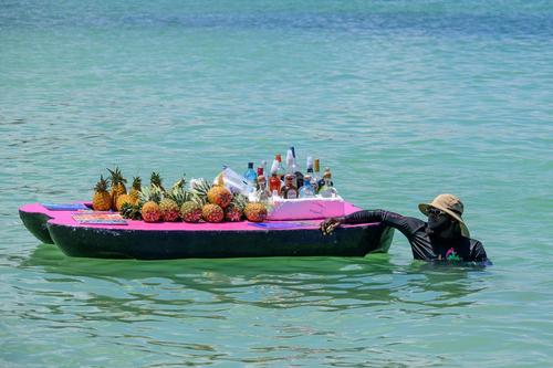
If I went for a swim in this beautiful area I wouldn't want to have to hear the sellers calling out and advertising how good their wares are.
I'd just want to relax a bit , but no peace for the wicked anywhere ;-) -
@RoelHendrickx has written:
AN ALBANIAN HERO
Having just landed on Tirana's Mother Thereza airport, we had picked up our car and headed north towards our first stop, the mountain city Krujë, from where Albanian hero Skanderbeg had started his campaign against the Ottomans who had held him as captive/hostage/ward, in order to free Albania. A good place to start an exploration of the geography and history of this intriguing country.
Our first night was to be spent in a guesthouse right in the center of the ancient citadel, next to a new Skanderbeg historical museum and above the Old Bazaar.
(Quite tricky to get there, actually, with a car on steep roads through the actual bazaar, especially on a Sunday, when the place is crowded and when also the site of the old fortress ruins is filled with cars parked quite randomly... Anyway: my first driving experience in Albania was a good baptism of fire.)Before reaching the ancient and mountainous Krujë (very touristic) and its certified local hero (Skanderbeg is to the Albanians as George Washington is to the USA) we passed through a more "modern" and bigger village/city in the plains, called Fushë-Krujë, and this gave us our first big surprise of our fantastic Albania travels.
Driving up and almost at the foot of the actual old city, I noticed a "George W. Bush bakery" in the corner of my eye.
Obviously, this intrigued me, so at night I googled a bit and found out that Dubya Bush is somewhat of a hero in Albania and specifically in this town, because he visited the town on one of his foreign trips. The occasion was something to do with Albania and NATO.
georgewbush-whitehouse.archives.gov/news/releases/2007/06/images/20070610-1_d-0958-515h.html
This is what made me want to find that bakery again the next morning.(This is a photo of that bakery on the next morning, taken on my sunrise morning walk. Not the one I aim for feedback on, just a quirky mental note)
Googling a bit further after breakfast and before leaving Krujë, I found an article on Atlas Obscura telling me that there is not only a bakery, but even a statue of the US President in the town.
www.atlasobscura.com/places/george-bush-statue
Obviously, as we headed back south to start our Albanian adventure proper with a drive past Tirana and Elbasan to Lake Ohrid on the North-Macedonian border, I just HAD to go find that statue. It stands proudly on the center of a Y-shaped and very busy intersection in the business/commercial part of the town.
Having seen the various images of the statue in the Atlas Obscura online article, I spent a minute or so looking for a better angle on the statue, with a natural frame and some interesting background.
Our Albanian expedition had only just begun and I had already found a first quirky gem!
That is a bit strange. He must have made a good impression on someone there.
