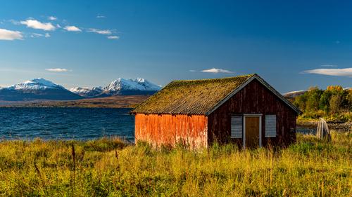
Very nice scene but it looks better on my screen with the shadows lightened a little and with a bluer sky.
-
-
-
I like that scene. The blue sky in the background creates an interesting backdrop and sets the stage for exploration.
-
That hut with a splash of fading colour against the blue sky and water creates visual interest.
-
Two different posts create tension and interest.
-
That rainbow of colours make the picture.
-
Nightmare for electrician, but great background for the main subject.
-
Like the shape of that hill and the lonely tree as an anchor. Great evening shot.
-
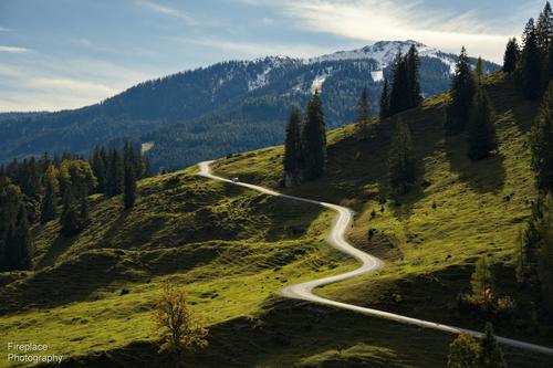
Great capture of that winding road.
-
Hidden gem in the forest. The setting is perfect.
-
That branch at the angle makes the picture.
-
-
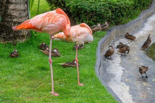
That juxtaposition of big birds vs small is perfect. Well seen.
-
Thanks Chris,
But you missed it!
🙄
Rich
-
@RoelHendrickx has written:
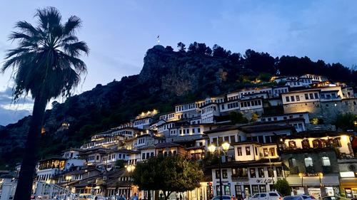
BERAT AROUND SUNSET
Another image from Albania, and another one made with my Iphone
("real camera" images, many similar to these previews, at least in composition, but with other lenses are made,
but are on my hard drive waiting for me to find time for selection and processing).
Enlarge for more detail.This is a view of Berat, a gorgeous (and seemingly very pleasant to live in) city in the center of the country, south of Tirana.
Berat consists of several quarters, dominated by a citadel with old fortress ruins (and a few churches perched on the cliffs).
One quarter on the one side of the river that transects the town between steep hills is predominantly muslim originally.
The other on the opposite side of the river is predominantly christian. Two bridges unite them and the (more modern) recent quarters of the city.Both of the historic quarters are beautiful to stroll through and together they give the city UNESCO status and also its nickname of "The City of 1000 Windows".
Indeed : the houses against the hills and cliffs form a remarkably harmonious ensemble, because most houses have the same type of rectangular window in white stucco walls, and the windows are most often even spaced similarly. It looks highly harmonious while also organic, as if the whole city is one big organism.An unusual composition. The palm silhouette provides the balance to the bottom right details and highlights. The three bands , sky, dark cliff face, and lit up houses are somewhat interesting. I don't think I would have picked up the window regularity without the text. Once noted however, the whole shot gets a second look and an explore. Do the windows from the different cultural communities have the same windows?
-
@Fireplace33 has written:
Nearly there!
The long and winding road, starting in the Riedingtal valley and used to take supplies up to the “4 huts”.
They are a popular hiking destination, for a welcome rest along the way, and can be reached on foot via several different routes.
(Please do not edit this image)
A very nicely judged exposure. It keeps the line of the road bright but not burnt out while the road moves through the shadow area, bottom right. It's the length of the road and the movement it gives through the scene that makes the photo work.
I know it isn't the same road but the fingers extending down from the far peak pick up lines that connect foreground and background. -
@DanHasLeftForum has written:@minniev has written:
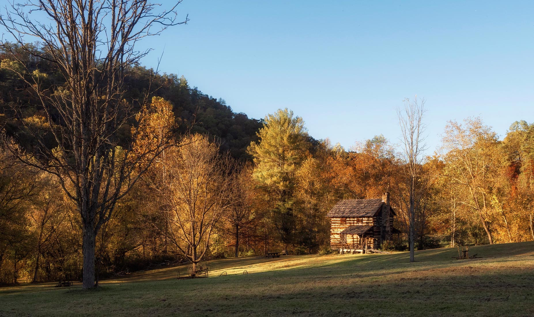
Gladie - Traveling in Kentucky and explored the Red River Gorge yesterday, it is geological oddity that is protected and available to the public like a national park but under auspices of the dept of Agriculture. This old farm is called Gladie and is used by district rangers. It was beautiful in the sunset light, which comes earlier inside a gorge than it does in the above-world. I have some closer ups but liked the distant scene the way I came upon it, though unsure if it works for others.
\
I like this scene and lighting very much but the hut leaning over slightly is a little off putting for me.
Straightening it and cropping a bit off the bottom making it more of a pano aspect ratio works better for me.
As always, just some food for thought.
I like the suggested crop. It keeps the shadows and warm light of the original. It keeps the balance of the building on the right and the tree on the left. It builds on the horizontal lines of the original. What I like best is the clearer detail given to the wagon wheels and what I think is an artwork from discarded tractor parts. These features add character to the house.
Both look best when viewed large so the foliage and rich light can be savoured. -
@DanHasLeftForum has written:
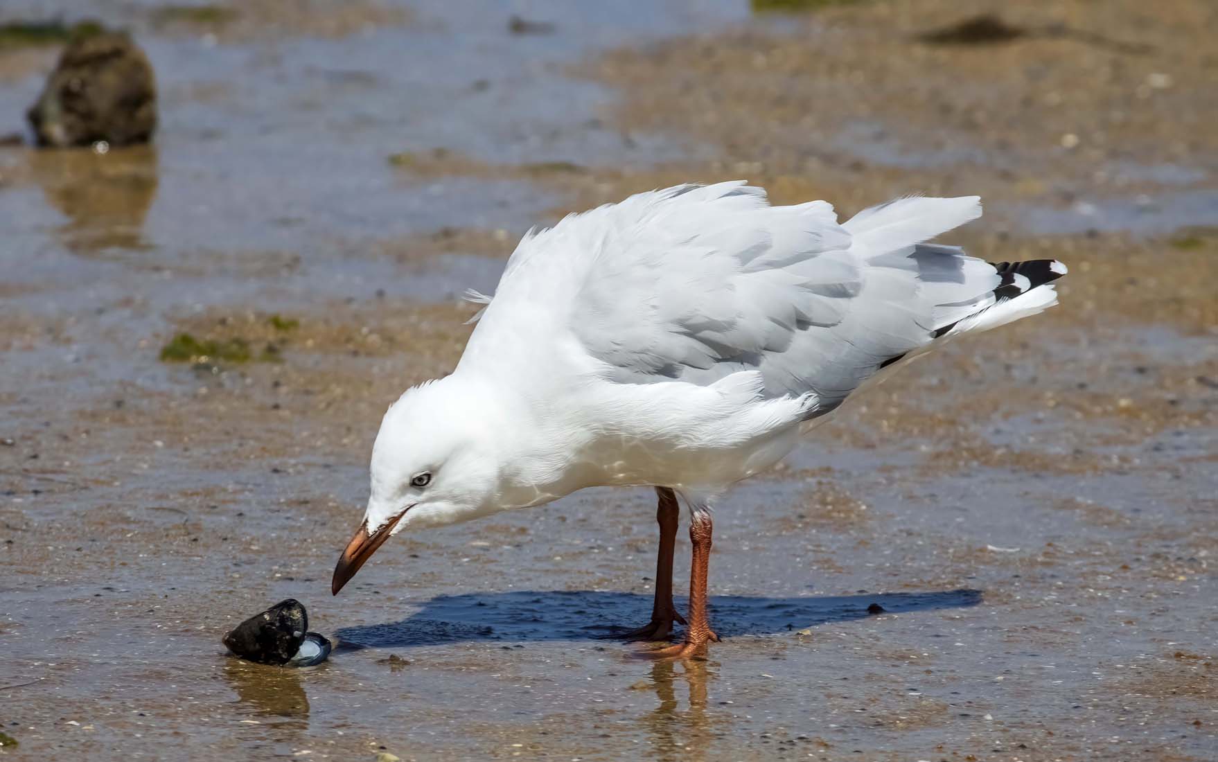
** SNACK TIME **
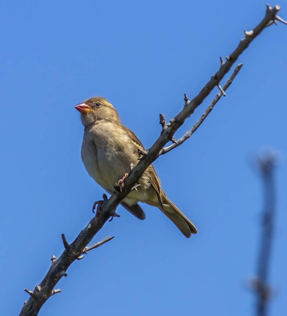
** KEEPING LOOKOUT **
Snack Time.
The downward tilt of the bird's head and body creates a line that flows from the tail. It comes together through the eye to the very point of the beak. And these take the viewer to the open shell. The shadow gives a second line to the same opening on the shell. It's a V composition that locks the viewer's eye so we share a point of intense interest with the bird.
A very effective shot.
