I've got a problem in responding to these Alan. Are they intended to be independent shots or should they be considered as linked?
-
-
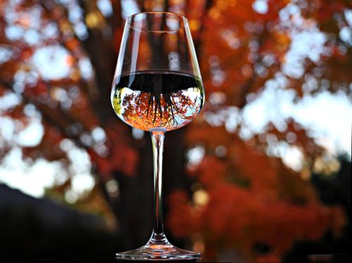
A shot that brings back lots of memories for me Chris. Way back in 2009 I did a series at a winery/restaurant on the Murray River in Australia. I was playing with the same inverted image in a wine glass effect. I dug into the archives and looked at mine. The quality of digital images has come quite a distance in fifteen years.
My favourite thing here is that the image in the glass allows us to see the tree that forms the dark background to the glass. Further, the pale blue sky around the image in the glass beautifully separates the glass image from the out of focus background so the inverted image emerges.
The dark, rich reds inspire the appetite. -
Wonderful.
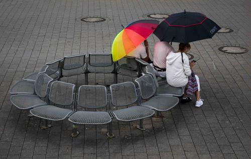
Two things create the magic.
First, the repetition of the umbrella shape. The seating creates its own circle and is also composed of many umbrella like shapes in the sets and backs. Add the umbrellas themselves. Then add another series of similar shapes in the paving, top right. The circles top right lead out of the frame and the girls are facing out of the shot along the same line. It fee;s OK as the movement is balanced by the weight of the large circle of empty seats.
While the bright umbrella at first is the subject, it doesn't dominate our attention as it sits along the diagonal line of the picture. It adds awareness of the more subtle composition at work here. -
Independant shots taken on the same evening.
Alan
-
@AlanSh has written:@MikeFewster has written:@AlanSh has written:
Night time views (not to be editied, just commented upon)
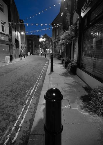
St Chad's Church in Rochdale
Baille St.
I've got a problem in responding to these Alan. Are they intended to be independent shots or should they be considered as linked?
Independant shots taken on the same evening.
Alan
Interesting pics.
Odd that the second shows no EXIF data. Is this because the sky is blue and the rest B&W? (How did you do that, by the way?)
What noise reduction did you use on the first picture?
David
-
@Rich42 has written:
Rich
Right down to the nose protector, chinstrap and bevor.
You had your eyes open. Thanks for sharing. -
@RoelHendrickx has written:@MikeFewster has written:
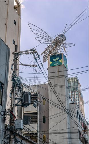
Manga Territory.
This part of Osaka is dedicated to Manga and Transformas and action figures and comics......This is a prime example of the fact that a wider shot can be so much better than a zoomed-in image.
I am quite certain that most photographers shooting the art installations in this neighbourhood, would whip out the telephoto lens and try to isolate that insect (a bee? a wasp?) perching on the building.
Such an image would be a good shot for in an art catalog, but not a good representation of the art in its natural surroundings.
A wider view adds context and (frankly) life.
Many would consider the chaos and tangle of all those electricity and telecom wires a distraction and a nuisance.
But they are integral to this area of the world (although I must admit I would expect them sooner in Thailand Vietnam or China than in Japan; Japan always conjures images of exaggerated neatness and structure in my mind).
More than just context and a sense of place, it adds also interest and a layer.
Because, of course, that tangle of wires resembles a spider's web, enlarged, and it fits with the insect sitting above it, about to be caught.I'll chat about Roel's comments in my response to Dan's thoughts.
-
@MikeFewster has written:@DanHasLeftForum has written:
** SNACK TIME **
** KEEPING LOOKOUT **
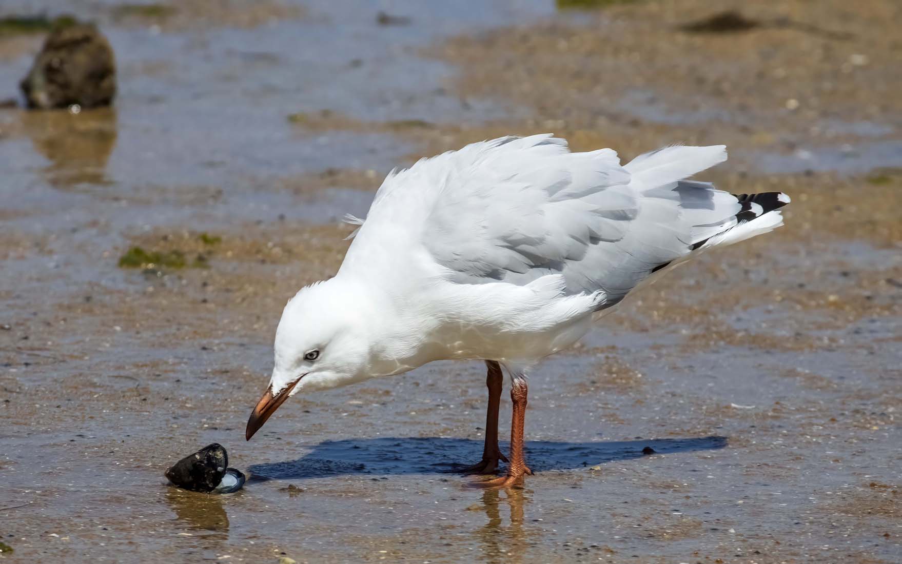
Snack Time.
The downward tilt of the bird's head and body creates a line that flows from the tail. It comes together through the eye to the very point of the beak. And these take the viewer to the open shell. The shadow gives a second line to the same opening on the shell. It's a V composition that locks the viewer's eye so we share a point of intense interest with the bird.
A very effective shot.Thank you but you are reading far more into this snapshot than what I was thinking at the time.
The seagull was continually moving around and I didn't have any time to compose it in any particular way.
-
@DanHasLeftForum has written:@MikeFewster has written:@DanHasLeftForum has written:
** SNACK TIME **
** KEEPING LOOKOUT **
Snack Time.
The downward tilt of the bird's head and body creates a line that flows from the tail. It comes together through the eye to the very point of the beak. And these take the viewer to the open shell. The shadow gives a second line to the same opening on the shell. It's a V composition that locks the viewer's eye so we share a point of intense interest with the bird.
A very effective shot.Thank you but you are reading far more into this snapshot than what I was thinking at the time.
The seagull was continually moving around and I didn't have any time to compose it in any particular way.
Sure. But that is what you got. That is what is in the image, irrespective of your intentions.
-
@RoelHendrickx has written:
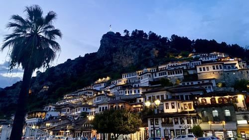
BERAT AROUND SUNSET
Another image from Albania, and another one made with my Iphone
("real camera" images, many similar to these previews, at least in composition, but with other lenses are made,
but are on my hard drive waiting for me to find time for selection and processing).
Enlarge for more detail.This is a view of Berat, a gorgeous (and seemingly very pleasant to live in) city in the center of the country, south of Tirana.
Berat consists of several quarters, dominated by a citadel with old fortress ruins (and a few churches perched on the cliffs).
One quarter on the one side of the river that transects the town between steep hills is predominantly muslim originally.
The other on the opposite side of the river is predominantly christian. Two bridges unite them and the (more modern) recent quarters of the city.Both of the historic quarters are beautiful to stroll through and together they give the city UNESCO status and also its nickname of "The City of 1000 Windows".
Indeed : the houses against the hills and cliffs form a remarkably harmonious ensemble, because most houses have the same type of rectangular window in white stucco walls, and the windows are most often even spaced similarly. It looks highly harmonious while also organic, as if the whole city is one big organism.The dominant repeating arch shapes rising from the lower left to upper right controls the reading of this image. The palm tree is an interruption that gives counterbalance. The subject matter itself is fascinating with all the matching windows in structures set so close together. Of course the contrast between blues and yellows is always a winning combination. Very nice.
-
@Fireplace33 has written:
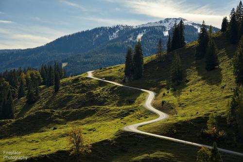
Nearly there!
The long and winding road, starting in the Riedingtal valley and used to take supplies up to the “4 huts”.
They are a popular hiking destination, for a welcome rest along the way, and can be reached on foot via several different routes.
(Please do not edit this image)
The twisting line of the road that disappears over the edge of the hill causes this image to be read two ways: left to right following the landscape lines that rise from the left lower corner to the right upper, and right to left as we follow that road. The road disappears along the thirds line. There are alternating bands of subject matter and color that approximate thirds as they rise to the right. There is a visual mystery to solve, as to where the road leads, This is a compositional lesson in framing, beautifully done. (I do think a slight raising of the shadows would make it flow even better, as the darks are getting a bit close to blocking).
-
@DanHasLeftForum has written:
** SNACK TIME **
** KEEPING LOOKOUT **
Both are nice sharp images that are well composed along visual and implies lines that lead from lower left to upper right. The first is most engaging because it also contains a story. The second is a successful portrait. In the second I would clone out or crop away the OOF stick on the right lower edge; it is a distraction and doesn't add anything to the image.
-
@MikeFewster has written:@AlanSh has written:
Night time views (not to be editied, just commented upon)
St Chad's Church in Rochdale
Baille St.
I've got a problem in responding to these Alan. Are they intended to be independent shots or should they be considered as linked?
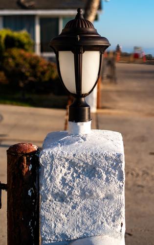
Interesting, sort of quirky shots that convey the feeling of a nighttime walk in the city. If they were mine I would crop some of that dark area off the first one's right edge, since there's not much visible over there, to give more balance between the light and dark areas. In the second, I'd crop out hat lower post which isn't quite sharp anyway, and go with a square composition, putting the viewer at more distance from the scene but also keeping him/her from tripping over that post!
-
@ChrisOly has written:
Glass
Half empty or half full...
I've seen these kinds of photos but never tried one! You did well here. Your choice of the lovely tree as a backdrop works nicely, and having the background tree blurred so thoroughly that we only see its true form in the tiny reflection is very effective. I also like that the colors are brighter in the reflection than in the background - that makes me look more carefully at the fine details in the reflected object. Beautiful.
-
@RoelHendrickx has written:@MikeFewster has written:
Manga Territory.
This part of Osaka is dedicated to Manga and Transformas and action figures and comics......This is a prime example of the fact that a wider shot can be so much better than a zoomed-in image.
I am quite certain that most photographers shooting the art installations in this neighbourhood, would whip out the telephoto lens and try to isolate that insect (a bee? a wasp?) perching on the building.
Such an image would be a good shot for in an art catalog, but not a good representation of the art in its natural surroundings.
A wider view adds context and (frankly) life.
Many would consider the chaos and tangle of all those electricity and telecom wires a distraction and a nuisance.
But they are integral to this area of the world (although I must admit I would expect them sooner in Thailand Vietnam or China than in Japan; Japan always conjures images of exaggerated neatness and structure in my mind).
More than just context and a sense of place, it adds also interest and a layer.
Because, of course, that tangle of wires resembles a spider's web, enlarged, and it fits with the insect sitting above it, about to be caught.Roel has said this so well and so thoroughly that I can only agree. The story told in the larger framing is much more interesting than the art object alone. Knowing it is in manga-land adds to the story.
Photographs of art objects by themselves are seldom enough of a story to warrant consideration of the photograph as art itself, but add context, add other elements, tell a story, and the art object becomes a component of a different art object.
-
@DanHasLeftForum has written:@PeteS has written:
Just Sitting Around
Taken from a boat at the quay in Kappeln, on the Schlei Fjord in Northern Germany this summer. It was showery weather, going from cloudy, to fine rain, to shower, to hardly raining, to heavy shower and back again in quick succession. When I took this it wasn't raining, but I think these people just got fed up of opening and closing umbrellas, and just left them up!
I like the way the splash of colour stands out from the monochrome like rest of the scene.
The motif of repeating circles is the core of this image - the chairs, the floor inserts (drains?) the umbrellas. That the one colorful umbrella is askew interrupts the sameness. It is punctuation in the composition: an apostrophe.
-
@DanHasLeftForum has written:@Fireplace33 has written:
Nearly there!
The long and winding road, starting in the Riedingtal valley and used to take supplies up to the “4 huts”.
They are a popular hiking destination, for a welcome rest along the way, and can be reached on foot via several different routes.
(Please do not edit this image)
Very nice scene but it looks better on my screen with the shadows lightened a little and with a bluer sky.
I understand why you would want to brighten the shadows a bit and I don't disagree but we must make absolutely sure that the path remains a very clear main element, that pops up because of the high contrast between its brightness and the surrounding landscape.
-
@JSPhotoHobby has written:
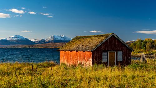
Getting to editing my Norway images
I love this photo. The light is gorgeous, the colors rich. A weathered structure is one of my own favorite subjects, and this one is a gem. The angle is perfect and the backdrop of snow covered mountains in the distance and blue water in the mid ground is perfect to contrast in color and texture with the yellows of the grasses. A wonderful image!

