Thank you Chris.
-
-
@Rich42 has written:@lhphoto has written:
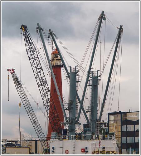
Lighthouse, thanks for looking.
Essentially an abstract composition. .........
Depends on how you define abstract in art or photography.
An abstract image should not have any connection to any object in the real world.
Given lhphoto titled the image "Lighthouse" I doubt he intended it to be abstract, especially since the lighthouse and cranes are clearly identifiable objects.
-
@DanHasLeftForum has written:
** KEEPING LOOKOUT **
You always recommend what I should remove or replace in a photo.
Why didn't you come up with this simple idea: -
@JSPhotoHobby has written:
Getting to editing my Norway images
Excellent photo...
Makes me wish I could have been there with you. -
@Kumsal has written:
You always recommend what I should remove or replace in a photo.
Why didn't you come up with this simple idea:Go back and read the thread if you are genuinely interested because that suggestion was already put forward by someone else and answered 😀
-
@DanHasLeftForum has written:@MikeFewster has written:
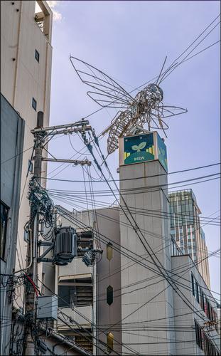
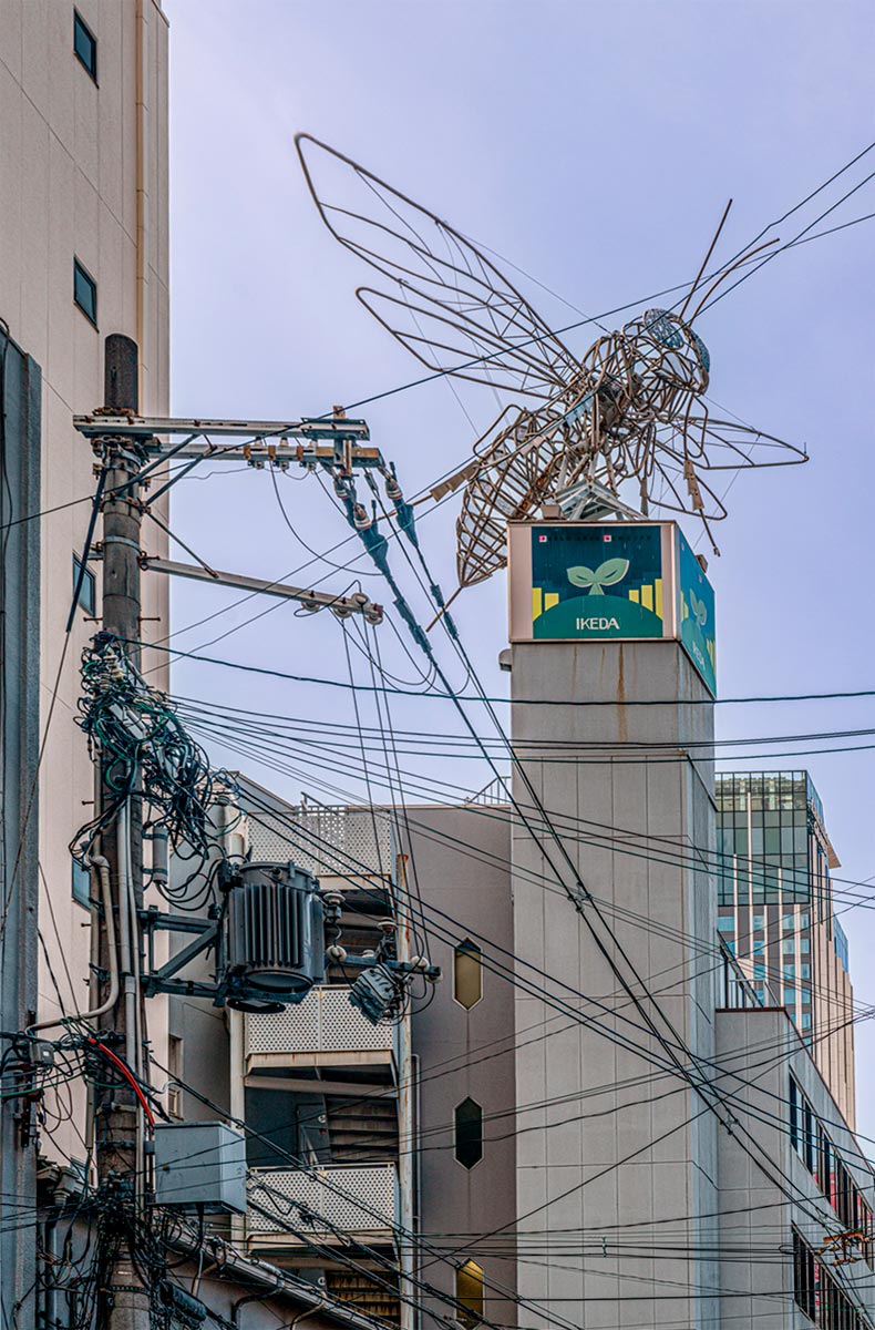
Manga Territory.
This part of Osaka is dedicated to Manga and Transformas and action figures and comics......I don't know if another angle without all the clutter in the bottom half was possible but the clutter spoils the image for me regardless of the intention of the image.
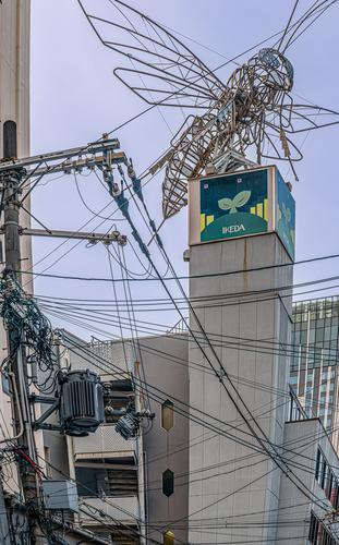
For me, straightening the image helps make the other elements (cables and buildings) apart from the bee less distracting and less of an eye magnet given the cables leading our eyes away from the bee.
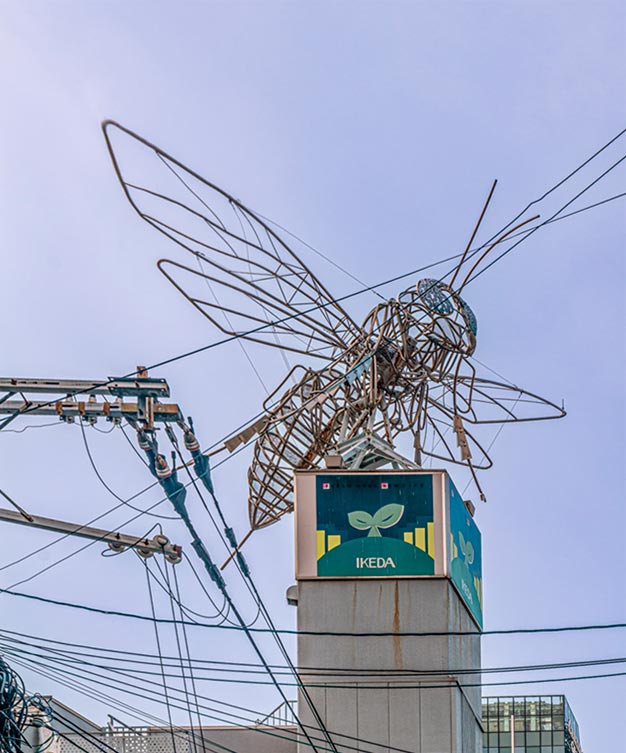
And depending on what you would like to highlight as the subject, a crop something like this after straightening works much better for me.
Thanks Dan, Roel, Chris and minniev.
When I took the shot I was very aware of manga. The district is full of shops with all the gear. I didn’t see the critter as benign or caught in a web. It looked like one of the techno monsters created accidentally, or by the inevitable mad scientist. Naturally, it has been unleashed to destroy the world. Again. You know the story. Probably it feeds off our power lines. I noted the stinger at the back.
I was trying to get something of the above into the image and so I tried to get ”the city” and “tech” in the image. I wanted all the power lines and electrical supply thingies in the shot.
Was what I wanted coming across? I didn’t know so I cheated somewhat with prompts in the text and by leaving it for anyone to try edits to see what they made of it.
Dan’s edits prodded me in a direction I should have seen first up. Rather than correct the perspectives, I should have gone further down the graphic novel track.IMNHO, this latest version is better than the original post.
-
@JSPhotoHobby has written:
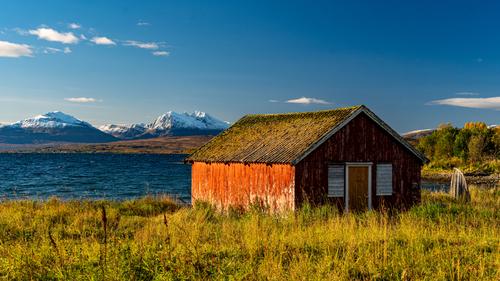
Getting to editing my Norway images
A line of inverted Vs from side to side (including the on end boat) hold the image together. The glowing orange of the peeling paint wall gives a focal point but it isn't the subject. The scene radiates out from here. Just enough cloud in the sky to break up the blue and complement the snowy peaks.
Peaks, grasses, weathered timber and a lake. There's a spot almost exactly opposite on the other side of the globe with a much photographed old boat shed. The places feel similar. Cradle Mountain in Tasmania. -
@ChrisOly has written:@AlanSh has written:
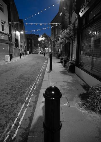
Baille St.
I like that scene. The blue sky in the background creates an interesting backdrop and sets the stage for exploration.
Agreed Chris. And I like the parallel white lines from foreground to background and the echo of them in the white lines of the flags.
Looking at it again I further picked up on the white refeletion on the top of the closest ballard. It's almost not noticed but very important. It lifts the bollard from being a featureless black shape but more importantly picks up the white lines to the left and the flags at the rear. It unifies the elements of the photo into a harmonious whole. -
@AlanSh has written:@davidwien has written:@AlanSh has written:@MikeFewster has written:@AlanSh has written:
Night time views (not to be editied, just commented upon)
St Chad's Church in Rochdale
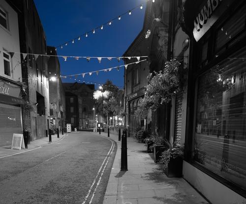
Baille St.
I've got a problem in responding to these Alan. Are they intended to be independent shots or should they be considered as linked?
Independant shots taken on the same evening.
Alan
Interesting pics.
Odd that the second shows no EXIF data. Is this because the sky is blue and the rest B&W? (How did you do that, by the way?)
What noise reduction did you use on the first picture?
David
First picture - NR was done with ACR.
Second picture, I selected the sky in Phtoshop, inverted the selection and turned that to B&W. It has no Exif because I (unwittingly) ticked a button on the image resizer which says 'don't copy exif'.Minnie, here's a version without the first bollard. Personally, I prefer the original as my eye follows the road better if the image is ling and thin. Bur feel free to comment.
I prefer the original version as well. It makes more of the parallel white lines and these fit well with the portrait mode. Number one also includes the chalk markings on the pavement which gives extra character to the location.
-
@RoelHendrickx has written:@MikeFewster has written:@RoelHendrickx has written:
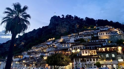
BERAT AROUND SUNSET
Another image from Albania, and another one made with my Iphone
("real camera" images, many similar to these previews, at least in composition, but with other lenses are made,
but are on my hard drive waiting for me to find time for selection and processing).
Enlarge for more detail.This is a view of Berat, a gorgeous (and seemingly very pleasant to live in) city in the center of the country, south of Tirana.
Berat consists of several quarters, dominated by a citadel with old fortress ruins (and a few churches perched on the cliffs).
One quarter on the one side of the river that transects the town between steep hills is predominantly muslim originally.
The other on the opposite side of the river is predominantly christian. Two bridges unite them and the (more modern) recent quarters of the city.Both of the historic quarters are beautiful to stroll through and together they give the city UNESCO status and also its nickname of "The City of 1000 Windows".
Indeed : the houses against the hills and cliffs form a remarkably harmonious ensemble, because most houses have the same type of rectangular window in white stucco walls, and the windows are most often even spaced similarly. It looks highly harmonious while also organic, as if the whole city is one big organism.An unusual composition. The palm silhouette provides the balance to the bottom right details and highlights. The three bands , sky, dark cliff face, and lit up houses are somewhat interesting. I don't think I would have picked up the window regularity without the text. Once noted however, the whole shot gets a second look and an explore. Do the windows from the different cultural communities have the same windows?
The regularity of the windows is better seen in some of my other images of the place.
Like this one (shot by day and from across the river so with less distortion than an image pointing up):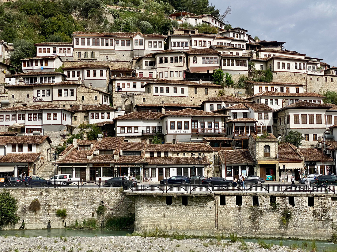
From what I could see, there was little if any difference between the houses (and their windows) in both ancient quarters on the two sides of the river.
OK. Nice to see some harmony between the cultures.
-
@DanHasLeftForum has written:@lhphoto has written:
Lighthouse, thanks for looking.
Hmmmmm.......I assume you had no choice but why would you put the subject in the background!
The cranes are a distraction and detract from the image for me.
Surely it is the juxtaposition of the cranes and the lighthouse that's the point of the image? The lighthouse is a stone structure from a different era. It shares an elongated cylindrical shape with the modern structures. The crown like splaying out of the cranes frames the lighthouse in an unexpected way. The rich dark red of the lighthouse easily helps it emerge from the gantries.
Further, I like the balance provided by the dark band across the sky at the top to the base structure. -
@DanHasLeftForum has written:
What I said was
@DanHasLeftForum has written:Hmmmmm.......I assume you had no choice but why would you put the subject in the background!
The cranes are a distraction and detract from the image for me.
Let's see if lhphoto decides to discuss why the lighthouse, which I interpret to be the subject judging by his post,
@lhphoto has written:Lighthouse, thanks for looking.
was put in the background in his photo.
Hmmmmm.......I assume then that you decide what the photo should be from the words, not the image itself?
I have a lovely photo of a sunset that I was going to post, but I made the classic error of puttijng the subject in the background. Oh well...
-
Putting a subject in the background might be ok if it isn't obscured by the foreground.
-
@ChrisOly has written:@Sagittarius has written:
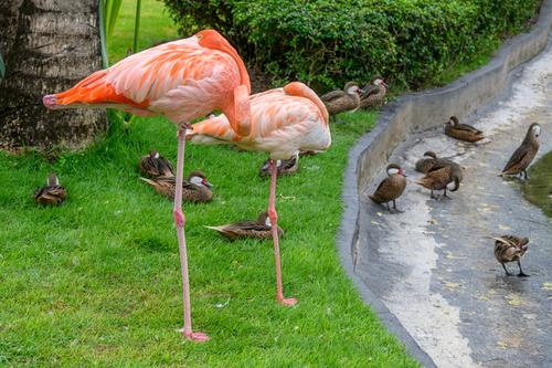
Cooling time
That juxtaposition of big birds vs small is perfect. Well seen.
Another shot where I'm saying much the same as Chris. Size, colour, stance. The exotic and the everyday.
Another "Well seen." -
@DanHasLeftForum has written:
Putting a subject in the background might be ok if it isn't obscured by the foreground.
Try to look at it this way:
We see a photo of a woman's face behind a veil.
Is the woman the subject, or the veil?
Could be either, I guess. -
@MikeFewster has written:@ChrisOly has written:@Sagittarius has written:
Cooling time
That juxtaposition of big birds vs small is perfect. Well seen.
Another shot where I'm saying much the same as Chris. Size, colour, stance. The exotic and the everyday.
Another "Well seen."Agree.
Like a photo of two supermodels taking a nap on a bench between lots of housewives chattering and going about their daily business.
(With all due respect to housewives, of course. Just making an analogy.) -
@RoelHendrickx has written:@DanHasLeftForum has written:
Putting a subject in the background might be ok if it isn't obscured by the foreground.
Try to look at it this way:
We see a photo of a woman's face behind a veil.
Is the woman the subject, or the veil?
Could be either, I guess.It depends on the nature of the veil and whether it is physically on the woman or separate from the woman and some distance in front of her.
Lhphoto titled his image "Lighthouse", making it the subject, according to my interpretation of his post hence my question asking why is the lighthouse in the background.
-
@DanHasLeftForum has written:@RoelHendrickx has written:@DanHasLeftForum has written:
Putting a subject in the background might be ok if it isn't obscured by the foreground.
Try to look at it this way:
We see a photo of a woman's face behind a veil.
Is the woman the subject, or the veil?
Could be either, I guess.It depends on the nature of the veil and whether it is physically on the woman or separate from the woman and some distance in front of her.
Lhphoto titled his image "Lighthouse", making it the subject, according to my interpretation of his post hence my question asking why is the lighthouse in the background.
Well, from the title one can suppose that Lou wanted the viewer to look at the lighthouse (permanent) through the "veil" of nautical ship cranes (temporary).
-
@RoelHendrickx has written:@DanHasLeftForum has written:@RoelHendrickx has written:@DanHasLeftForum has written:
Putting a subject in the background might be ok if it isn't obscured by the foreground.
Try to look at it this way:
We see a photo of a woman's face behind a veil.
Is the woman the subject, or the veil?
Could be either, I guess.It depends on the nature of the veil and whether it is physically on the woman or separate from the woman and some distance in front of her.
Lhphoto titled his image "Lighthouse", making it the subject, according to my interpretation of his post hence my question asking why is the lighthouse in the background.
Well, from the title one can suppose that Lou wanted the viewer to look at the lighthouse (permanent) through the "veil" of nautical ship cranes (temporary).
I don't know his intention and the cranes are a distraction and detract from the image for me, as I posted.
Maybe if the "veil" had been something more interesting then it might have had a different impact on me.
I am visualising the scene at night with light from the lighthouse passing through the cranes to some extent. I suspect that could be a more interesting veil.
