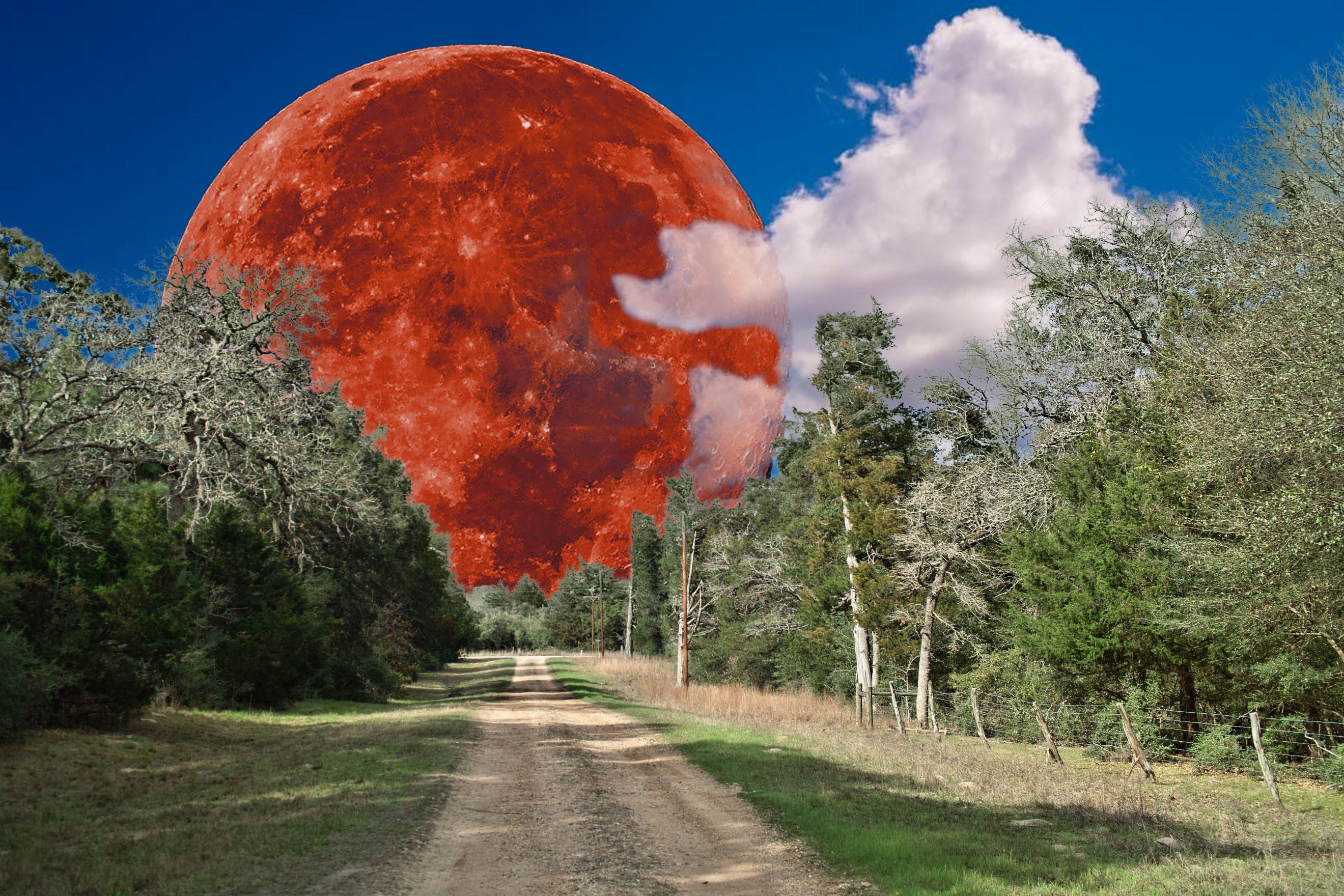
I think the street and blood moon and clouds is over the top but in a good (kitschy) way. Self-consciuous photo fun.
The UFO takes it just that step too far for me.
-
-
That is my current thought too ...
-
I love to do imaginative composites myself so I'm glad to see I am not the only one. They are challenging, like creating a puzzle then putting it together. Yours is fun and fanciful: a gigantic blood red moon at the end of a peaceful tree lined road. The alien spaceship may be a little too much fun, but if you wanted to keep it, it might fit in a little better if it was darkened. Dan has already addressed the technical issue of the fringing along the lines of the tree selection. I don't use the same software you do, but there's probably similar tricks like adjusting the color of the fringe to hide it, reducing the edge of the selection a few pixels through one of several methods. In PS, Blend-If often helps me work with such things. Some softwares do better at masking such things (for instance, I find that On1 seems to produce less fringing than PS), but that battle is ongoing and softwares are always changing.
Composites are not easy, you are right! But they are fun.
-
You can add fine detail to selections using the Colour Range filter in Selections and adjusting the Range and Fuzziness sliders.
Getting rid of fringes can be done by painting with the Colour Blend Mode on a separate layer.
Depending on the fine detail it can be tedious but definitely doable in something like Ps.
Clipping masks help a lot.
xpatUSA doesn't use Adobe apps though.
-
@DanHasLeftForum has written:@xpatUSA has written:@DanHasLeftForum has written:@ChrisOly has written:
Last Gasp before winter...
<>
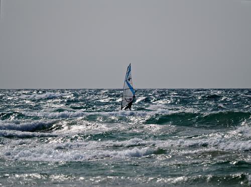
But I'm really confused about why the sky looks so gloomy when in your description you say it is a sunny 20C and there is plenty of sunlight hitting the water.
<>The settings are for far more that just a "sunny day" - almost 18 EV - as opposed to the classic 16 EV, thereby reducing the sky by 2EV.
The scene was spot-metered which may have fooled the metering with all those specular highlights around the subject.
Still confused?
I didn’t go through the exif data to see how he took the shots.
Of course you didn't - and it looks now like you didn't bother to read the EXIF under the posted image either.
Quoted message:In any case it's not difficult to get a natural looking sky in the final image while retaining the specular highlights especially if shooting raw as described earlier.
-
I did read the posted exif data.
The point I was making is that it's not difficult getting a natural looking sky in that type of scene.
-
@minniev has written:@xpatUSA has written:
Here's a composite involving the moon and my rural street
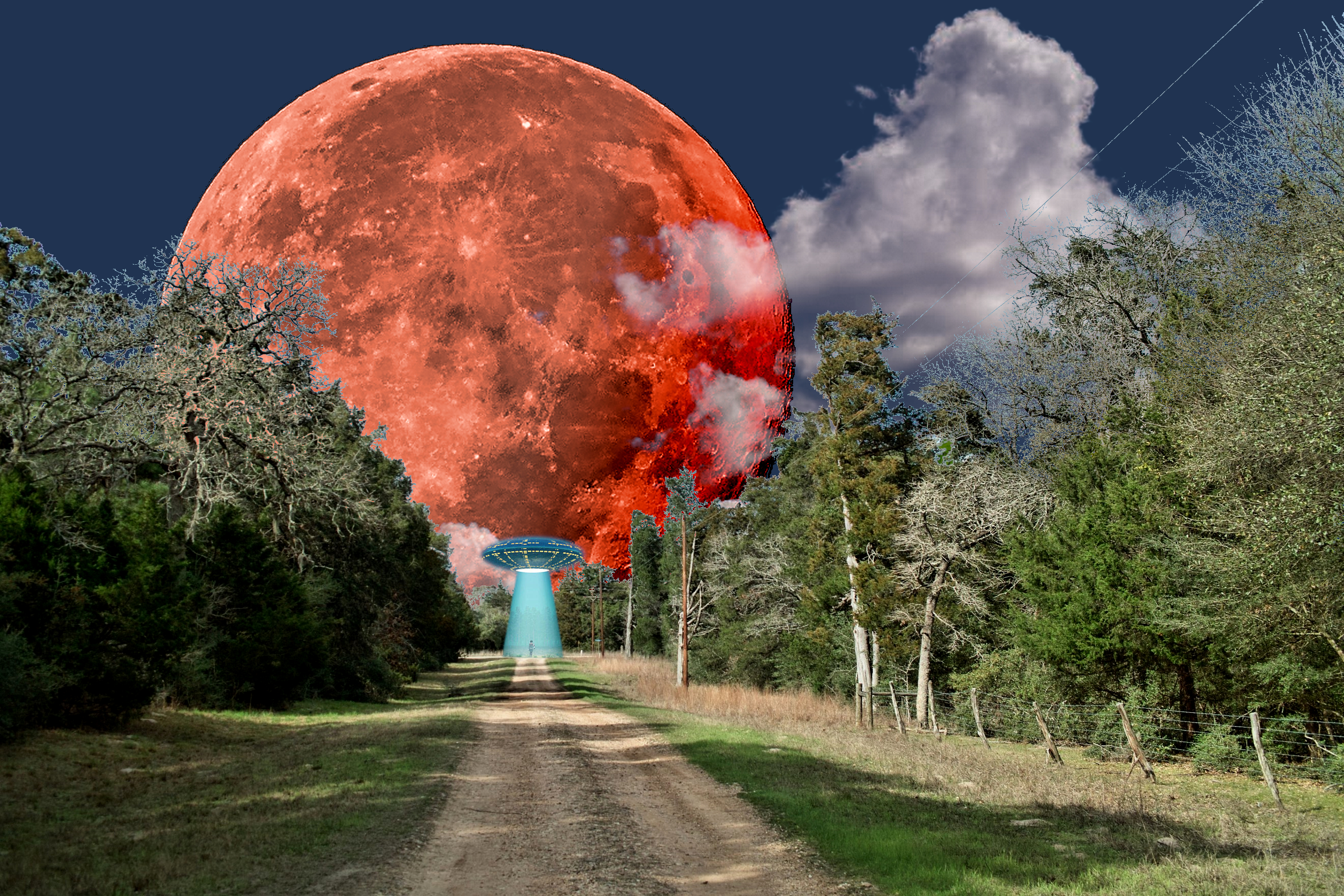
I love to do imaginative composites myself so I'm glad to see I am not the only one. They are challenging, like creating a puzzle then putting it together. Yours is fun and fanciful: a gigantic blood red moon at the end of a peaceful tree lined road. The alien spaceship may be a little too much fun, but if you wanted to keep it, it might fit in a little better if it was darkened.
Agreed!
Quoted message:Dan has already addressed the technical issue of the fringing along the lines of the tree selection. I don't use the same software you do, but there's probably similar tricks like adjusting the color of the fringe to hide it, reducing the edge of the selection a few pixels through one of several methods. In PS, Blend-If often helps me work with such things. Some softwares do better at masking such things (for instance, I find that On1 seems to produce less fringing than PS), but that battle is ongoing and softwares are always changing.
Yes, that many branches and twigs is difficult when creating a mask by conventional means. Often I find that the GIMP's Color 'Threshold' function works well, producing a pure black & white mask instantly, especially when said branches and twigs are back-lit as they often are.
Quoted message:Composites are not easy, you are right! But they are fun.
-
@DanHasLeftForum has written:
I did read the posted exif data.
In that case, why did you say you were "really confused about why the sky looks so gloomy" - when the sky was so obviously under-exposed according to the displayed EXIF?
Quoted message:The point I was making is that it's not difficult getting a [natural-looking] sky in that type of scene.
OK
-
@RoelHendrickx has written:
I think the street and blood moon and clouds is over the top but in a good (kitschy) way. Self-consciuous photo fun.
The UFO takes it just that step too far for me.I'm amazed at how far we've come 😂😂😂
It's getting more and more fun! -
@minniev has written:@DanHasLeftForum has written:@xpatUSA has written:
Here's a composite involving the moon and my rural street

Potentially a sensational composite but unfortunately the blue tinge all around the top of the trees spoils it a lot for me.
I'm guessing it's a masking issue. If it is then tidying up your masking will help a lot to improve the composite.
This is just a quick and basic re-composite to show what the composite would be similar to if you remove the bluish tinge. Imo it looks much better without it.
I also wouldn't make the moon visible through the clouds but that's a personal choice. I reduced the opacity to show the moon only slightly through the clouds.
I'd also clone out the power lines.
The masking below still needs a little tidying up but it shows the gist of what I mean.
Fwiw, just some food for thought.
I love to do imaginative composites myself so I'm glad to see I am not the only one. They are challenging, like creating a puzzle then putting it together. Yours is fun and fanciful: a gigantic blood red moon at the end of a peaceful tree lined road. The alien spaceship may be a little too much fun, but if you wanted to keep it, it might fit in a little better if it was darkened. Dan has already addressed the technical issue of the fringing along the lines of the tree selection. I don't use the same software you do, but there's probably similar tricks like adjusting the color of the fringe to hide it, reducing the edge of the selection a few pixels through one of several methods. In PS, Blend-If often helps me work with such things. Some softwares do better at masking such things (for instance, I find that On1 seems to produce less fringing than PS), but that battle is ongoing and softwares are always changing.
Composites are not easy, you are right! But they are fun.
I'm amazed at how far we've come 😂😂😂
It's getting more and more fun! -
@DanHasLeftForum has written:@Kumsal has written:
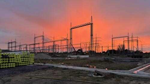
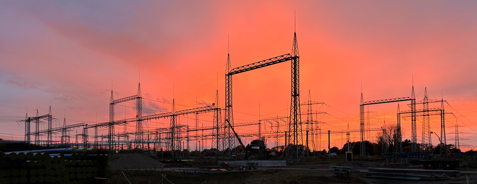
Overwhelming Sky
Only cut to 16:9 format, no other post-processing.
The sky is interesting but the foreground is uninspiring and detracts from the sky for me.
Electrical infrastructure has never really done anything for me.
But since your title suggests the sky is the most important part, a crop and edit something like this works better for me by highlighting the sky more.
Of course, you don't care what happens to the photo in the bottom left corner.
You hope that all viewers don't take the viewing too seriously.
That is your main dilemma, even with your photography. -
@Kumsal has written:@DanHasLeftForum has written:@Kumsal has written:
Overwhelming Sky
Only cut to 16:9 format, no other post-processing.
The sky is interesting but the foreground is uninspiring and detracts from the sky for me.
Electrical infrastructure has never really done anything for me.
But since your title suggests the sky is the most important part, a crop and edit something like this works better for me by highlighting the sky more.
Of course, you don't care what happens to the photo in the bottom left corner.
You hope that all viewers don't take the viewing too seriously.
That is your main dilemma, even with your photography.It doesn't follow that the title tells us what the subject is and therefore the rest of the image is irrelevant. In looking at an image, the whole thing needs to be thought about. In this case, the foreground is very relevant.
-
@MikeFewster has written:
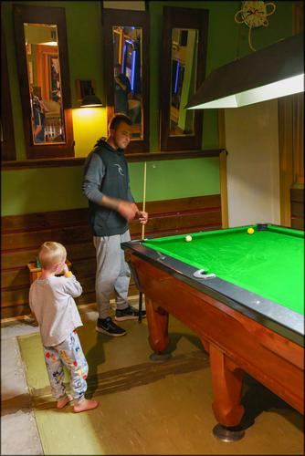
A Country Pub.
Following with keen interest.
There is a "Hustler" getting his education here.
I like how the diagonal of the pool table's edge leads to the hand in motion. -
@AlanSh has written:
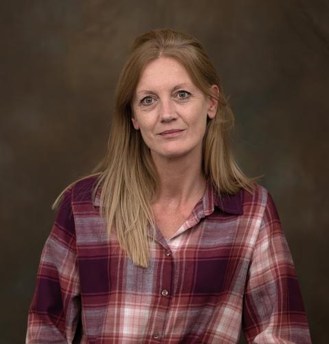
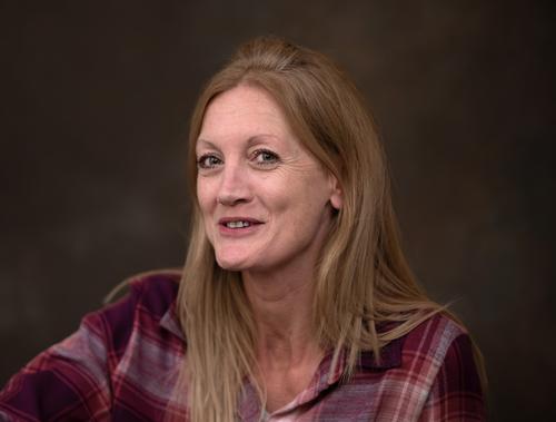
Last night our club had a portrait evening. Unfortunately, the models didn't turn up, so we had to take it in turns to be 'the model'. Here's some I took.
For me the third and fourth are the best portraits here. Probably because they have good lighting, good composition and show the subjects in a relaxed way (for me, the best portraits do not necessarily include a smiling expression - smiles often look forced.)
-
@ChrisOly has written:
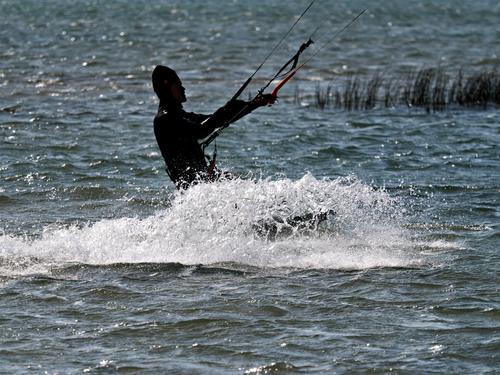
Last Gasp before winter...
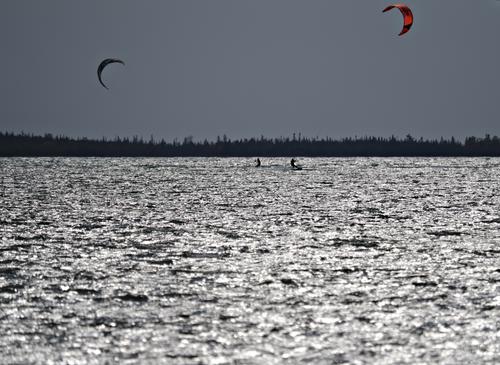
Conditions were ideal - wind 20 knots or 37km/hr, sunny and 20C. Location is Lake Huron, Ontario, Canada.
Nice day.
Did you get any shots of the kitesurfer out of the water and airborne?
Or was this a timid or beginning surfer? -
@minniev has written:
Transitions...
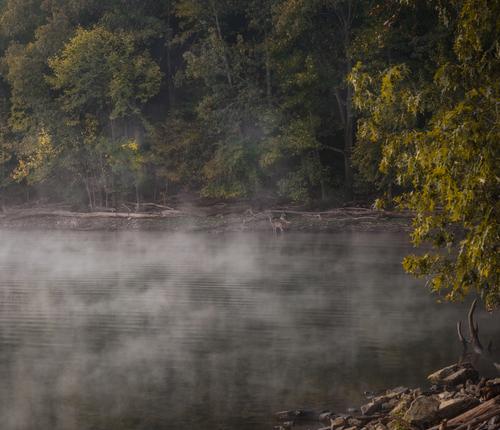
Summer to fall, night to morning, lake to forest, surprises included. Lake Barkley, KYThe deer are indeed a dear inclusion.
Now an alligator please, stalking.
I love the mood that the fog creates. -
@Rich42 has written:
Oceanside can be a weird kinda place.
Rich
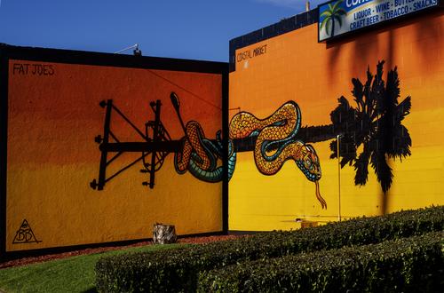
The keyword here is disorientation and it works a charm.
The way the graffiti is spread over two walls at an angle with each other, creates a paradoxical but wonderful 3D effect.
Our brain knows that that angle is "inwards" (away from the viewer) and still the snake seems to protrude from the walls (towards the viewer).
You have chosen the perfect vantage point to show us that illusion.And the graffiti artist gets extra points for creating a pole for the snake to "dance" on, that has no grounding but only tops:
telephone pole on one side and palm tree on the other.It's a bewildering concept but it works perfectly because it takes a moment of logical reasoning to realize that this is not a normal scene.
The best surrealism is the kind where the "realism" hits you first and the "sur" seeps in a bit slower
-
@Sagittarius has written:
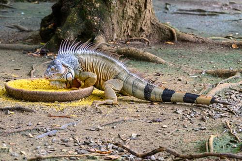
Your title it very apt.
If you almost crawl into your eating bowl, that is a clear sign that you will not allow competitors for the food...
It's a good shot of interesing behaviour.
A bonus element is that the blueish shades on the head of the lizard (some kind of "varaan" (that is the flemish word, I don't know the translation), complement nicely with the yellow of his food.
If you were to consider a more concentrated view, it would be an option to crop rather severely, getting rid of most of the foreground and background and a large part of the tail (impressive though it is) to end up with a close up of head, bowl, back and legs.
