• Members 1416 posts
    Nov. 1, 2024, 2:39 a.m.

    This is an interesting shot for C&C. I can see two quite different ways of looking at it. In both, the lizard capture is magnificent. Examining the texture and creases on the skin is a joy. As is the bright yellow eye standing out from the cooler colours of the head. The back spikes are admirably positioned against the dark area on the tree. The yellow food bowl contents zero our eyes in on the head of the lizard. All good.
    Then there is the stick, bottom right. The yellow bowl and the spikes strongly make the subject clear. The bottom stick isn't a distraction, it adds more information to the scene. The stick adds another wavy horizontal line to the RHS of the image. The resulting pattern incorporates the lizard's tail.

    Cropping above the stick gives more of a panoramic format that accentuates the shape of the lizard. The crop looks good and still uses some of the horizontal lines on the right that I like here.
    To me, It's a toss up.
  • Members 3960 posts
    Nov. 1, 2024, 3:28 a.m.

    Our eyes tend to land on the lizards head and bowl.

    The pebbles near the bottom center tend to then draw our eyes down with the left tip of the wavy stick being the go-to point.

    The wavy stick then leads our eyes out of the image via the bottom right corner.

    Imo putting the bowl around the bottom 1/3 horizontal helps to keep our eyes on the lizard with a more compelling scene.

  • Members 1416 posts
    Nov. 1, 2024, 4:11 a.m.

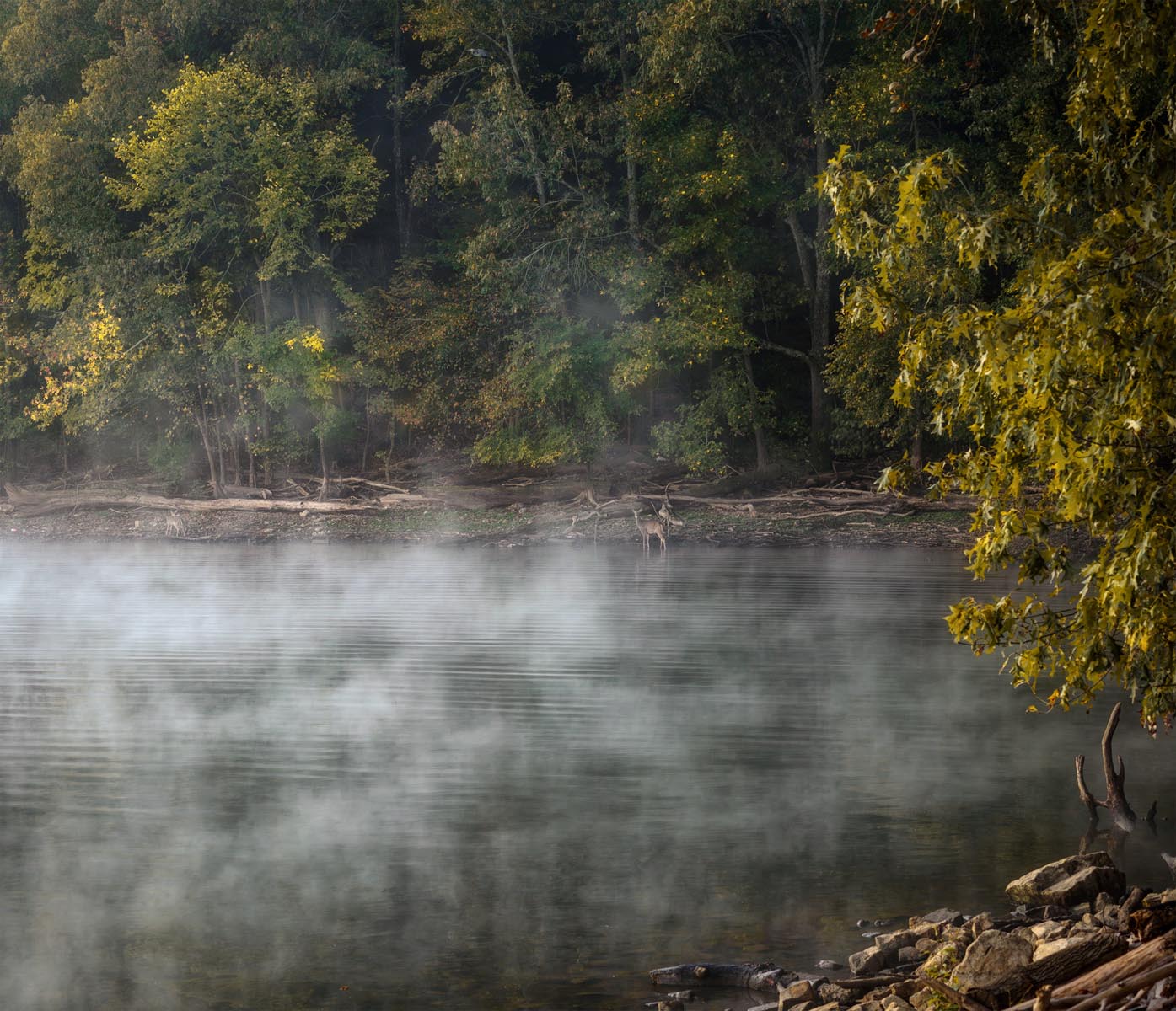
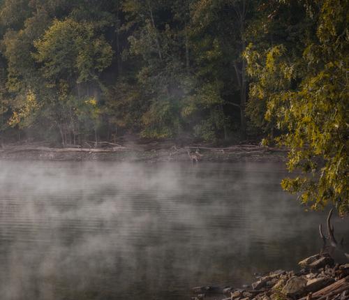
    A perfect title. Sometimes, and this is one of them, an image doesn't have and doesn't need, a subject focus point. Images should be considered in their entirety.
    The lake shoreline splits lake and forest disinterestedly. The foliage highlights on the right are balanced by similar highlights on the left.
    Eventually, we discover the deer. They aren't highlighted with major lines in the image or by highlights. They are simply there, an intrinsic part of the overall place.
    Looking north-south and east-west, change can be seen but the change isn't a celebration of one thing or another. It's indeterminate. Like mist.

  • Members 1416 posts
    Nov. 1, 2024, 5:09 a.m.

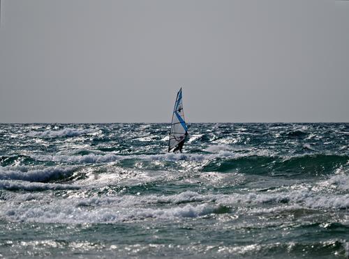
    I'll consider these as a series rather than individual shots and I'm influenced by the title in looking at them.
    Shot one establishes place and mood. It's bleak. The windsurfer looks isolated with water and sky. He's central and relatively small in the image with nothing else in sight. We can assume that he is pretty dedicated to be out there.
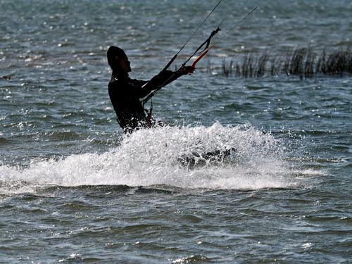
    Shot 2. Closer up but still bleak. The white wash and the angles convey movement. The rushes give some clues to the kind of body of water.
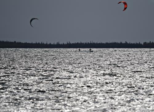
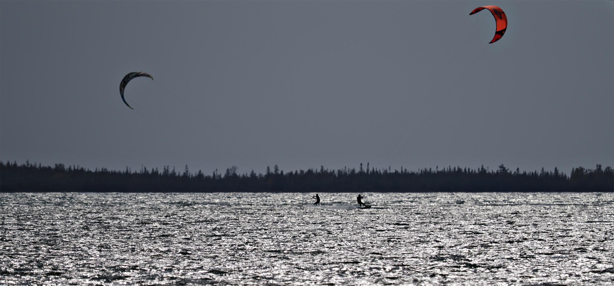
    Shot 3. Still bleak. The new moons of the sails and the east west spread of the shoreline make the width of the shot a feature. As the scale has already been established and here the figures are very small, I don't think the large out of focus foreground is adding to the series. Against all the grey, the touches of colour on the right hand sail complement your "Last Gasp before Winter" title. Perhaps consider underlining this as a final statement in the series by cropping, say, the bottom half of the water from the shot. What do you think?

  • Members 1416 posts
    Nov. 1, 2024, 7:04 a.m.

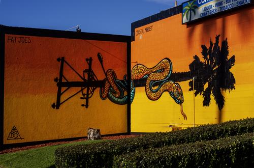
    Fat Joe wants to be noticed. A jolt to the eyeballs. The colour speaks/shouts for itself. The selected angle adds extra punch. It makes clear the urban/beachside location with the pole that morphs from one thing to another while the snake spans them both. The inclusion, top right is small but we get the message.
    Actually, I find the photo funny. Despite all the biker tatts promotion, the garden is neatly kept and the palm fronds are carefully cleaned up and binned.
    The photo suggests Fat Joe's is a market for elderly Harley riders.

  • Members 3960 posts
    Nov. 1, 2024, 9:36 a.m.

    Sensational scene and I love the fog/mist wafting across the lake.

    But I see a significant reddish cast on my screen which spoils the image to some extent.

    This version without the cast works much better on my screen. YMMV of course.


    dprevived.com/media/attachments/4e/24/8nJdMO4CXgqo50AN6f4QzCMd4IXjp13hhC7OsjWUrDelGhlXwxjSlaB12T2kAf3d/transitions-edit.jpg

    transitions_edited.jpg

    JPG, 274.5 KB, uploaded by DanHasLeftForum on Nov. 1, 2024.

  • Members 3960 posts
    Nov. 1, 2024, 9:52 a.m.

    Very nice range of subject distances in the series but I feel in the last one cropping out the out of focus foreground makes better use of the large distance between the two kites in a panoramic aspect.

    But I'm really confused about why the sky looks so gloomy when in your description you say it is a sunny 20C and there is plenty of sunlight hitting the water.

    Anyway, I like your 3rd shot best but as a panorama aspect.

    As always, just some food for thought.


    dprevived.com/media/attachments/d2/e4/8XEQaM1VMYTMEtB0ZDq43J3WYb4EeO6hRgxTjk2oE7xk28UQuj3vlAmpbKkwlfc2/kitesurfing.jpg

    kiteSurfing.jpg

    JPG, 324.7 KB, uploaded by DanHasLeftForum on Nov. 1, 2024.

  • Nov. 1, 2024, 10:41 a.m.

    Interesting - on my laptop screen, your picture has a definite greenish cast to it.

    I also know that with my Fuji and using the Provia simulation, it produces a magenta cast to pictures if I just look at the JPG.

    Alan

  • Members 1585 posts
    Nov. 1, 2024, 11:25 a.m.

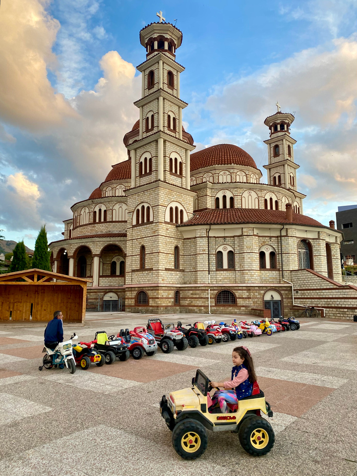
    The photo, with its creative processing, is gonna be hard to beat with your camera version. The perfect placement of the girl in her toy jeep forms a Z shape that takes my eye on a zig zag course through the image corner to corner, The lines are perfect, the colors are rich without being too much, the contrast is intense enough but not too much. There is a mix of history and whimsy to enjoy. The sky is what every photographer dreams of (I just spent a week in sore disappointment because the beautiful place I was exploring had not a single cloud the whole time). The look you've presented reminds me of the beautiful postcards from the 1930s, printed on linen stock.

  • Members 3960 posts
    Nov. 1, 2024, 11:27 a.m.

    Our screen settings are clearly different.

  • Members 1585 posts
    Nov. 1, 2024, 11:34 a.m.

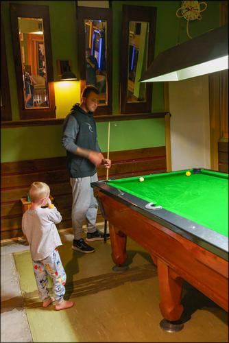
    Quite a nice culture shot, compelling me to make up my own story: Dad, left to babysit while Mom is working nights, as taken the little one (who Mom left dressed for bed) out with his pals for a night of pool and beer instead of putting him to bed as she intended. The lines and the wedge of bright green of the table drive the composition and help us focus on the child, even though he occupies a very small part of the photo. There is an interesting contrast between this shot and Roel's, also with a small child as the central character.

  • Members 1585 posts
    Nov. 1, 2024, 11:46 a.m.

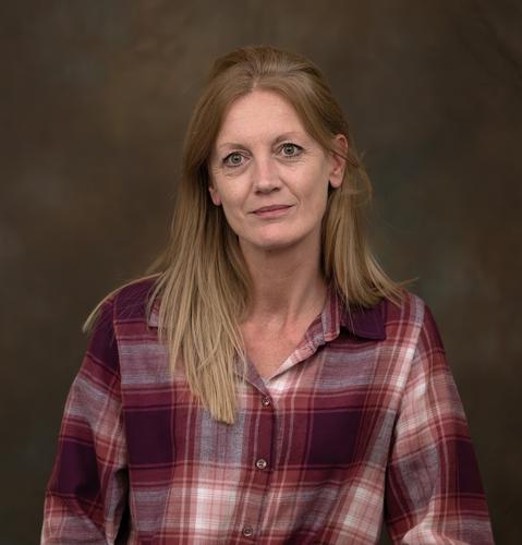
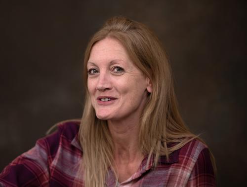
    Nice casual portraits. The third is my favorite though I'm not enough of a portraitist to explain why. Her expression, especially around her mouth. seems more relaxed in that one. What people do with their mouths in photos seems to have a big impact on the overall outcome.

    I don't think the images look overly reddish, with the exception of the first one. Three of the people look like they have skin tones that are on the reddish side anyway, so they might benefit from some toning down of the reds. Dealing with skin tones in post is often a matter of figuring out a balance between the actual person, the camera and settings, the influence that the lighting and surroundings had on the capture, how that person will look best in the image. Dan's edit makes the lady look a bit pasty to me, perhaps somewhere in between yours and his?

  • Members 3960 posts
    Nov. 1, 2024, 11:50 a.m.

    Would really need the raw file to set the white balance accurately. The WB has already been baked into jpegs and so is less flexible when adjusting.

  • Members 1585 posts
    Nov. 1, 2024, 12:02 p.m.

    Conditions may have been ideal for the surfer but I feel for the photographer, in that bright harsh light, with all that reflectivity, and not a cloud to help you out. Exposing for the scene would have blown out your highlights while exposing for the highlights has left the scene underexposed. I experienced similar last week trying to photograph a beautiful waterfall in deep shadow on a day such as this. The conditions defeated me. Multiple exposures wouldn't help either, with a moving subject like this. You have an interesting subject but a challenge in capture. The only tool left in your toolbox would be processing, so I'd use it if I were you, to try to normalize the lighting, or convert to monochrome, or something to maximize the detail that's available. (Note on my own dilemma: I failed with my waterfall, miserably).

  • Members 1585 posts
    Nov. 1, 2024, 12:08 p.m.

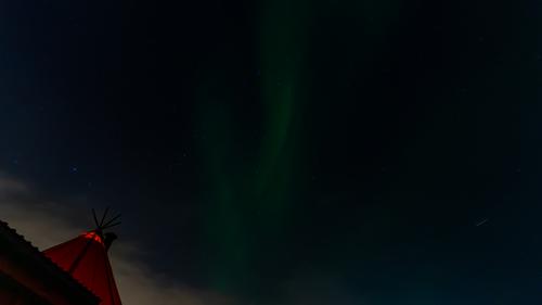
    You are right: only the large version does this justice. The angled tent with its red color and interior lighting is the necessary grounding to give us a frame of reference to appreciate the image. We are not just looking at one more image of stars: we are in the wild, under those stars, appreciating their beauty in a personal experience. Is that a bit of aurora? Is that the currently famous comet? Lots of treasures to discover in this night sky as we lie outside our tent - constellations, northern lights, shooting stars. Very nice image.

  • Members 1585 posts
    Nov. 1, 2024, 12:16 p.m.

    Fiercely rich colors and sharply defined shapes are the first thing that grabs my attention here. Then I stay for the art, which (like most art) could be interpreted in multiple ways. The snake has perhaps taken down the palm tree and replaced it with an electrical pole. And the evidence, the stump, is left behind. The snake has recently swallowed something, and the shadow of the wire takes my eye right to the bulge: the villain who took down the tree? The owner of the lot? The city itself? Society? Local political figure?

  • Members 3960 posts
    Nov. 1, 2024, 12:21 p.m.

    I don't see why. With evaluative/matrix metering and using the camera's histogram and blinkies you can get a nice blue sky without clipping highlights, especially if shooting raw.

  • Nov. 1, 2024, 12:39 p.m.

    Even when DR of scene is like 14-16EV or more? You lose specular highlights dynamics at least.