Ok, thanks.
-
-
@DanHasLeftForum has written:
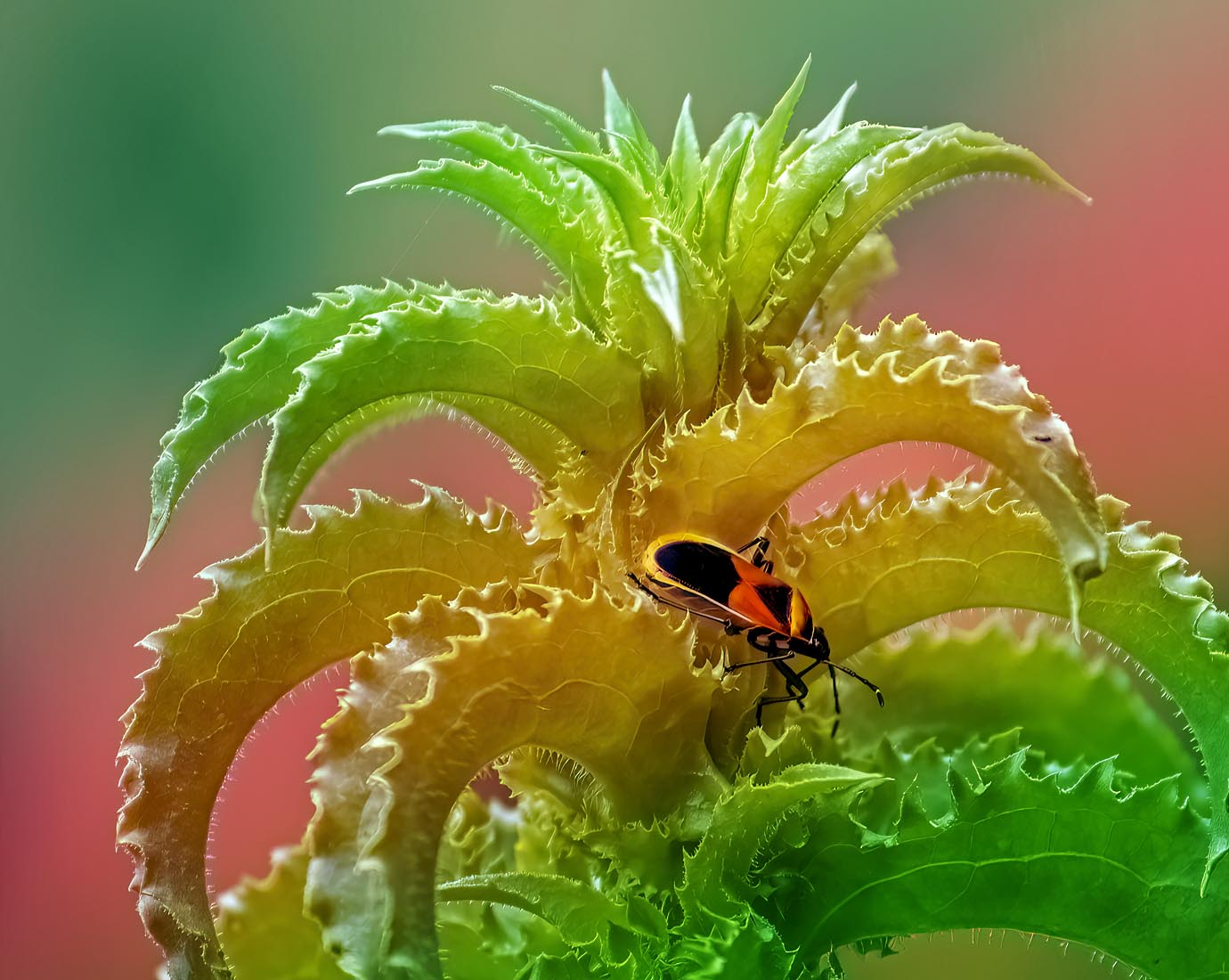
I have no idea what type of bug/beetle this is.
Is the plant wilted in the middle?
It can't be the lighting conditions.
You put the exaggerated background color on it out of laziness. -
@Kumsal has written:@DanHasLeftForum has written:
I have no idea what type of bug/beetle this is.
Is the plant wilted in the middle?
It can't be the lighting conditions.
You put the exaggerated background color on it out of laziness.Thank you for your opinion.
-
@Kumsal has written:@DanHasLeftForum has written:
I have no idea what type of bug/beetle this is.
Is the plant wilted in the middle?
It can't be the lighting conditions.
You put the exaggerated background color on it out of laziness.An obvious attempt to irritate Danno.
Didn't work - it went to his credit but certainly not yours.
Please point out the illegality of faux color in this thread's guidelines:
dprevived.com/t/wednesday-cc-no-theme-thread-864-revived-084-on-2024-11-06/6419/post/87810/
-
-
@ChrisOly has written:
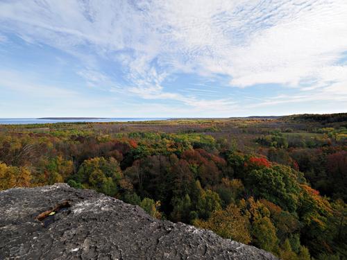
on the edge
Skinner's Bluff, Ontario, Canada
Very nice scene with its Autumn colours. I like the ledge as a foreground element leading into the scenic view.
-
@xpatUSA has written:@Kumsal has written:@DanHasLeftForum has written:
I have no idea what type of bug/beetle this is.
Is the plant wilted in the middle?
It can't be the lighting conditions.
You put the exaggerated background color on it out of laziness.An obvious attempt to irritate Danno.
Didn't work - it went to his credit but certainly not yours.
Please point out the illegality of faux color in this thread's guidelines:
dprevived.com/t/wednesday-cc-no-theme-thread-864-revived-084-on-2024-11-06/6419/post/87810/
I doubt Kumsal is saying the image I posted is against this forum's rules.
If you look through his posts over the last few months you will see several times he makes it clear that in his opinion "artistic" images should not be posted in this weekly thread. It seems he believes all images should look realistic to him and so he struggles to cope with images that he doesn't like or with opinions of his images that differ to his.
-
@xpatUSA has written:
Texas Twilight a la Foveon (Polaroid x530):
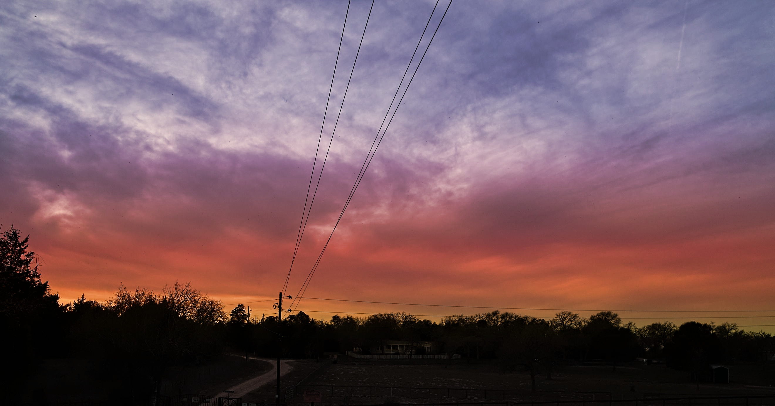
Very nice sunrise/sunset and I like that the foreground is not completely silhoutted with enough detail still visible.
However, I would have cloned out the power lines, especially the ones running up and down the middle. For me they are a distraction "splitting" the scene somewhat.
Anyway, just some food for thought.
-
@RoelHendrickx has written:
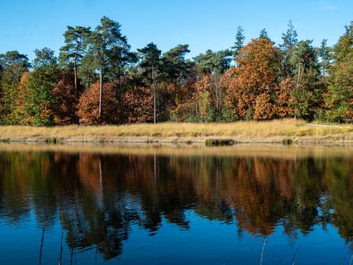
A pleasant fall image with colors changing in the hardwoods, a scene that could easily have been taken on my Kentucky trip. The oranges of the trees work well with the complementary blues of the sky and reflection, which is lovely. (Hint: a pano crop of the bottom half, flipped upside down, would make an interesting artistic alternative).
-
@DanHasLeftForum has written:
I have no idea what type of bug/beetle this is.
Though it appears the base photo might be interesting, well composed and well taken, the color overlay spoils it for me. It's just too garish for my taste. Interesting insect, much like some I see on milkweed plants here this time of year.
And out of curiosity, I am wondering what you, its creator, feel like the color overlay effect adds to this image? What is your goal in using it? How did you choose the overlay? I use overlays fairly often, mostly texture but occasionally color, but quite differently, so I am interested in your ideas.
-
@minniev has written:@DanHasLeftForum has written:
I have no idea what type of bug/beetle this is.
Though it appears the base photo might be interesting, well composed and well taken, the color overlay spoils it for me. It's just too garish for my taste. Interesting insect, much like some I see on milkweed plants here this time of year.
No problem. Thank you minniev.
-
@MikeFewster has written:
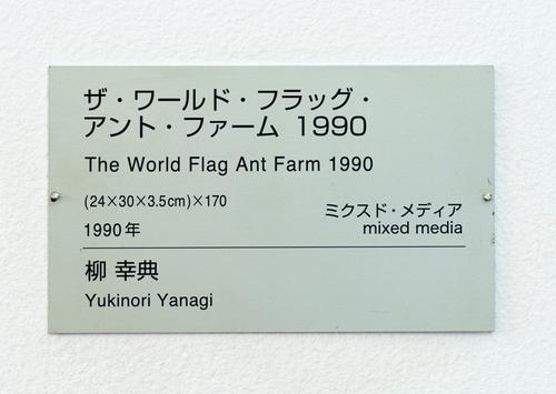
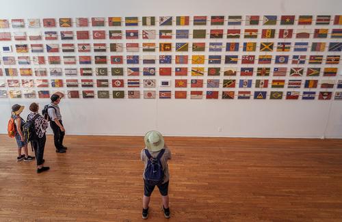
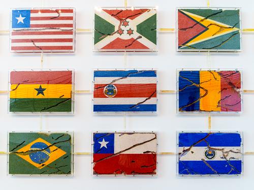
Yukinori Yanigi. If you like this, google for some of his other work.
An installation at the Benesse House SArt Gallery. Naoshima
It feels appropriate today.
This is a documentation series. None of the images has photo value.
Some explanation.
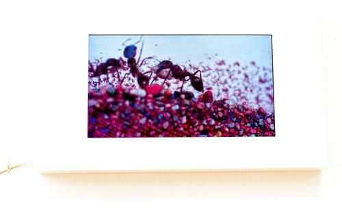
Lots of 3d perspex boxes. Each box contains the flag of a country and the flag is made from coloured sands and grains.
The boxes are connected by plastic tubes.
There are ants in there. There is a tv screen so you can see the inhabitants up close. They breed. and spread. And breed again...
Eventually....
I posted the images in order. No idea why they don't display in order. You will just have to figure it out. The photo showing at the top is actually the last in the sequence. Good luck.
That's pretty amazing. I have never heard of or imagined such a thing, though with 3 sons and 3 grandsons I've had plenty of ant farms. The creativity to imagine such a thing as this is off the charts. Thanks for sharing it with us, a fine documentary series. I disagree about photographic value, as I think the one of the viewers,with the stalwart pigeon toed person in the pale green hat staring at the amazing display has artistic merit.
-
@AlanSh has written:
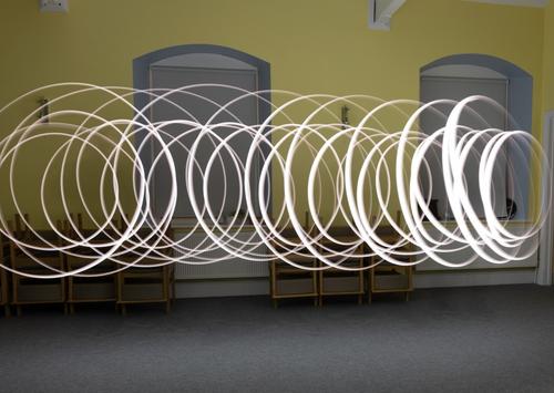
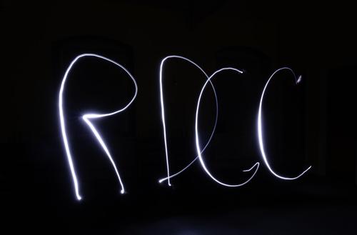
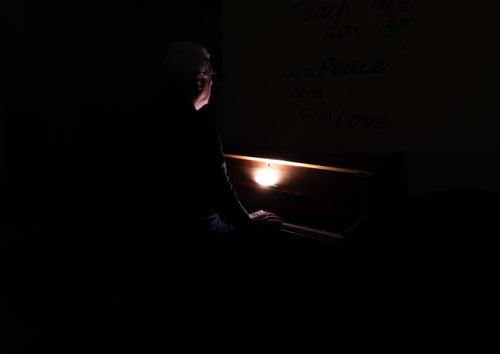
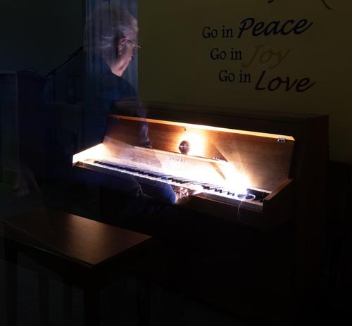
Last night, my club tried their hand at indoor light painting. For some of us, it was the first time. I found it a fun thing to do, but not something I'd ever put in an exhibition at the level we were playing (have a look here for some really good examples www.bbc.co.uk/news/articles/cyv7prndj0qo).
Anyway, here's some that I took. Feel free to comment - but not to edit please.
This was me (with remote shutter in hand) twirling a light around my head
Our Chairman wanted a new logo for our club
We then tried dark lighting around the piano
Finally, I tried to "ghost" a person.
Alan
Like Mike, you have shared a bit of a project. And it is interesting. Great result on the final "ghost at the keyboard" who seems like he might be teleporting to another realm after the concert. I've only done light painting once and it came out quite terrible. You've done much better than I. The first one,with all the twirls, is an interesting artistic result too.
-
@Rich42 has written:
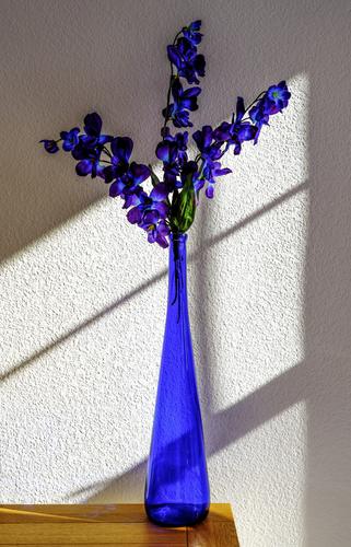
I had to wait 6 months for the sunlight to come in our bedroom window like this. I like the contrast of the bureau top.
Window muntins are a photographer's friend.
Those rich blues are almost like paints.The blue works well with the orange tones of the table, and both work well with the pale pebbled backdrop. But yes the secret weapon is the set of diagonal lines of various widths that divide the frame into slanted quarters, guide the eye, and parralel one of the branches of the flowers. Quite nice.
-
@xpatUSA has written:
Texas Twilight a la Foveon (Polaroid x530):

Lovely dramatic sunset with variegated color tones that cover all the rainbow except the greens. I like the minimal treatment you've given the trees as an L shaped partial frame. Usually I dislike power lines but these seem to have function: they are holding up the sky.The have an almost 3D appearance, adding depth to the frame. Their shape echoes the L of the left tree line. So I have to conclude they enhance the photo rather than detract from it.
-
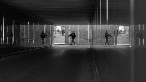
@Kumsal has written:
Multiply reflected subject
Fascinating image, and it works well in monochrome. The fact that the fellow is reflected twice is a little disorienting but makes the photo that much more interesting. The interspersed rectangles and lines offer balanceee. But the most interesting character is the woman who is barreling straight into the graffiti-covered window on her bike. Very well done.
