A bit of HDR effect but I really like the photo.
I think you used the full dynamic range of the camera.
The composition, the vibrant colors and the sensitive post-processing make this photo a feast for the eyes.
-
-
Very informative, very interesting.
I'm surprised at the ideas the artists come up with.
I would have liked to have seen the photo with the flags a bit bigger, i.e. more pixels. -
Is there a convention that says that, in a scene like that with very little sky content, the sky should be blue or is that your personal opinion?
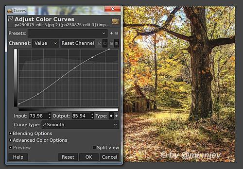
My personal opinion is that an exposure beyond ETTR followed by a slight increase of the shadows and an increase in mid-tone contrast would be more toward @minniev's preference. For example:
-
Thanks, Mike -
I was not consciously lining up the diagonal line of flowers with the shadow line during the "shoot." The contrast between the different elements in the scene was different than the photograph conveys. The room was very bright with light in a way that doesn't come through here. But from several images taken over about 20 minutes, this one "felt right" to me. The shadow was moving across the wall during that time, changing the relationships.
Rich
-
@Bryan has written:
Proposal
Please don't edit without permission
Very good photos.
A pleasure to look at. -
@AlanSh has written:
oops
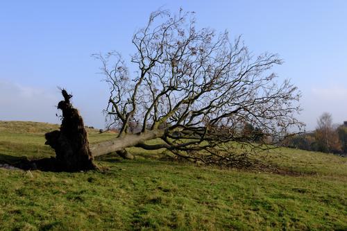
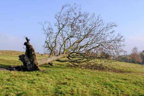
I don't usually do it, but I saw a lot of potential in this photo.
So I edited it, I hope you don't mind. -
I like what you've done, but I would have preferred you not to edit it, but just let me know how you think it could be improved.
As it happens, I left the roots dark deliberately as it merged well with the shadow.
Alan
-
@AlanSh has written:
I like what you've done, but I would have preferred you not to edit it, but just let me know how you think it could be improved.
As it happens, I left the roots dark deliberately as it merged well with the shadow.
Alan
In my opinion, two things could be improved:
1.) The sunlight in autumn is very strong, so the photo should look much more dynamic. The photo seems to have been taken in such a way that the highlights are protected, but the rest of the photo suffers as a result.
2.) At least some detail should be visible in the roots of the tree so that you can see what happened to the tree. -
@minniev has written:@MikeFewster has written:@DanHasLeftForum has written:@MikeFewster has written:
Dan, I think your advice here is in the "teaching your Grandmother to suck eggs" category.
minniev clearly knew exactly how to control her particular camera and the processing she knew she would be using. The proof was in the image.I know she knows how to set the exposure to not clip the skies. I acknowledged that in my post about minniev's image.
You were the one who said the exposure needs to be perfect.
@MikeFewster has written:Exposure and colour (while getting some blue in the sky. Exposure has to be perfect to do that.)
My post was in reply to your above opinion in your post, not minniev's post, explaining why the exposure does not need to be perfect.
dprevived.com/t/wednesday-cc-no-theme-thread-864-revived-084-on-2024-11-06/6419/post/88026/
So help me Dan. And my statement to minniev was discussing the image. minniev got the exposure she needed to get the image she got perfectly. End of discussion.
YES, I got the exposure I needed to create the final image I envisioned. That is what I do whenever I'm taking pictures. I am not wedded to the results of a capture. I am driven by the imagined final result and what I mean to do with it to take it where I want it to go. If I don't have a clear idea of where I want it to go, I just try to get the most good pixels I can, and will await inspiration later. In this case, I knew I wanted to recreate what I saw and not be limited by how the camera captured it with its limitations and the lighting conditions of a bright mid-day.
@DanHasLeftForum has written:I know you were talking about the image and you said the exposure needs to be perfect to get some blue in the sky.
I posted my opinion saying why the exposure does not need to be perfect to not clip the skies as you stated with your opinion.
For scenes like that the exposure can easily be 1/2 a stop smaller than perfect and the sky will still be blue without significant degradation of final image quality, especially if shooting raw and editing in 16 bits.
I think we may be arguing semantics. Perfect for me means the best file to do what I want with. I think that is what Mike means, not necessarily perfect by the textbook definition in the manual I studied when I was learning to use my camera.
And for whatever reason the exposure blending did not yield the results I expected and usually get. I have my files so I'll try again with them when I have time. I had hopes that I'd be able to get more from that effort than I got. But this image was pretty much what I saw when I came upon it on the rightly named Fairyland Trail.
I'm not sure what Mike means by "perfect exposure". Perfect/optimum exposure means different things to different people.
He said it needs to be "perfect" to get blue skies in scenes like yours and I showed why it does not, at least for me.
-
@xpatUSA has written:
Is there a convention that says that, in a scene like that with very little sky content, the sky should be blue or is that your personal opinion?
I answered that question earlier this thread.
-
@DanHasLeftForum has written:@minniev has written:@MikeFewster has written:@DanHasLeftForum has written:@MikeFewster has written:
Dan, I think your advice here is in the "teaching your Grandmother to suck eggs" category.
minniev clearly knew exactly how to control her particular camera and the processing she knew she would be using. The proof was in the image.I know she knows how to set the exposure to not clip the skies. I acknowledged that in my post about minniev's image.
You were the one who said the exposure needs to be perfect.
@MikeFewster has written:Exposure and colour (while getting some blue in the sky. Exposure has to be perfect to do that.)
My post was in reply to your above opinion in your post, not minniev's post, explaining why the exposure does not need to be perfect.
dprevived.com/t/wednesday-cc-no-theme-thread-864-revived-084-on-2024-11-06/6419/post/88026/
So help me Dan. And my statement to minniev was discussing the image. minniev got the exposure she needed to get the image she got perfectly. End of discussion.
YES, I got the exposure I needed to create the final image I envisioned. That is what I do whenever I'm taking pictures. I am not wedded to the results of a capture. I am driven by the imagined final result and what I mean to do with it to take it where I want it to go. If I don't have a clear idea of where I want it to go, I just try to get the most good pixels I can, and will await inspiration later. In this case, I knew I wanted to recreate what I saw and not be limited by how the camera captured it with its limitations and the lighting conditions of a bright mid-day.
@DanHasLeftForum has written:I know you were talking about the image and you said the exposure needs to be perfect to get some blue in the sky.
I posted my opinion saying why the exposure does not need to be perfect to not clip the skies as you stated with your opinion.
For scenes like that the exposure can easily be 1/2 a stop smaller than perfect and the sky will still be blue without significant degradation of final image quality, especially if shooting raw and editing in 16 bits.
I think we may be arguing semantics. Perfect for me means the best file to do what I want with. I think that is what Mike means, not necessarily perfect by the textbook definition in the manual I studied when I was learning to use my camera.
And for whatever reason the exposure blending did not yield the results I expected and usually get. I have my files so I'll try again with them when I have time. I had hopes that I'd be able to get more from that effort than I got. But this image was pretty much what I saw when I came upon it on the rightly named Fairyland Trail.
I'm not sure what Mike means by "perfect exposure". Perfect/optimum exposure means different things to different people.
He said it needs to be "perfect" to get blue skies in scenes like yours and I showed why it does not, at least for me.
I am following this discussion and I don't think it will lead to a result that everyone involved is happy with.
I know the dynamic range of my cameras and how much I can overexpose, so I can make everything right in post-processing.
In this respect, it is not important which exposure Minniev chose.
The important thing is that she achieved a very good result. -
@Kumsal has written:@DanHasLeftForum has written:@minniev has written:@MikeFewster has written:@DanHasLeftForum has written:@MikeFewster has written:
Dan, I think your advice here is in the "teaching your Grandmother to suck eggs" category.
minniev clearly knew exactly how to control her particular camera and the processing she knew she would be using. The proof was in the image.I know she knows how to set the exposure to not clip the skies. I acknowledged that in my post about minniev's image.
You were the one who said the exposure needs to be perfect.
@MikeFewster has written:Exposure and colour (while getting some blue in the sky. Exposure has to be perfect to do that.)
My post was in reply to your above opinion in your post, not minniev's post, explaining why the exposure does not need to be perfect.
dprevived.com/t/wednesday-cc-no-theme-thread-864-revived-084-on-2024-11-06/6419/post/88026/
So help me Dan. And my statement to minniev was discussing the image. minniev got the exposure she needed to get the image she got perfectly. End of discussion.
YES, I got the exposure I needed to create the final image I envisioned. That is what I do whenever I'm taking pictures. I am not wedded to the results of a capture. I am driven by the imagined final result and what I mean to do with it to take it where I want it to go. If I don't have a clear idea of where I want it to go, I just try to get the most good pixels I can, and will await inspiration later. In this case, I knew I wanted to recreate what I saw and not be limited by how the camera captured it with its limitations and the lighting conditions of a bright mid-day.
@DanHasLeftForum has written:I know you were talking about the image and you said the exposure needs to be perfect to get some blue in the sky.
I posted my opinion saying why the exposure does not need to be perfect to not clip the skies as you stated with your opinion.
For scenes like that the exposure can easily be 1/2 a stop smaller than perfect and the sky will still be blue without significant degradation of final image quality, especially if shooting raw and editing in 16 bits.
I think we may be arguing semantics. Perfect for me means the best file to do what I want with. I think that is what Mike means, not necessarily perfect by the textbook definition in the manual I studied when I was learning to use my camera.
And for whatever reason the exposure blending did not yield the results I expected and usually get. I have my files so I'll try again with them when I have time. I had hopes that I'd be able to get more from that effort than I got. But this image was pretty much what I saw when I came upon it on the rightly named Fairyland Trail.
I'm not sure what Mike means by "perfect exposure". Perfect/optimum exposure means different things to different people.
He said it needs to be "perfect" to get blue skies in scenes like yours and I showed why it does not, at least for me.
I am following this discussion and I don't think it will lead to a result that everyone involved is happy with.
I know the dynamic range of my cameras and how much I can overexpose, so I can make everything right in post-processing.
In this respect, it is not important which exposure Minniev chose.
The important thing is that she achieved a very good result.That is the point I was making in that the exposure does not need to be "perfect" to get blue skies in scenes like minniev's.
-
@Kumsal has written:@AlanSh has written:
I like what you've done, but I would have preferred you not to edit it, but just let me know how you think it could be improved.
As it happens, I left the roots dark deliberately as it merged well with the shadow.
Alan
In my opinion, two things could be improved:
1.) The sunlight in autumn is very strong, so the photo should look much more dynamic. The photo seems to have been taken in such a way that the highlights are protected, but the rest of the photo suffers as a result.
2.) At least some detail should be visible in the roots of the tree so that you can see what happened to the tree.OK - thank you. I will see if I can make some adjustments.
Alan
-
@AlanSh has written:
I like what you've done, but I would have preferred you not to edit it, but just let me know how you think it could be improved.
As it happens, I left the roots dark deliberately as it merged well with the shadow.
Alan
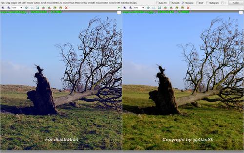
In the GIMP, it looks like you were defeated by the blue channel in this image. Lots of bottomed (almost 14%) and blown (13%) blue values but few in-between ... whereas the red and green histograms look quite normal. When a channel is bottomed to 14% of the count, those pixels become bi-chromatic (only red and green in this case) which is unusual in nature. Similarly, blown pixels may not look right after an attempt at highlight recovery.
The raw histogram would be really interesting, if available.
This kind of thing can happen when Saturation is edited to taste in a wide color space and then the image is converted to sRGB for posting on the web. For example, the classic yellow flower shot coming out with 100% saturated petals in sRGB with no blues in the pixels.
P.S. Messed with the blue channel attempting to recover it - no surprise as to the result:
-
@DanHasLeftForum has written:@xpatUSA has written:
Is there a convention that says that, in a scene like that with very little sky content, the sky should be blue or is that your personal opinion?
I answered that question earlier this thread.
Forget it. Anybody else?
-
@xpatUSA has written:@DanHasLeftForum has written:@xpatUSA has written:
Is there a convention that says that, in a scene like that with very little sky content, the sky should be blue or is that your personal opinion?
I answered that question earlier this thread.
Forget it. Anybody else?
No problem.
-
@Kumsal has written:@AlanSh has written:
oops
I don't usually do it, but I saw a lot of potential in this photo.
So I edited it, I hope you don't mind.That is way too light now on my screen and not realistic given the sun is low and to the right of the scene judging by the direction and length of the shadow.
Alan's original looks much better to me except I would have lightened the shadows just a little bit, not as much as you did.
-
@DanHasLeftForum has written:@xpatUSA has written:@DanHasLeftForum has written:@xpatUSA has written:
Is there a convention that says that, in a scene like that with very little sky content, the sky should be blue or is that your personal opinion?
I answered that question earlier this thread.
Forget it. Anybody else?
No problem.
Let me have a go. No, Dan didn't answer this earlier (and his use of colour in his own shots doesn't show much awareness of the issue.) There is no such convention. What makes it important in minniev's photo is that it is a complementary colour to the golden tones of the leaves. Having the blue in the sky (and it doesn't need much) enriches the autumn feel because it alters our perception of the leaves. That's what made it perfect.
