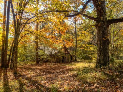
Thank you. I think we humans visually perceive in a higher dynamic range than the camera does (or at least my camera!), so sometimes, if not overdone, HDR processes can help restore what we saw. I did try some HDR, and some other kinds of blending of multiple exposures to compensate for running out of room on the camera's dynamic range, but didn't get the results I wanted, so reverted to this single capture and just tinkered till I got something that seemed like what I saw. The strong noon sun was actually penetrating the leaves giving a beautiful glow underneath the canopy, that is what I was trying to convey.
-
-
@MikeFewster has written:@DanHasLeftForum has written:@xpatUSA has written:@DanHasLeftForum has written:@xpatUSA has written:
Is there a convention that says that, in a scene like that with very little sky content, the sky should be blue or is that your personal opinion?
I answered that question earlier this thread.
Forget it. Anybody else?
No problem.
Let me have a go. No, Dan didn't answer this earlier (and his use of colour in his own shots doesn't show much awareness of the issue.) There is no such convention. What makes it important in minniev's photo is that it is a complementary colour to the golden tones of the leaves. Having the blue in the sky (and it doesn't need much) enriches the autumn feel because it alters our perception of the leaves. That's what made it perfect.
Yes, the complementary colors of blue/gold are to me the most compelling combination. It's why I make a trek every fall to see the beautiful foliage changes. That little touch of blue to me made a huge difference in the image so I was determined to preserve it.
-
@MikeFewster has written:
Let me have a go. No, Dan didn't answer this earlier (and his use of colour in his own shots doesn't show much awareness of the issue.) There is no such convention.
Yes he did answer the question but it seems you missed it.
Regarding colours, what brightness have you calibrated your screen to and how have you profiled your screens?
The colours on his screen look how he wants them to look.
Using your own logic in your above quote it can then be justifiably argued that the use of colour in your own shots doesn't show much awareness of the issue as well.
So we could just go round in circles and back and forth ad infinitum.
The colours you see on your screen will not necessarily match exactly the colours others see on their screens for a given image for obvious reasons and vice versa.
-
@DanHasLeftForum has written:@MikeFewster has written:
Let me have a go. No, Dan didn't answer this earlier (and his use of colour in his own shots doesn't show much awareness of the issue.) There is no such convention.
Yes he did answer the question but it seems you missed it.
You did not miss it, @MikeFewster, because no direct answer was given.
-
@xpatUSA has written:@DanHasLeftForum has written:@minniev has written:
Let me have a go. No, Dan didn't answer this earlier (and his use of colour in his own shots doesn't show much awareness of the issue.) There is no such convention.
Yes he did answer the question but it seems you missed it.
You did not miss it, @minniev, because no direct answer was given.
Hi Xpat. That was from me not minniev on this occasion.
G'day Dan. If you wish, I'm happy to continue this discussion with you once this week's thread is about to expire. ie., Wed. afternoon Australian time. I don't like the way these exchanges block up the regular discussions on the thread. It's one of many problems with flat view threads. I only responded at this time because the question from Xpat was taking the discussion into different territory. -
We'll just have to disagree on this one.
-
@JSPhotoHobby has written:
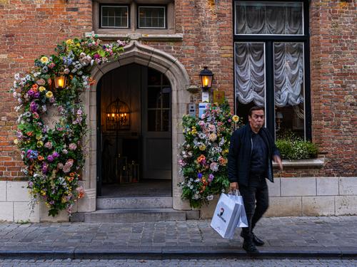
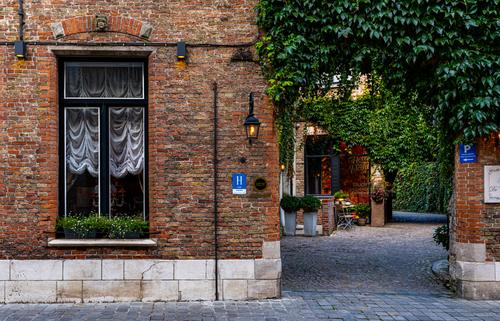
Still working with my trip images. I shot around this location for 30 minutes, don't feel like I really got a complete composition. What am I missing in these?
I really like these images. There is lots to take in and the lighting and colours all seem to blend in quite well. I especially like that there is plenty of light in the courtyard / laneway and we can explore in there with ease. It doesn't matter that there is no one subject - all the parts make the whole.
The weathered brickwork, ornaments, light fittings (love the old style filaments look), greenery, flowers, doorways and windows, paving are all well defined and nothing overly dominates the others.
The first is perhaps a touch less exposed than the second (maybe a cloud passing by?) but not in a diminishing way.
You maybe had others without the man but people inhabit these places so why not. His darker clothing blends in without being too much of an eye magnet.
Re your question about composition. If I was thinking about it (and I often don't) I would have zoomed out a little to get the tops of the windows in the first and to get the white sign on the right hand wall in the second and maybe bring the laneway a little more towards the centre. Zooming out a bit may have provided a natural border to what we see. But we don't know what else may have been there and that may well have introduced something detracting. It is never definitive. -
@MikeFewster has written:
What makes it important in minniev's photo is that it is a complementary colour to the golden tones of the leaves. Having the blue in the sky (and it doesn't need much) enriches the autumn feel because it alters our perception of the leaves.
Totally agree as I acknowledged in my reply to minniev's post with her image.
@MikeFewster has written:That's what made it perfect.
That is an opinion I disagree with because "perfect" implies it cannot be improved in any way.
-
@MikeFewster has written:
Hi Xpat. That was from me not minniev on this occasion.
I fixed the quote tag in my post.
My proof reader is on their last warning now 😠
-
@minniev has written:
Cummins Falls State Park in TN - This old shed was once where products of the Cummins mill were stored in the 1800s. The mill is gone, but the shed remains, barely.
For me the key to this image is to sit back and take in the whole scene at once.The autumn oranges and yellows blend quite nicely and there is plenty of depth through the greens. The foreground trees provide a nice frame to the path to the old shed, which is well visible but still nestled in, and being reclaimed by, the forest. I tried a crop reducing the foreground a little and the top to balance that (nice panno) but for the effect you have I think the shed cant be any closer.
-
@minniev has written:@Rich42 has written:
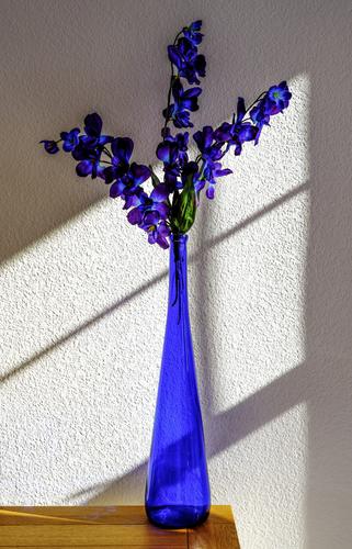
I had to wait 6 months for the sunlight to come in our bedroom window like this. I like the contrast of the bureau top.
Window muntins are a photographer's friend.
Those rich blues are almost like paints.The blue works well with the orange tones of the table, and both work well with the pale pebbled backdrop. But yes the secret weapon is the set of diagonal lines of various widths that divide the frame into slanted quarters, guide the eye, and parralel one of the branches of the flowers. Quite nice.
Yes some awesome shades in the flowers - reminds me of my grandmother's pansies when I was young - and the vase is good too and well matched.
-
@AlanSh has written:
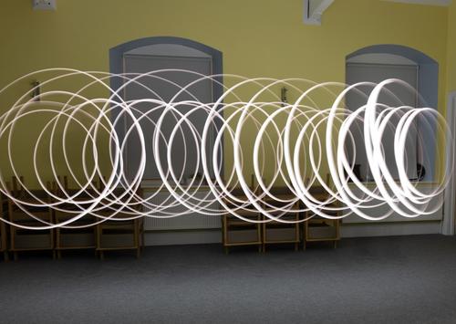
Last night, my club tried their hand at indoor light painting. For some of us, it was the first time. I found it a fun thing to do, but not something I'd ever put in an exhibition at the level we were playing (have a look here for some really good examples www.bbc.co.uk/news/articles/cyv7prndj0qo).
Anyway, here's some that I took. Feel free to comment - but not to edit please.
This was me (with remote shutter in hand) twirling a light around my head
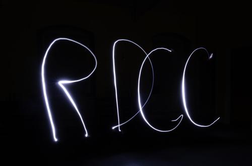
Our Chairman wanted a new logo for our club
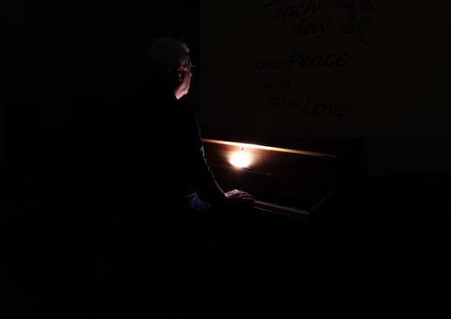
We then tried dark lighting around the piano
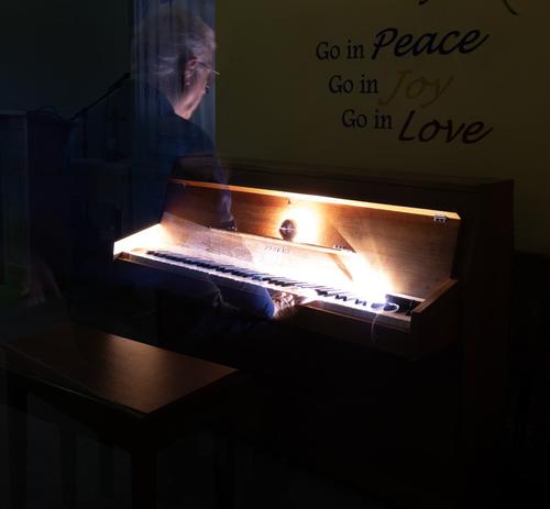
Finally, I tried to "ghost" a person.
Alan
Nice effects, especially the first and the last. Was good to see Gjon Mili's photos of Pablo Picasso light painting
-
@minniev has written:@Kumsal has written:
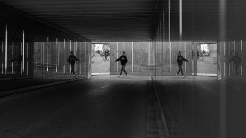
Multiply reflected subject
Fascinating image, and it works well in monochrome. The fact that the fellow is reflected twice is a little disorienting but makes the photo that much more interesting. The interspersed rectangles and lines offer balanceee. But the most interesting character is the woman who is barreling straight into the graffiti-covered window on her bike. Very well done.
I cant process whether the woman is seen through a window, another reflection, or a mural. There seems to be a wall behind ruling out a window. The angles seem wrong for a reflection and it seems too bright for a mural / painting.
Well spotted / captured none the less. -
@Kumsal has written:@Bryan has written:
Proposal
Please don't edit without permission
Very good photos.
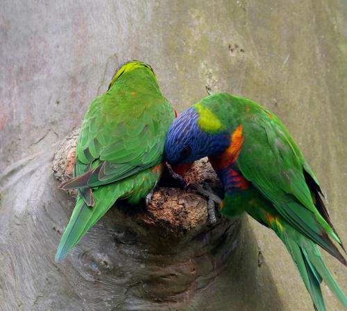
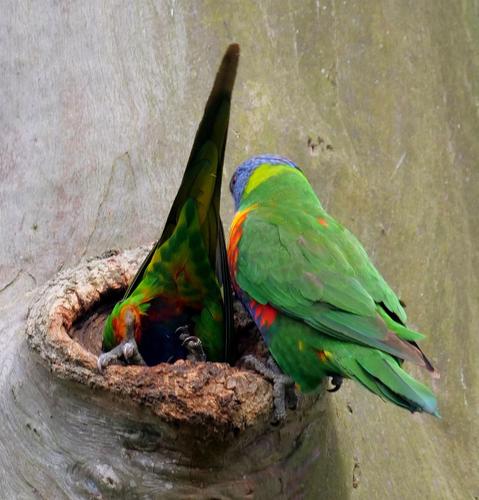
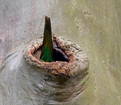
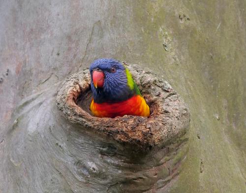
A pleasure to look at.Thanks Kumsal and everyone else. Your comments have made me reflect a bit more on what I actually capture. I have many shots of Rainbow Lorikeets so I tend to take them for granted...
-
@MikeFewster has written:@xpatUSA has written:@DanHasLeftForum has written:@minniev has written:
Let me have a go. No, Dan didn't answer this earlier (and his use of colour in his own shots doesn't show much awareness of the issue.) There is no such convention.
Yes he did answer the question but it seems you missed it.
You did not miss it, @minniev, because no direct answer was given.
Hi Xpat. That was from me not minniev on this occasion.
Ta, Mike. Please call me @xpatUSA or, better yet, 'Ted' to avoid mis-spellings.
I'm not real good at clearing quotes from deeply-nested exchanges as can occur between some around here ...
-
@Bryan has written:@minniev has written:@Kumsal has written:
Multiply reflected subject
Fascinating image, and it works well in monochrome. The fact that the fellow is reflected twice is a little disorienting but makes the photo that much more interesting. The interspersed rectangles and lines offer balanceee. But the most interesting character is the woman who is barreling straight into the graffiti-covered window on her bike. Very well done.
I cant process whether the woman is seen through a window, another reflection, or a mural. There seems to be a wall behind ruling out a window. The angles seem wrong for a reflection and it seems too bright for a mural / painting.
Well spotted / captured none the less.On the left side of the underpass there is a large mirror so that cyclists can see who is coming from the other side.
The walls to the right and left of the underpass are reflective and have neon tubes in them.
That's why there are multiple reflections. -
@Kumsal has written:@Bryan has written:@minniev has written:@Kumsal has written:
Multiply reflected subject
Fascinating image, and it works well in monochrome. The fact that the fellow is reflected twice is a little disorienting but makes the photo that much more interesting. The interspersed rectangles and lines offer balanceee. But the most interesting character is the woman who is barreling straight into the graffiti-covered window on her bike. Very well done.
I cant process whether the woman is seen through a window, another reflection, or a mural. There seems to be a wall behind ruling out a window. The angles seem wrong for a reflection and it seems too bright for a mural / painting.
Well spotted / captured none the less.On the left side of the underpass there is a large mirror so that cyclists can see who is coming from the other side.
The walls to the right and left of the underpass are reflective and have neon tubes in them.
That's why there are multiple reflections.Thanks for the explanation. I couldn't work it out either. I had been trying to figure the letter inversions to decide what was a mirror and what wasn't but I couldn't make sense of why a mirror would be there.
-
@xpatUSA has written:@MikeFewster has written:@xpatUSA has written:@DanHasLeftForum has written:@minniev has written:
Let me have a go. No, Dan didn't answer this earlier (and his use of colour in his own shots doesn't show much awareness of the issue.) There is no such convention.
Yes he did answer the question but it seems you missed it.
You did not miss it, @minniev, because no direct answer was given.
Hi Xpat. That was from me not minniev on this occasion.
Ta, Mike. Please call me @xpatUSA or, better yet, 'Ted' to avoid mis-spellings.
I'm not real good at clearing quotes from deeply-nested exchanges as can occur between some around here ...
Thanks Ted. One of the reasons I tend to use the whole message when I reply is because of the frequency with which quotes are misleadingly taken out of context.
-
@ChrisOly has written:
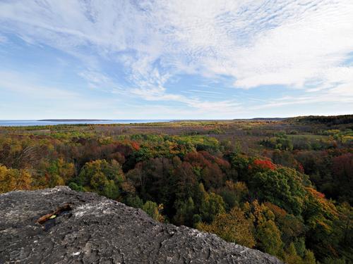
on the edge
Skinner's Bluff, Ontario, Canada
There's much in this image that is different. It breaks expectations for landscape shots but it all comes together. Has to be looked at large.
The horizon splits the scene almost in two with completely different textures and tones in both. The foreground rock is well over to the left with a point that carries the eye also to the left and a mere sliver of blue ocean and land on the left. You might expect the whole image to feel way out of balance but it doesn't.
There is just enough red in the tree foliage right of the rock plus the extra weight in the clouds, top right, to bring this off.
Same for the tones. The mass of pale blue with the light cloud texture is opposed by the dark, dense area of the forest and rock of the bottom half.
As a vision of Autumn, this photo could hardly be more different to the photo from minniev's classic this week. It is" on the edge" in more ways than one. But it works.
