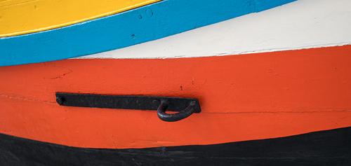
I like the first one because the colors have an appealing curve to them and they seem to flow in the same direction.
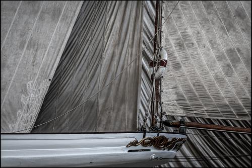
The second one for it's angles and patterned texture.
-
-
-
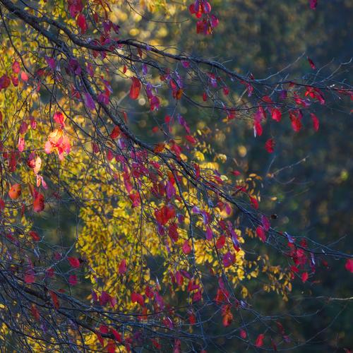
I like the colors and the backlighting highlighting the dark maroon. It helps bring it out from the greens.
Seems like there are 3 layered tones in these images, have you tried a black and white as a textured image? Maybe cropped to give more detail? -
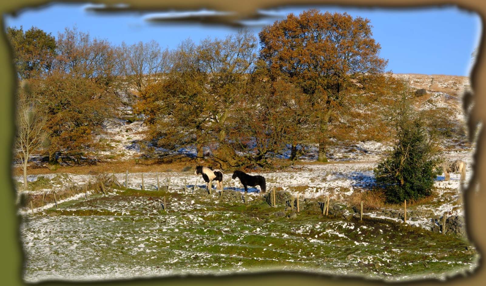
The white vignette doesn't work for me, but I don't like white vignettes, so that's probably just me.
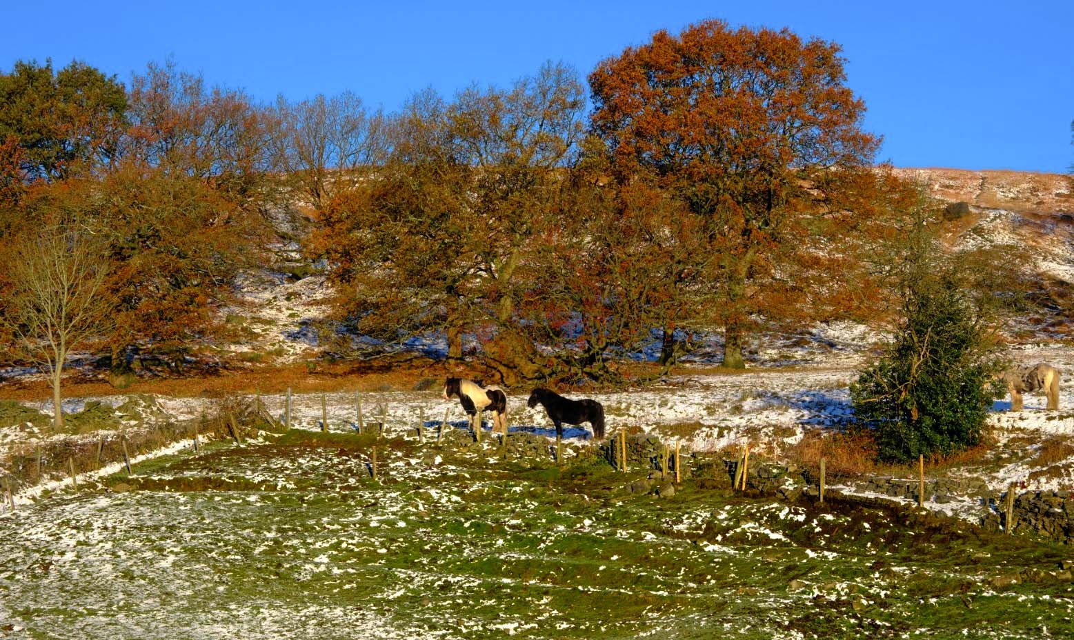
I like the crop of the second image a lot, I couldn't see the third horse in the first image.
I would probably crop out the tree and horse on the right, place the two horses on the lower right rule of thirds and let the horses look deep into the image.Edit: after reading everyone's comments.
None of the vignettes are really working for me.
I don't think there is anything wrong with the first image, someone said boring I think? I would say maybe plain. It lacks deep shadows and colors that pop. The image seems to have a single brightness to me. Is that something that can be done in edit, make the shadows deeper?
Or am I just seeing it with Instagram eyes? Everything in bright colors and dark shadows? -
I don't normally use strong vignettes or artistic crops for images to be displayed online but I often do when including images in a final video of an event or holiday etc. They add visual interest to the stills included in a video.
The white vignette doesn't really do much for me in this case.
This version below is most probably a bit ott but I'm sure you could come up with something in between your originals and this version if you want to.
I used Photoshop Elements - crop shapes to crop the image and then added a gradient made up of two of the dominant colours in the scene behind the crop. I then added a drop shadow, bevel and inner glow until I got something that looks reasonable to me.
Anyway, fwiw, just some food for thought.
-
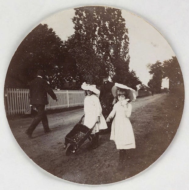
Weren't always. Read this today: petapixel.com/2013/09/30/blast-past-photos-captured-kodak-1-125-years-ago/
-
-
No, certainly not boring splashes of color.
I like these very much. The colors and lighting complement each other very well in each of the images.
-
step-by-step deleted
-
@JSPhotoHobby has written:
Edit: after reading everyone's comments.
None of the vignettes are really working for me.
I don't think there is anything wrong with the first image, someone said boring I think? I would say maybe plain. It lacks deep shadows and colors that pop. The image seems to have a single brightness to me. Is that something that can be done in edit, make the shadows deeper?
Or am I just seeing it with Instagram eyes? Everything in bright colors and dark shadows?It was Alan who suggested his original image seemed boring to him. I agree with you - it is more plain/bland than boring.
This version works much better for me on my screen with more punch/pop. I think Alan's image would be a great starter image in the "Edit Me An Image" threads here.
-
@JSPhotoHobby has written:
Crooked horizons are a pet hate of mine and unfortunately it spoils this interesting scene for me.
This version works much better for me visually.
-
[quote="@MikeFewster"]
Quoted message:I'm really liking this photo more than a little! I love the textures, lines, and demured saturation.
-
@DanHasLeftForum has written:
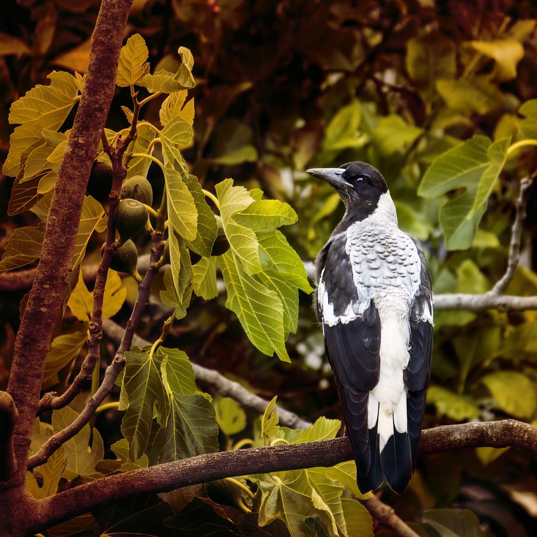
Again, a beautiful bird, well caught in a very nice posture. Your magpies are different than ours, but I see the resemblance. Plenty of detail in the white feathers, always a challenge with birds who have mixed white and dark feathers. I am not a fan of the colored overlay which makes the left side of the tree look muddy, and appears to create or enhance a dark blob just above the bird's head. A nice capture, but I don't like the overlay.
-
@JSPhotoHobby has written:
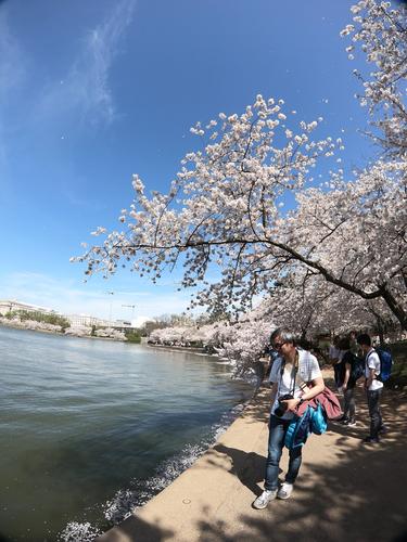
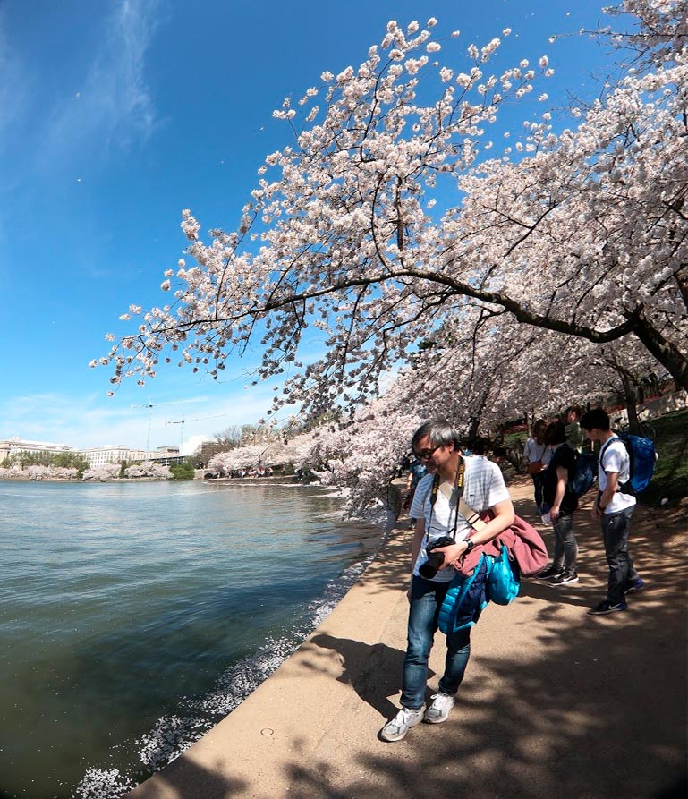
Nice image with a wealth of fluffy blossoms, likely cherry, and a pleasing coastline. But you really ought to straighten that horizon line before all the water spills out into that park.
-
Replying to those who commented on
@minniev has written:Sequence, light and color.
@ArvoJ has written:The last one has the most potential to become non-boring splash :)
Central part of second one is likely usable too - or maybe entire scene; looking at it in isolation reveals quite interesting color distribution and swirly structure
First one - if you could separate red leaves from greenish (and yellow) background then it likely would be more interesting, I can't experiment at the moment :(@ArvoJ has written:I discovered that those images are very display-sensitive - on calibrated screen they all look really good, almost ethereal.
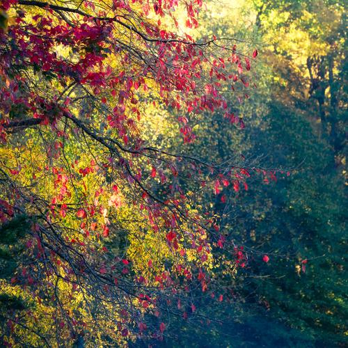
My initial impression was based on 'normal' office monitor rendering, sorry :(Glad the colors "woke up" for you on another screen! The colors were so vivid in real life, but the lighting came from behind and to the left, so it hit the yellow tree more, leaving the red tree in a bit of blue hour still. I was hoping to capture both kinds of light (cold and warm) and the transition between the two. It was tricky business.
@Fireplace33 has written:They are quite pretty!
I like the second one bestThank you. The second was the one that came out closest to what I envisioned. The little clump of red and yellow leaves in the middle was picking up a shaft of light that I was intent on capturing. The last one was sort of a surprise once I got home and sorted them out.
@Rich42 has written:Very pleasing colors and "feel." These would work well as multiple framed prints in most any room.
Rich
Had not thought of choosing all of them! Thanks!
@ChrisOly has written:a & b are great, but c is my fave, by far. It totally captures the immense beauty of the trees. Excellent.
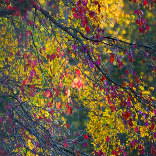
Thanks, it was my favorite too, though I first thought it a failure. I ended up liking the cascade effect moving into the green tree behind.
@Kumsal has written:I like the third photo best.
With vibrant colors and light that makes the leaves glow.
Just how you imagine a beautiful autumn day.Thanks, that glow is what stopped me and kept me stopped till the sun rose enough to let the drama subside.
@xpatUSA has written:I like this one because of the tonal balance and especially because of the "swirls" around that one bright leaf in the middle ...almost as if you had shot with a Helios 44-2 or a Petzval, kinda ..
Thanks for an interesting comment. The swirl effect was all Mother Nature! Glad someone noticed that one bright leaf, because it was the thing that made me stop and engage.
@JSPhotoHobby has written:I like the colors and the backlighting highlighting the dark maroon. It helps bring it out from the greens.
Seems like there are 3 layered tones in these images, have you tried a black and white as a textured image? Maybe cropped to give more detail?The idea of a monochrome variation is something I hadn't thought of but will try. Yes, the tonalities varied all through the spectrum.
@DanHasLeftForum has written:No, certainly not boring splashes of color.
I like these very much. The colors and lighting complement each other very well in each of the images.
Thank you. That's exactly what I was caught by!
@MikeFewster has written:in shot three, the red leaves look to be slightly sharper. This can be an illusion caused by greater contrast. I like the balance of light to dark backgrounds best in 2. I'm a long way from being able to answer minniev's question. Like Arvo, I'd want to do a lot of experimenting and comparison of crops.
Probably an illusion caused by contrast. #2 is the one that best exhibits what I was trying to capture. The third one was a happy surprise.
-
@Fireplace33 has written:
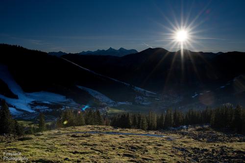
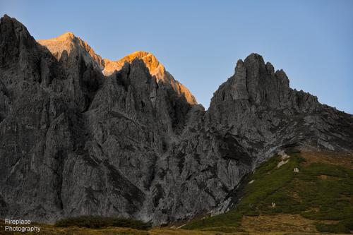
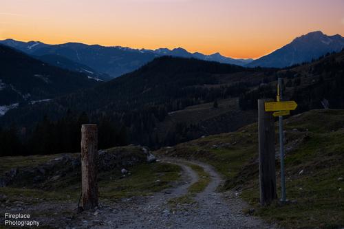
A walk in the mountains as the sun goes down
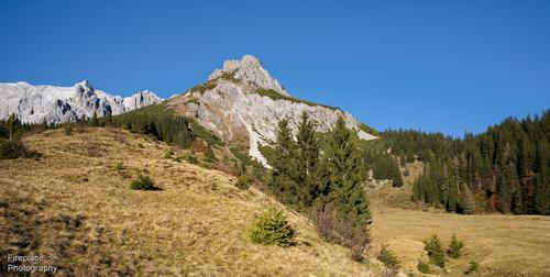
Arrived a bit late so we only had time for a short hike in the close-by mountains at Dienten, Austria .
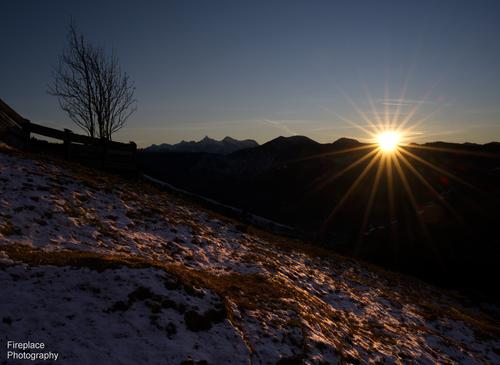
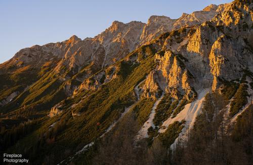
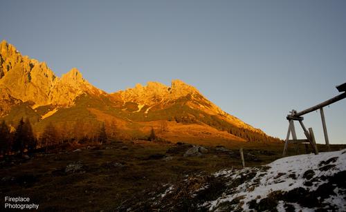
But that did have the advantage that we got to see the sun go down and the mountains turn red.
Please don't edit these imagesArrived at about 15:00.
The sun is shining in the mountains :-)
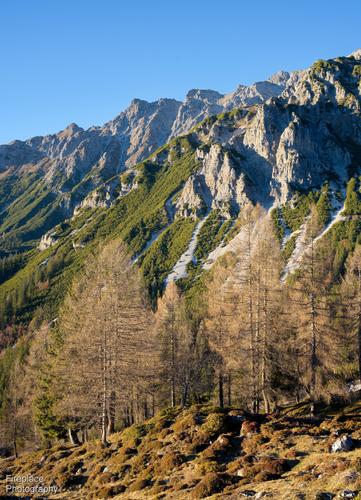
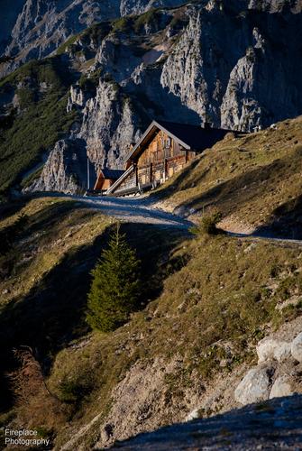
... which makes a nice change from the 2 weeks of fog and mist we've had in Upper Austria!The goal for today was to reach this hut, it's closed in winter of course, but still nice to have a "goal" for the hike.
Doesn't take long before the sun starts to disappear
...and the mountains start to warm up, at least their colour does ;-)
That's a wonderful story of a hike.
It feels like I am up there with you.
The changing light is very dramatic and you captured it really well.
There is nothing I would do differently. -
@MikeFewster has written:
Boats.
Please don't edit these images.The detail in that first image, with the very vivid colour, works well.
But I still like the second image much better.
The natural almost monochrome colour scheme makes the textures stand out so well.
The tenstion and the ripples in the sails evoke their destination: a turbulent sea. -
@RoelHendrickx has written:@Fireplace33 has written:
A walk in the mountains as the sun goes down
Arrived a bit late so we only had time for a short hike in the close-by mountains at Dienten, Austria .
But that did have the advantage that we got to see the sun go down and the mountains turn red.
Please don't edit these imagesArrived at about 15:00.
The sun is shining in the mountains :-)
... which makes a nice change from the 2 weeks of fog and mist we've had in Upper Austria!The goal for today was to reach this hut, it's closed in winter of course, but still nice to have a "goal" for the hike.
Doesn't take long before the sun starts to disappear
...and the mountains start to warm up, at least their colour does ;-)
That's a wonderful story of a hike.
It feels like I am up there with you.
The changing light is very dramatic and you captured it really well.
There is nothing I would do differently.One thing I would have done differently in #4 is lighten the sky and shadows a little bit.
The sun is still above the horizon but the overall darkness of the scene makes it look closer to a night scene.
