• Members 1549 posts
    Nov. 29, 2024, 3:44 a.m.

    You are rubbing it in. I'm just back from a camping trip to the Grampians area, complete with a new lens that I hoped would help me get dragonfly shots. They went into hiding.
    Time after time I've written much the same about other photographer's dragon fly shots. I should keep this on a cut and paste. Lots of fine, sharp detail in wings and legs and eye. A stick that echoes the shape of the critter. Soft bokeh that shows off the fine details.
    Very nice. GRRR!

    Fascinating speculation re nature of the soil and the colour of the fly. Worth further exploration.

  • Members 4254 posts
    Nov. 29, 2024, 4:02 a.m.

    No problem. I'm glad you like this one.

    As I have mentioned numerous times in other threads, my images are not everyone's cup of tea.

    As a side note and without aiming to get into a to and fro over rendered colours and profiling on different screens, assuming you describing the jackets as red is not a typo, they are very much closer to orange on my screen albeit with a slight reddish tinge but no way can I describe them as red on my screen.

    However, the bucket is fairly pinkish on my screen as you described.

    I looked back at minniev's comments of the image and she saw the jackets as being orange as well.

    Anyway I don't want to get into a discussion on if/how people calibrate and profile their screens and I don't doubt at all that the jackets appear as red on your screen. But your comments on this image strongly suggest to me that for a given image at least some of the colours I see on my screen are significantly diferent to what you see on your screen, for whatever unknown reason.

    Hence it might contribute at least to a small extent why you are not keen on most of the colour grading I have done in my other posted images.

    It's no big deal but I wanted to highlight the differences we are seeing on our individual screen because it seems to me that a few members here are under the misapprehension that everybody sees the same image lightness and colours on their screens for a given image.
  • Members 1549 posts
    Nov. 29, 2024, 4:41 a.m.

    My mistake. It wasn't typo, I was slack. If I had been more precise, I'd have described what I see on the jackets as orange. I'm confident in the calibration and profiling of my screen. Mine is set up to match that of the printer who does the large archival prints I sell and we have never had reason to think there was an issue with how my screen shows colour.
    How we see what our screens show is a different matter. My sons are both photo enthusiasts. One is colour blind. He has a very expensive, carefully calibrated monitor but he can't work well with colour at all. He regularly over popped (to my eye) some colours because he could then distinguish them better. He's well aware of it and now works entirely in Black and White. He consults his parents when painting his house.
    PS. I looked back at my post and noted that I had described the colors at the background that pick up the same colour as the jackets as orange.

  • Members 4254 posts
    Nov. 29, 2024, 4:47 a.m.

    No problem but the colours in the background are more orange than the jackets on my screen. The jackets have a slight reddish tinge on my screen.

    The colours we see on our respective screens are clearly slightly different. It's no big deal.

    I do my own home printing and calibrate my screen to match the brightness of my printer. I then profile my screen.

    I make my own printer profiles for each paper/ink combo I use.

    Overlaying the 3D printer profiles with the printer profiles downloaded from the paper/printer manufacturer (Epson) I see they are close to identical.

  • Members 1549 posts
    Nov. 29, 2024, 5:28 a.m.

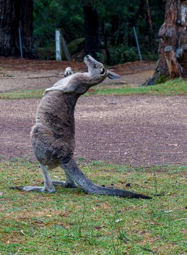
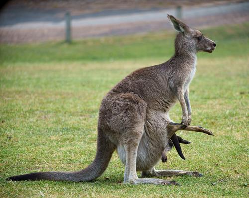
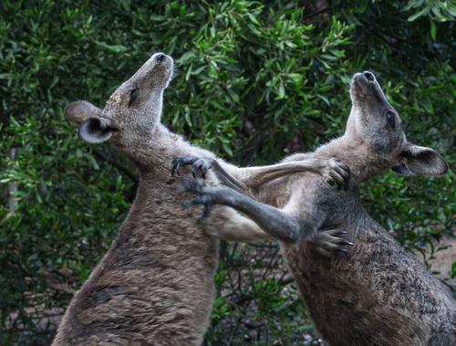
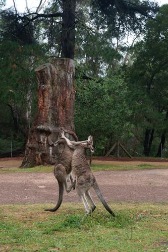
    Yes, they are wild but only in a technical way. This group are part of a mob of about 30 that come down to the Hall's Gap camping area every evening. A more docile, human ignoring mob of wild animals would be hard to find. A couple hopped up to our camp side dining table.
    The males are big. Standing on hind legs as when fighting they are inches taller than me. These are grey kangaroos. The red variety are taller again. When fighting, they try to hold on with the upper arms, balance on the tail and kick up then rip down with the back legs. The upper arm action is somewhat boxing like. Humans have been disemboweled like this. Dogs too. It's only the big males that are a problem and even then, a human would need to be doing something stupid and very aggressive to get a response like that. Kangaroos are generally gentle herbivores.

  • Members 1549 posts
    Nov. 29, 2024, 5:47 a.m.

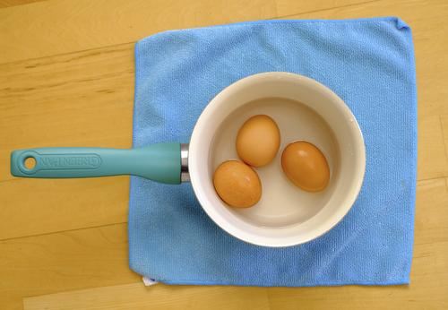
    This shot has made my photo day. There are many things I like about photography. One of them is the way it hones our awareness and appreciation. of what is around us all the time.
    Take out all the real life detail and reduce this to three colours and four or five basic shapes and you have something like a Rothko Field of colour work. Seeing it in real objects is even better. It's witty and beautiful.
    Gold stars plus.

  • Members 59 posts
    Nov. 29, 2024, 6:14 a.m.

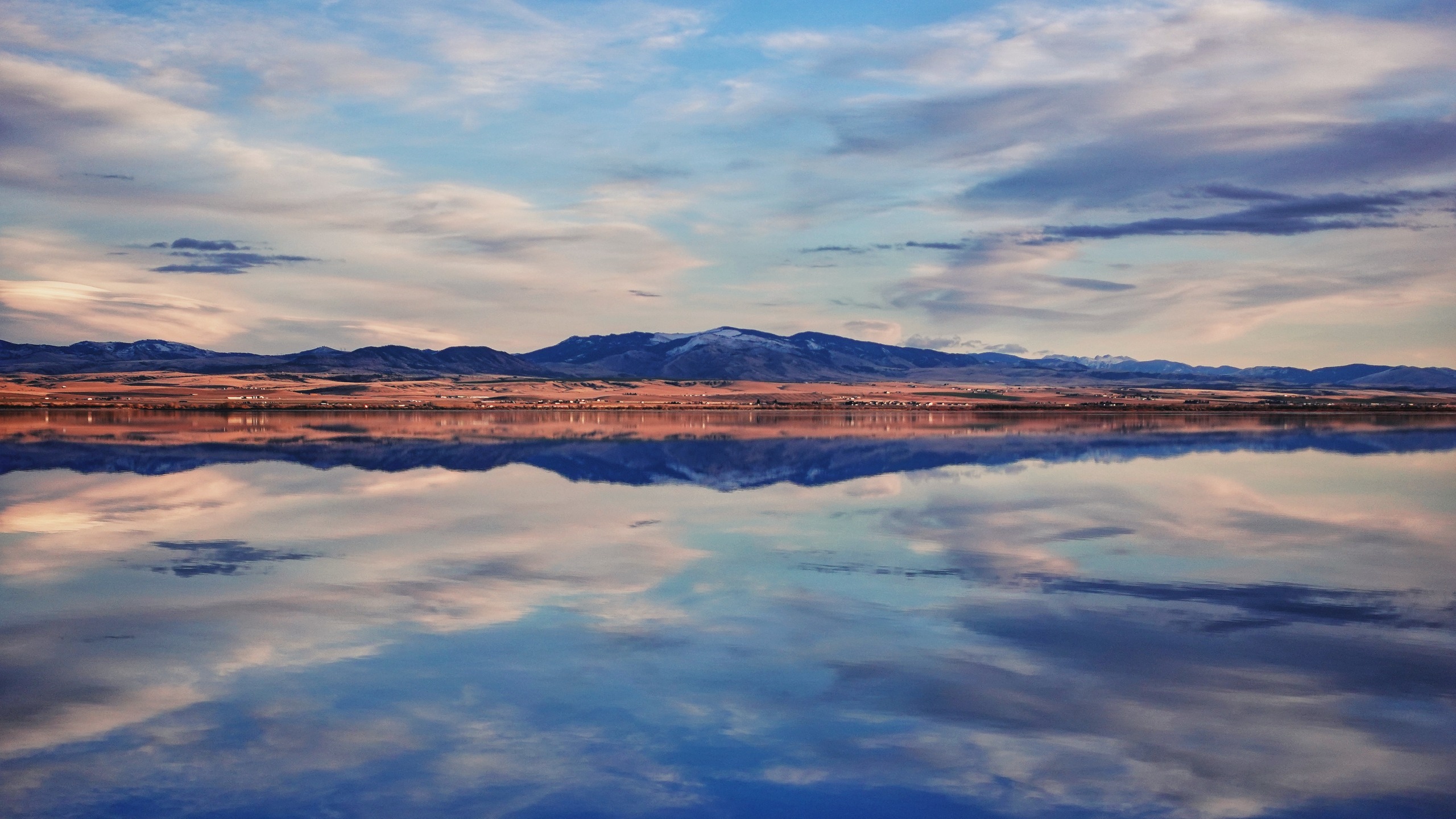
    Some friends had me over for thanksgiving this evening. I've been over to their place several times before, and knew they lived close to a lake, but had never bothered to drive the extra mile down to the lake before.

    I had arrived a little early and the bird wasn't quite done yet, so I decided to drive down to check the lake out this time. It is winter here, the temperatures have dropped, and the water is just a tad above freezing, so the fishermen and campers were long gone, and I was surprised to find I had the whole beach to myself.

    This picture doesn't quite do justice to the serenity and beauty of the place. I was disappointed with myself for never having stopped by during my previous visits.

    blog.jeshurun.ca/gallery/2024-11-28__-__Silos_Recreation_Area,_Townsend,_MT.jpg

    SONY/ZV-1 | 1/640s | 𝑓/3.2 | ISO125 | 70mm

  • Members 4254 posts
    Nov. 29, 2024, 6:36 a.m.

    Very nice 🙂

  • Members 1549 posts
    Nov. 29, 2024, 7:41 a.m.

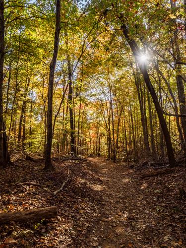
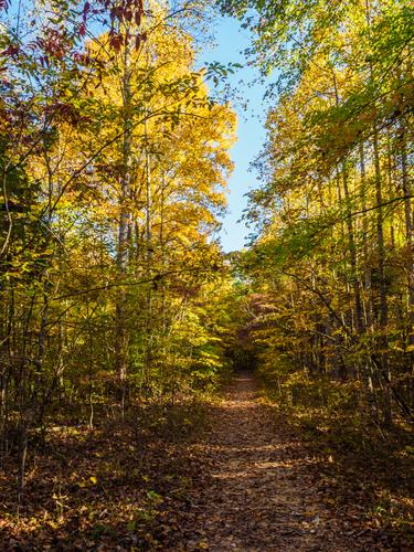
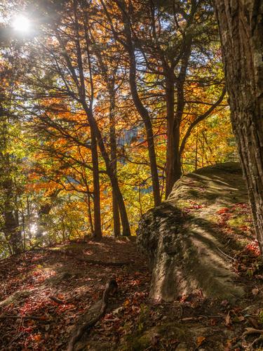
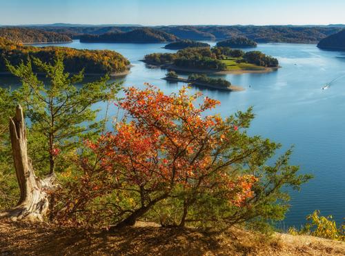
    Fireplace, Roel, your good self. This site is becoming a dangerous place for those of us that get itchy feet. It all looks too tempting. Still, going along on the rambles is very enjoyable as is looking at the different scenery. The trees and the greens change as much as the scenery.
    As a series, I think 1 and 2 are too similar. I know 1 is showing a steeper grade but I wouldn't have caught on without the text.
    The last is a fitting finale. The curtain sweeps back on a view we wouldn't have expected from the early shots. Every walk should have a climax like that.

  • Members 843 posts
    Nov. 29, 2024, 10:36 a.m.

    I agree with most of what Minnie said.
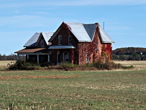
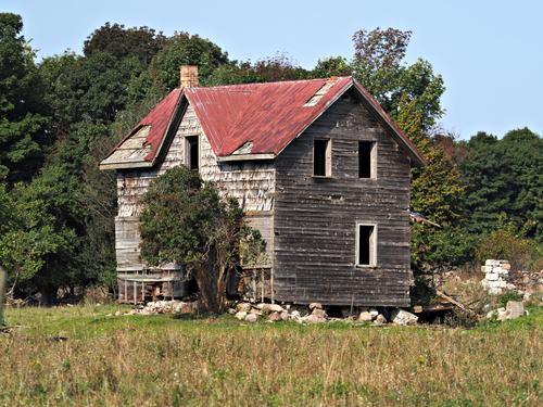
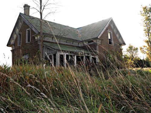
    Abandoned buildings (houses, factories) always have a strange appeal. They contain so many stories.
    The way you framed the last one, with that extremely low vantage point that makes the grass almost feel like a jungle, is effective in creating an even more intriguing, mysterious, slightly sinister atmosphere. But indeed, that sky is a bit of a shame. It could be blue for contrast. It could be overcast and dramatic to fit the mood. But now it is just a white canvas.
    My personal favourite here is the second, again because of the framing mostly, with house neatly contained between the contours of the treeline behind it.

  • Members 843 posts
    Nov. 29, 2024, 10:41 a.m.

    I totally agree that this is very nice.

    It would also look glorious in a 16:9 ratio panorama crop.
    Not that the sky or the foreground reflection are not interesting (they are!) or that I consider the lowest and highest parts to be "empty space" (I don't), but a panorama crop can always be so helpful in creating a cinematic impression.

    Wide landscapes look even wider and endless in 16:9.
    It can sometimes almost feel like there is MORE to see in a frame if you show LESS, i.e. that the image seems to become bigger by cropping...

    And while you are cropping, you could also experiment with different ratios between sky and water, placing the "horizon" of the reflection (the shoreline) higher and lower in the frame and see what looks best. I think this image has potential for several good proportions: shoreline straight in the middle, shoreline at 1/3 vs 2/3 or 2/3 vs 1/3 or even lower or higher than that.

  • Members 843 posts
    Nov. 29, 2024, 10:45 a.m.

    I agree with everything Mike said here.

    I love the sun bursting through foliage in shots 1 and 3.
    Shot 2 does not have that, so maybe that is why it is more "meh".
    It is a good image in its own right, but the two before and after it are more "photographic" because of the play with the actual light.

    Those sunburst are like guiding beacons towards a more open landscape : a promise that is fulfilled with the final image.
    (Mike's description of a curtain sweeping back is exactly how it feels.)

  • Members 843 posts
    Nov. 29, 2024, 10:48 a.m.

    I agree with this and with Minnie's preceding thoughts.
    I know that if I had spotted this opportunity for a perfect top-down almost abstract composition, I would have been tempted to "correct" the top left corner of the little blue towel, unfurling it "better" to make a more perfect square.
    And frankly, that would have been :
    a) cheating, because the "aha" moment is actually about the scene as you saw it
    b) unnecessary, because it is the slight geometric "imperfection" that actually anchors your abstract in concrete reality.

  • Members 843 posts
    Nov. 29, 2024, 10:52 a.m.

    I like the series.

    I like the reassuring thoughts about how docile kangaroos are (but I am still going to keep enough distance if I encounter them).
    (Closest I ever got to a group like this was on some abandoned cricket field in the area of Canberra that is being used as a balloon departure zone. The kangaroos have made that field their territory. We were warned not to get too close.)

    The shot of the little one upside down in the pouch is simply hilarious.
    If you had shot video footage of that maneuver, you would now be a TikTok superstar.

  • Members 843 posts
    Nov. 29, 2024, 11 a.m.

    I have just now read some of the comments on this image.
    It's strange how the dog can be so divisive.
    Some like the image better for the dog and feel that he adds a layer of story.
    Others scratch their heads or see wideangle distortion more than they see the actual dog and would consider cloning it out.

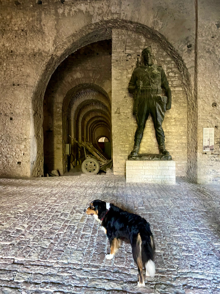
    For me, the dog is what distinguishes this image from one or two others I made there.
    The dog belongs to people who have entered the castle from behind my back and are now off-stage left.
    The dog waits a second and then follows them.

    I was shooting just the static scene, with the arched shape and the patriottic guard statue and then trying to get an angle on the view into (indeed, Minnie) "nested" arches leading far into the distance, under which antique guns and mortars are displayed.
    The dog showed up, and rather than think that it ruined my composition (I was aiming for a future square crop), I thought that it enhanced that composition, because now suddenly, I had two guards in my viewfinder.
    (I don't own a dog myself, and I always associate dogs - if they are big enough - with "guarding"; small dogs I associate with "not worth the attention".)

  • Nov. 29, 2024, 11:33 a.m.

    The dog adds life to otherwise static image. I don't like dogs, but I do like dynamic images - this is already a conflict for single viewer (me) :)
    Then it could be possible to use a bit different, symmetrical crop - shifts image focus a bit (and amplifies the conflict). My attempt is attached.

    p440391083-6-crop.jpg

    JPG, 336.8 KB, uploaded by ArvoJ on Nov. 29, 2024.

  • Members 4254 posts
    Nov. 29, 2024, 11:42 a.m.

    I don't see it as strange at all.

    Like with all images there will be aspects some people like and some aspects some people won't like.

    Personally I am not a fan of excessive unrealistic distortions..

  • Members 1549 posts
    Nov. 29, 2024, 1:04 p.m.

    Yep. If I had seen it, almost certainly I'd have tried to straighten the edges and I'd have been wrong. Same for the little white tag bottom left and the tiny bent over corner top right. The fabric creases seem ok too along with the benchtop markings. I'd be very hard pressed to explain why however.