• Members 4254 posts
    Dec. 6, 2024, 6:24 a.m.
  • Members 1549 posts
    Dec. 6, 2024, 6:43 a.m.

    Lotsa attitude and the grins make it clear this is in fun. I like the tight overlapping of the figures and the repetition of the hooded heads while still leaving the face expressions clear. The curving path on the right is small but it is excellent in adding movement towards us.
    Pity about the foot at the front. Dan's suggestion to fix this is clever. Another way to go would be to make more use of the extended arm with the stick. Crop some off the top and some off the left so we get a stronger diagonal from top left, through both of the boys arms and give a line linking to the path. Then crop some from the bottom a little below the leading warrior's knees.

  • Members 403 posts
    Dec. 6, 2024, 8:11 p.m.

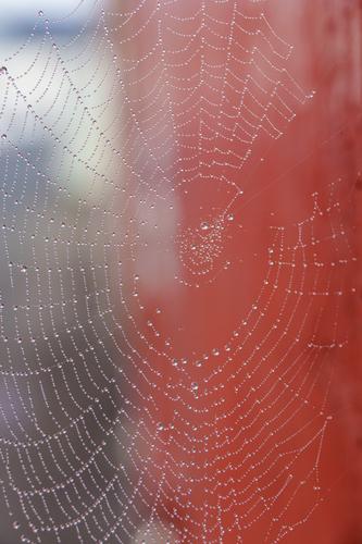
    Cobweb

    _DSC3720.jpg

    Photographed in Ireland two years ago.

    _DSC3720.jpg

    JPG, 2.4 MB, uploaded by Kumsal on Dec. 6, 2024.

  • Members 403 posts
    Dec. 6, 2024, 8:29 p.m.

    Very nice 👍

  • Members 403 posts
    Dec. 6, 2024, 8:34 p.m.

    A very beautiful, well thought out photo.
    But the saturated purple color is disturbing.

  • Members 403 posts
    Dec. 6, 2024, 9:52 p.m.

    My God, Mike!
    Can it get any worse?

  • Members 677 posts
    Dec. 6, 2024, 10:01 p.m.

    The purple color does not appear to be saturated. Mostly about 25% HSL.

  • Members 223 posts
    Dec. 6, 2024, 10:11 p.m.

    Not necessarily a problem, as long they don't keep trying to chase colour as absolute but rather understand that it's perceptual and relative. Sometimes if you understand that you do not see all colour correctly it can give you a distinct advantage, you start from the understanding that what you see is not absolute, that it's abstract. It turns out that understanding what you don't see can make you far more colour literate than not understanding what you do see.

    I advise they not shy away from colour but learn more the perceptual side of colour, as in the colour wheel, Josef Albers "interaction of colour" etc. Practice helps understanding, and confidence, and if you know the tools and how and when to use them some of the auto WB features can give a real good toggle. It's surprising what looking more carefully as an active process can achieve.

  • Members 1549 posts
    Dec. 6, 2024, 10:26 p.m.

    I'll pass this on to my son. While he's aware of the technical assistance and can be aware of where the issues are and make settings accordingly, it's different to actually perceiving it. He knows the combinations where he gets it wrong and when in those areas when painting his house or buying clothes, he gets opinions from his friends and parents.
    Re para 2, agreed. When looking at images, it's the perceptual rather than the absolute and looking as an active process where I think the real pleasure in photography is to be found. We have discussed this in more detail in another thread.

  • Members 1549 posts
    Dec. 6, 2024, 10:48 p.m.

    We both said we are confident that we aren't colour blind but no, we didn't establish that the reds and oranges display differently on our screens. At the time I used "red" and "orange" a little loosely because I was more interested in discussing the saturation rather than the accuracy of the tone. You say you are confident that colours display accurately on your screen. I'm confident of the same with my screen, although mine isn't HDR. Is yours? Unless we put the monitors side by side, we'll never know. Otherwise it looks like a difference in perception.
    My commercial images get printed by one of the very best printers in Adelaide. If there was a colour accuracy problem, it should have shown up.
    In my experience, I agree with Bryan's recent contribution. Unless we are talking about quite old monitors, most today are accurate to the point where colour differences are insignificant. Differences are usually about the blacks, brightness, sharpness, screen reflectivity. Gamma is usually of most interest to photographers preparing images for reproduction.

  • Members 1549 posts
    Dec. 6, 2024, 10:49 p.m.

    I have no idea what you are talking about. Could you be more explicit?

  • Members 403 posts
    Dec. 6, 2024, 10:50 p.m.

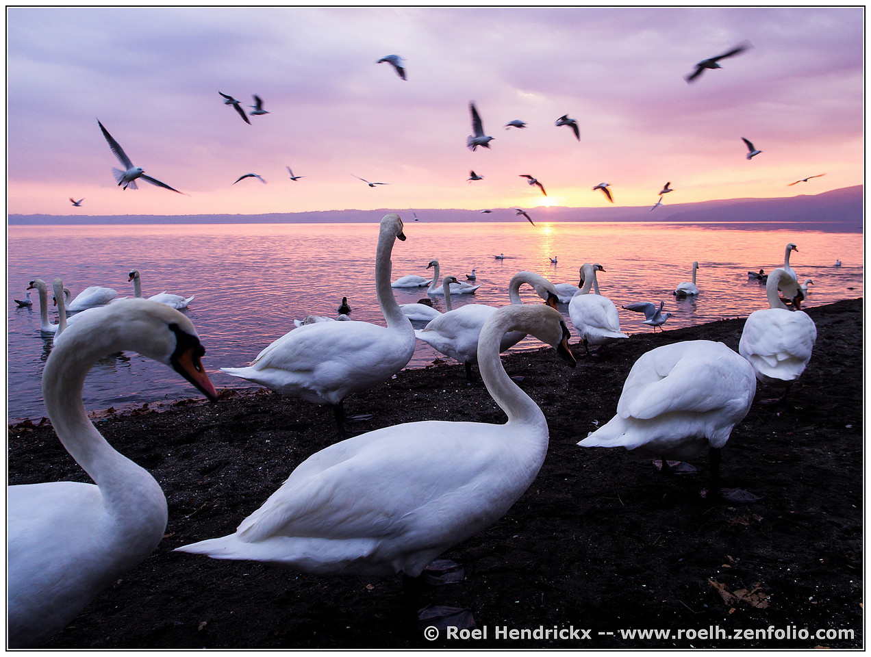
    Have you ever seen such colors at sunset?

  • Members 403 posts
    Dec. 6, 2024, 10:58 p.m.

    I can't see anything that should catch my interest.
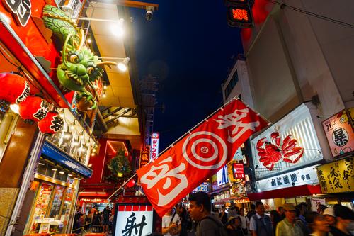
    Should I look at the flag in the foreground or at the people?
    Or at the buildings that are distorted in perspective?
    What was your intention for this photo?

  • Members 1549 posts
    Dec. 6, 2024, 11:32 p.m.

    Others commenting on the photo have already noted much of what I wanted to get. Check their comments.
    Dotonbori at night is crowded, It's claustrophobic. It's loud (in every sense of the word. ) You are bombarded with bright colour and invitations to eat- from every angle and in your face. If it might convince you to buy, someone will try it. It's a lot of fun too.
    That's what I tried to get. Whether I did is up to you.

  • Members 403 posts
    Dec. 6, 2024, 11:40 p.m.

    I don't see anything of what you're describing!
    Unfortunately!
    There are simply too few people in this photo to the point of being unrecognizable.

  • Members 403 posts
    Dec. 6, 2024, 11:55 p.m.

    really nice photo

  • Members 677 posts
    Dec. 7, 2024, 12:38 a.m.

    Color is made of three parts: Hue, Saturation and Lightness. You were talking about Saturation of the purples and I responded only to that, just so we're clear.

    Therefore, I must assume that your question is rhetorical.

  • Members 781 posts
    Dec. 7, 2024, 12:41 a.m.

    Absolutely, yes! And sunrise, also. Lavender and apricot. Classic. Sublime.

    Apparently, you haven't. What a shame.

    Rich