• Members 803 posts
    Jan. 11, 2025, 5:13 a.m.

    Thanks Mike.

    I don't disagree.

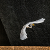
    There were four things that kept me from appreciating the DOF at the time I took the shot.

    1. I was almost standing on my head to frame the image. I wasn't paying close attention to the composition, and couldn't. I knew I had the thing generally in the frame and depended on the camera to bail me out.

    2. It's a 45mm lens on a medium format camera. I should have had pretty good DOF but it's actually a macro shot so the DOF is limited for that reason.

    3. The shot is at f/8. I sort of unconsciously set at f/5.6-8 when I try to maximize the technical aspects (resolution) of the shot (which I do too frequently). But I sort of unconsciously find myself getting uncomfortable getting too close to f/11 (and, horrors), f/16 because dreaded diffraction will creep in. I need to stop doing that when I need DOF. But in my defense, stopping down at the close focusing distance would not have increased DOF much. (Dammit, I paid a lot for this lens' resolution, I ain't about to limit it!)

    4. Over the last year and a half I've had a problem with my right eye. My dominant eye. It's improving and my Ophthalmologist keeps reassuring me it will return to normal. I have better days and not better days. I've tried focusing and composing with my left eye. That's not really working. I rely on the camera to bail me out a lot - point it generally where I know it should be aimed and depend on its auto focus. But I miss things. Like in this shot. Maybe I'll discuss the eye problem more in a later post. Sort of a PSA. What happened to me can happen to anyone.

    Rich

  • Members 1635 posts
    Jan. 11, 2025, 6:28 a.m.

    Thanks Rich.
    I see (pun) the problem.
    PSA required a Google search from me - it has been added to my vocabulary.
    Eyesight and Photography looms larger in my life and it scares me witless. Praise be for AF improvements.
    I hope your Ophthalmologist is correct.

  • Members 597 posts
    Jan. 12, 2025, 9:20 a.m.

    This series definitely brings across the feeling of a bleak northern winter. The greys and blacks are heavy and depressing, and the only colour is a rust brown, and although in itself that is a warm colour, it does nothing to lift the mood.
    The unusual composition of the first is an eye catcher, and at first glance the trees seem to be floating on a little island of scooped earth, with the trodden snowy paths providing mysterious clouds! Maybe I have seen too many album covers painted by Roger Dean.
    The second is more traditional, and works well, but I am not so sure about the third, which for me just seems too cut off at the bottom. If you think that too, you could try cropping out the sky, to leave a more abstract image with the lovely patterns and shapes of the winter branches.

  • Members 597 posts
    Jan. 12, 2025, 9:30 a.m.

    I’ll just add my weight to the comments above.
    I especially like those blocks peeking through the haze, in fact cropping out the bright parts of the top right to leave the bird, the spray and the blocks would also be a great image.

  • Members 1744 posts
    Jan. 12, 2025, 2:31 p.m.

    Thank you. (I think he just swallowed his fish, they hold their neck that way when their meal is working its way down that long neck!). I love all the framing that nasty old structure offers me, different every day.

    Thank you, though not sure what you mean by caution. Like a lot of my dam pictures, this crop was not planned, but discovered after the fact. I wish I could've reduced the noise better but Topaz doesn't work well on water spray, it tries to resolve it like noise, and that makes a mess of things, so I processed this one lightly, with the old manual tools in LR.

    Thank you Chris

    Thanks. The birds are scarce in winter, when they fish from the riverbank instead of the dam. A few determined fellow like this will wait at the chutes to see what comes through. I will crop to any format, which is why I taught myself to cut my own matts, rather than depending on precut ones in particular dimensions. Glad you spotted that implied line, that's one of the features I liked best about the shot!

    thanks Pete. I liked those blocks too, that's what made me notice this one in the slush pile and do a little work on it.

  • Members 803 posts
    Jan. 12, 2025, 6:25 p.m.

    After all the other comments, I don't have a lot to add.

    Just lovely.

    I like the lines, the contrast, the mystery of the shot.

    Looks like old Tri-X.

    Rich

  • Members 863 posts
    Jan. 13, 2025, 8:14 a.m.

    The gold of the sunrise (or sunset) is gorgeous and velvety and makes for a winning combination with the blue hues of a mountainscape in shadow.
    But still I wonder how this would look if the foreground were lifted just a little bit to make it just that bit brighter (not daylight-bright of course).
    Just to make the eye travel easier towards the back.

  • Members 863 posts
    Jan. 13, 2025, 8:16 a.m.

    They are all four fine records of your walk, but my eye lingers most onto the last one (displayed quite small in the post).
    It has a graphic quality and a flow of lines and a chromatic simplicity which gives it more of a timeless appeal.

  • Members 863 posts
    Jan. 13, 2025, 8:19 a.m.

    This is an image that could serve immediately as the cover for a book on "China in Transition".
    The old as bedrock for a mushrooming explosion of novelty.
    And those stairs symbolize a long and arduous hike upwards, crafted with much labour and creativity.
    Transition is the word.
    It just needs some kind of boat or ferry in the vast expanse of rather drab water, to bridge the void there.

  • Members 863 posts
    Jan. 13, 2025, 8:21 a.m.

    That first one of yours here really caught my eye.
    The shapes of the snow, surrounding the bare field with the trees on top of it, look almost like this image was made with a fisheye lens.
    The overall effect, to my eye, is one of a suspended island of soil an vegetation, floating above a maelstrom of coldness.
    Could be an image from a computer roleplaying game: that is the "Floating Island" you need to reach in level seven;

  • Members 863 posts
    Jan. 13, 2025, 8:23 a.m.

    I never complain when you turn to the dam.
    Your images there never disappoint, with their combination of brutalist economy and natural elegance and grace.
    The dam birds images are poetry without words.

  • Members 863 posts
    Jan. 13, 2025, 8:26 a.m.

    This is simultaneously intriguing, inviting and scary.
    Like I imagine much of Japan (at least the technological side ot the nation) must be be.
    The way the artificial faces overlap, almost feels like a composite, but the half person on the right grounds the scene in reality and provides scale.
    And the scale is quite unexpected.
    The mechanics behind the front-most face look complicated, but could also be "swiss watch" like small.
    Not so.
    The size makes "scary" dominate over "inviting".

  • Jan. 13, 2025, 9:46 a.m.

    Thank you.

    Alan

  • Members 863 posts
    Jan. 13, 2025, 10:23 a.m.

    I wrote my own comment unbiased before reading any of the other comments.
    So I was pleasantly surprised that the impression of an island floating above clouds resonated also with Pete.

    Album covers : yes, that would be a good reference.
    And I was thinking of this OLD computer game : cyan.com/games/myst/
    Not so much the gameplay video or game mechanics, but that still image at the top of the page.

  • Members 863 posts
    Jan. 13, 2025, 10:26 a.m.

    It's amazing how, in Japan, marketing installations seem to be highly immersive and highly inspired by popular teenage culture (video games, social media, AI, etc).
    The country seems not to stop boggling the mind.
    Mental note to self : Need to go there someday.

    As for the image: similar thoughts as on the first one apply: good angle, good inclusion of what seems unavoidable (spectators circling the display).

  • Members 1046 posts
    Jan. 13, 2025, 2:39 p.m.

    Thanks Roel, it was a sunset.
    I am too lazy to get out of bed early enough for sun rises 😊

    I tried a few versions of this in pp with various brightness’s to balance the foreground and background.
    For me, the presented version worked best; the darker foreground better “explains” the bluer colour of the shadows and, being darker, it doesn’t compete with the gentle slightly brighter colours of the pink clouds hanging in the mountain.
    The house kept dark, shows clearly it’s getting late and adds to the feeling
    By the way, the tracks you can see leading to the Erichhütte are mine, made with snow shoes. On that day I was the first to get to the top 😊

  • Members 863 posts
    Jan. 13, 2025, 3:47 p.m.

    Thank you.
    I can totally follow your reasoning.
    And congratulations on what must have been a strenuous but satisfying hike.
    I hope you got a ... Fireplace ... blazing in that hut.

  • Members 597 posts
    Jan. 14, 2025, 10:07 a.m.

    I think Mike describing this as thought bubbles in a cartoon is just right. The photo was transformed once I had made the observation that the adverts could be what was going on in the cat’s mind. Up until then it was just a pleasant picture of a cat. The little white feather is the important trigger to get the viewer to make that link. Has the cat succeeded in catching the bird? Or is the feather making it hungry? It is fun to think about, but doesn’t really matter, it has already acted as a catalyst to change how the viewer sees the image.
    It is a clever image, which rewards spending time with it.

  • Members 597 posts
    Jan. 14, 2025, 10:25 a.m.

    This is a fantastic surreal image. The faces are so realistic and with such subtle details, and are then juxtaposed with the rather clunky looking machinery, which makes them look as though they were developed by a mad Victorian genius (probably steam powered!). The viewer is drawn straight to the eyes and, on exploring further, there is a real shock in discovering the face ends so abruptly, followed by an intellectual struggle to explain the perfectly natural faces and the totally unnatural detachment from the rest of a body, or even a head. Then the people give clues to the enormous size of these faces, which is a further shock to the expectations, and further cause for unease.
    It is all from a dream, and we don’t know if it is a good one or a nightmare, but it is an exciting experience.

  • Members 597 posts
    Jan. 14, 2025, 1:06 p.m.

    Having read your reply to Mike and his comments, I can only sympathise with you for your optical problems, both photography and health wise, and send best wishes for the latter.
    That said, I agree with Mike about the area of sharpness, and had the leaf and the red rock been sharp, it would be so much better. As it is, that little corner of leaf on the right is about the centre of sharpness, which makes it a distraction.
    A suggestion would be a seriously large crop, just to the right of the central leaf, leaving the top right hand quarter of the image, which shows the incongruous triangular and brightly coloured corner of the leaf peeping out amongst the rounded grey stones. It would no longer be so much about fractals as about the leaf breaking the mould of uniformity. For me at least, that would also be an enjoyable image.

  • Members 1635 posts
    Jan. 14, 2025, 11:08 p.m.

    Re the spectators. I wanted to be able to show what they were doing but couldn't get an angle. They had an ap that let them look at selfie portraits and try on the wild sunglasses that were being promoted- without picking up a pair of real sunglasses There were plenty of mirrors around but no one was using them. Perhaps the young no longer know how to use mirrors?