I genuine, fun moment of life captured pretty close with a UWA lens. I love that sort of shots, closeness brings authenticity and a connection between the viewer and the subject.
Jan. 22, 2025
66
-
-
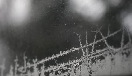
Nice composition of a frosty scene.
-

It's always a good idea to look straight down (or straight up) in a staircase in a building with some architectural merit.
Quite often you will find geometries that remind of fractals, snails houses and shells.
This is a prime example, and it looks über-cool.(The best staircase in my city is in a public building, called the "Bell" tower because it used to be Alcatel Bell's Antwerp headquarters.
That staircase looks just as stunning looking up as it does looking down.
Looking up is easy: just position yourself well and shoot away.
For the view down, you gotta get your camera out in the void with outstretched hands though, for maximal effect.) -

Perhaps. But it doesn't make it any easier to take a photo as good as this.
Straight from the aesthetic school of ikebaba flower arrangement. An off centre subject positioned to give perfect balance by using longer elements to the other side. Then there is the positioning of the shadows. All of them but especiallyt he point of the flower shadow to the apex to the leaf intersection.
Add in the repeating curves of the flower, the vase base, the circular shadow in the depths of the flower, the curve at the base of the left leaf.
There's still more to be appreciated in this photo.
Yeah, it's easy to get a good photo of a Calia Lily. -
As Daneland said.
The simplicity of the classic composition is a real strength. It feels right without demanding we look at a particular point. Now we explore the landscape details. It has to be viewed and explored large. The frost details on the various surfaces from branches to grass are beautifully captured. Its a shot where sharpness and dof choices are nailed.
Great colour control as well. The grey blue touches everything and because of this evenness, it creates stillness.
A masterful landscape. -
Can we combine both? I prefer the complexity of planes and the colours of 2. I like the shapes at the side of the walkway on 2 and their fit to the planes of the side.
But I prefer the church on the hill bottom right.
Artist's privilege. A touch of Photoshop and away we go.
Might as well make the bike ride really worthwhile. -
Permanents and migrants. All too timely.
The Dam continues to give and you find new things to capture.
I imagine that different groups passing through can be expected in different months.
Compare 1 and 2. The permanents look a little sullen alongside the energetic migrants. Travel does that for you.A Guest book of visitors over a year might be possible?
-
Rich beat me to M C Escher. Sort of Escher meets 2001 coolness? I don't share Rich's impression on height. The relaive eveness of the light and dof doesn't convey height to me. That isn't a criticism, it just strikes me differently. More like an eye (with eyelashes) looking at modernity.
And I agree with the "Great shot." And a layered title. -
The white frame shows up OK
I am sure these all look great as large prints. I'd like them as individual prints horizontally positioned on a big wall. The vertical arrangement doesn't seem right to me and I'm trying to work out why. Perhaps it is because there is a strong horizontal line in the first two although not the third. Looking vertically down the triptych doesn't seem to flow and I think a grouping needs to do this.
Considering them individually or arranged horizontally, it's different. The east west dappled white and black body has a green dappled east west fram while the grey base has more east west lines to complete the frame. Black and white with a green surround is unexpected and gives plenty of impact. In each case the cat isn't stationary. A personal act is being performed that makes the moment captured a little special
Ha. Try posting these in the Sunday Cat thread. I want to see the responses. -
Interesting architectural images loaded with geometry and shapes, but also a pleasing study of direct and reflected delicate colors and tones.
-
Fun image of young folks getting a big kick out of obsolete technology - dial up phone and oscillating rotary fan. My favorite part is the expression of the older onlooker (who might be someone the photographer knows...)
-
A lovely, peaceful example of bleak mid winter scenery in muted pastels, and how it can be captures and presented in a pleasing study. The treeline forms a big flattened V that extends the width of the frame. The flattened downslope of the trees on the left lead to the V of the split between the two sections of the tree, so there's a V nested within another V. The third V lies on its side, rising from the right thirds line and its apex meeting the base of the V of the treeline before veering back behind the tree towards the right edge. We don't have to see these shapes consciously to be affected by them. Thus the power of visual design.
-
You are right about calla lilies. (I've always admired Vincent Versace's collection of images of callas.)
This is a lovely example from an unusual angle, and in harsher light than is typical. I like how you made the shape of the shadow part of the composition, instead of trying to fight it off. The colors are pleasingly rich. Good management of focus, a technical and artistic victory.
-
Intriguing architectural abstract. This photo seems a cousin of both Roel's image and Rich's image. Only the small figures trodding on the stairs give any indication of the directionality of the angle. The subdued colors palette allows them to blend in and get somewhat lost in the criss crosses and curves of this maze. It's an artistically pleasing set of lines and tones, but the tiny humans, once discovered, add significant interest as they scurry through like ants in an anthill.
-
The cat is lovely in all his poses. I agree with Mike that the vertical arrangement doesn't quite do them justice. Maybe there needs to be more space between, and a corresponding increase in space at the edges? Maybe arrange them with custom matting to create separation space? Or as Mike suggests, mount separately and hang as a grouping?
My methods won't appeal to everyone, but if I were doing a triptych of these I might consider imposing artistic (irregular, faded, etc) edges on the crops, making the first one larger and the other two somewhat smaller, in a sort of triangular arrangement and printing on a good sized textured cold press paper.
-

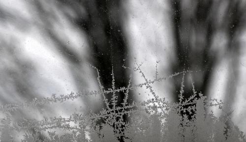
Ice Art @ -20C
-
Oh I like this. Classic.
-
Love those lines, crevices, shadows etc. It's extraordinary assembly of indentations and different shapes. An absolute architectural treasure.