Hands down the best interpretation. Bright enough to be enjoyed with just right amount of light. Excellent effort.
March 12, 2025
89
-

-
-
Great b&w image with some drama in the sky. Rope on the beach ties nicely with the boat. Very intriguing capture.
-

Hey Alan, you are not wrong at all. I think you are pushing me in the right direction and I can see I have been too defensive or passive when leaving the entrance as it was. Great work with lighten it up, Then of course i can't agree about everything. You have dragged the clarity a bit long to my taste and i have to think about the sky.
Overall, thanks again, really appreciated as you made the image interesting again! -
No problem. I think the sky should be a bit darker, but I didn't notice that until I'd published it here.
Alan
-
Now this became a work in progress again. I'm half there, maybe not have the sky really this dark and maybe turn down the purple a bit more again. One difference compared to the first version is that i added some sharpening this time, I usually don't do that.
Well, I may slowly get there... The No person-series is interesting to me so I'll keep working on it.
Cheers! -

LilyPow!
Rich
-
Let me try too :)
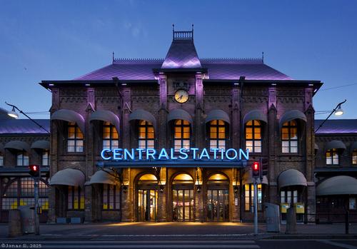
I chose different approach. As far as I can see, it is more early night than late day scene, thereby I attempted to bring more of entrance into light, made it a bit warmer and decreased sky intensity; also made purple illumination, neon sign and clock more intense. Perspective correction (DXO automatic) and very little sharpening are applied too. (I started from the first uploaded jpg image.)
-

Thanks Pete. I agree :-)
Both photos were taken in the same place. The second photo was taken first, I was standing on a small pier with a few others waiting for that "last" sunset of the year..
It went down just a few minutes later and then nearly everyone left the pier.
Often after the sun has set the colours are even better,... As in this case too, looking in the opposite direction, 30 minutes after the first photo was taken, the magic really started, and it lit up those fantastic buidings for the second photo :-) -
Impressive colours. The composition reminds me of an exploding firework.
-
A Photo Essay of Sorts: My Search For Forgotten People
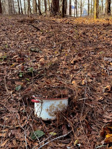
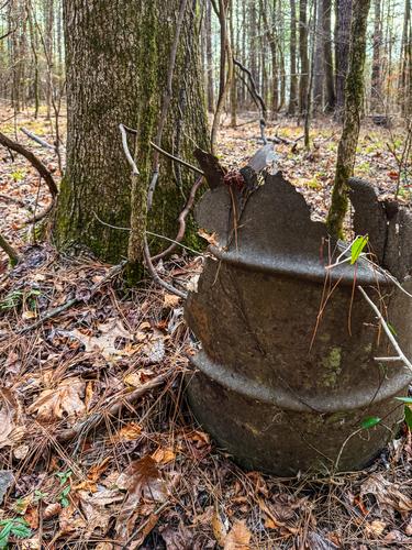
My land is a share of a small family farm in Mississippi that was sold to my great great grandfather in 1830, soon after the government stole it from the Choctaws and set them on the trail of tears. It has been in my family ever since. It was occupied by my ancestors, possibly by some slaves, then by various farm workers and sharecroppers and foremen who had their own homes and croplands on the acreage. Since I got the land myself a few years ago, I've been trying to reconstruct what was here before my time. The cropland is reforested now (much was always forested), so it's rough going in the hills, but fascinating. Around Christmas I stumbled into an area I'm sure was inhabited, and I'm trying to understand it. I'll share my journey. Go along if you'd like, offer any insights you discover; don't feel you have to comment on particular pictures but moreso on the overall effort to uncover the stories of the forgotten people who lived here.
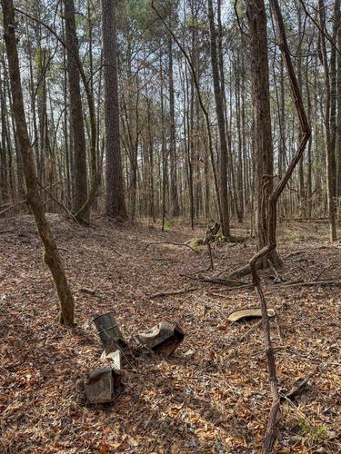
I started into the woods at this point, late one afternoon and you can see my house in the background. The enameled pot pointed me south so I picked up there.
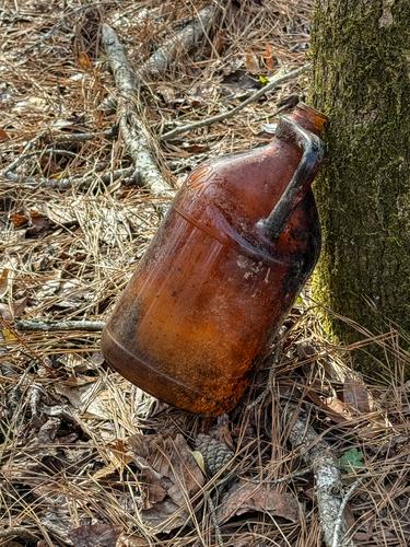
The next clue was this barrel. There's actually two, one more dessicated, and 3 clear gallon jugs that I took to the house. (Moonshine?)
Next came a clorox bottle. This one was easy to date since Clorox has a website for that. 1930s.
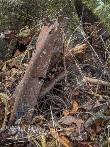
Then I came upon an area that gave me a start. On the tallest ridge, a flat area with what looked like an old roadbed laid in a circle. There were various artifacts there, an old stovepipe, old bricks, a pipe sticking up from the ground (similar to what is used for artesian spring wells in this area), the back of an old metal chair of some kind, various worked stones (foundations? doorsteps?), rusted tin roofing material.
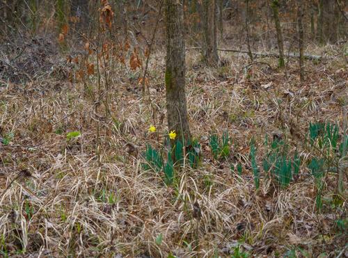
Behind the brick piles were rows of blooming daffodils, a surefire way to identify an old house site.
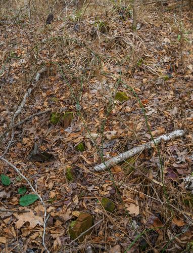
The piles of bricks are covered in many decades of botanical debris. Very hard to see unless you dig around.
The rusted metal seat of something? A farm implement? Plow?
[]
(/a/N5Vk43n65LDANboDWG705hMrnhdApnoe0QH35fq6PkthG4sK1RUbczjxAMMk7NZ5/31543/?shva=1)The last item I found Sunday evening was inside a tree. What looks like a bedspring and rail were embedded in the roots of this oak tree that looks to be 70 years old. So now I have to peep into the roots of the trees to find more clues.
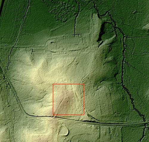
The last image is the lidar for this section. I don't know much about lidar (except that it's very subtle) but I do know it shows an old roadbed, and an oddly regular shape like an inverted "9", which doesn't look like a natural feature.
-
[quote="@minniev"]
A Photo Essay of Sorts: My Search For Forgotten PeopleMy land is a share of a small family farm in Mississippi that was sold to my great great grandfather in 1830, soon after the government stole it from the Choctaws and set them on the trail of tears. It has been in my family ever since. It was occupied by my ancestors, possibly by some slaves, then by various farm workers and sharecroppers and foremen who had their own homes and croplands on the acreage. Since I got the land myself a few years ago, I've been trying to reconstruct what was here before my time. The cropland is reforested now (much was always forested), so it's rough going in the hills, but fascinating. Around Christmas I stumbled into an area I'm sure was inhabited, and I'm trying to understand it. I'll share my journey. Go along if you'd like, offer any insights you discover; don't feel you have to comment on particular pictures but moreso on the overall effort to uncover the stories of the forgotten people who lived here.
. . .
What a story!
The images are wonderful, not for photographic content but for the historical information and "detective" evidence.
I have no idea how much further into the quest you'll be able to go, but I hope we can follow along.
Rich
-

In my comments on your previous Barcelona photo of last week, I mentioned Casa Battlo (or is it Batllo) by Antonio Gaudi.
And now in this image, we see precisely that building with its organic shapes that have always reminded me of a sleeping dragon (especially also the roof section that is absent from you view, with the "scales" for roof tiles). That is not a coincidence, surely?While you do not show us the whole building (that can be found online), and the view towards the building is "obstructed" if this was supposed to be an architectural digest image, your composition is striking, effective and very clever.
The ladies and how they are dressed, with hats in round organic shapes and shades of orange and red to match perfectly with the shades of blue of their blouses, also look like they have been designed and placed there by Master Gaudi.
The casual and fleeting (street photography) foreground photo opportunity matches perfectly with the static background that is always there.
You caught a "decisive" moment. -
This photo puzzled me.
There are things I like and things I like less (or maybe it's not really that I like them less, but they have me puzzled.)I like the leading diagonals from the bottom right.
I like how that leading line is followed by the gaze of the museum employee.
I like how he looks towards a group of visitors that are lined up in an almost perfect circle (or is it an aperture).
I like how those visitors are preoccupied with themselves, looking inward, instead of at the beautiful, iconic image that hangs on that wall.What I like less are a few distractions that you could not do much about, but they obstruct the geometry of what I have just mentioned : you really have to look past and ignore that trash can, that piece of carpeting and those two chairs and sofas, in order to crystallize the view and the mathematics of leading line, circle of people and square image on the wall. Like I said, nothing you can really do about that.
And what really had me puzzled, is why THAT image by Steve McCurry would be hanging prominently on the wall of the entrance of the Leica Museum.
It is true that McCurry NOW uses at least one type of Leica camera (next to the Nikons he has always used on his travels).
Maybe the exhibition in the museum showcases some of his work (portraiture) done with that Leica.But it is widely known (and I looked it up again, just to be sure), that the "Afghan Girl" image that ended up on the cover of National Geographic in 1984 and raised world awareness for the very human victims and refugees of war in Afghanistan, was shot NOT with a Leica but with a Nikon camera and lens.
cameraville.co/blog/afghan-girl-the-nikon-fm2
So what were they thinking?
(Maybe you have the answer?) -
These two photos and the difference between them, are interesting not only because they are both good, but also because they allow me to say something about the practice of photographing sunsets.
Your SECOND image is what I would call a good, competent sunset image.
It shows us the setting sun, above a cityscape in silhouette, and with a nice reflection of the warm light in the water.
Actually, I would call this image well above average as far as that kind of sunset images go.Most people, when photographing a sunset, just point their camera or smartphone in the direction of the sun and if they can, they will even zoom in on the sun itself, and have little regard of other composing elements that can contribute to the image.
How many vacation sunset images from friends and family have we all seen that are basically just two (most likely 50/50) horizontals parts of sky and sea, with an overexposed blob of sun near the straight horizon?
Most people also shoot their sunset too early, when the sun still has power and is still bright, while the best of those sunsets (looking towards the sun itself) are shot when the sun is already nice and red, and just on the edge of the horizon. And post-sunset images, with light still reflected in the sky and illuminating and colouring clouds, can often be better still.But all of those images (like your second), show the sunset by looking AT the sun.
IMHO, the better sunsets are OTOH shot while looking AWAY from the sun.
Those images allow us to enjoy the spectacle of what those last rays of sunlight are illuminating, and painting in vivid warm colour.And in that regard, your FIRST image is a true stunner.
The buildings come alive and look like the contents of Fort Knox were put into a giant bag and tossed then onto the landscape.
There is randomness and edginess, but also order and structure, painted in honey-sweet oranges, yellows and gold.
The sunset paints a landscape of gold onto the blue hues of the surface of the buildings' glass exteriors, framed by reflecting blue on the edges of the buildings and then that much deeper blue of the sky. Wonderful. -
For my reply I am snipping away all of the text of the initial post (you may try to do the same in editing your image post).
And so we can concentrate on the image. It is truly worthy of the attention.
You have here an excellent classic photo (not the kind of experiments we have come to expect from you).
There may have been processing tricks involved (maybe a sky replacement behind the ship or some compositing?), but I like how natural the image feels to me (well, of course it is B&W and not colour, but for a photographer, a good B&W can feel "natural").There is an excellent composition her, with a sip on the beach or in low water, against a dramatic sky, but the main highlight is the fact that you have included such riveting (anchoring maybe even, pun intended?) foreground interest.
The nearby and the far away connect perfectly.
I also like the B&W conversion.
It is the kind of shot that I like to think that I could have come up with in this situation : wide angle to include the foreground, but with a clear focus towards the faraway and then the visual and thematic connection between both. -
I think we are on the right track here.
Because the image of that building, taken from that position, presents itself more as an architectural image than as a situational image trying to give us the feeling of the whole square and the "train vibe), I feel like the image could benefit also from a touch of perspective correction. Both the vertical and the horizontal axis could use a very subtle, minimal tilt (vertically: forward / horizontally : towards the right). -
I am reading this "making of" comments a few hours after I had written my comments on the two images, looking only at the original photo post.
And I am pleased to note that we are on the same frequency as to the best ways to capture the magic of sunset:
- look in the OTHER direction
- wait until the last light becomes not more direct, but reflected by the atmosphere.Sunsets can be magical, but most casual sunset-snappers look in the wrong direction and at the wrong time.
(Well, not "wrong" of course, because there is no right or wrong in photography, but you get what I mean.)

![e142_Centralen_DPRevived_v2_2503[1].jpg](/a/thumb/OB2GGnrHn0K4724odk0hZY9kkqzNd2YdZreNI5fWOSOifJhDccleWViILhuNsUZF/31533/?shva=1)