Simple and simply outstanding. The tonalities and textures make this call out for a print.
March 8, 2025
35
-
-

Very nice shot, reminiscent of hammer house of horror
-

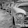
Great capture Andy. A classic street shot. One has to wonder what this dude is smoking. 🤪
-

I can't imagine that I would have found this shot interesting in colour. It's the B&W characteristics I'm enjoying here.
The tone range is full and beautifully controlled.
I like the unexpected hillock across the front of the building and the line of grasses against the stones. -
It's a fine old building. I like the composition with the track edging around the side.
Personal taste. I'd have preferred it with somewhat less processing. -
And what conclusion did you reach? What did you want to do with the sky? Another way to do this (apologies if I'm telling you stuff you know) is to make a B&W conversion and adjust the colour channels. Doing this can give you precisely the tone you want in a blue sky.
-
Most curious. The whole style of the bike seems completely at odds with the style of the owner. Your exposure with the very bright bike and the deeply shadowed owner/rider accentuates the chasm between the styles.
Were these for hire? -
Yes, these were bikes for hire - a quick spin round Covent Garden area of London.
-

A walk along the River Han in Seoul
If I'm looking for a shot that might work well in B&W I'll often go for a high contrast scene and perhaps even push the contrast some more in post.
While walking down by the river in Seoul, the lights and their reflection in the water were saying to me "this one in B&W" :-)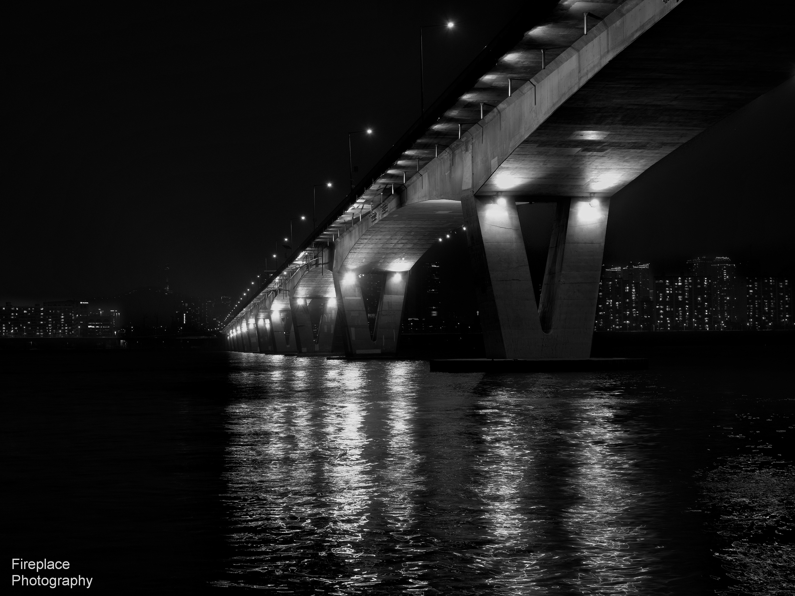
-
Roaming around this photo while showing it large is fun too. There are myriads of smaller possibilities here for cropped standalone images.
An image that keeps on giving. -
Agreed. A good subject for B&W.
The proportions, the areas of empty black to image details feel "right." As does the positioning.
The structure and its reflection give visual movement and drama. Sharp details and controlled highlights. -
And you heard it right. Nice capture. Great leading lines. My only comment is maybe a square format would have been better as it seems heavy to the right.
-
Pete, this reminds me of the a fractal - just keep zooming the image as more and more to offer. Great capture.
-

One aspect of this image that I like is that the concrete looks almost organic. Gone are the cold grey tones we usually see. I am not sure if the nice oily texture of the water reflections contribute to that. Certainly the under bridge lighting does.
-
There are again many nice photos in this thread👍
I do like @minniev 's old barn a lot and also the one @Fireplace33 posted (River Han)This is one I shot many years ago:
Intro:
Being raised during the cold-war periode, I visited the former Inner German border near the Brocken many times but was never able to cross the border.
Finally we could cross the border after the Iron Curtain came down in 1989
We visited the Harz region again in October 1990 after Germany was one country again.
Still many things that reminded of the old border were visible even after the fall in 1989
We literally could go through the opened (iron) curtain and hiked to the Brocken Summit and we were not alone. It looked like a pilgrimage.
An opened fence by Photobygms, on Flickr
A bit crowded by Photobygms, on FlickrUsed Ilford HP5 and a Pentax P30 with some SMC Pentax A lenses back in those days
Developing was done with Ilford Microphen in a darkroom at a local newspaper back in 1990 where my father used to work. -
Wonderful compositions and descriptions. I can only imagine the trauma of the German people during the Cold War. In the job I held in the mid 70's on, I was often tapped from to interview and debrief defectors from the East and people that just got out of East Germany for conferences, vacations on certain subjects. I always took away, good people put in unfathomable positions. Your photos take me back to that time. Nice work.
-

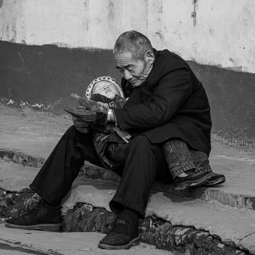
Grandfather
-
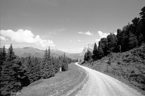
let's go for hike 😎
Somewhere between Kleine Scheidegg and Alpiglen (Near Grindelwald, Switserland)
Canon Eos 1V - Canon EF 28-300mm F/3.5-5.6 L IS USM
Film used: Rollei Retro 80S (80 ISO) developed with Ilford ilfosol 3