Jan. 14, 2025
5
-

-
Humm - first one of yours that didn't do anything for me. I don't know why - maybe there's nothing special going on or the colours and shading didn't work for me.
Alan
-

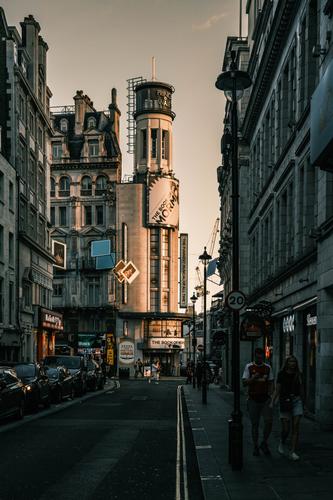
¡Hola!
I like the framing, the way the leading lines point towards the building in the background, already highlighted by the light, the use of complementary colors for lights and shadows... I wouldn't mind a little more light overall, and especially in the couple on the right: once included in the frame, in a prominent position, i think they claim their share of the spotlight. -
I take this as a complement :)
The light was so good, but I am aware that I could not manage to capture what I witnessed.
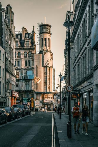
Thanks Doc, how about this?
-
The theater building may lose a bit of prominence, but the image as a whole seems more balanced. Without that couple in the picture, maybe I would have stayed with the first version…
-
I prefer the first version. Being able to see the couple on the right more clearly does not improve the photo for me -- I would rather they were not there. It looks to me as though the problem is lack of space in that part of London to do justice to the buildings.
David