The landing page looks fine and is simple to use. I would only change the banner area. The Photo appears there 3 times (one is actually right above the banner). I'd reduce this to one. I like the photographer's quote and would move it out of the banner.
On another subject, changing others photos bothers me. These photos are art and should be respected. Artists have discussed the Mona Lisa for years without defacing the painting. Most photo sites I visit frown on modifying others images unless asked first.
Thanks,
barondla
Logical link/url structure, consistency of site address in search engines, much simpler to point to our site in other forums or in social media and so on.
Alan, you can also use urls like forum.the-photo.org and [www.]the-photo.org - as long as domain is the same, both variants look reasonable.
I'm not following this. If the www.the-photo.org/ site, wherever we use it, takes people to the explanation of what we do and the link buttons on this site connect to the Index site, what is the problem we have overcome?
We only need to point to one of our sites as they are linked together.
I'm not arguing against doing what Bryan has suggested, I simply think we have bigger fish to fry at the moment and we need to get on with the frying and not be diverted, unless the diversion has some real benefits that we need right now.
I agree. And also think it should be possible to make it the root of the tree with the material from dprevived as branches.
Then members can either enter through that as front door, or go straight to the page we want (e.g. Threads).
Web crawlers should lead interested non-members to the home page (the-photo.org), from which they should be able to navigate and discover what they need to know about us -- the details of which we have rehearsed more than once!
Let's give the dprevived name a private and silent funeral: it has outlived its purpose.
OK, but we have a process underway. I'm entirely happy to have new members being reached by whatever is going to work. I don't want to keep chopping and changing while we are in the middle of something. The pages we have set up are not designed to be reached by search engines. When we have finished what we are about, we can try something else. What we are doing at the moment can only be done once and it needs to be done while we have plenty of activity generated from the weekly threads. We have got that at the moment.
We need the one right at the top because that is the same on all web pages. I want to keep the main title page (Welcome to The Photo).
I could remove the one on the left next to the title. Would that work for you?
Where would you move it to?
I am pretty sure we have that in one of the rules. But some categories state that if you post here, then you are allowing others to edit unless to say no. I think we have it about right, but I'm open to better suggestions.
I hesitate to comment on the site visual design because I am experienced enough to know that a) It's a lot harder than you think to do it well, b) Someone who has put their heart and soul into doing the best they can is (rightly) not going to be happy about having their work criticised. The current page is better than previous efforts, it's functional and reasonably tidy looking. That is ok. But, if we want the page to act as a shop window and attract new people, I think we have to accept that it does not look like a page that has been designed by a skilled and experienced web designer/graphic designer. Unfortunately, I'm not a graphic designer (my own efforts would likely be no better than this one), but I was the intranet manager/website admin for a major UK public body and we had our own graphic design team who helped out on the website design, so I picked up on a few inklings as to how graphic designers think.
Often it is relatively small things that create an impression of professionalism and polish - you don't need to be some kind of creative genius to design a page. One example: positioning and spacing of type. For example, the "Image of the Week" heading above the central picture isn't positioned correctly. It looks scrunched up, too close to the top edge of the image (I'm looking via Firefox on a 32" desktop monitor). It's an (apparently) minor point, but it is the accumulation of these little details that are important in graphic design. All the page elements need to be very precisely fitted to some kind of grid and all accurately lined up and spaced to avoid looking amateurish. There also needs to be careful attention as to the fonts used and the relationships of different font sizes, weights and styles. Same goes for the page colour palette. Normally, a great deal of effort would go into working out the visual design colour scheme. Typically, a designed would focus one or two colours with perhaps some occasional accents. I don't know how to do it, but I do know it makes a big difference. v1.0 websites back in the 1990s were often designed by people without design skills and it showed in the hodgepodge of unrelated colours, type faces, use of emphasis (like boldface) and a mishmash of fonts. Modern "designed" sites take as much care over these issues as they would with a magazine layout or product packaging. That kind of slickness calls to people. Again, this page is not terrible but it is also not terribly appealing. I think of the difference between the UIs of, say, Adobe Lightroom and some open source alternatives. Adobe have spent more time and effort in making their interface look expensive, the Open Source products tend to look open source. Another example from the home page is the use of the buttons. They are functional, they get across the information they should, but they look kind of crude. The use of capital letters is inconsistent. The box shadowing effects is clearly meant to compensate for that but instead (IMO) it just draws attention to the lack of an overall design vision.
I wish I was a graphic designer and could actively help rather than just criticise, but unfortunately my skills here don't stretch beyond thinking something isn't professionally styled :-( The site could benefit from the help of a member who spends all day and everyday designing websites for clients and knows what's what.
More consistency, subtlety and precision is needed to make the page look polished.
Removing one The Photo would be fine. Perhaps place famous quote below The Photo is the visible... or at the bottom under Abstract and Experimental or the opposite bottom corner. Think it is helpful to free up banner. It eases new visitors into the site. You are doing a great job and are much appreciated.
Thanks,
barondla
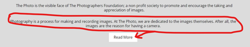
We now have several responses from members saying www.the-photo.org/ is easy to understand and use. Fantastic. That's the purpose of this page. But I keep coming back to one area of the functionality and no one is commenting. The "Our Focus" statement seems to me to be very important in saying what we are about. It is right at the bottom of the page. Then the "read more" button is below that. Depending on the screen I'm using, I need to scroll down to see this.
My question: Is the "Our Focus" statement being read and is the statement understood?
If the statement isn't being read or is missed at the bottom of the page or if the statement isn't clear, we need to know and fix it.
Re editing other people's photos. It's a variable thing. Some people don't want their images edited, some don't mind. It can depend on the purpose of a particular thread. We don't have overall rules for the site but those who establish a thread make the guidelines for their discussions. In Weekly C&C the guidelines specifically state Unless the original poster specifically states (for every individual posting offered for C&C) that they do not want their image(s) to be downloaded, altered or reposted, it is understood that within the context of this thread, other participants are free to download and alter the posted image and repost it in a reply for C&C purposes. That reposted image may remain permanently within the week's thread, or you may remove it after a short period of time if you prefer. The downloaded and altered images are not to be used for any other purposes nor uploaded anywhere else than within the context of the C&C in this thread. No copyright disputes here!
There's some history here. We had a resident troll who mainly worked through his editing of the photos of others. For many of us, the "Please don't edit" tag was us a defence. In the Weekly C&C, I'm happy if someone takes the time and trouble to work on one of my images when they wish to discuss a point. I don't always agree but I have sometimes learnt a lot when this has been done.
It seems risky to put our most important information, an explanation of what is different here from other forums, at the bottom of the page where it may not be seen because of having to be scrolled to be viewed, or where viewers have to click on something to see all of it. When asked if they want to read more, many viewers won't click on that. If this is what we most want them to read, it should be somewhere that they are more likely to read it. If it seems longer than what the average new viewer would read, then maybe edit/shorten/condense/rearrange it so that all the most important points are on the landing page, and the part they have to click on to see more is just a more in depth explanation.
This is our marketing pitch. Other forums offer a chance to post pictures, but there is little real discussion out there past technical considerations. The conversation about the pictures here is what makes us a different kind of photography community.
You can now look at our dev2 site - switch to dark theme there, does that look better? If almost, but some elements are of low contrast or otherwise look wrong, report that by PM :) Sure you can comment on light theme too - this should not be just gray on gray, but having very light colour shades.